
Get Set GudnessFood BoxPackaging Design
Six granola packs. Hyper-realistic bowls. One cohesive brand.
Project Overview
Get Set Gudness Food Box Packaging Design
Get Set Gudness approached food packaging with an opportunity to make everyday breakfast more visually exciting for a younger audience. At Brij Design Studio, we developed six unique granola packaging designs that combine appetising food imagery, refreshing colours, and a cohesive brand identity.
The creative direction positioned granola as an all-day breakfast choice, appealing to consumers looking for convenient and visually engaging food options. Every pack was designed to communicate the product's appeal at a glance while ensuring that each flavour had its own distinctive personality.
Client
Get Set Gudness
Audience
Younger consumers
Range
Six granola pack designs
Scope
Inspired by Modern Food Preferences
A Food-First Visual Direction
As interest in healthy and mindful food choices grows, packaging plays an important role in how consumers discover and evaluate products.
Our approach for Get Set Gudness focused on creating a contemporary, premium-looking design that could connect with younger consumers. Rather than relying on abstract graphics, we chose a food-first visual direction that placed the granola experience at the centre of the design.
The result was packaging that communicates the product category clearly while giving the brand a fresh, recognisable presence.
 The Granola Experience
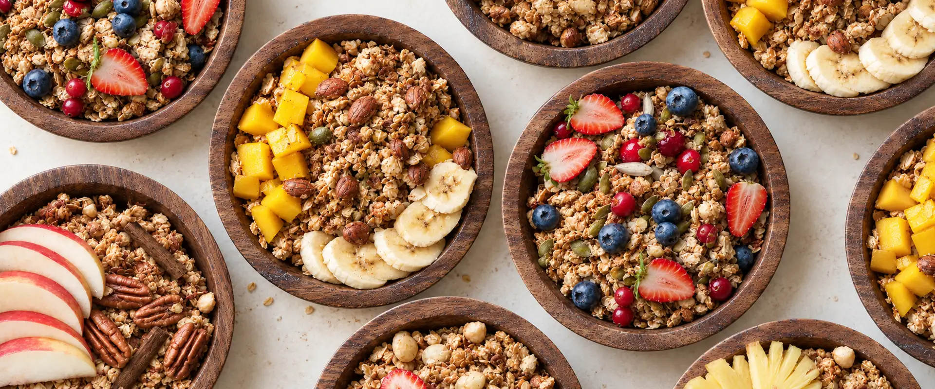
Hyper-Realistic Granola Bowl Imagery
Hyper-realistic granola bowl imagery, created through sophisticated photo manipulation.
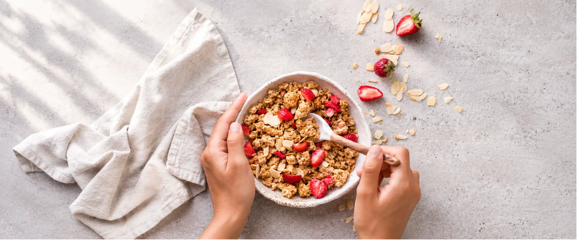
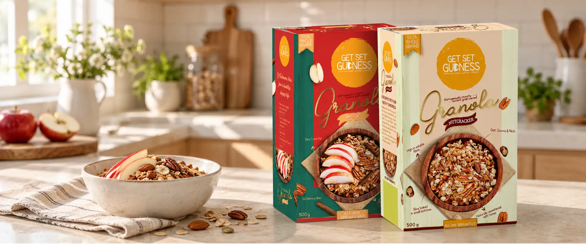
A key feature of the project was the use of hyper-realistic granola bowl imagery created through sophisticated photo manipulation. The visuals highlight the textures, ingredients, and appetising appearance of granola, helping consumers imagine the product as part of their daily routine.
This approach made the food itself the hero of the packaging, creating a stronger connection between the product and its intended use. The bowl imagery also supported the brand's all-day breakfast positioning, making the packs relevant beyond a traditional morning meal.
The Food Is the Hero
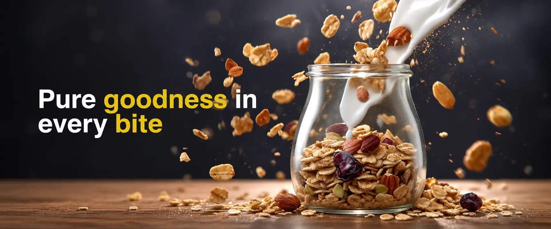
Making the Food Itself the Hero
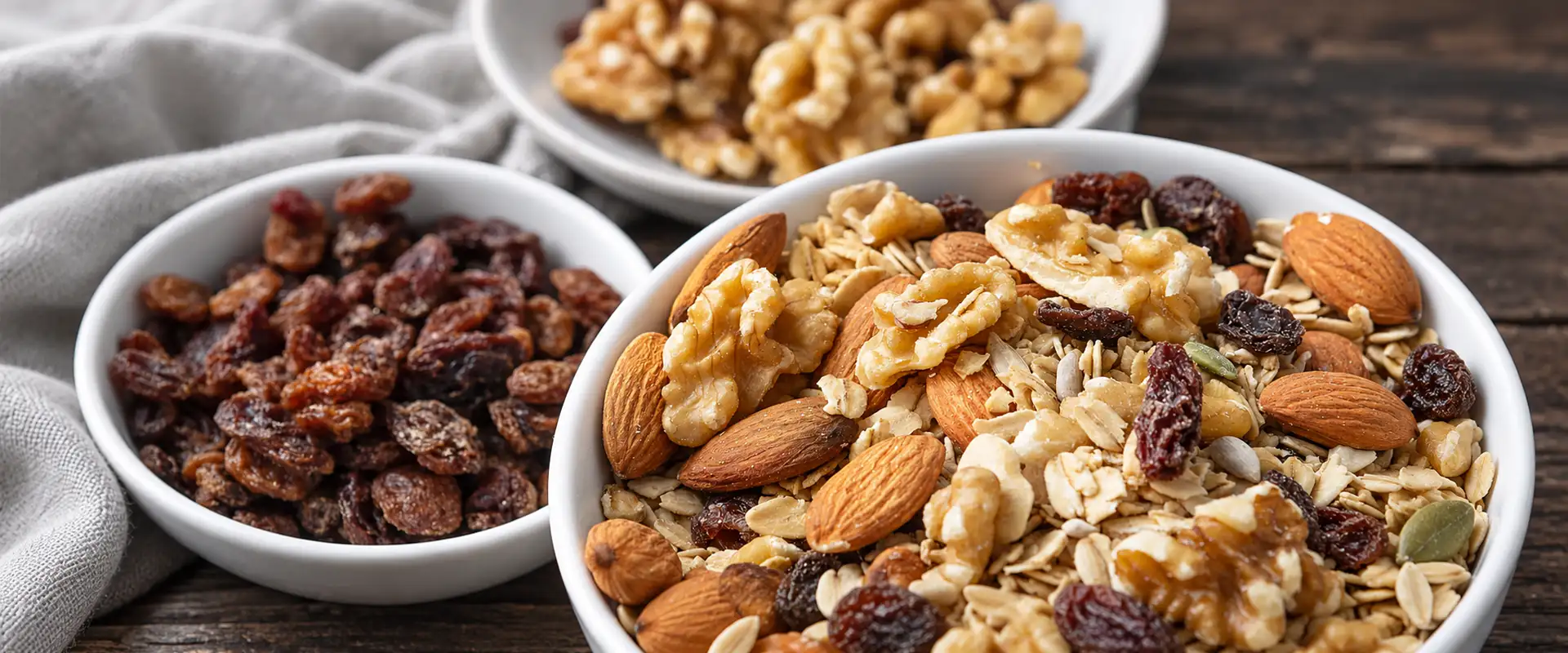
Textures & Ingredients
Helping consumers imagine granola as part of their daily routine.
 Real Textures
Six Designs, One Cohesive Brand Identity
Unified Without Looking Identical
We designed six distinct packs under the Get Set Gudness brand umbrella.
Each design follows a consistent visual language while using a carefully selected colour palette to distinguish the individual product variations. This balance between consistency and differentiation helps the range feel unified without making every pack look identical.
The colours work alongside the food imagery to give each variant its own identity, helping shoppers recognise different options while maintaining a strong and cohesive brand presence across the range.
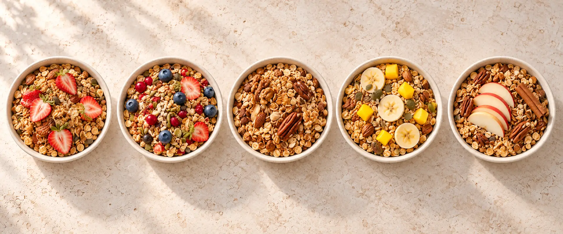
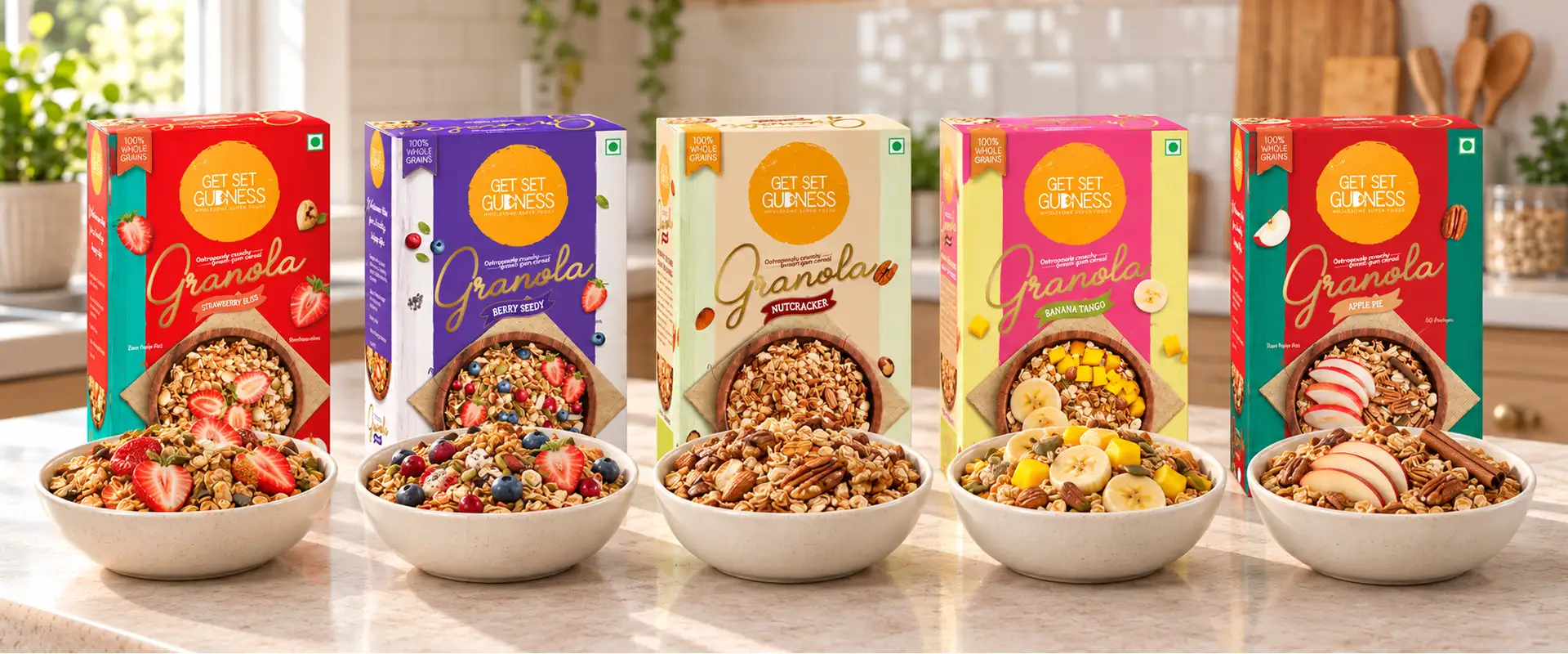
The Bowls
Colour-Led Packaging for Better Shelf Recognition
Colour Strategy
A Colour for Every Flavour
Colour was an essential part of the design strategy. Each granola variation received a refreshing colour treatment selected to complement its product identity.
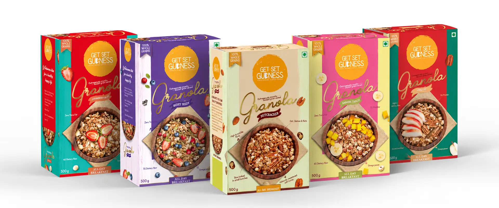 The Range
At a Glance
This creates visual interest while helping consumers differentiate between flavours at a glance. On a crowded retail shelf, a recognisable and well-organised packaging range can make product discovery easier.
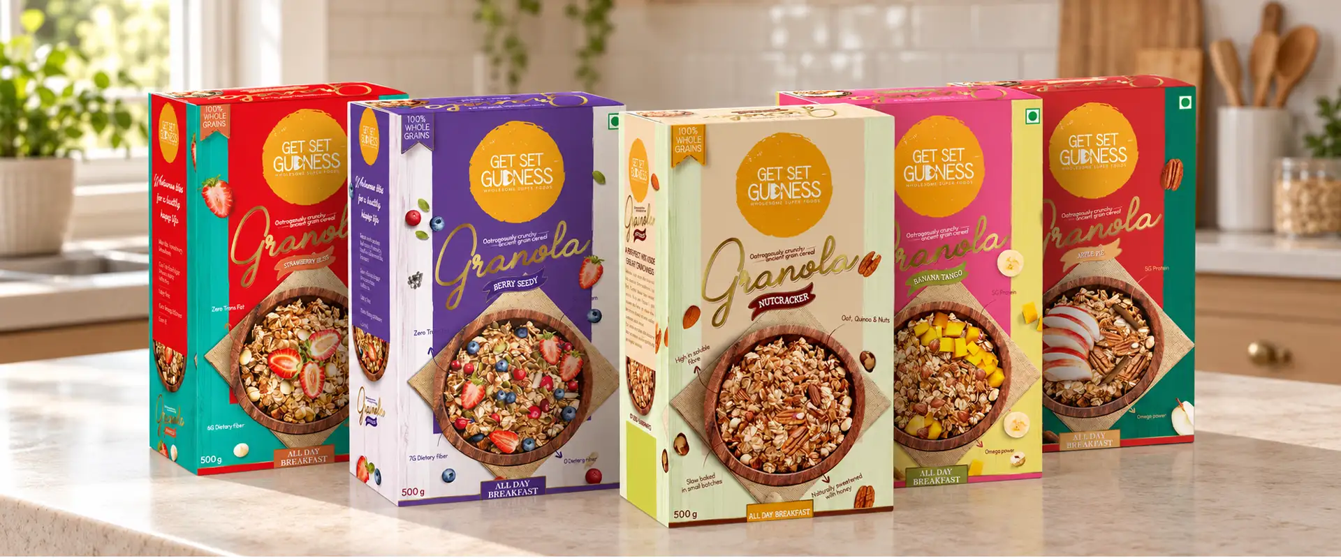 Side by Side
One System
By combining variant-specific colours with consistent branding and appetising imagery, we created a packaging system that supports both individual product recognition and the overall identity of Get Set Gudness.
 In the Kitchen
Brij Design Studio's Approach to Food Box Packaging
Storytelling, Communication and Visual Appeal
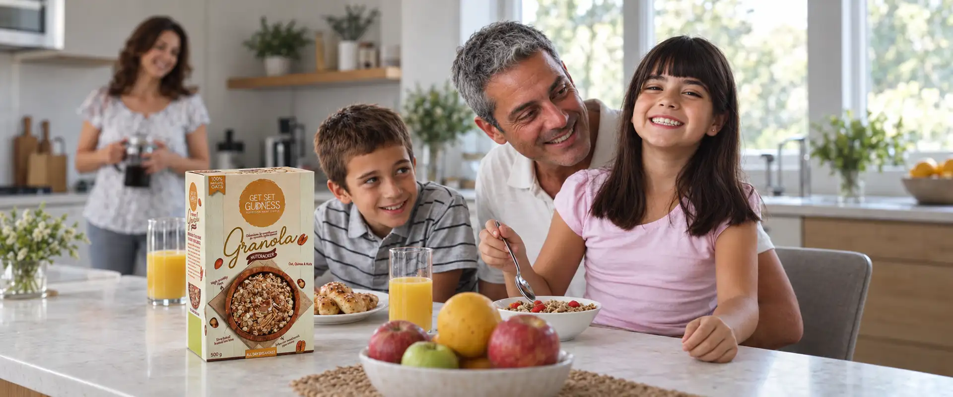
At Brij Design Studio, we approach food box packaging design as a combination of brand storytelling, product communication, and visual appeal. For Get Set Gudness, the focus was on creating a modern granola packaging range that speaks to younger consumers without losing clarity or cohesion.
From the selection of colours to the development of photorealistic bowl visuals, every design decision contributed to a unified packaging experience. The six designs demonstrate how thoughtful visual direction can help a food brand communicate its product range with confidence and consistency.
What We Designed
The Get Set Gudness project included:
01
Six granola pack designs
02
Food box packaging design
03
Hyper-realistic granola bowl imagery
04
Photo manipulation
05
Variant-specific colour palettes
06
Cohesive brand identity
07
All-day breakfast positioning
08
Shelf recognition system
Project Outcome
A Distinctive Look Across the Product Line
The Get Set Gudness project resulted in a six-design granola packaging range built around appetising imagery, clear product differentiation, and a fresh contemporary aesthetic.
The packaging brings together a consistent brand identity and individual variant colours, creating a distinctive look across the product line.
By placing realistic granola bowl visuals at the centre of the concept, the designs communicate the food experience directly and reinforce the brand's all-day breakfast positioning.
More Work
Our work that will interest you


Journal
Blogs you may like


Questions & Answers
Frequently Asked Questions
Get Set Gudness food box packaging design is a granola packaging project by Brij Design Studio featuring six unique designs, realistic granola bowl imagery, and colour-led differentiation for individual product variations.
The packaging was designed with a younger audience in mind, using contemporary visuals, appealing food photography, and a fresh colour palette.
A good granola packaging design combines appetising food imagery, clear product information, attractive colours, and a distinctive brand identity. Realistic granola bowl visuals can help communicate the product experience, while a consistent design system makes the range easy to recognise.
Granola packaging can stand out through bold yet cohesive colours, high-quality food imagery, readable typography, and clear product differentiation. For Get Set Gudness, six unique designs were developed using realistic granola bowl visuals and variant-specific colours.
Contemporary granola packaging often explores clean layouts, appetising food photography, distinctive typography, and cohesive visual identities. The right approach depends on the target audience, brand positioning, packaging format, and product information.
Yes. Packaging influences first impressions through its colours, imagery, typography, and presentation. A well-designed pack can communicate a brand's intended positioning and help consumers understand the product at a glance, without replacing the need for accurate product information.
Attractive healthy food packaging begins with understanding the target audience and product positioning. Designers can use appetising food imagery, a suitable colour palette, clear typography, and a consistent layout to create packaging that is visually appealing and easy to understand.
Younger consumers may respond to contemporary visual styles, engaging food photography, distinctive colours, and easy-to-navigate packaging. The design should reflect the brand's personality while communicating the product clearly and avoiding unsupported health claims.
Businesses should consider the target audience, product positioning, packaging material, product protection, shelf visibility, mandatory labelling requirements, and differentiation between variants. The final design should balance visual appeal with functionality and clear communication.
Consistent branding helps consumers recognise the brand across the range, while colour and imagery can distinguish one product variation from another.
Look for a studio with relevant food packaging experience, a strong portfolio, an understanding of your target audience, and the ability to translate your brand positioning into practical packaging designs. Experience with multiple product variants can also be valuable for growing food brands.
Brij Design Studio works on packaging design projects that bring together visual identity, product communication, and variant differentiation for food brands.
Professional packaging design helps establish a consistent brand identity, improve product presentation, communicate important information, and differentiate products from competing options. It also creates a visual system that can be extended as the product range grows.
For Get Set Gudness, Brij Design Studio created six unique granola pack designs for a younger audience. The concept used hyper-realistic granola bowl imagery, refreshing colours, and a consistent visual identity to distinguish product variations while keeping the range cohesive.
A food packaging design studio can help a new brand establish its visual identity, define its packaging style, organise product information, and create a consistent look across its initial product range. The design should be tailored to the product, target audience, and intended retail or online sales channels.
Food Packaging Design Agency in Mumbai
Launching a food range? Let's make it irresistible.
Let's Talk →