

TNT Healthy SnackPouch Design
Handcrafted Goodness. Illustrated with Character.
Project Overview
TNT Healthy Snack Pouch Design
Handcrafted Goodness. Illustrated with Character.
Client
TNT
Category
Healthy Snacks | Pouch Packaging
Project
Healthy Snack Pouch Design
Scope
Handcrafted Goodness
Good snacks deserve packaging that feels just as thoughtful as the food inside.
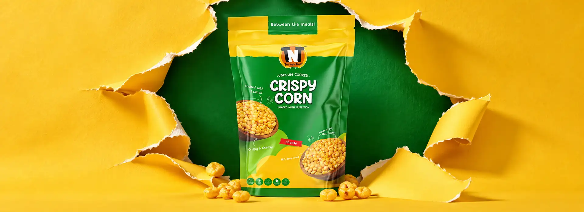
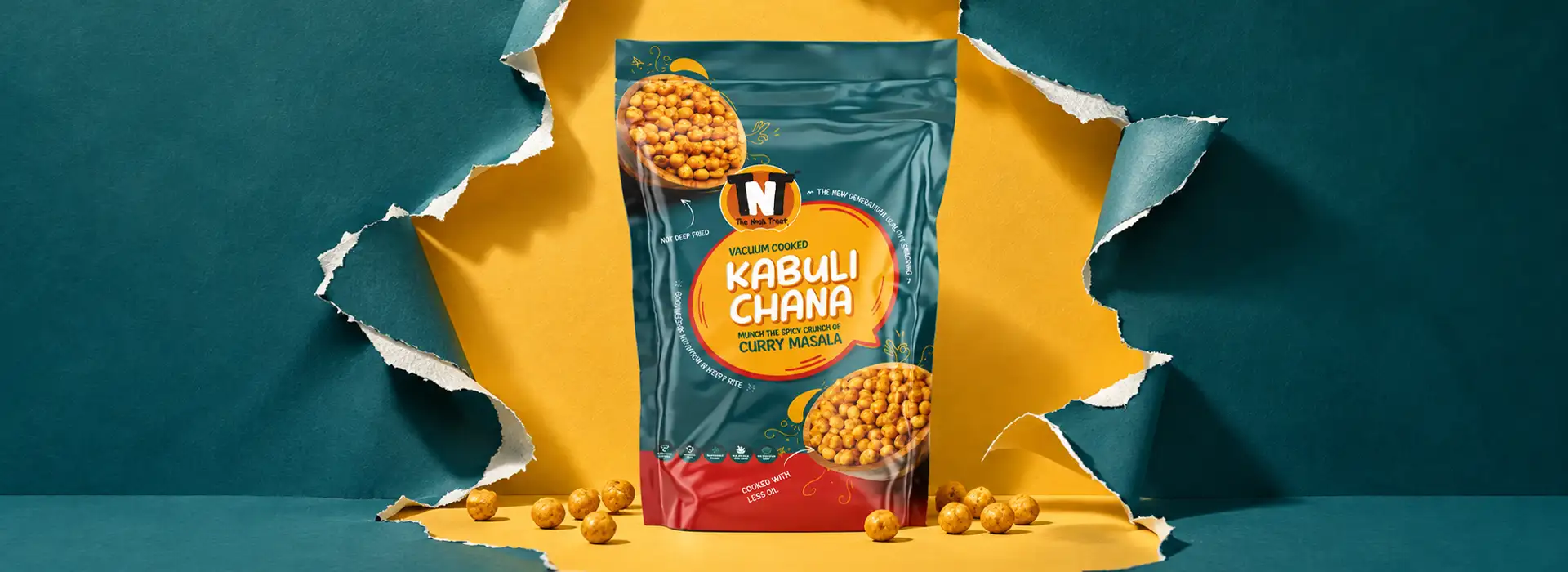
For TNT, Brij Design Studio developed a healthy snack pouch design that brings the charm of handcrafted snacks to the shelf through expressive illustrations, distinctive typography and a design language full of personality.
The idea was to move beyond ordinary snack packaging and create something that feels approachable, creative and rooted in the spirit of handmade goodness. Every visual element works together to give the pouches a unique identity while keeping the snacks at the heart of the design.

Packaging That Feels Handcrafted
A little less factory-made. A little more heart-made.

The visual direction draws inspiration from the warmth and individuality of handcrafted snacks.
Hand-drawn illustrative elements add character to the packaging, making it feel personal, inviting and full of life.
Instead of relying on predictable snack-pack conventions, the design uses illustration to create a more distinctive visual experience.
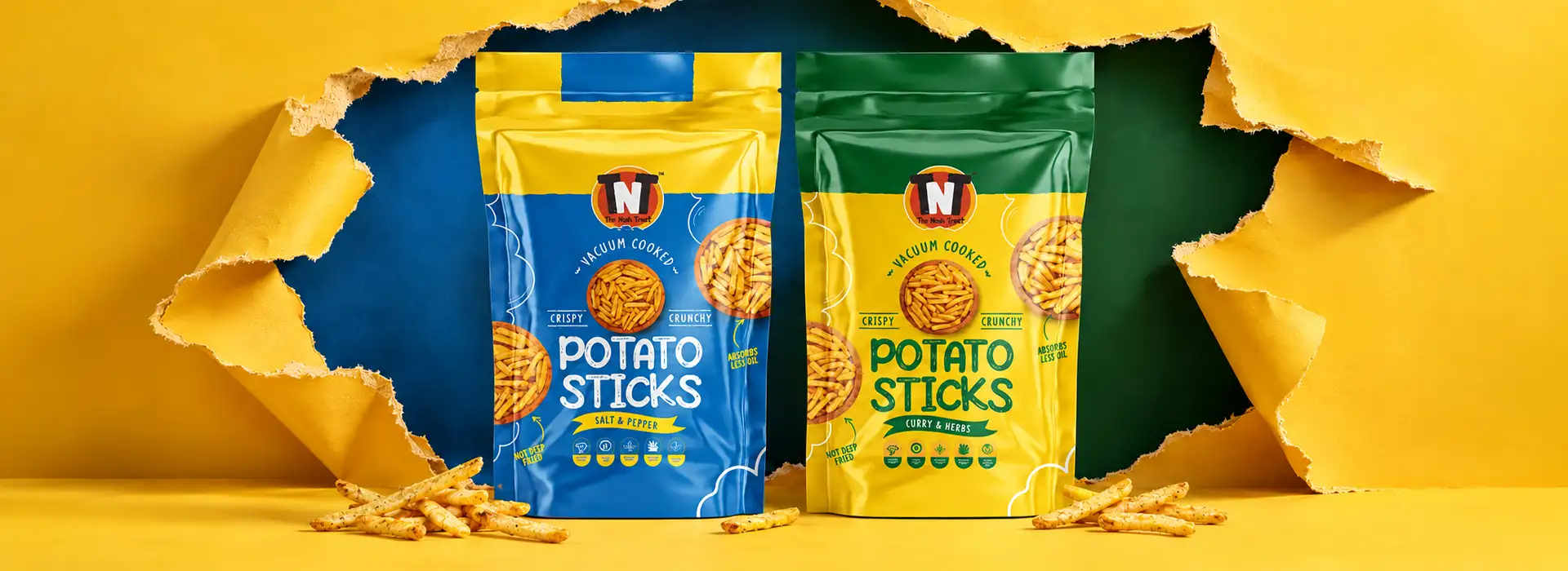
Illustrations with a Story to Tell
Every detail adds a little personality.
More than decoration
Illustration becomes more than decoration—it helps shape the overall mood of the packaging.
The handcrafted-inspired graphics bring visual interest to the pouch, creating a connection between the product and the care associated with handmade food.
Expressive & memorable
The result is packaging that feels expressive and memorable, with a style that stands apart from more conventional healthy snack packs.
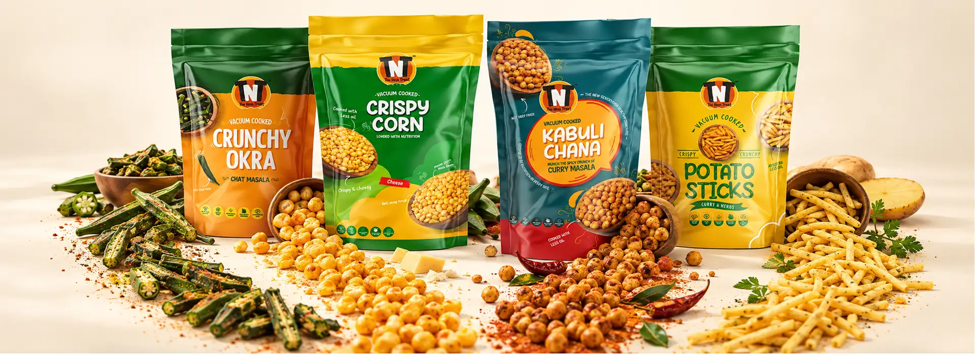
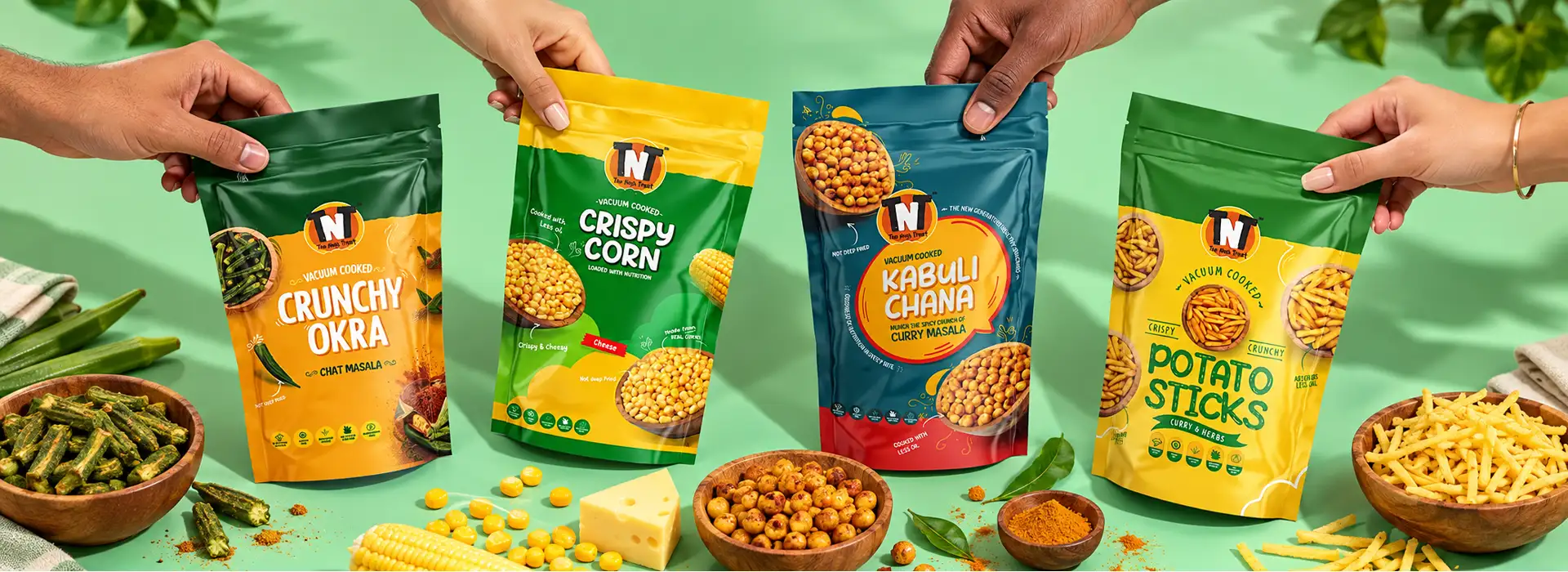
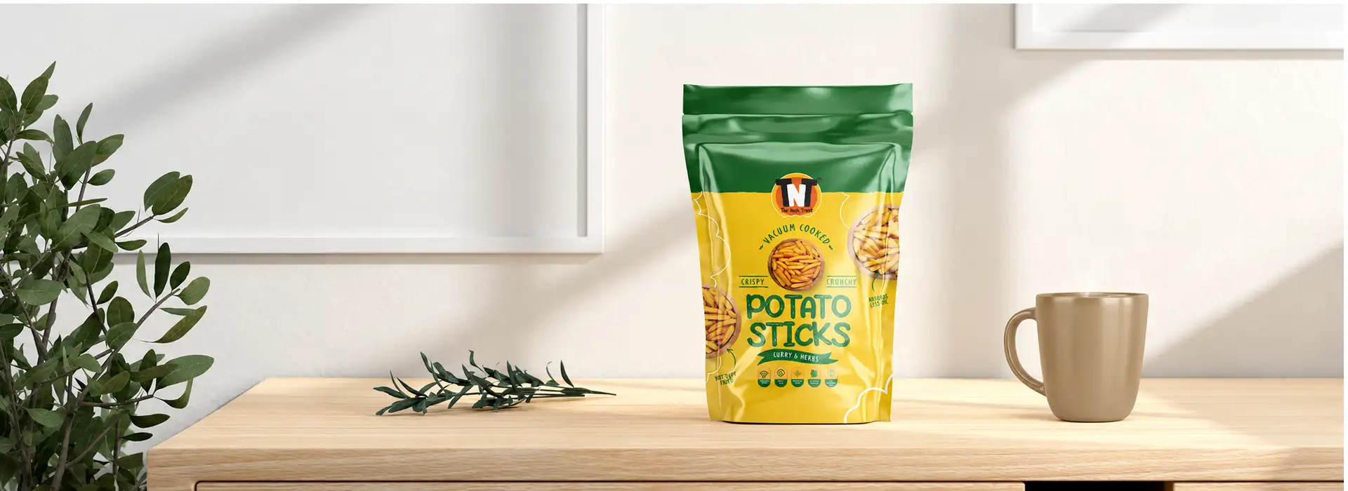
Typography That Matches the Vibe
Good design has its own voice.

The right typeface can change how a product feels before the pouch is even opened.
For TNT, typography was chosen to complement the illustrative direction and reinforce the handcrafted personality of the snacks.
Together, the fonts, graphics and layout create a cohesive design language—one that feels lively and approachable without losing sight of the product.
Healthy Snack Packaging with Character
Designed to catch the eye.Created to feel different.
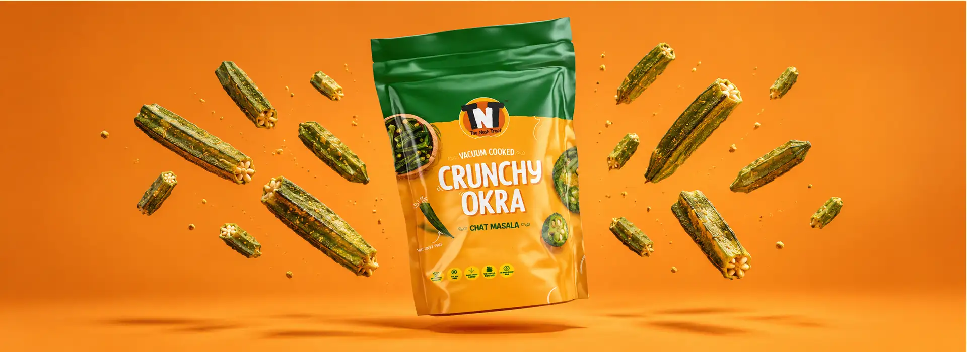
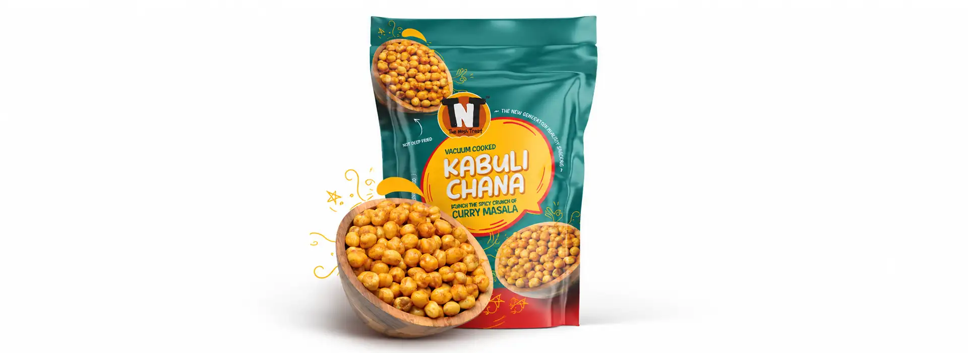
A few moments to impress
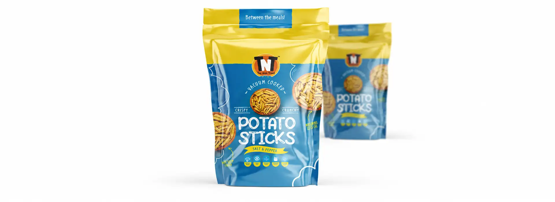
A pouch has only a few moments to make an impression. The balance of typography, illustration and layout helps TNT's packaging build visual recognition while communicating a more personal, handcrafted spirit.
This is healthy snack packaging that aims to do more than hold a product. It gives the product a visual personality and makes the overall presentation feel considered, distinctive and engaging.
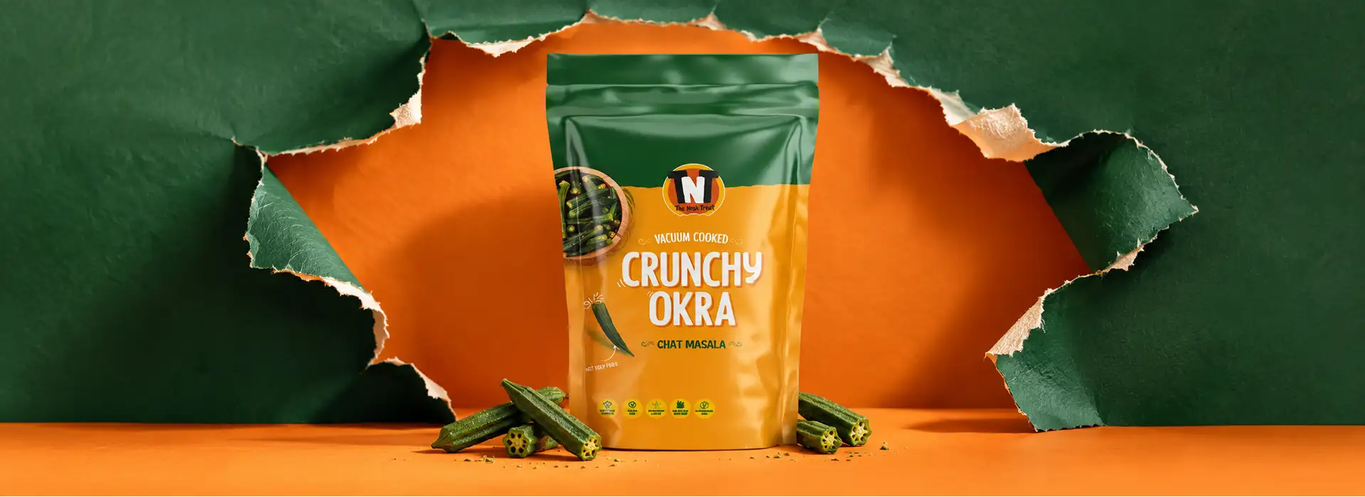 01
 02
 0304
Our Approach
Our Approach to TNT Pouch Design
At Brij Design Studio, the focus was on translating the idea of handcrafted snacks into a visual identity for the pouch.
From illustrative elements to complementary typography, each design decision supported the same direction: packaging that feels creative, approachable and true to the spirit of the product.
The Result
The result: snack packaging with a handmade heart and a distinctive visual voice.
More Work
Our work that will interest you


Questions & Answers
Frequently Asked Questions
The design focuses on the handcrafted character of the snacks, using illustrative elements, complementary typography and a cohesive layout to create packaging with personality.
Illustrations can make snack packaging feel more expressive and approachable. They help establish a visual style, add character and make a product stand out from conventional packaging designs.
Typography helps communicate a product's personality. When fonts complement the illustrations and overall layout, they create a consistent visual identity and make the packaging more engaging.
Packaging design can visually communicate the warmth, individuality and care associated with handcrafted products. Illustrations, typography and layout work together to express that feeling before the customer tries the snack.
Brands should consider visual differentiation, clear product presentation, typography, illustration style, readability and how the packaging reflects the product's character. The design should be attractive while keeping essential product information easy to identify.
Yes. Brij Design Studio works on packaging design projects that translate a product's personality into a distinctive visual direction. This can include concept development, illustrative design elements, typography and packaging layouts tailored to the brand.
The best packaging for snacks depends on the product's texture, freshness requirements, shelf life and storage conditions. Flexible pouches are a popular choice because they are lightweight, convenient to carry and offer ample space for branding and product information. The right packaging material and barrier properties should be selected according to the snack's specific needs.
Stand-up pouches, flat pouches, resealable pouches and zipper pouches are common options for healthy snacks. Stand-up pouches provide good shelf visibility, while resealable options are useful for snacks consumed over multiple occasions. The ideal choice depends on the product, portion size, storage requirements and intended customer experience.
Pouch packaging offers a practical combination of convenience, lightweight construction and design flexibility. It provides space for product details, brand messaging, illustrations and distinctive typography, helping healthy snack brands create an appealing shelf presence.
A good healthy snack pouch design should balance visual appeal with functionality. Important considerations include product protection, material selection, sealing, readability, product information and brand identity. Illustrations and typography can also help communicate the personality of the snacks and make the packaging more memorable.