
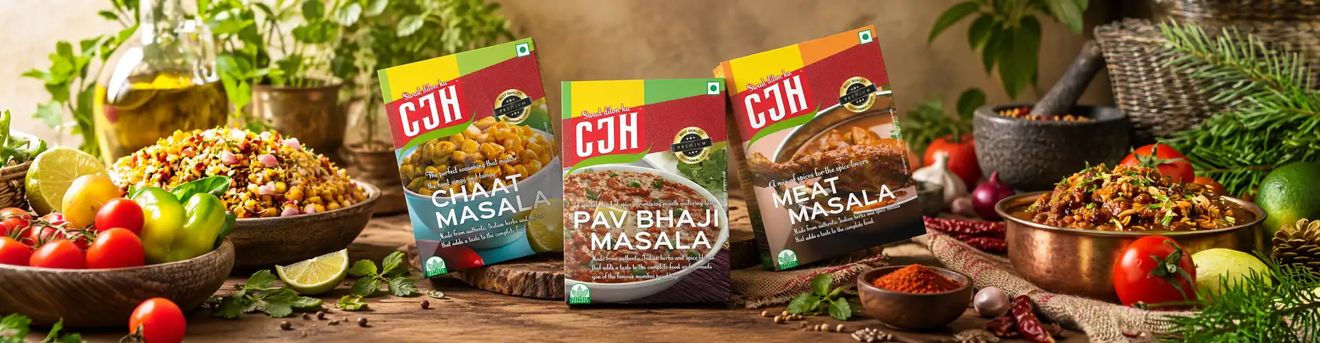
CJH MasalaPouch Design.
CJH needed a masala pouch design that could work as a system, not a one-off pack.
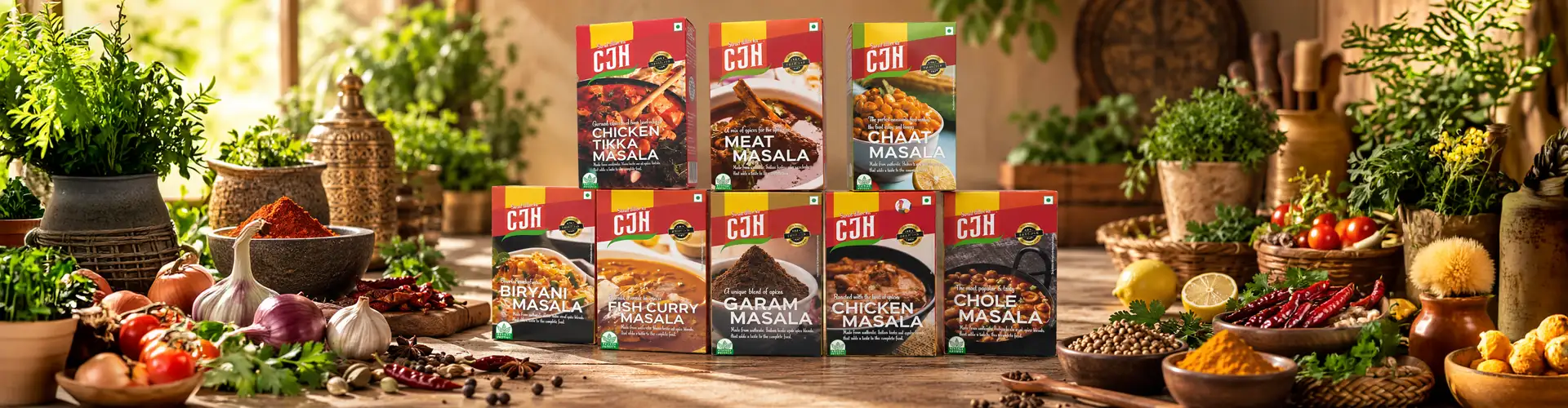
The CJH masala rangeScroll
Scope
Masala pouch design system · Colour-coded variant range · Typography · Print-ready artwork · Shelf visualization
Project Overview
CJH Masala Pouch Design
Client
CJH
Category
Food & Spices
Scope
The Brief
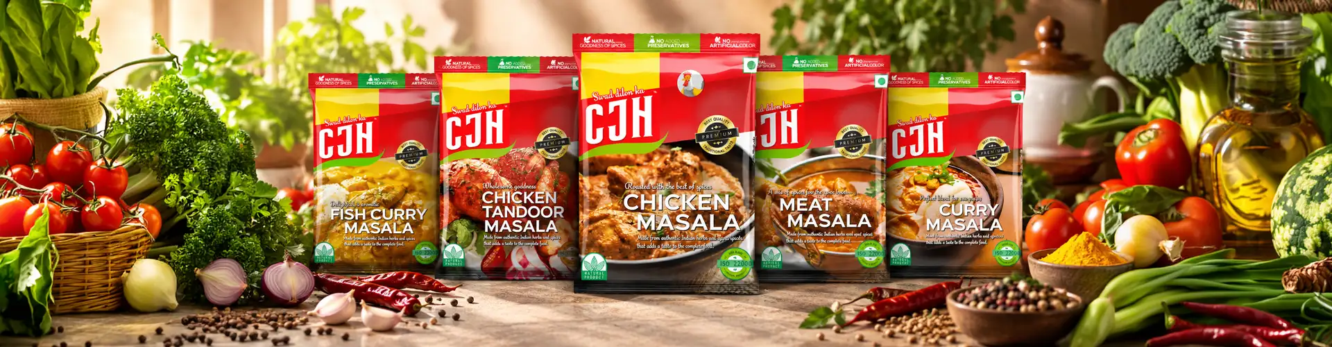
CJH needed a masala pouch design that could work as a system, not a one-off pack. With multiple masala variants sold side by side, the brief was to create a Spice Packaging Design that read clearly as one brand while letting customers instantly tell each variant apart on shelf. The packaging needed a consistent visual structure across the range, while giving each masala its own clear identity and making the products easy to recognise during a quick shopping decision.
 One brand · Many masalas
The Design Challenge
Designing Packaging for an Indian Masala Brand
Masala packaging often needs to communicate the brand and variant quickly, particularly when multiple products are displayed together.
For CJH, the challenge was to create a Pouch Packaging Design system that could bring the entire spices range together while making each masala easy to distinguish. Rather than designing every pouch independently, we developed a consistent structure across the range, using a clear visual hierarchy and distinct variant cues to create packaging that was cohesive as a brand and quick to recognise on shelf.
Concept Development
Concept Development for Indian Spice Packaging
The concept-building process for the CJH spice packaging started with one clear direction: bringing the familiar feel of Indian local markets into a contemporary pouch design.

Concept Development
Bringing the familiar feel of Indian local markets into a contemporary pouch design.
Local Feel, Modern System
We explored the colours, visual cues and everyday character associated with Indian spices and masalas, using that familiarity as the foundation for the creative direction. Rather than making the packaging look overly traditional, we translated the local feel into a cleaner, structured system that could work across the range. This gave the spice packaging a distinctly Indian character while keeping it modern, recognisable and easy to shop.


Colour
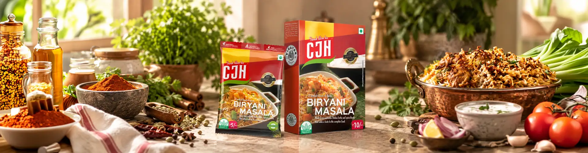
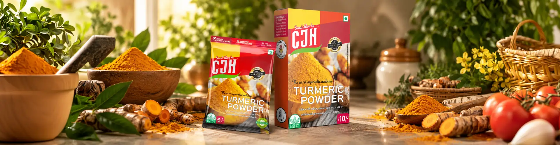
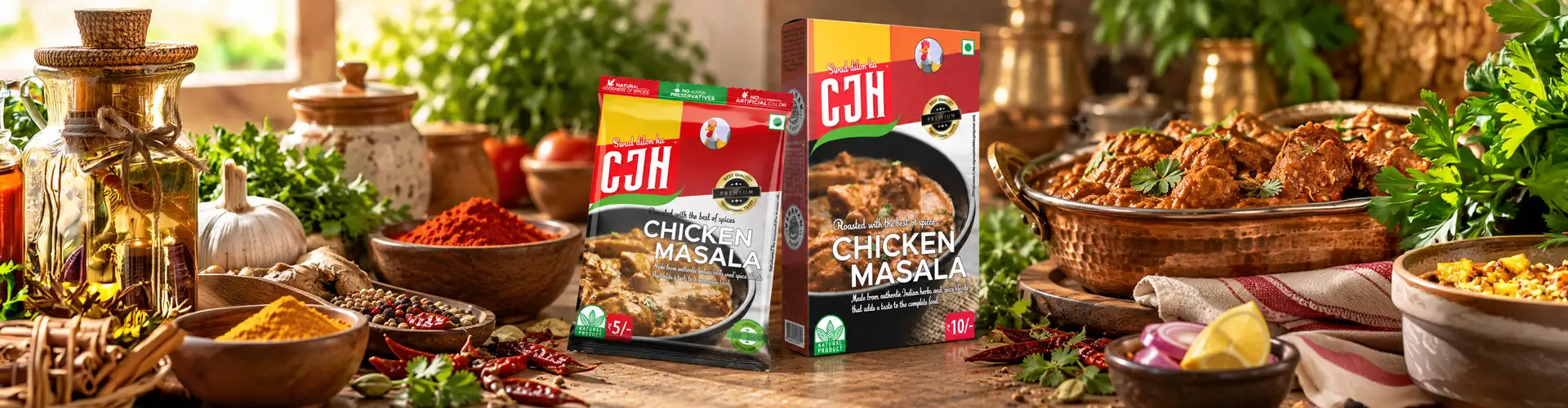
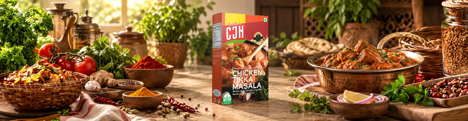
Colour as the Shelf Identifier For Every Masala Pouch
Rather than leaning on food photography or illustration to differentiate variants, we used a dedicated colour system as the primary shelf cue for each masala.
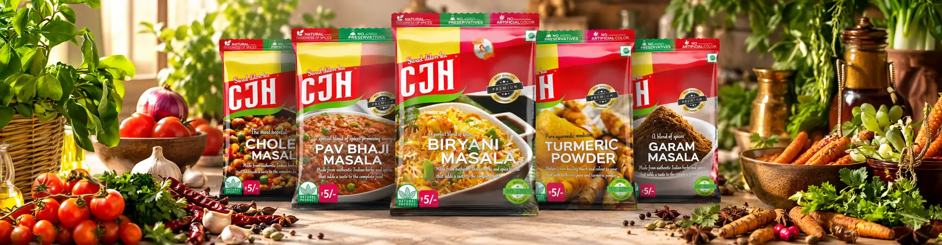
This colour-first approach lets a customer identify the exact variant they want without reading the pack, speeding up recognition and repeat purchase. The approach became a key part of the Masala Pouch Packaging system, creating a consistent visual structure across the range while giving each spice blend its own distinctive colour and shelf presence.
Range System
Balancing Range Consistency With Individual Clarity
01Fixed brand structure
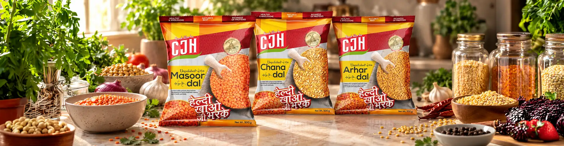
We kept a fixed brand structure, logo placement, typography, and layout grid, while allowing colour and variant name to do the work of differentiation.
02Every pouch size
This let CJH's full range of Indian spices feel cohesive as a family while remaining easy to shop individually. The system was applied across each masala pouch, including the small pouch formats, ensuring that differences in pack size did not compromise brand recognition or make the variants harder to identify on shelf.
Fast Recognition
Designing for Fast Recognition
Fast shelf recognition was the lens behind every decision on this masala pouch design.
Typography and colour were treated as functional tools, not decoration, sized and weighted for quick scanning rather than close reading. As a Packaging Design Agency, our Design Process focused on turning the brief into practical visual solutions, exploring different Creative Ideas and Design Concepts before refining the strongest direction into a clear, scalable packaging system for the CJH range.

Production
From Artwork to Pouch
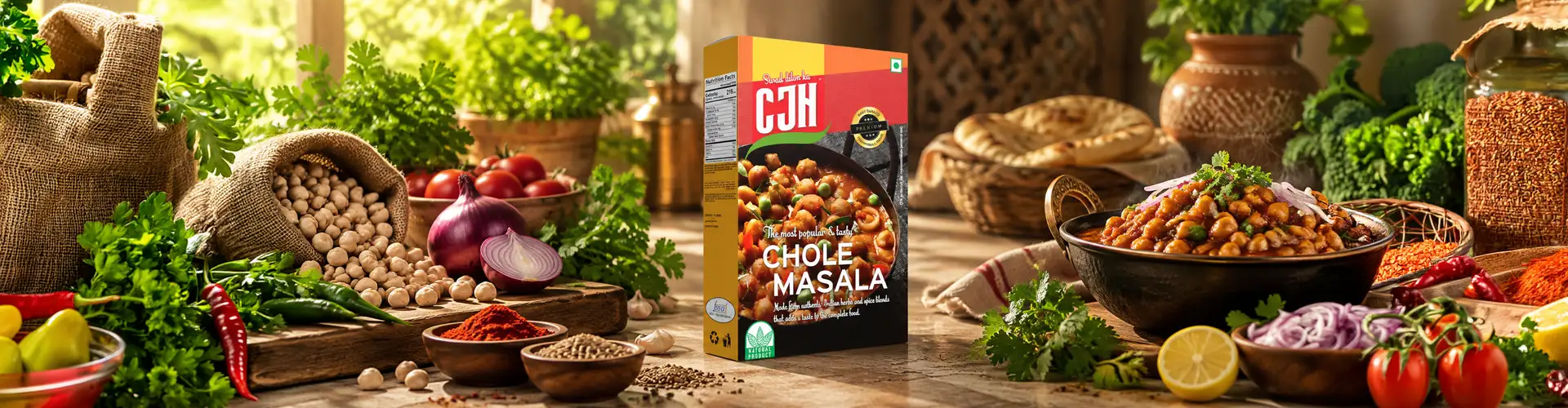
Print-ready artwork was developed to perform consistently across different pouch sizes and print runs, with colour consistency checked to keep the variant system reliable at scale.
Our packaging approach focused on making the final Pouch Packaging practical as well as visually consistent. The design stage considered how the artwork would translate onto the physical pack, while the overall direction remained inspired by Indian spices, ensuring the finished pouches retained their distinct character across the range.


The Result
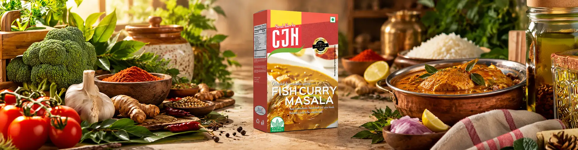
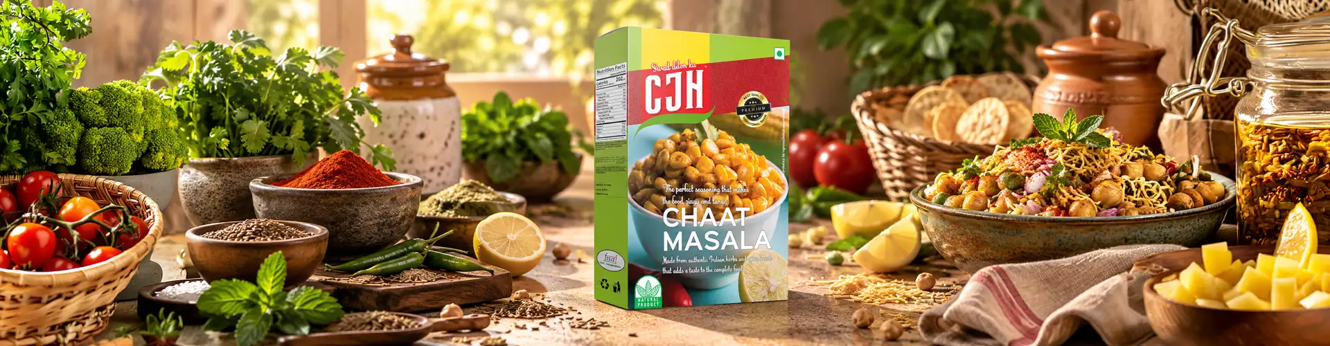
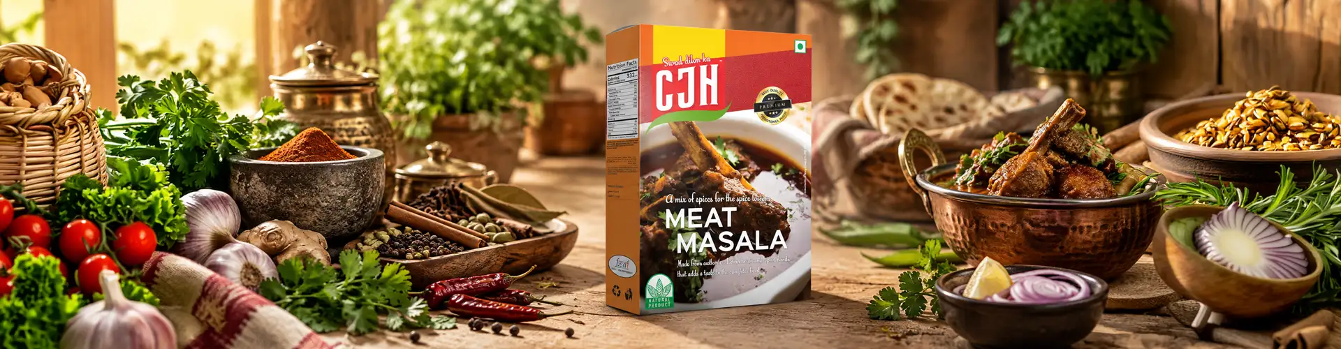
A cohesive masala pouch design system that allows CJH's full spice range to stand together as one recognisable brand while keeping every variant easy to identify.
Developed by our packaging design studio, the system combines a clear colour structure with practical creative design decisions that work across different spice pouches and formats. The result is packaging designed for quick shelf recognition, giving each masala its own visual identity while maintaining consistency across the complete range.
 One recognisable brand
What we designed
01
Masala pouch design
02
Colour-coded variant identity
03
Typography & layout
04
Print-ready artwork
05
Shelf visualization
06
3D Pouch Mock ups
Questions & Answers
FAQs
Masala pouch design is the packaging system for spice pouches, covering layout, typography, and colour coding so each variant is instantly identifiable on shelf — usually designed as a system across a full product range rather than a single pack.
Masala packaging is almost always sold as a range, not a single SKU, so it relies more on fast visual differentiation like colour coding than single-product packaging, where one distinct design is enough.
Colour coding lets customers scan a full spice range and identify the exact variant they want without reading the pack, speeding up purchase decisions and making repeat buying easier — especially important since spice buyers often shop by habit.
It should communicate the variant and brand instantly at a glance — through colour, typography hierarchy, and consistent layout — without relying on customers to read closely while shopping.
It starts with defining what stays fixed (brand elements) versus what varies (colour, variant name), then builds a layout grid and typography system that scales cleanly across every SKU, finishing with print-ready artwork and shelf testing.
Stand-up pouches and gusseted pouches are the most common formats for masala packaging, chosen for shelf stability, print surface area, and ease of stacking in retail spice sections.
More Work
Our work that will interest you


