
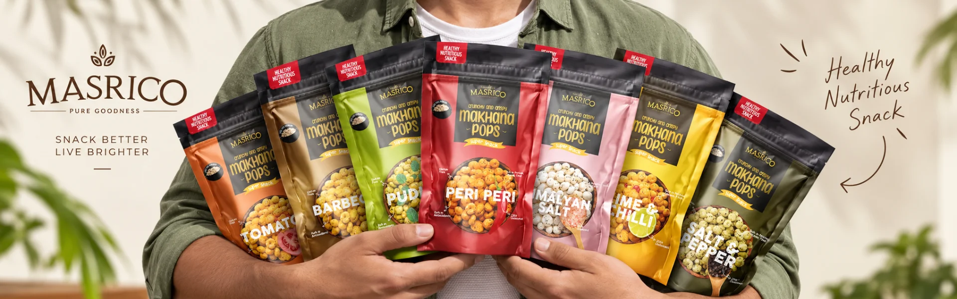
Masrico MakhanaPackaging Design.
A Modern Makhana Pouch Designed to Bring Traditional Snacking Into a Contemporary Food Brand
The Masrico makhana rangeScroll
Scope
Pouch Packaging | Packaging Concept | Product Story | Product Photography | Packaging Graphics | 3D Packaging Visualization
Project Overview
Masrico Makhana Packaging Design
A Modern Makhana Pouch Designed to Bring Traditional Snacking Into a Contemporary Food Brand
Client
Masrico
Category
Food & Healthy Snacks
Project
Makhana Packaging Design
Scope
The Brief
Creating Packaging for a Modern Makhana Brand
Masrico approached Brij Design Studio to develop the packaging for its makhana range.
Makhana has traditionally been part of Indian snacking, but the category has increasingly found a place among consumers looking for convenient and better-for-you snack options.
The challenge was to create packaging that could communicate this shift—bringing together the familiarity of a traditional Indian food with the visual language of a contemporary snack brand.
The packaging needed to look appetising, communicate the product clearly and create enough shelf presence to compete within a growing healthy-snacking category.

The Design Challenge
Making Healthy Snacking Look Appetising
Healthy food packaging can easily become overly clinical or predictable.
For Masrico, we wanted to avoid making the product look like a purely health-focused commodity.
The packaging needed to communicate:
Health
Health — through clear and considered communication.
Taste
Taste — through appetising product imagery and flavour cues.
Trust
Trust — through a clean and organised information hierarchy.
Modernity
Modernity — through a contemporary visual language suited to today's snack consumer.
At the same time, the packaging needed to retain a connection with the product's Indian roots.
The challenge was to bring these qualities together without making the pouch feel visually crowded.
From Traditional Makhana to a Modern Snack
Connecting Heritage With Contemporary Snacking
Makhana has a strong connection with Indian food culture. Rather than treating this heritage as something separate from the modern snack category, we used it as part of the visual story.
The design direction combines cultural influences with a contemporary packaging approach, allowing Masrico to feel familiar while still looking relevant to younger, health-conscious consumers.
Subtle cultural cues help establish the product's roots, while the overall composition, typography and colour treatment keep the packaging modern.
This balance became an important part of the Masrico packaging identity.

The Visual Language
Vibrant, Appetising and Easy to Understand
The packaging was designed around a clear visual hierarchy.
The brand name, product type and flavour needed to be easy to identify, while the nutritional and product information had to remain accessible without competing with the primary visual communication.
We used vibrant colours and appetising product photography to create energy and flavour appeal.
Rather than filling the pouch with multiple decorative elements, the design gives the key product information enough space to be understood quickly.
The result is a pouch that communicates the product at a glance while still creating a distinctive shelf presence.


Product Photography
Making the Makhana Look as Good as It Tastes
Making the Makhana Look as Good as It Tastes
For a food product, photography can play an important role in creating appetite appeal.
We developed product photography that allows consumers to understand what they are buying before opening the pack.
The makhana is presented in a way that highlights its texture and flavour, helping the packaging communicate the eating experience visually.
This became particularly important for Masrico because the product needed to compete with an increasingly visual snack category where consumers make quick decisions at the shelf.
The Stand-Up Pouch
Designing for Shelf Presence and Everyday Convenience
The stand-up pouch was an important part of the packaging solution.
Its upright format gives the product greater visibility on the shelf while providing a larger surface for the brand and product communication.
The format also supports everyday convenience, making it suitable for a snack product that may be stored, carried or consumed across different occasions.
For Masrico, the pouch therefore had to perform two roles:
01
A visual billboard for the brand on the shelf.
02
A practical format for the consumer.
The packaging design was developed around both requirements.
Packaging Hierarchy
Making the Important Information Easy to Find
Food packaging has to communicate a lot within a limited space.
The Masrico pouch needed to accommodate the brand, product name, flavour, nutritional information and other essential product communication without creating visual clutter.
We therefore developed a clear hierarchy that allows the consumer to quickly understand:
01What is the brand?
02What is the product?
03What flavour is it?
04Why should I consider it?
This clarity helps the packaging work both as a brand-building tool and as a practical source of product information.


Designing Across the Range
Creating Consistency Without Making Every Pack Look the Same
01One family
A food brand needs its individual products to be recognisable as part of one family.
For Masrico, the packaging system was developed so that the core visual language could remain consistent across the range while individual flavours could have their own visual distinction.
02Every flavour
This helps consumers recognise the Masrico brand while making it easier to navigate different products within the range.
The objective was not simply to create one attractive makhana pouch, but to establish a packaging language that could work across the product range.
Packaging Visualization
Seeing the Packaging Before Production
As part of the project, we developed 3D packaging visualizations to evaluate how the finished pouch would appear as a physical product.
These visualizations helped us assess the relationship between the artwork, proportions, product imagery and overall shelf presentation before production.
It also allowed the packaging concept to be presented as a complete product rather than simply as a flat artwork file.
What We Designed
Masrico Makhana Packaging
For the Masrico project, Brij Design Studio developed:
01
Makhana pouch packaging design
02
Packaging concept
03
Product story
04
Visual direction
05
Product photography
06
Packaging graphics
07
Colour direction
08
Typography and visual hierarchy
09
Stand-up pouch design
10
Packaging visualization
11
3D packaging renders
12
Print-ready packaging artwork
These elements were developed together to create a packaging system that could communicate taste, health and modernity while remaining connected to the product's Indian heritage.
The Final Packaging
Traditional Product. Contemporary Presentation.
The final Masrico packaging brings together the qualities we wanted the brand to communicate from the beginning.
01
The vibrant visual treatment creates shelf energy.
02
The product photography makes the snack appetising.
03
The clear information hierarchy makes the packaging easy to understand.
The stand-up pouch gives the product presence and everyday convenience.
And the combination of cultural references with a contemporary design language helps position makhana as a modern snack without disconnecting it from its roots.
The result is packaging designed to make a traditional product feel relevant to today's consumer.

Questions & Answers
FAQs
We approached the project by looking at how makhana could be presented as a contemporary snack while retaining its connection with Indian food culture. The packaging combines cultural cues with modern visual design, vibrant colours, product photography and clear information hierarchy.
The challenge was to make the product communicate health and nutrition without making the packaging feel clinical or unappetising. We balanced wellness-oriented communication with vibrant colours, flavour cues and appetising product photography.
The stand-up pouch provides strong shelf visibility while offering a practical format for a snack product. Its upright structure also gives the packaging sufficient surface area for brand, product and nutritional communication.
Product photography was used to make the makhana visually appetising and help consumers understand the product before opening the pack. The imagery highlights the food itself and supports the flavour communication on the packaging.
When executing a creative snack packaging design, several elements are essential:
1. Visual Hierarchy: Ensuring the brand name and flavor are the most prominent features.
2. Color Psychology: Using bold colors for taste appeal and earthy tones for health associations.
3. Product Clarity: Using windows or high-quality photos of the snack packet.
4. Typography: Using legible, modern fonts to convey nutritional facts.
5. Functionality: Incorporating features like tear notches and zip-locks into the makhana pouch packaging design to ensure long-term freshness.
A stand-up pouch packaging design offers significant advantages for both the brand and the retailer. For the brand, it provides a larger "billboard" space for product packaging design elements, ensuring the brand story is visible even from a distance. For the retailer, it is easy to stack and display. Most importantly, for the consumer, it represents a premium makhana packaging design that is easy to store and keeps the makhana snacks crunchy. This format enhances the perceived value of the product compared to traditional flat pillow pouches.
When creating packaging design for food, you must prioritize:
1. Compliance: Ensuring all legal and nutritional information is accurate and easy to read.
2. Material Choice: Selecting materials that protect the food from moisture and light.
3. Brand Consistency: Ensuring the packaging design for makhana aligns with the overall brand identity.
4. Sustainability: Modern consumers prefer food product packaging design that is eco-friendly or uses minimal plastic.
5. Sensory Appeal: The design should trigger the consumer's appetite through effective use of imagery and "flavor cues."
Pouch packaging is lightweight, convenient and suitable for a wide range of snacks such as makhana, chips, nuts, namkeen and healthy snacks. Its large printable surface also provides strong space for branding and product communication.
A snack pouch should clearly communicate the brand name, product name, flavour or variant, key product information and relevant nutritional or product details. The design should also create a clear visual hierarchy so shoppers can understand the product quickly.
Effective snack pouch packaging uses a distinctive visual concept, strong typography, appetising product imagery, appropriate colours and clear information hierarchy. The design should help the product attract attention while making the brand and product easy to recognise.
More Projects
Our Work That Will Interest You


