
Our Approach
Brij Design Studio's Approach to Ayurvedic Packaging Design
Packaging as a Visual Expression of Identity
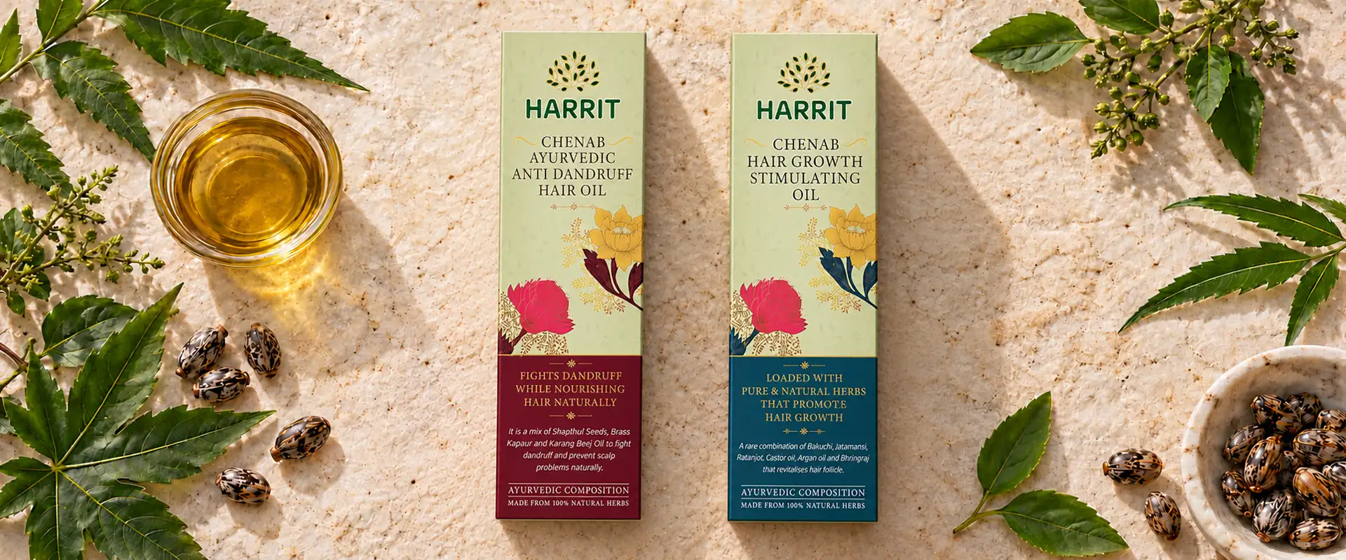
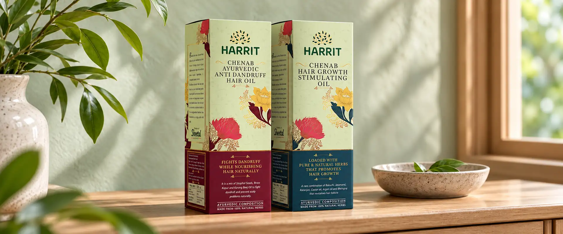
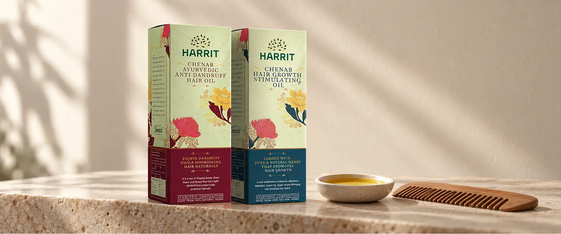
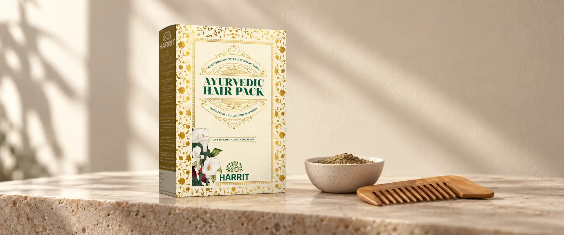
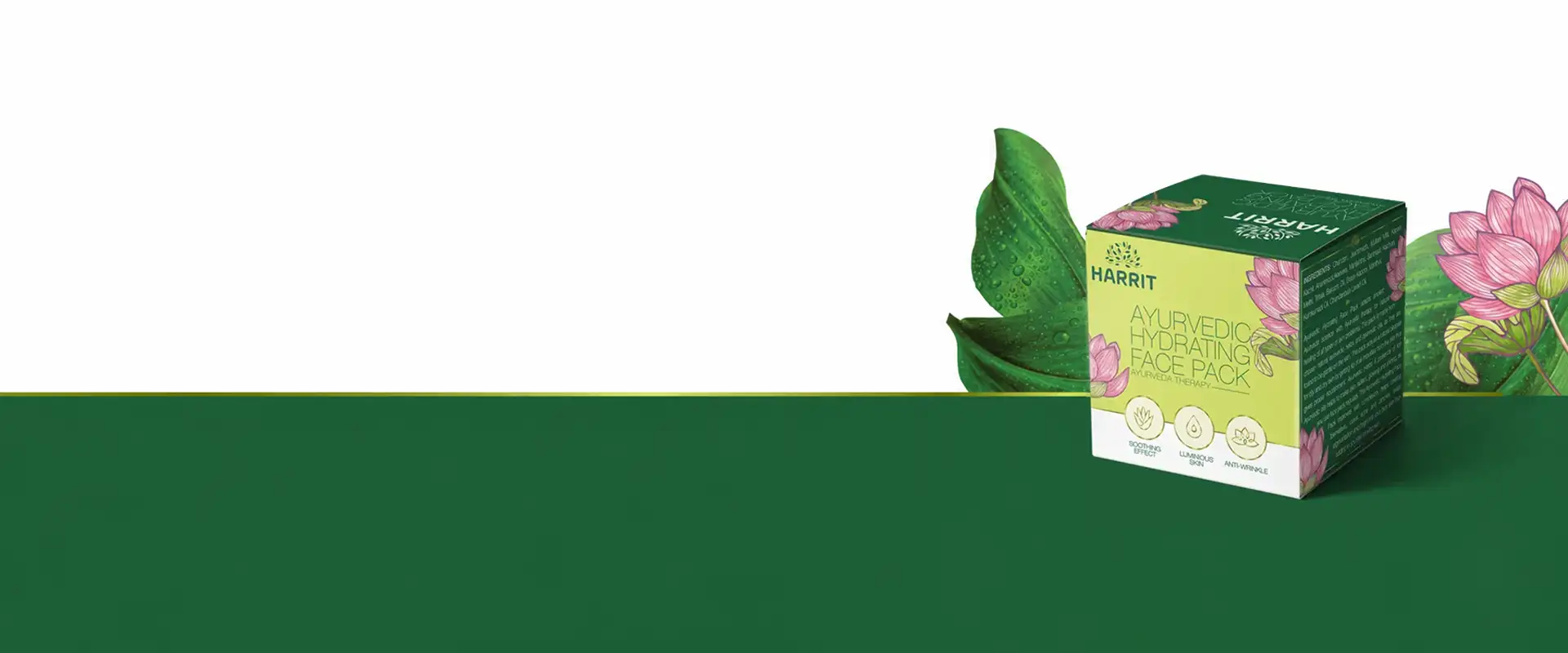
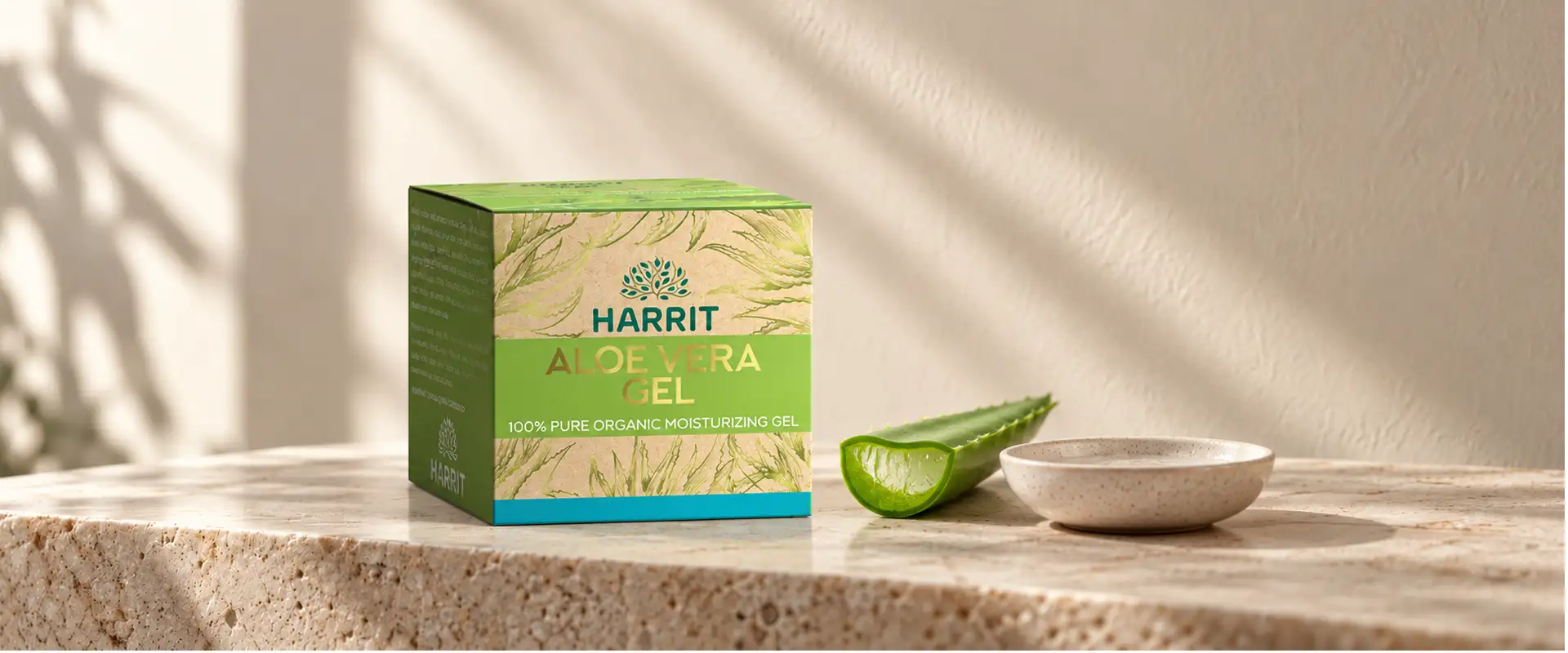
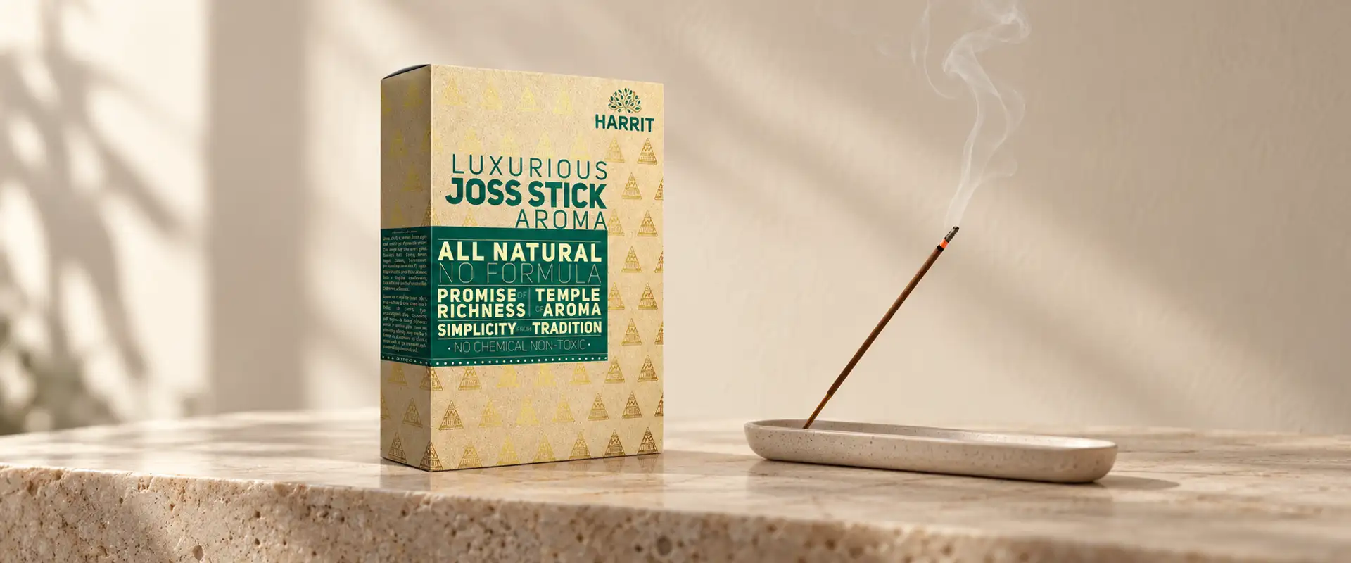
At Brij Design Studio, we see packaging as a visual expression of a brand's identity and positioning. For Harrit, we brought together natural inspiration, premium detailing, and a consistent design language to create packaging across a diverse Ayurvedic product portfolio.
From the brown paper-inspired texture to the gold accents and botanical visual direction, every design decision supported the same creative idea: traditional herbal inspiration can be presented with contemporary sophistication.
The project demonstrates our approach to Ayurvedic medicine packaging design, where colour, texture, product clarity, and brand consistency work together to create a cohesive packaging experience.