

MNMHealthy Food Packaging
A Natural Story. Told Through Handcrafted Design.
Project Overview
MNM Healthy Food Packaging
A Natural Story. Told Through Handcrafted Design.
Client
MNM
Products
Wheat Flour | Sprouted Grain Offerings
Format
Stand-up Pouch
Scope
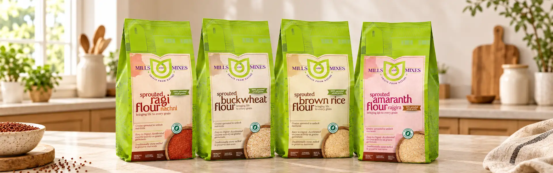
A Natural Story
Healthy food packaging should communicate more than what is inside the pack.
It should express the product's character, its connection to nature and the values behind the brand. For MNM, Brij Design Studio developed a packaging direction for healthy food products, including wheat flour and sprouted grain offerings, using handcrafted-inspired illustrations, earthy backgrounds and a vibrant green colour palette.
The objective was to create a visual identity that felt natural, warm and distinctive. Rather than relying on generic food packaging graphics, we explored hand-drawn elements and botanical influences to give the pouches a more personal feel. The result brings together product presentation and visual storytelling, creating packaging that connects the idea of natural food with a contemporary retail experience.
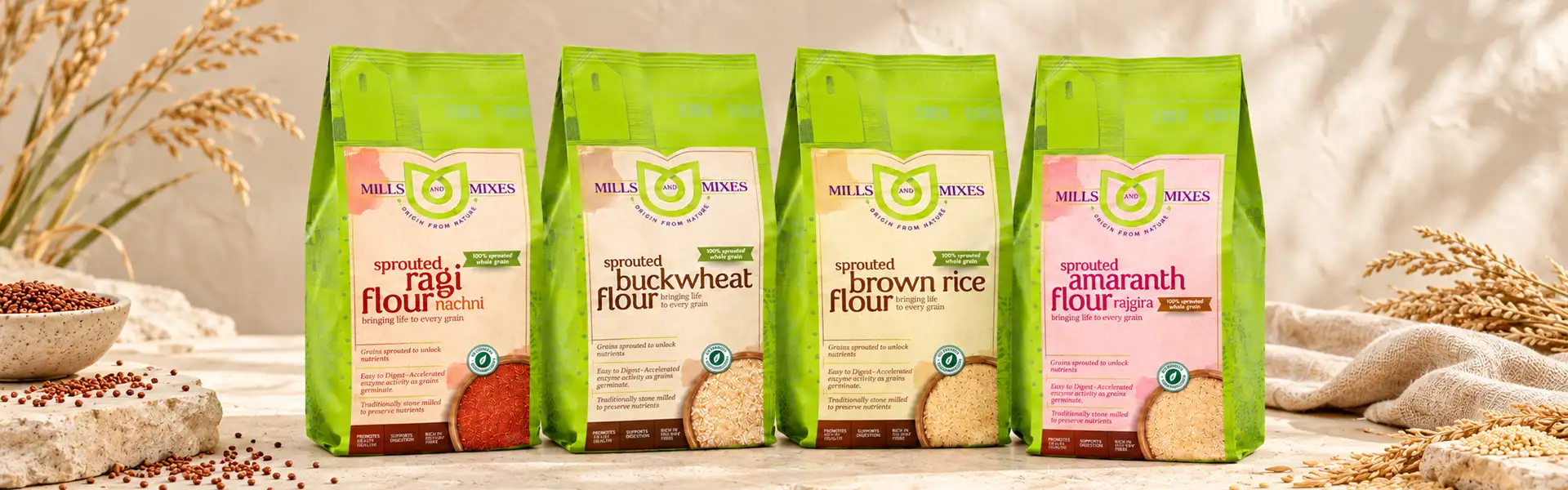 The MNM range
Naturally Inspired
Naturally inspired. Thoughtfully designed.
Healthy food packaging needs to communicate its product category clearly while creating a visual connection with customers. For MNM, the creative direction drew inspiration from nature, using green tones, earthy textures, and handcrafted-inspired graphics to establish the overall look.
The aim was to avoid an overly industrial appearance and give the packaging a sense of warmth and authenticity. Each design element contributed to a consistent visual language that could work across different healthy food products.
This approach helped shape a packaging identity that feels connected to natural ingredients while remaining clear and recognisable.
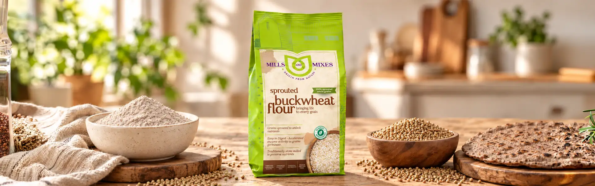
Wheat Flour Packaging Design
Bringing the warmth of the harvest to the shelf.
Flour is an everyday kitchen essential, yet its packaging can communicate a much bigger story about the product and its origins.
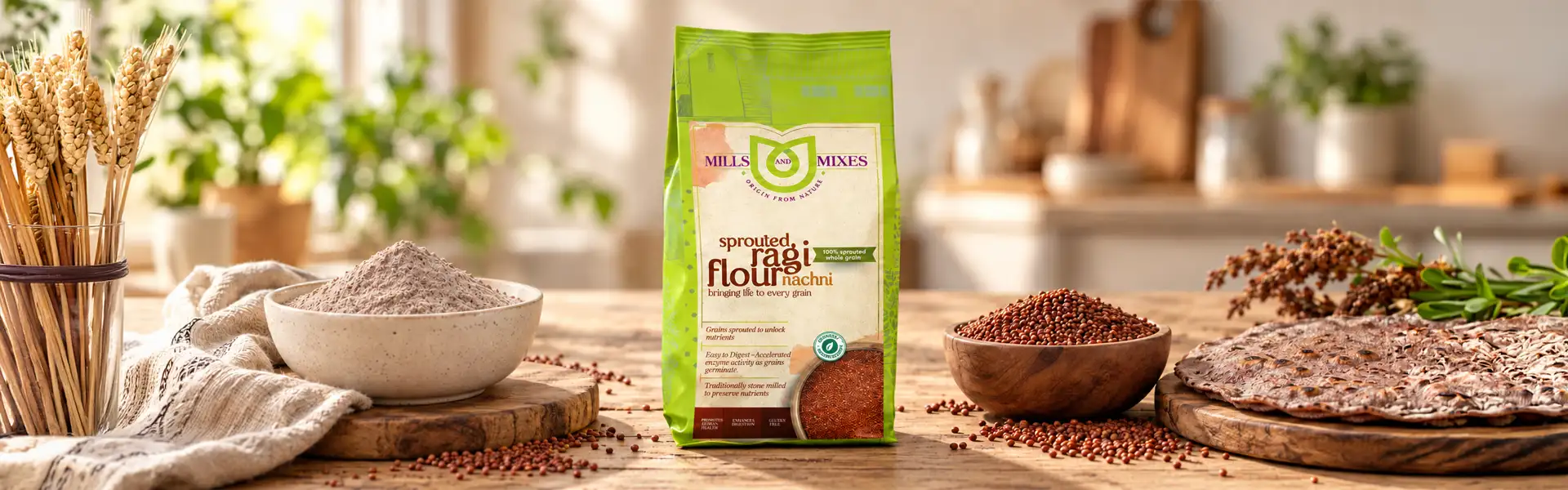
For MNM, the wheat flour packaging design focused on creating a natural, handcrafted aesthetic through botanical inspiration, earthy backgrounds, and hand-drawn visual elements.
The design direction moved away from conventional, mass-produced-looking graphics and towards a more personal visual expression. The intention was to reflect the simplicity associated with natural food while giving the flour pouch a distinctive appearance. Through considered typography, illustration and layout, the packaging connects an everyday staple with a thoughtful brand experience.
03 · Wheat flour
An everyday kitchen essential.
03 · A thoughtful brand experience
A more personal visual expression.
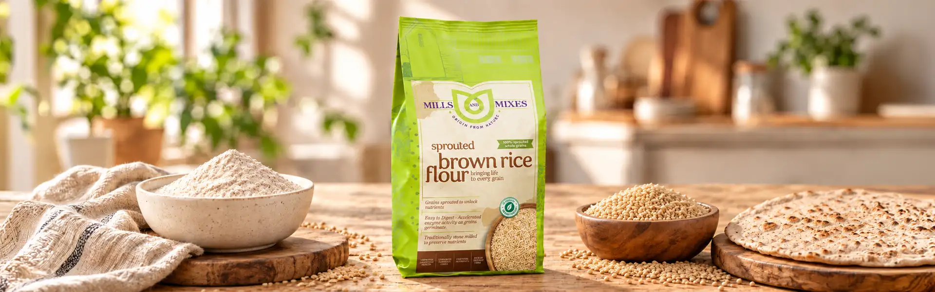
 01
 02
04 · Stand-up Pouch Packaging
Practical in form. Distinctive in appearance.
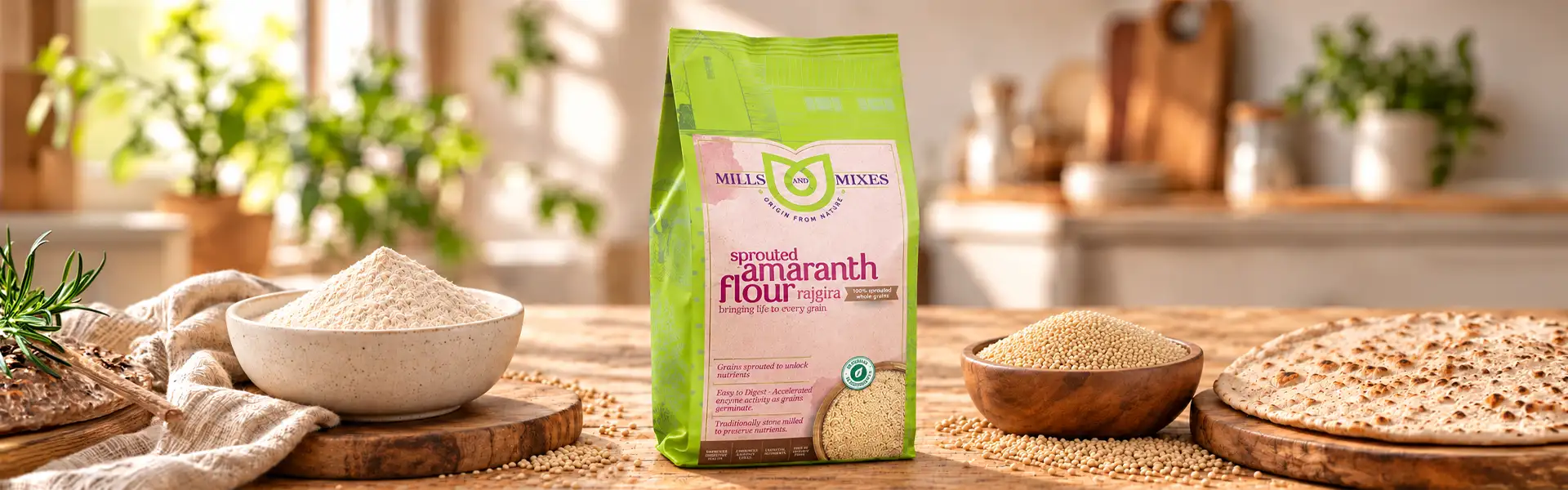
The stand-up pouch provided a suitable format for presenting MNM's flour and healthy food products.
Its upright structure offers a visible front-facing surface for the brand identity, illustrations, and product information, allowing the packaging design to work as a complete visual composition.
For MNM, the pouch artwork combines earthy colours and handcrafted-inspired elements to create a consistent presentation. The format also supports convenient storage and can accommodate resealable features when specified for the final pack. The design brings visual appeal and practical packaging considerations together, ensuring the format supports the product as well as the brand.
Handcrafted Illustrations and Natural Visual Elements
A little less industrial. A little more human.
The handcrafted-inspired illustrations are an important part of MNM's packaging character. In a category where food packs can often look similar, hand-drawn elements introduce a sense of individuality and warmth.
Botanical influences and nature-inspired graphics help establish a visual connection with the product's positioning. These elements are balanced with the overall layout and typography so the packaging feels considered rather than cluttered. The intention was to make the design feel personal and approachable, giving the healthy food range a visual identity that goes beyond a simple product label.
Organic Product Packaging Design
Inspired by nature. Designed for everyday food.
Organic product packaging design benefits from a visual language that communicates the brand's intended positioning without overwhelming the product information.
For MNM, the design direction used green hues, earthy backgrounds, and botanical inspiration to create a natural-looking presentation for its flour and sprouted grain products.
The emphasis was on visual simplicity and a handcrafted feel. Rather than using excessive graphics, the packaging relied on a coordinated palette and illustrative details to express its character. This approach helps create a cohesive appearance across the range while keeping the product and its information central to the packaging experience.
FMCG Packaging Consistency
One visual direction. Multiple product possibilities.
In FMCG packaging, consistency matters when a brand needs to present different products under one identity. MNM's healthy food packaging project brought together a common design approach through colour, illustration, typography and layout.
01
Colour
02
Illustration
03
Typography
04
Layout
This visual consistency provides a foundation for presenting different products while allowing each pack to communicate its own product identity.
The approach is especially useful for a growing food brand that may need to extend its range over time. By creating a recognisable packaging language, the design helps connect individual products to the wider MNM brand.
Our Approach to MNM Healthy Food Packaging
The creative direction was built around a simple idea: natural food packaging can feel both contemporary and personal.
From the stand-up pouch format to the botanical visual elements, each component supported the same design story.
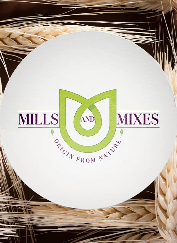
The objective was to create packaging that reflects the brand's natural positioning while giving the products a distinctive presence.
The result: a cohesive healthy food packaging concept that brings together natural inspiration, handcrafted character, and functional pouch presentation.
Scope of Work
At Brij Design Studio, the project combined:
01Packaging concept development
02Brand logo design
03Handcrafted-inspired illustrations
04Packaging visualisation
05Print-related artwork preparation
More Work
Our work that will interest you


Questions & Answers
Frequently Asked Questions
Healthy food packaging design combines brand identity, product information and visual elements to present food products clearly and attractively. It may use illustrations, colours, typography and packaging formats that reflect the product's positioning. Effective design balances shelf appeal with readability, food protection and applicable labelling requirements.
MNM's healthy food packaging design uses a vibrant green palette, earthy backgrounds, botanical influences, and handcrafted-inspired illustrations. These elements create a natural-looking visual identity that feels warm and approachable. The design approach connects the brand's flour and sprouted grain products through a consistent packaging language.
Stand-up pouches offer an upright format that can provide good shelf visibility and space for branding and product information. They are lightweight and convenient to store, while resealable options can help maintain usability after opening. The packaging material, barrier properties, and closure must be suitable for the flour and its storage requirements.
Brands should consider the product's storage requirements, packaging material, product information, readability and visual identity. Earthy colours, botanical illustrations and handcrafted-inspired graphics can support a natural-looking design direction. Any organic or nutritional claims displayed on the pack should be accurate and supported by the relevant product documentation and applicable regulations.
Handcrafted illustrations can give food packaging a more personal and distinctive appearance. They add visual character and can help communicate a product's relationship with nature, tradition, or artisanal processes. When balanced with clear typography and an organised layout, illustrations can make packaging more memorable without compromising readability.
Colour helps establish the visual mood of a food brand and supports product recognition. Green tones and earthy shades are often used to create nature-inspired visual associations. However, colour alone does not establish that a product is organic or healthy; packaging should communicate these attributes through accurate product information and substantiated claims.
FMCG packaging design can create consistency by using a shared colour palette, typography, illustration style, and layout structure across products. Individual products can retain their own names and identifying details while remaining recognisable as part of the same brand family. This creates a more cohesive presentation as the product range grows.
Food product packaging design can include concept development, logo integration, illustration, typography, product information layout, packaging visualisation and print artwork preparation. The scope depends on the project and packaging format. Structural specifications, material selection, and production requirements should also be considered to ensure the final pack is suitable for the product.
Packaging design helps a healthy food startup establish a visual identity and present its products consistently. A distinctive design can improve recognition, communicate the brand's positioning, and help the product stand out in a competitive category. A clear information hierarchy also helps customers understand what the product is and find essential details.
Yes. Brij Design Studio develops packaging concepts for food and FMCG products, including pouch formats. The MNM project showcases a nature-inspired approach to healthy food packaging, with stand-up pouch artwork, handcrafted-inspired illustrations, brand identity elements, and packaging visualisation.
Work With Brij Design Studio
A natural story deserves packaging with character.
Brij Design Studio develops packaging concepts for food and FMCG products, from pouch artwork and handcrafted illustration to brand identity and packaging visualisation.
Start Your Packaging Design Project →