

MasricoSnack Packaging Design
Goodness in Every Crunch. Fun in Every Tube.
Project Overview
Masrico Snack Packaging Design
Goodness in Every Crunch. Fun in Every Tube.
Client
Masrico
Product
Flavoured Cashews & Almonds
Format
Paper Tube Packaging
Scope
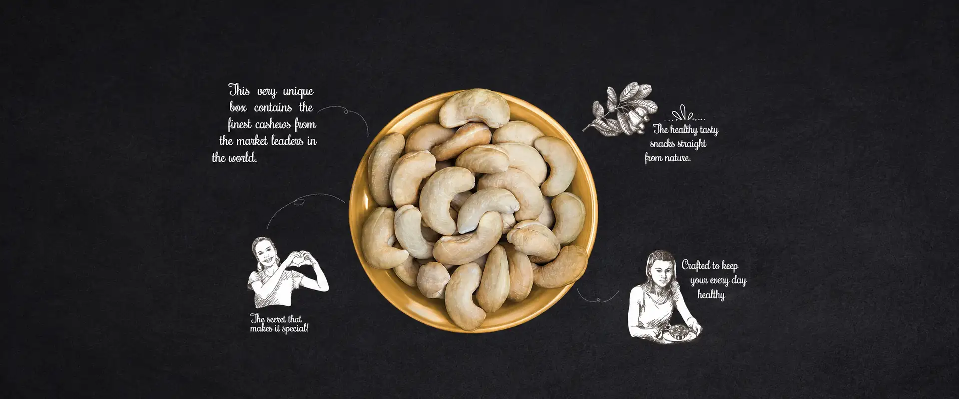
Goodness in Every Crunch
What if dry fruits could be enjoyed just like your favourite everyday snack?
For Masrico, Brij Design Studio developed a packaging concept that reimagines flavoured cashews and almonds as convenient, easy-to-carry snacks. The idea was to move beyond the traditional perception of dry fruits as products mainly associated with gifting and special occasions, and position them as a simple, enjoyable part of everyday routines.
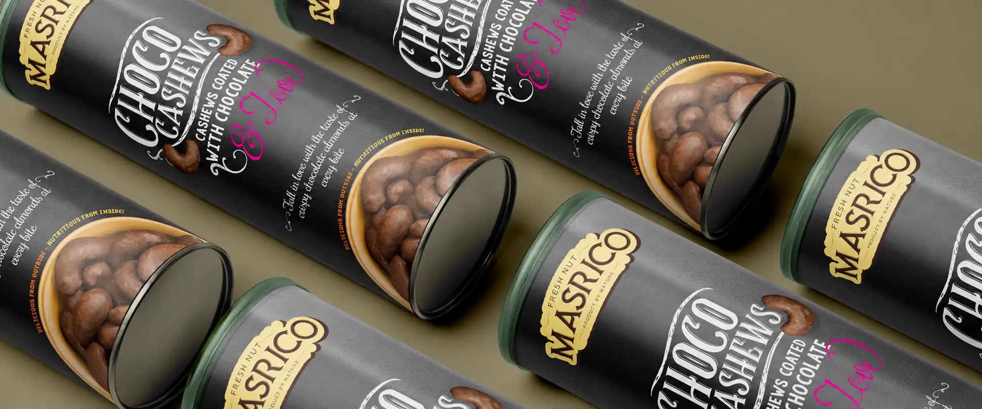
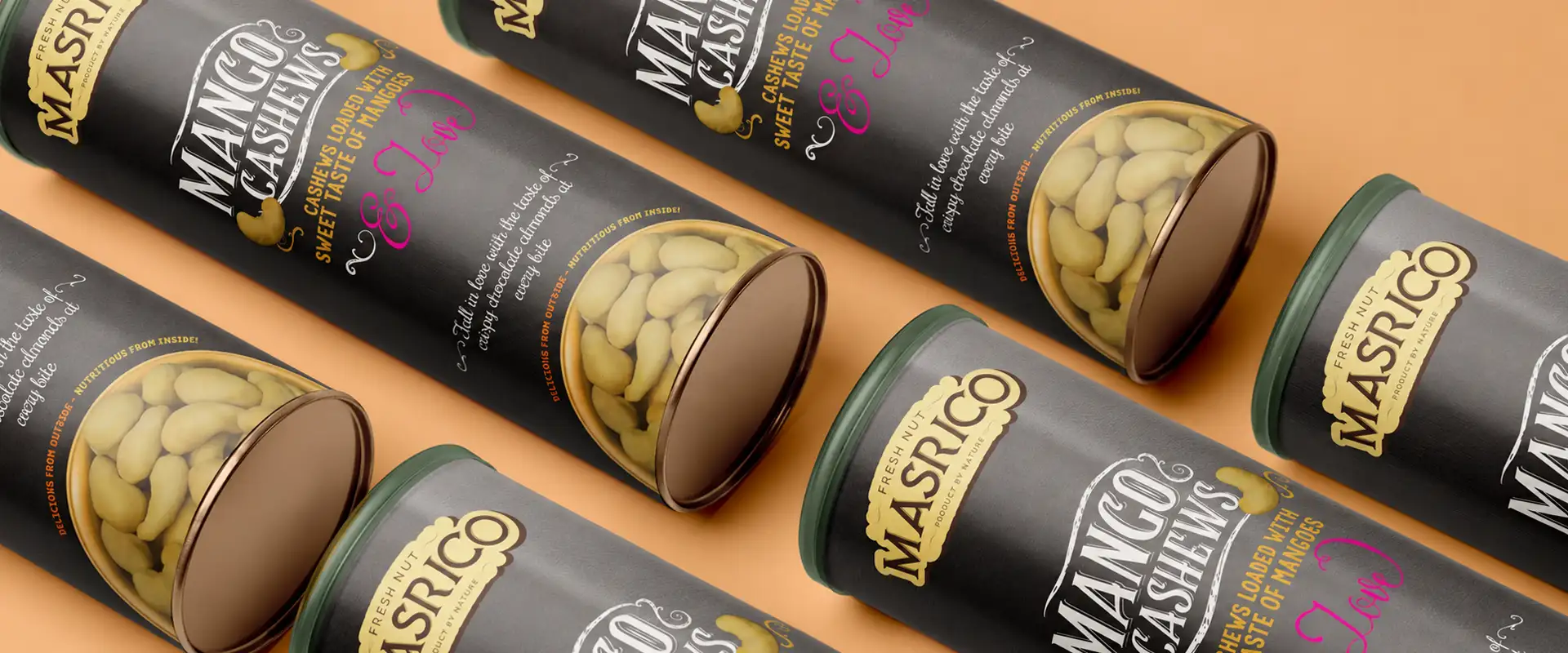
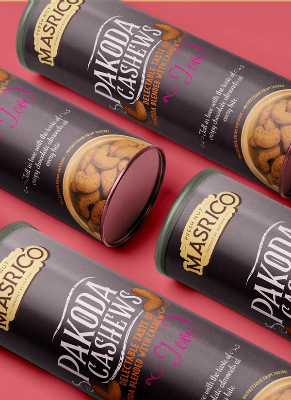
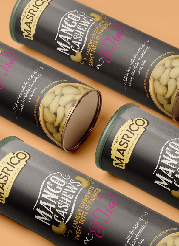
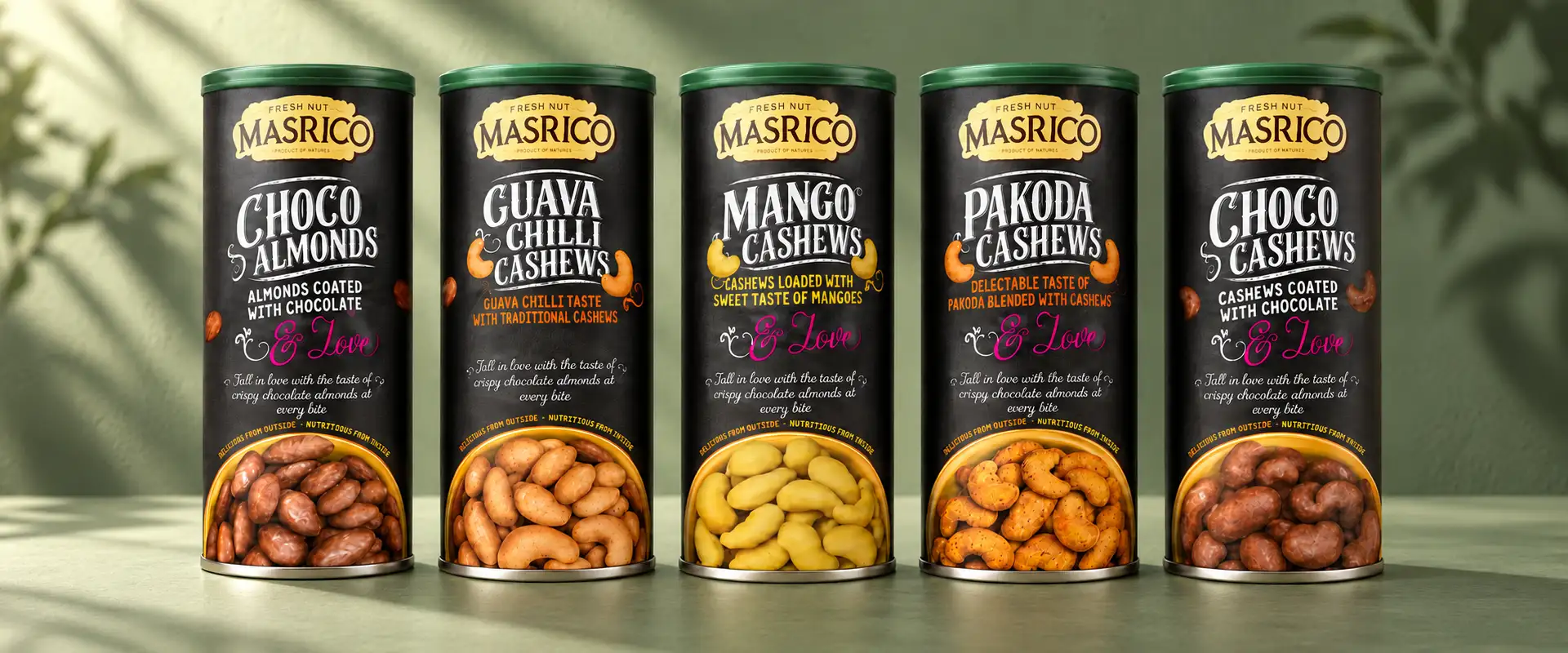
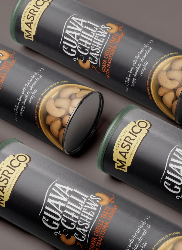
The project brought together playful handcrafted typography, expressive illustrations and distinctive paper tube packaging. Inspired by the familiar convenience of a chips container, the tube format offered a handy way to carry and enjoy dry fruits on the go. The result is packaging that gives a healthy snacking brand a fresh personality while making the product feel fun, accessible and relevant to modern lifestyles.
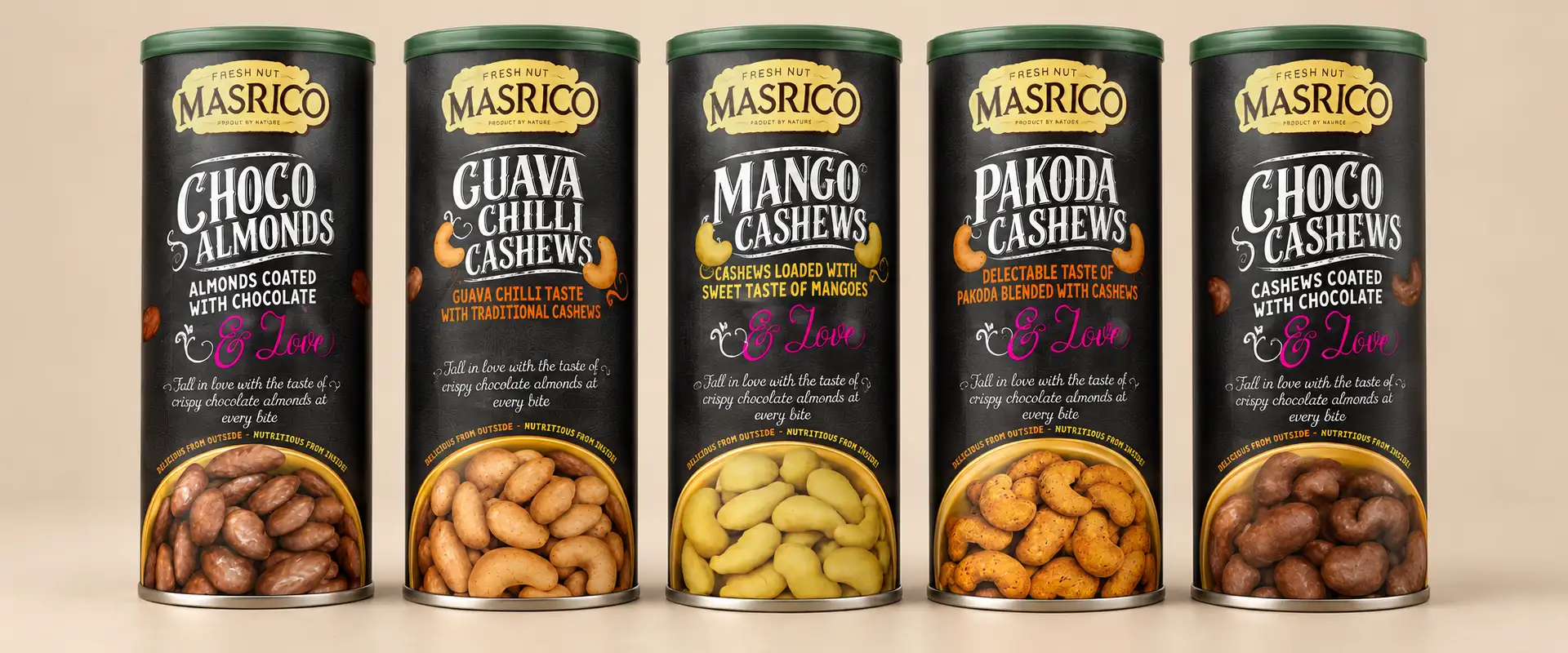 The tube range
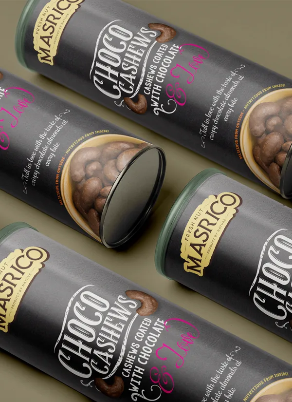
A Familiar Favourite
A familiar favourite. A fresh way to snack Dryfruits.
Dry fruits are often associated with nutrition, gifting and traditional food habits. But they can also be an easy snacking choice throughout the day. This consumer insight shaped the creative direction for Masrico.
Rather than following the conventional look of dry fruit boxes, we explored a more playful and contemporary approach. The packaging was designed to give flavoured cashews and almonds a distinct identity, presenting them as snacks that people could conveniently enjoy during work breaks, while travelling or between daily activities.
The visual language brings personality to the product while helping the brand stand apart from more traditional dry fruit packaging.
A little flavour. A lot of personality.
Flavoured cashews and almonds offer an opportunity to make everyday snacking more exciting.
For Masrico, the packaging needed to reflect this enjoyable side of the product category.
Handcrafted-inspired typography and illustrations formed the heart of the creative direction, giving the packaging a playful and approachable feel. The graphics were designed to complement the product presentation rather than make it feel overly formal or premium in a conventional way.
By combining expressive lettering with distinctive visual elements, the design gives the flavoured dry fruits a personality of their own. It helps communicate a different way to experience cashews and almonds: not just as pantry staples, but as convenient snacks for everyday moments.
03 · A little flavour
03 · A lot of personality
03 · Cashews & almonds, reimagined
 01
 02
04 · Inspired by chips. Reimagined for dry fruits.
One of the key ideas behind the Masrico project was the choice of packaging format.
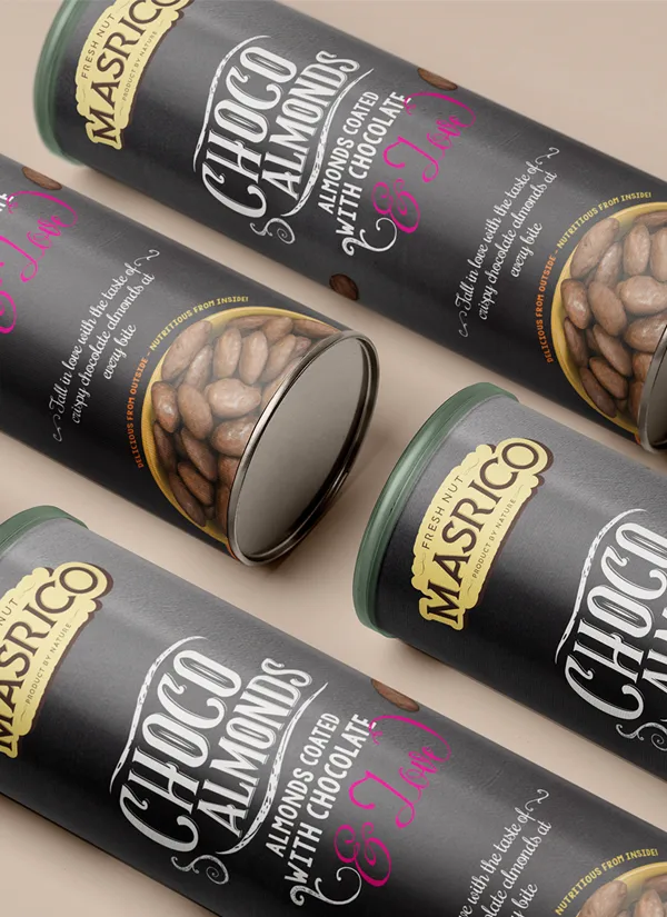
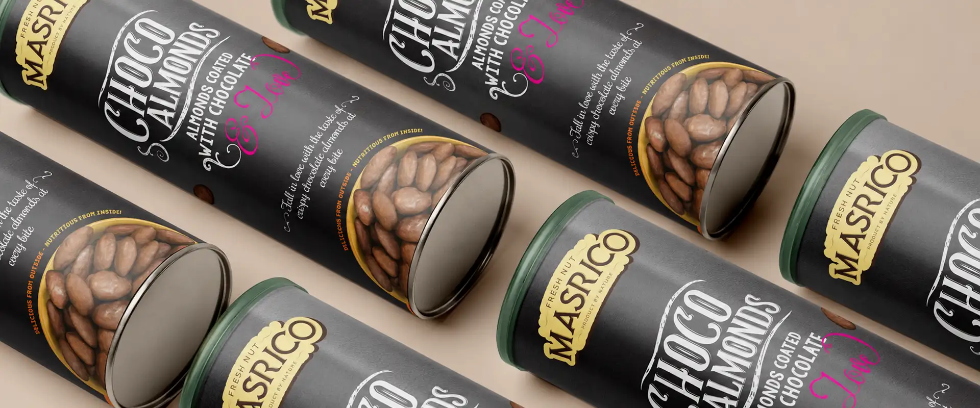
Instead of relying solely on conventional dry fruit boxes or pouches, we explored paper tube packaging inspired by the familiar shape of a chips container.
The tube format creates a distinctive silhouette and is designed to be convenient to hold and carry. Its cylindrical structure also offers a continuous surface for playful typography, illustrations and brand communication.
This approach gives Masrico a recognisable packaging format while supporting the central idea of making dry fruits feel like an everyday snacking choice. The packaging becomes part of the product experience, combining a familiar form with a fresh visual identity.
Less ordinary. More character.
Typography and illustration can change how customers perceive a product.
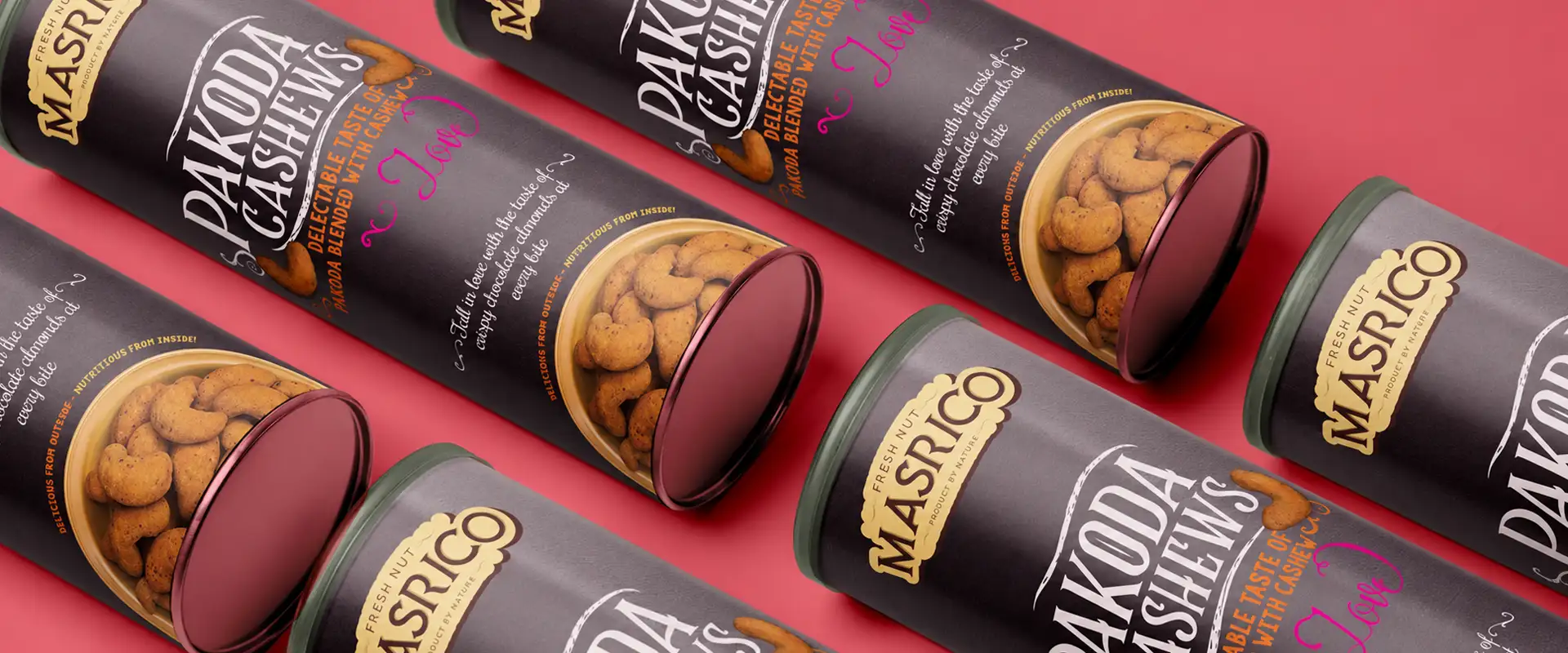
For Masrico, the creative direction moved towards handcrafted-inspired lettering and playful graphics that gave the packaging a lively, individual character.
The intention was to create a visual language that felt approachable and engaging rather than overly formal. The typography adds personality, while the illustrations contribute to the overall mood of the design.
Together, these elements help distinguish Masrico from traditional dry fruit packaging. They also reinforce the idea that healthy snacking can be convenient, enjoyable and full of character.
Healthy Snack Packaging Design
Made for the little moments in your day.
A snack does not always need a special occasion. It can be part of a workday, a journey, a break between activities or a moment when you want something to munch on.
Masrico's packaging concept was developed around this everyday snacking insight. The handy tube format and playful visual identity work together to present flavoured cashews and almonds as easy-to-carry products. The packaging aims to make the experience feel more casual and accessible, moving away from the idea that dry fruits are meant only for traditional consumption or gifting.
It is a fresh take on healthy snack packaging, where the format and design work together to shape how the product is perceived.
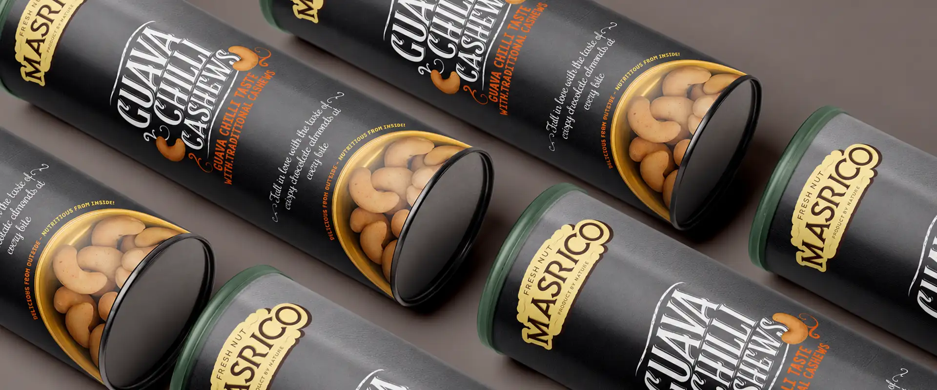 Made for little moments
Our Approach to Masrico Packaging Design
At Brij Design Studio, the project began with a simple consumer insight: dry fruits can be positioned as everyday snacks when their presentation feels convenient, engaging and relevant to modern routines.
We translated this idea into a packaging concept that combined:
01
Flavoured cashews and almonds
02
Playful handcrafted typography
03
Expressive illustrations
04
A distinctive paper tube format
Each element supported the same direction—making dry fruits feel approachable and easy to enjoy beyond traditional occasions.
The result: dry fruit packaging that brings together everyday convenience, playful design and a fresh perspective on healthy snacking.
More Work
Our work that will interest you


Journal
Blogs you may like


Questions & Answers
Frequently Asked Questions
Dry fruit packaging design combines product presentation, brand identity and practical packaging requirements to create an appealing pack for products such as almonds, cashews, pistachios and other nuts. It considers the packaging format, visual identity, product information and storage needs while helping the brand communicate its personality.
Masrico's packaging takes a playful approach to flavoured cashews and almonds. It combines handcrafted-inspired typography, illustrations and paper tube packaging to position dry fruits as convenient everyday snacks rather than products associated only with traditional consumption or gifting.
Paper tube packaging is a cylindrical packaging format commonly used for products that benefit from a structured container. It provides a continuous surface for branding and artwork and can offer a distinctive alternative to conventional boxes and pouches. Its suitability for food products depends on the materials, internal lining, closure and protection required by the product.
Tube packaging gives cashews and almonds a distinctive cylindrical format that is convenient to hold and carry. It also creates space for brand graphics, typography and product information. The final packaging specification should provide suitable protection against moisture, air and other factors that can affect the freshness of nuts.
Packaging can help present dry fruits as convenient products for everyday routines rather than only as ingredients or festive gifts. A portable format, clear product presentation and approachable visual identity can support this positioning. For Masrico, the paper tube and playful design were central to communicating this everyday snacking concept.
Good packaging for flavoured cashews and almonds should balance brand appeal with product protection, clear information and convenience. The design should identify the product and flavour clearly, while the packaging material and closure should be suitable for maintaining freshness and protecting the contents.
Illustrations and handcrafted-inspired typography add personality and help create a distinctive visual identity. They can make a snack brand feel more approachable and memorable, particularly in categories where products often use similar packaging formats. Their style should complement the product positioning and maintain clear readability.
Brands should consider product freshness, packaging materials, storage requirements, portability, ease of use, product information and visual differentiation. The design should reflect the brand's intended positioning while ensuring that any health or nutritional claims are accurate and appropriately supported.
Paper tube packaging can be suitable for certain food products when it is designed with appropriate food-contact materials, internal barriers and closures. For dry fruits, the complete packaging system should be evaluated for moisture protection, freshness, hygiene and the product's expected shelf life.
Brij Design Studio develops packaging concepts that connect product positioning with visual identity and packaging format. The Masrico project demonstrates an approach to dry fruit and healthy snack packaging through playful typography, illustrations and paper tube design for flavoured cashews and almonds.
Work With Brij Design Studio
Goodness in every crunch. Fun in every tube.
Have a snack that deserves a fresh personality? Brij Design Studio creates packaging concepts that connect product positioning with visual identity and packaging format.
Start Your Packaging Design Project →