

Proteeno LifeProduct Packaging Design
Packaging Nutrition with Personality. Designed for Growing Kids.
Project Overview
Proteeno Life Product Packaging Design
Packaging Nutrition with Personality. Designed for Growing Kids.
Client
Proteeno Life
Category
Kids' Protein Powder | Nutrition
Project
Product Packaging Design
Scope
First Impressions
A product's first impression begins long before it reaches the table.
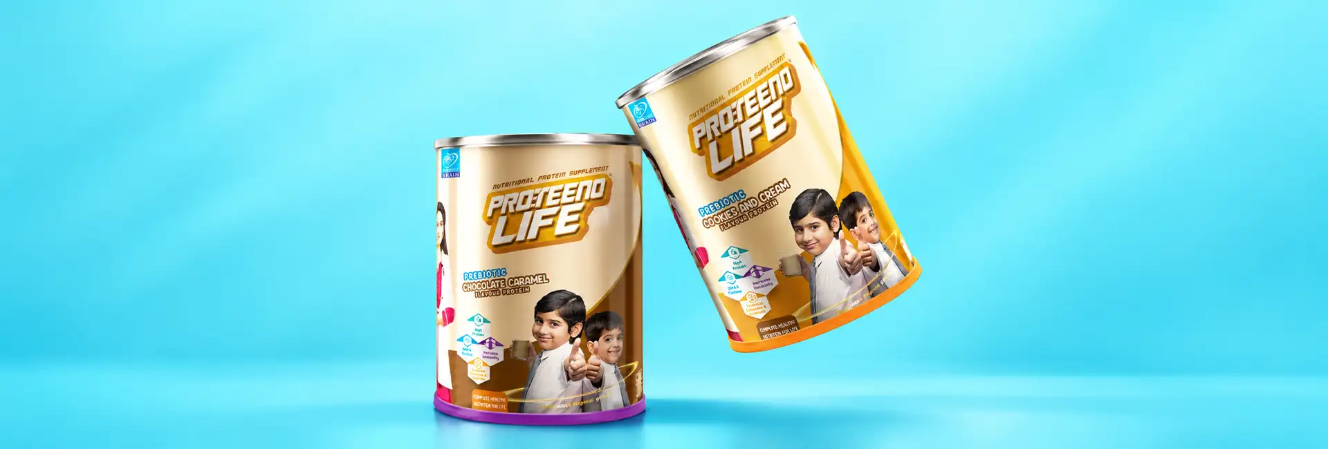
For Proteeno Life, Brij Design Studio developed a product packaging design concept for kids' protein powder, bringing together logo design, tin packaging and lifestyle-led visuals to create a distinctive brand presentation.
The creative direction focused on making the product feel approachable and engaging for its intended audience. Along with designing the brand identity and tin packaging, we incorporated visuals of people consuming the product to help customers connect with it in an everyday context.

Kids' Protein Powder Packaging Design
Designed to stand out. Created to connect.
Packaging for children's nutrition products needs a clear visual identity that speaks to both parents and young consumers.
For Proteeno Life, the focus was on creating a cohesive look through the logo, packaging graphics and product presentation.
The design brings these elements together to give the product a recognisable appearance while keeping the packaging at the centre of the brand experience.
03 · Logo Design and Brand Identity
A distinctive identity for a growing brand.
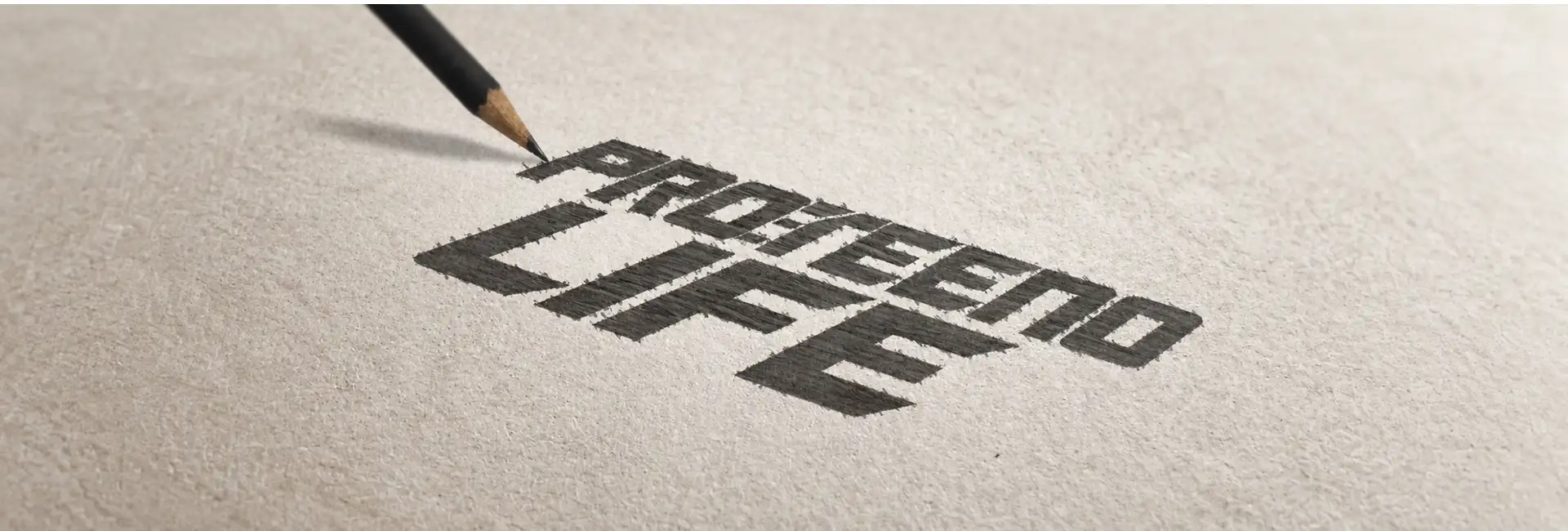
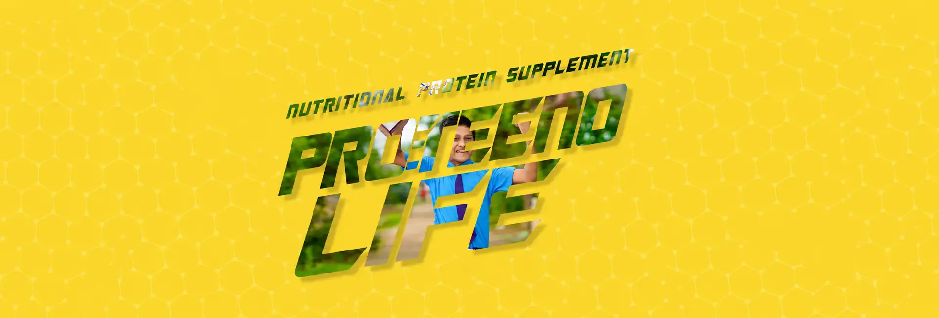
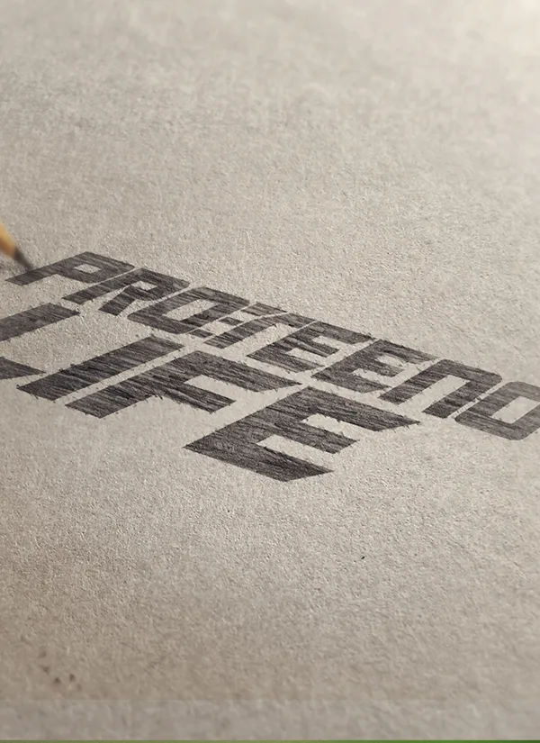
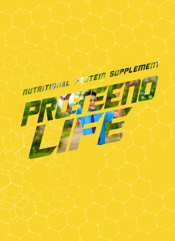
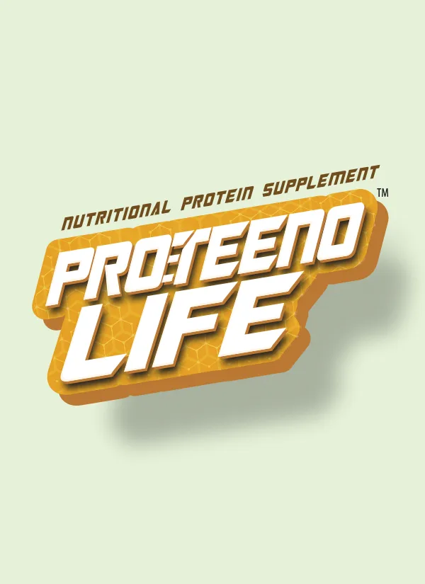
The logo is an important part of how a product is recognised and remembered. For Proteeno Life, we developed the brand identity as part of the overall packaging project, creating a visual foundation that works alongside the tin design.
One consistent presentation
The aim was to build consistency between the brand name, packaging artwork and supporting visuals, giving the product a unified and considered presentation.
 01
 02
 03
04 · Tin Packaging Design
A product presentationthat makes an impression.


More than a container
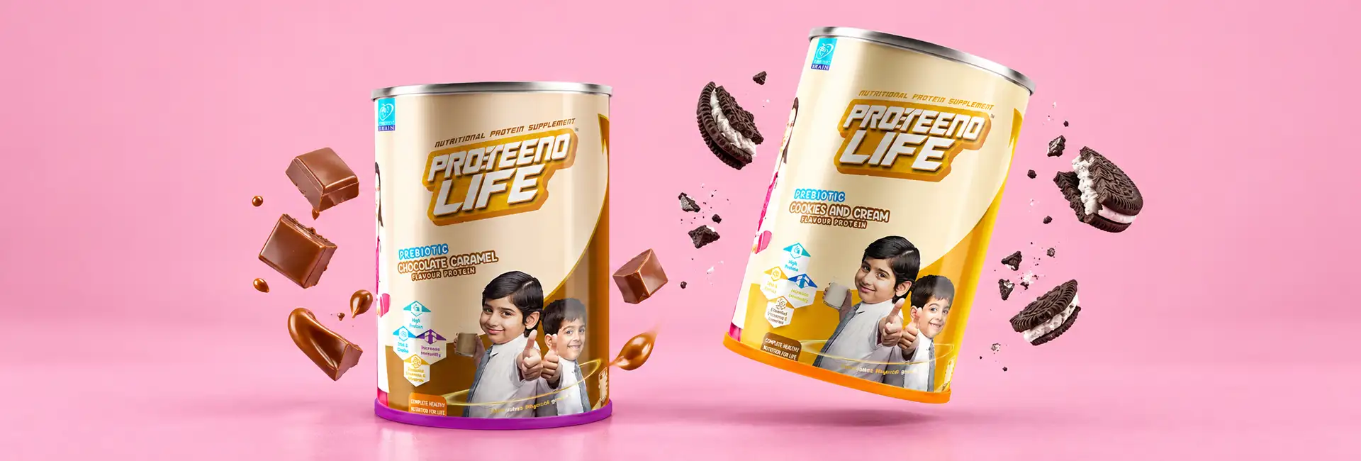
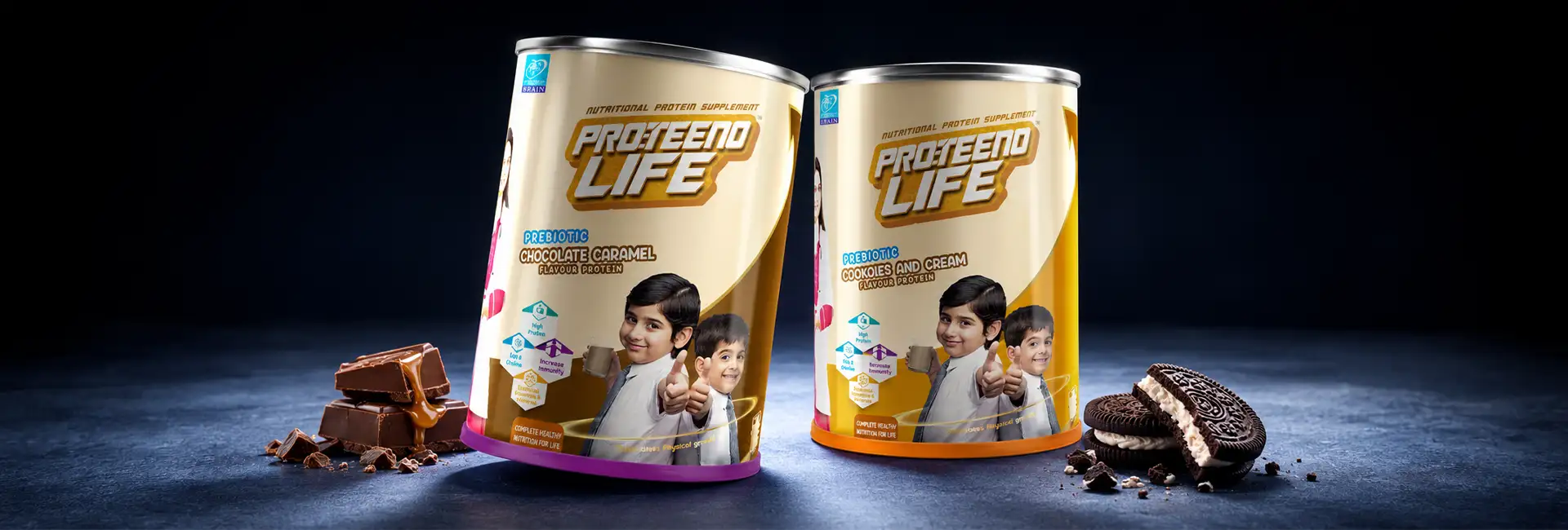
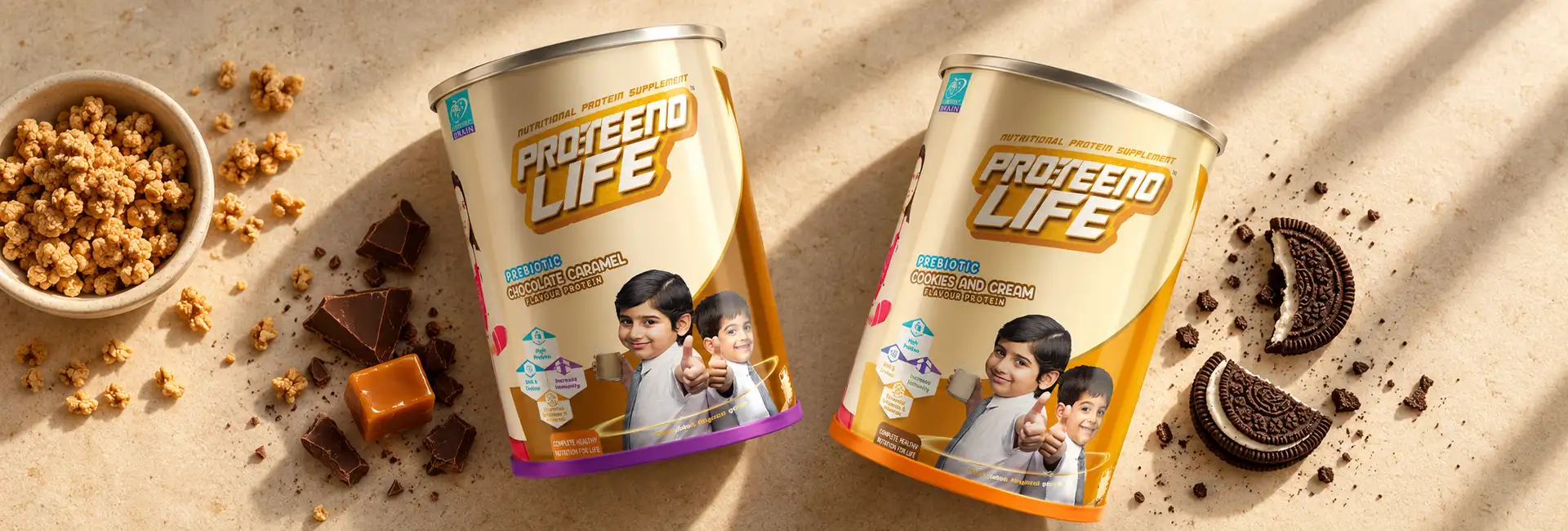
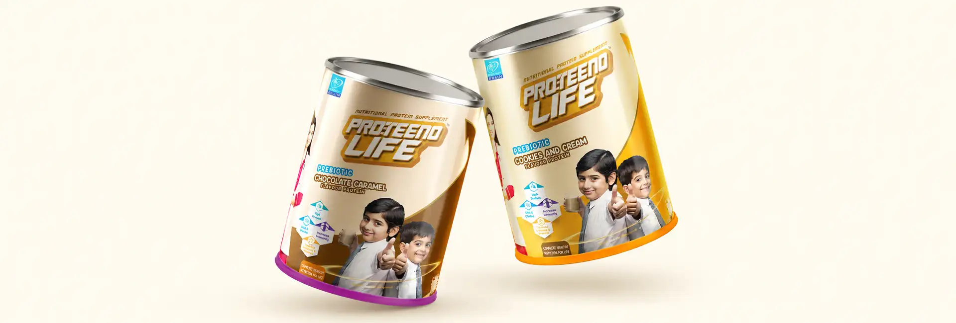
The tin is more than a container—it is a key part of the product's visual identity. For Proteeno Life, the tin packaging design brings the logo and visual elements together in a format that gives the product a defined presence.
Every aspect of the presentation contributes to the overall look, helping the packaging feel cohesive and distinctive. The design connects the product's identity with its physical form, creating a recognisable package for the shelf and everyday use.
Lifestyle Visuals That Bring the Product to Life
Beyond the pack. Into everyday moments.

Product packaging becomes more relatable when customers can see it in context.
For Proteeno Life, we showcased visuals of people consuming the product, adding a lifestyle dimension to the packaging presentation.
These visuals help move the communication beyond the tin itself and show the product as part of an everyday routine. By combining the packaging with lifestyle-led imagery, the overall presentation creates a more complete picture of the brand.
Our Approach
Our Approach to Proteeno Life Packaging
At Brij Design Studio, the focus was on bringing the key elements of the project together: logo design, kids' protein powder tin packaging and lifestyle visuals. Each element plays a role in shaping how the product is presented and recognised.
The result is a unified packaging concept that brings brand identity, product design and lifestyle communication together.
More Work
Our work that will interest you


Questions & Answers
Frequently Asked Questions
Kids' protein powder packaging design involves creating the visual presentation of a protein powder product intended for children. It includes elements such as the logo, packaging artwork, typography, layout and product information, with a focus on making the product clear and recognisable to its intended audience.
Protein powder branding helps a product establish a recognisable identity in a competitive market. A consistent logo, distinctive packaging design, typography and visual communication can help build brand recognition and create a cohesive customer experience across packaging and marketing materials.
The best packaging for protein powder depends on the product formulation, shelf-life requirements, storage conditions and distribution needs. Common formats include tins, tubs, jars and flexible pouches. The packaging should provide suitable protection against moisture and other environmental factors while supporting convenient storage and clear product presentation.
Tin packaging can provide a structured container for protein powder and offers a surface for displaying the brand identity, product information and packaging graphics. The suitability of a tin depends on the product's storage requirements, material specification, closure and protective properties.
A clear brand identity, appealing visuals, readable product information and a cohesive design can help packaging connect with both audiences. The design should balance an engaging visual style with practical information that parents can easily understand.
A logo helps establish brand recognition and gives the packaging a consistent identity. When the logo works well with the colours, typography and other graphic elements, it helps create a unified presentation across product packaging and marketing materials.
Lifestyle visuals show a product in a relatable setting and can help customers understand how it fits into everyday life. For Proteeno Life, visuals of people consuming the product complemented the tin packaging and extended the brand presentation beyond the pack itself.
Brands should consider the intended audience, product information, readability, packaging format, storage requirements and visual identity. Any nutritional or health-related claims should be accurate and appropriately supported, with packaging and labelling meeting the applicable regulations.
Effective health supplement packaging starts with understanding the product, target audience, brand positioning and packaging requirements. The design process can include logo development, visual concept creation, typography selection, packaging layout and product imagery. The final design should combine brand recognition, clear information and packaging functionality.
Brij Design Studio works on branding and packaging projects that bring together visual identity and product presentation. The Proteeno Life project combines logo design, tin packaging design and lifestyle-led visuals to create a cohesive packaging concept.
Packaging Design Studio in Mumbai
Building a nutrition brand? Let's design packaging people remember.
Let's Talk →