Consumer perception and product packaging meet in about the time it takes a shopper to reach past one jar of ghee for the one next to it. Watch it happen at any kirana in Thane on a Sunday morning. Two jars, same size, same price on the shelf strip. One has a matte cream label and a gold lid. The other is shiny plastic with a cartoon cow. She doesn’t read either label. She takes the cream one, and if you asked why, she’d say it “looks purer”.
Nothing on that jar proved purity. The pack made a suggestion and her brain finished the sentence. That’s what this blog is about: what people decide about a product from colour, shape, weight, material, type, pictures and words, long before they taste it, use it or read the back.
Some of it sounds like guesswork. A fair amount has actually been tested. In a study reported by the University of Oxford, 50 adults tasted the same yoghurt from bowls that looked identical but weighed differently. From the heavier bowl, they rated it denser, nicer and more expensive. Same yoghurt. Different weight in the hand.
So this isn’t about making a pack pretty. It’s about making sure the story a shopper tells herself in three seconds is the true story of the product.
What Is Consumer Perception and Product Packaging?
It’s the set of quick judgements shoppers make about a product (its quality, taste, safety, price and who it’s meant for) based only on how the pack looks and feels. The judgement comes first. Reading, if it happens at all, comes later.
Every pack talks on two levels. There’s what it says out loud: the name, the claims, the ingredients, the net weight. Then there’s what it implies: the colour, the paper, the heft, the way the type is set, how much empty space there is. Shoppers believe the second level more, because it doesn’t feel like selling.
Put the words “100% natural” on two packs. On one, they sit in a neon bubble burst with three exclamation marks. On the other, they’re set small, in a calm typeface, on uncoated paper. The words are identical. Most people will trust the second one. The claim didn’t change. The packaging around it did.
Researchers have a name for this: sensation transference. Feelings about the pack slide over onto the product inside. A heavy bowl makes yoghurt seem richer. A flimsy box makes a perfectly good biscuit seem stale. Brands don’t get to switch it off. They only get to decide which feelings slide across.
FAQs: Understanding Packaging Perception
What does consumer perception mean in packaging?
It means what shoppers believe about a product because of its pack: how good it is, what it tastes like, what it should cost and whether it’s for them. Those beliefs form before any real use.
Is packaging perception the same thing as branding?
No. Branding is the whole idea of the business. Packaging perception is the slice of it a shopper meets on a shelf or a screen, and often the only slice she meets before buying.
Do shoppers really judge a product by its pack?
Yes, especially the first time. With no past experience to go on, the pack is the only evidence they have.
How does Brij Design Studio think about shopper perception at the start of a packaging project?
Its packaging work begins with a deep dive into the product, the target audience and the market positioning. That groundwork decides what the pack should make a shopper feel and believe before any design starts.
Why Consumer Perception and Product Packaging Matter to Trust and Price
The pack decides two things on the first purchase: whether a shopper trusts the product enough to try it once, and what price feels fair for it. Get either wrong and the product inside never gets its chance.
A first purchase is a small bet, and with food or skincare it’s a bet on her family’s health too. A clean layout, a believable photo, a clear maker’s address and a pack that doesn’t feel cheap in the hand all make the bet feel safer.
Price works the same way. Shoppers don’t judge a price on its own. They judge it against what the pack has led them to expect. A thoughtfully made jar of honey can carry a higher price without complaint. Put the same honey in a thin plastic bottle with a clip-art bee and the same price starts to feel like a con.
It cuts the other way too, and founders often forget this. A pack dressed far above its price can scare off the people it was meant for. “This must be expensive, not for me,” she thinks, and never turns it over to check.
Packaging can buy a trial. Only the product earns the repeat.
FAQs: Trust and Price
Can good packaging justify a higher price?
It can make a higher price feel fair, as long as the product holds up. It can’t rescue a product that disappoints.
Can packaging make a good product look bad?
Easily. A weak carton, a blurry photo or a crowded front panel can make a well-made product look cheap or doubtful, and shoppers rarely give it a second look to find out.
Does packaging affect repeat purchase?
Indirectly. It sets the expectation the product has to meet. When the product matches or beats the pack’s promise, people come back. When it falls short, they feel misled, and that’s hard to undo.
What kinds of brands does Brij Design Studio design packaging for?
Its packaging page mentions FMCG, artisanal food, wellness, skincare, beverages and rising D2C labels. Its case studies also include confectionery, food startups and luxury packaging.
How Does a Shopper Read a Pack in a Few Seconds?
Roughly in this order: notice it, sort it, read its cues, look for proof, then check the price fits. Most of it happens without the shopper being aware of any of it.
1Notice
From two metres away, nobody reads words. They see blocks of colour and a shape. If the pack doesn’t register here, nothing else on it matters.
2Sort
The brain asks one question: what kind of thing is this? Snack, medicine, gift, treat for the kids. A pack that can’t be sorted gets skipped, however good it looks.
3Read the Cues
Now the finer signals land. Is it everyday or special? Spicy or mild? Fresh or long-life? Grown-up or fun?
4Look for Proof
An interested shopper picks it up. She checks for a window or a real photo, the claims, the net weight, the maker. This is where vague promises get found out.
5Check the Price Fits
Last, she compares the story the pack told her with the number on the shelf. If they match, it goes in the basket.
In practice, most packs lose the shopper at step two, not step three. Designers spend weeks perfecting the fine cues and forget that the shopper needed to understand, in a second, what the product even was.
On a quick-commerce app, steps one and two happen on a picture the size of a stamp, squeezed between a banner ad and a “frequently bought together” row.
FAQs: How Shoppers Read a Pack
How long does a shopper look at a pack before deciding?
In a busy aisle, often just a few seconds. No single number fits every store, category and shopper, so be wary of anyone quoting one without a source.
What do shoppers notice first on a pack?
Colour and shape, from a distance. Then usually the biggest image or word on the front.
Why do shoppers walk past some packs completely?
Usually because they couldn’t tell what the product was fast enough. A confusing pack feels like work, and shoppers don’t do work in an aisle.
How does Brij Design Studio decide what a shopper should read first on a pack?
As part of its process, Brij Design Studio refines hierarchy, typography, colour and brand elements so the pack works on the shelf and online. Hierarchy is simply the reading order: what the eye hits first, second and third.
Which Pack Cues Change What Shoppers Believe?
Colour, shape, weight, material, finish, fonts, pictures and claims all send signals, and they’re read together. One cue that contradicts the others is usually what makes a pack feel “off” without anyone being able to say why.
Colour
It isn’t only which colour, it’s how much and how bright. Loud, saturated colours tend to read as fun, cheap or made for children. Muted, slightly dusty shades read as calmer and more grown-up. Context changes everything, though. White feels clean and safe on dairy or a pharmacy shelf. On a Diwali sweet box, plain white can feel unfinished, because red, gold and deep pink are what gifting looks like in that moment.
Black isn’t automatically premium either. Matte black with one restrained foil line can feel expensive. Glossy black with gold swirls and four fonts looks like a cheap copy of expensive.
Shape
Rounded forms tend to feel soft, sweet and friendly. Sharp angles feel sharper, saltier, more intense. There’s good evidence for this in lettering: in a study published in i-Perception, researchers from Oxford and elsewhere found that people matched rounder typefaces with “sweet” and more angular ones with “bitter”, “salty” and “sour”. The rounder typefaces were also liked more and judged easier to read. Designers apply the same logic to pack shapes, but it’s better tested than assumed.
Weight and Heft
This is the cue founders most often ignore, because it never shows up in a design file. A lid that flexes, a carton that dents, a bottle so light it feels empty: each one quietly tells the shopper the product is cheaper than it is. Remember the yoghurt bowl.
Material and Finish
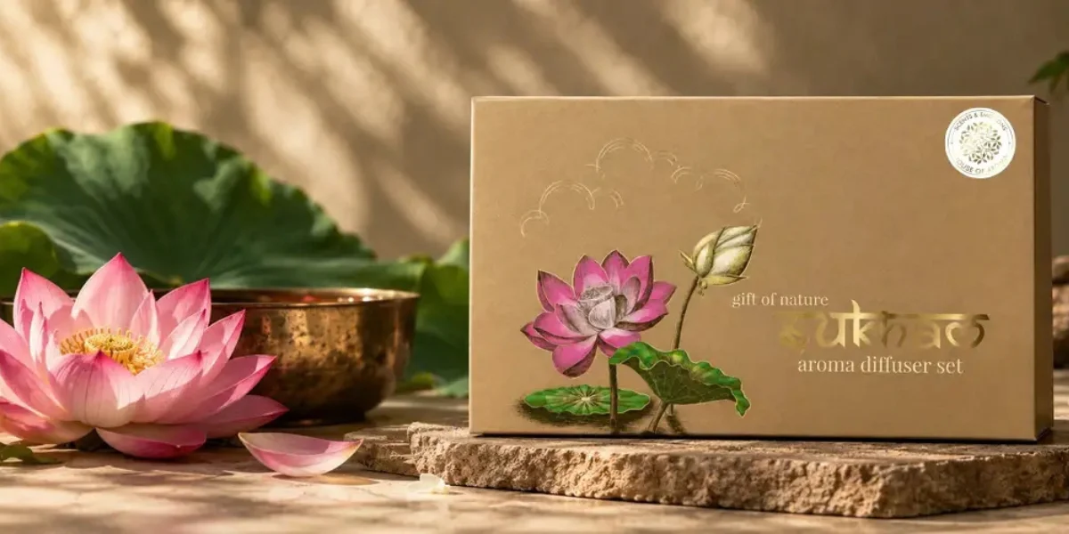
Kraft paper says natural and honest. In a gifting category, it can also say “they didn’t bother”. Soft-touch matte invites a second touch. High gloss can read fresh and juicy on a fruit drink and slightly cheap on a skincare jar. A clear window shows there’s nothing to hide, which is why dry fruits and pasta use them so often.
Fonts
Type carries a surprising amount of meaning. A hand-drawn script says homemade. A tight, modern sans says clinical or techy. Too many typefaces on one front panel almost always read as amateur. The BDS guide on fonts for packaging goes deeper into choosing them.
Photos and Illustration
A good food photo makes people hungry. One that’s too perfect, glossier than any real biscuit could be, makes them suspicious. Illustration feels crafted and warm, but gives up some of the “this is exactly what you’ll get” reassurance of a photo.
Claims and Words
Fewer, plainer claims get believed more. A front panel with twelve badges looks like it’s shouting, and shouting reads as insecurity. Specific beats vague every time: “stone-ground in small batches” sounds real; “premium quality” sounds like nothing at all.
FAQs: Packaging Cues
Which colours make packaging look premium?
There’s no magic colour. Premium usually comes from restraint: fewer colours, deeper or muted shades, plenty of space and a better finish. A pack in one rich colour often looks more expensive than one in five.
Does the weight of a pack change how people see the product?
Yes. In an Oxford study, people rated the same yoghurt as denser, nicer and more expensive when it was served in a heavier bowl. A pack that feels too light can make a product seem cheaper.
Are photos or illustrations better on packaging?
It depends on the product. Photos win when the shopper needs to see exactly what’s inside, like food. Illustration works well when mood and personality matter more than proof.
Which pack formats does Brij Design Studio design?
Its packaging page lists labels, cartons, pouches, bottles, jars, sleeves, boxes and multi-product packaging systems. The work moves from structural ideas to visual execution across these formats.
What Makes Packaging Look Premium, and What Makes It Look Like Good Value?

Premium packs say less, with more space, fewer colours and better materials. Value packs say more, more loudly, and put the deal up front. Neither is better. They’re promises to different shoppers, and the mistake is wearing the wrong one.
Premium Cues
- Lots of empty space on the front, with the product name small and confident.
- One or two colours, often deep or muted.
- A finish people want to touch: soft-touch matte, uncoated paper, a single foil or emboss.
- Weight. A rigid box, a thick glass jar, a lid that closes with a solid click.
- Almost no claims on the front. The confidence is the claim.
Value Cues
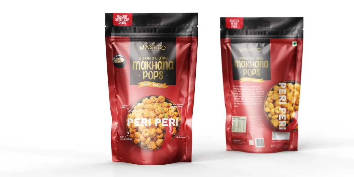
- Big, bright colours that are easy to spot from the end of an aisle.
- The offer front and centre: “20% extra”, “family pack”, “buy 2”.
- Large product photos, often showing quantity.
- Practical details shown off: zip lock, resealable, “makes 30 cups”.
The Tricky Middle
Most Indian D2C brands live here: a cut above the supermarket brand, but bought weekly, not once a year. The pack has to feel special enough to justify a little more without making the everyday buyer feel left out. That usually means borrowing one or two premium cues (a better finish, a calmer colour) while keeping the product visible and the information easy to find.
Value cues aren’t a failure, by the way. A family-pack atta brand that dresses itself like a perfume will lose the shoppers who were ready to buy it. For brands that genuinely sit at the top, the BDS piece on luxury packaging design covers that end of the scale.
FAQs: Premium vs Value Packaging
Can a value brand use premium packaging cues?
A few, carefully. One better finish or a calmer colour can lift it. Going all the way can push away the very shoppers who were looking for a good deal.
Does minimal packaging always look premium?
Not always. Done with care, it looks confident. Done carelessly, with cheap material and weak printing, it just looks empty or unfinished.
What is masstige packaging?
It’s packaging for products priced a little above mass brands but far below luxury. The pack borrows some premium signals while staying approachable for regular buyers.
Has Brij Design Studio worked on luxury packaging?
Yes. Its case studies page includes a luxury packaging project for a hospitality brand, alongside confectionery and food packaging work.
What Are Category Codes, and When Should a Brand Break Them?
Category codes are the unwritten visual rules shoppers use to sort products in a split second. Break all of them and nobody knows what you are. Follow all of them and nobody notices you.
Walk down a namkeen aisle and count the packs with red, yellow and a big photo of the snack. Look at a dry-fruits gift shelf before Diwali: jewel tones and gold. Check a pharmacy counter: white and blue. None of it is written down, but every shopper has learnt it.
These codes are what make step two, sorting, possible. A new chips brand in a dark navy, typography-only pouch might look beautiful in the studio. On the shelf, half the shoppers may not realise it’s chips.
Break One Rule, Keep the Rest
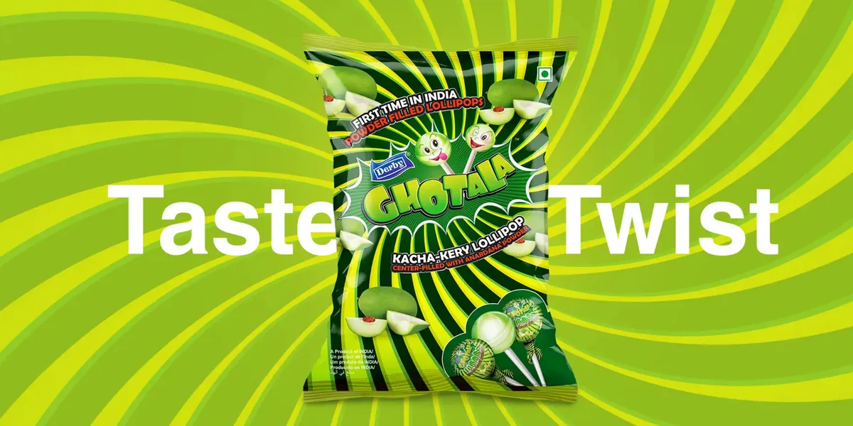
The packs that get noticed usually break one code clearly and keep the others. That navy chips pouch can work if it keeps the familiar pouch shape, shows the chips through a window and uses a flavour colour on the bottom. The shopper sorts it as chips in an instant, then notices it looks different. That’s the sweet spot.
Which code to break should come from the brand’s story. A healthier snack might drop the greasy close-up photo. Breaking a code just to be different, with no reason behind it, usually confuses more than it attracts.
FAQs: Category Codes
What are category codes in packaging?
They’re the shared colours, shapes, images and layouts that tell shoppers what kind of product they’re looking at, such as the typical look of a juice carton or a spice pouch.
Is it risky to look very different from competitors?
It can be. If shoppers can’t tell what the product is, they skip it. Looking different works best when the category is still obvious at a glance.
How many category codes should a new brand break?
Usually one, maybe two. Enough to be noticed, not so many that the pack becomes a puzzle.
How does Brij Design Studio study a category before designing a pack?
Brij Design Studio builds packaging concepts that combine brand strategy, visual communication and category understanding. Its strategy inputs include brand positioning, target customers, the product category, competition and production requirements.
Common Mistakes That Make a Pack Send the Wrong Signal
Most perception problems come from a mismatch: the pack says one thing, the price or the product says another. Here are the ones that turn up again and again.
- A luxury outfit on an everyday product. Gorgeous rigid box, weekly-shop price. Shoppers assume they can’t afford it and walk past.
- Claims stacked like stickers on a laptop. “No preservatives, high protein, gluten free, keto, vegan, award winning…” The more badges, the less any one of them is believed.
- A photo the product can’t live up to. The strawberries on the pack are glossy and huge. The bar inside is beige. Disappointment does lasting damage.
- Forgetting the hand. A heavy product in a thin carton that bends at the corners feels cheap, no matter how good the print is.
- Designing only at screen size. The front panel looks lovely on a big monitor and turns to mush as a thumbnail or at the bottom of a shelf.
- Copying the category leader too closely. Shoppers don’t think “similar”; they think “knock-off”, and knock-offs aren’t trusted.
Most of these are cheap to fix before printing and expensive to fix after. The BDS list of packaging design mistakes covers the practical side, from print errors to legal space.
FAQs: Signal Mistakes
Why does my product look cheap even though the quality is good?
Usually because of one weak cue: thin material, too many colours, crowded type or a low-quality photo. Find that one cue and fix it first.
Can a pack look too premium for its own good?
Yes. If it looks far more expensive than it is, everyday shoppers may assume it’s out of their range and never check the price.
Does a copycat pack hurt trust?
Often. A pack that looks too much like a famous brand can come across as a fake, which is the opposite of what a new brand needs.
How does Brij Design Studio help a brand avoid mixed signals on its pack?
It starts by understanding the product, audience and positioning, then refines hierarchy, typography and colour so they all point the same way. Realistic 3D mock-ups let the brand see the pack properly before it’s printed.
How Can a Brand Test What Shoppers Think of Its Pack?
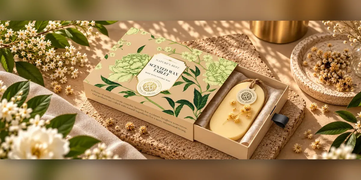
Show the pack, at real size, to the people who actually buy the category, and ask them what they think it is, who it’s for and what it costs. Then compare their answers with what the brand meant. It doesn’t need a research agency to be useful.
1Write Three Words
Before testing, write the three words a shopper should think. “Pure, homely, worth it.” Without these, there’s nothing to measure against.
2Make It Real
Print a real-size mock-up on the real material, or as close as possible. Perception of weight and finish can’t be tested on a laptop.
3Run a Five-Second Look
Show the pack for five seconds, then take it away. Ask what it was, who it’s for and what it might cost. First reactions are the honest ones.
4Put It Among Rivals
Place it on a real shelf next to competitors and photograph it from two metres. Can it be found? Can it be sorted?
5Shrink It
Drop the front panel into a phone screenshot of a quick-commerce grid. If the name and product vanish, that’s what most online shoppers will see.
6Ask About Price, Not Liking
“Do you like it?” gets polite answers. “What would you pay?” and “Would you pick this over the one you usually buy?” get useful ones.
7Listen for Surprises
If three people call a fruit drink “medicine”, that’s the finding. Unexpected words matter more than the scores.
Ten to fifteen real category buyers will show most big problems. Not friends or family; they’ll be kind. A society WhatsApp group or a kirana owner willing to put two versions on the counter for a weekend beats a polished deck reviewed by people who already love the brand.
FAQs: Testing Packaging Perception
How many people do I need to test packaging?
For spotting big problems, ten to fifteen real buyers of the category is often enough. Bigger decisions, like a full rebrand, deserve a bigger sample.
Can packaging be tested online?
Partly. Online tests work well for colour, layout and thumbnail clarity. They can’t test weight, finish or how it feels in the hand, so pair them with a physical mock-up.
What questions should I ask when testing a pack?
What is it, who is it for, what would it cost and would you buy it instead of your usual one. Skip “do you like it”.
Can Brij Design Studio show what a pack will look like before it goes to print?
Yes. Brij Design Studio provides realistic 3D mock-ups along with the print-ready artwork, so a brand can review and test the design before production.
Questions to Ask Before Signing Off a Pack Design
Before artwork goes to the printer, check that the pack’s quiet signals match the product, the price and the shopper. These questions catch most problems.
- “If the logo were covered, would people still guess the category?”
- “Does the weight and feel match the price we’re charging?”
- “What does the eye land on first, and is that the right thing?”
- “Would a regular buyer of this category trust it enough to try once?”
- “Is the photo honest about what’s inside?”
- “Does it still make sense as a thumbnail?”
- “How many claims are on the front? Could we lose half?”
- “Would someone feel proud or awkward giving this as a gift?”
- “Does it look right under a tube light as well as in a bright modern store?”
That last one sounds fussy. It isn’t. Plenty of packs are approved on a good screen in an air-conditioned office, then sold under harsh tube lights where soft pastels go grey and navy turns black.
FAQs: Sign-off Checks
What should a packaging sign-off checklist include?
Category clarity, reading order, price fit, honesty of images, number of claims, thumbnail size and how it looks in real store lighting. Plus the legal text, which is a separate check.
Who should approve a packaging design?
The founder or brand owner, plus someone who sells it, like a sales head or distributor. People who face buyers spot problems designers and owners miss.
Should packaging be checked under different store lighting?
Yes. Colours shift under tube lights, warm bulbs and daylight. Check the printed proof in at least two kinds of light.
What does a brand receive at the end of a packaging project with Brij Design Studio?
Print-ready artwork and realistic 3D mock-ups. The artwork is prepared to production requirements, so the printer works from exactly what was approved.
How Is Packaging Perception Changing With Quick Commerce and Online Shelves?
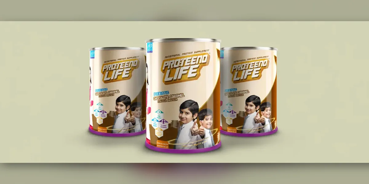
More first impressions now happen on a phone, so packs need cues that survive at thumbnail size. The touch cues haven’t gone away. They’ve just moved to the moment the order arrives.
On an app, a pack loses most of its tools. Nobody can feel the finish or the weight, and fine type disappears. What’s left is a colour block, a shape, the name and maybe one image. Online-first brands now design a strong, simple front for the grid and use the listing photos to show finish, texture and size in a hand.
Then the box arrives. That doorstep moment has become a second first impression. If the pack in the hand feels as good as it looked on screen, the promise holds. If it’s lighter, thinner or duller than the photos, the shopper feels slightly tricked, even if the product is fine.
Green cues are shifting too. Kraft textures and leaf icons used to signal “eco” on their own. Shoppers have seen enough of them now to be a bit sceptical, so a vague green look can backfire if the material isn’t actually better. Plain, specific information about the material works harder than a leaf. The BDS guide to sustainable packaging design goes into the materials themselves.
FAQs: Online and Future Perception
Does packaging matter if a product sells mostly online?
Yes, twice. It has to work as a tiny image on the app, and it has to match that image when it’s delivered.
How should a pack look on quick-commerce apps?
Simple and bold: one clear colour block, a big product name and an obvious view of the product. Test it at actual thumbnail size on a phone.
Do eco-friendly packs change how people see a brand?
They can, if the claim is real and specific. A green look without a genuinely better material can make shoppers more doubtful, not less.
Does Brij Design Studio design packaging that works online as well as on shelves?
Yes. Its process refines hierarchy, typography, colour and brand elements so the pack works on the shelf and online. The studio also does website design and digital marketing, which helps keep the online look consistent.
Why Choose Brij Design Studio for Packaging Design?
Brij Design Studio is a Mumbai design studio that does branding, packaging design, website design and digital marketing. Its packaging design work starts with a deep dive into the product, the target audience and the market positioning, which is where perception decisions really begin.
From there, the work moves through three stages the studio calls Concept, Structure and Print-ready. Concepts combine brand strategy, visual communication and category understanding, then hierarchy, typography and colour are refined so the pack works on a shelf and on a screen. The brand gets print-ready artwork and realistic 3D mock-ups, with production needs discussed at the start of the project.
Its case studies include rebrands, new product launches, food startups, confectionery and luxury packaging. Brands that want to talk through a pack can reach the team through the Brij Design Studio contact page.
Conclusion
Shoppers don’t separate the pack from the product. The weight of the jar, the softness of the paper, the number of claims, the shape of the letters: all of it gets folded into what they think the product is and what it should cost.
The good news is that none of this is mysterious. Decide what the shopper should believe, make every cue point the same way, and test it on real buyers at real size before printing. Small brands can do that as well as big ones.
A shopper will believe something about the product either way. The pack decides what.
Common FAQs About Consumer Perception and Packaging
What role does packaging play in how consumers see a product?
It shapes their first beliefs about quality, taste, safety and price, before they’ve used the product. For a new brand, it’s often the only evidence a shopper has.
How does packaging colour affect buying decisions?
Colour helps shoppers find and sort a product, and it sets the mood: fun or serious, everyday or special. How much colour and how bright it is matter as much as the colour itself.
What is sensation transference?
It’s when feelings about the packaging carry over to the product inside. A heavy, well-made pack can make the same product seem richer or more expensive.
Can packaging change how a product tastes?
It can change how people expect it to taste, and expectation affects experience. Research from Oxford found people rated the same yoghurt as nicer when it came in a heavier bowl.
How can a small brand make its packaging look more trustworthy?
Show the real product, keep claims few and specific, use a sturdy material and make the maker’s details easy to find. Clean beats busy.
Should a brand redesign its packaging if sales are slow?
Maybe. First check whether shoppers misread the pack, using a quick test with real buyers. If they get it wrong, a redesign can help. If they get it right and still don’t buy, the issue may be price, distribution or the product.
What is the difference between perceived quality and actual quality?
Actual quality is what the product really is. Perceived quality is what shoppers believe it is, mostly from the pack and price. Brands need both, and the gap between them causes most disappointment.
How often should a brand check how shoppers see its pack?
Whenever something big changes: a new competitor, a new channel like quick commerce, a price change or a new range. A quick check every year or two is sensible otherwise.
Where is Brij Design Studio based, and does it work with brands outside Mumbai?
Brij Design Studio is based in Vile Parle East, Mumbai. Its packaging page says businesses outside Mumbai can work with the studio remotely.
Can Brij Design Studio handle branding and packaging together for a new brand?
Yes. Its branding process first understands the business, then moves through stages it calls Business, Being and Becoming, before brand strategy, brand design, brand experience and brand support. Packaging can then grow from that same strategy.