
Case Study
Ready-to-Eat Food Packaging

MOM Ready-to-EatFood Packaging Design
Maa Ke Haath Ka Pyaar. Ready in Minutes.
MOM Ready-to-Eat Food Packaging Design
Maa Ke Haath Ka Pyaar. Ready in Minutes.
What if ready-to-eat food could feel as familiar and comforting as a meal served by your mother?
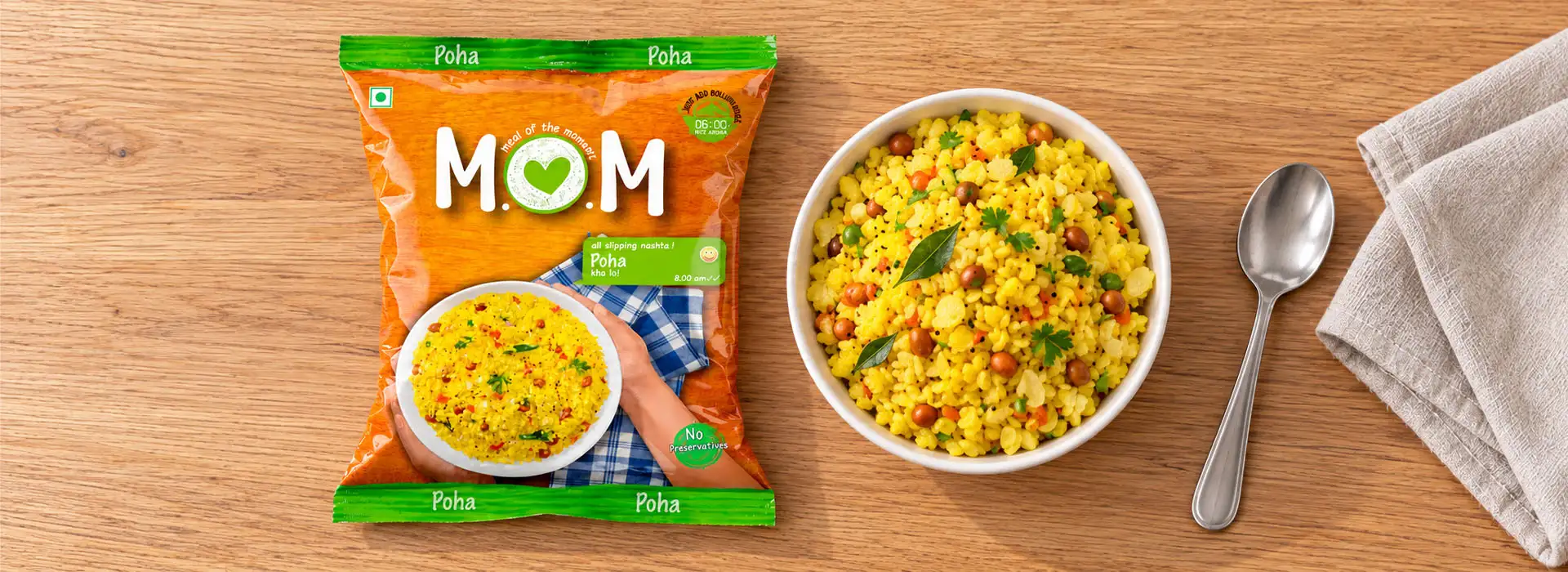
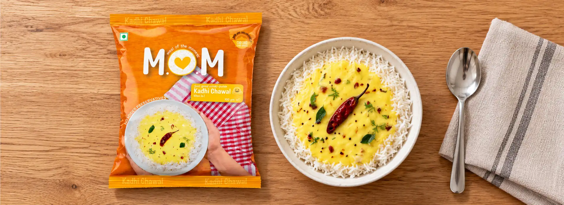
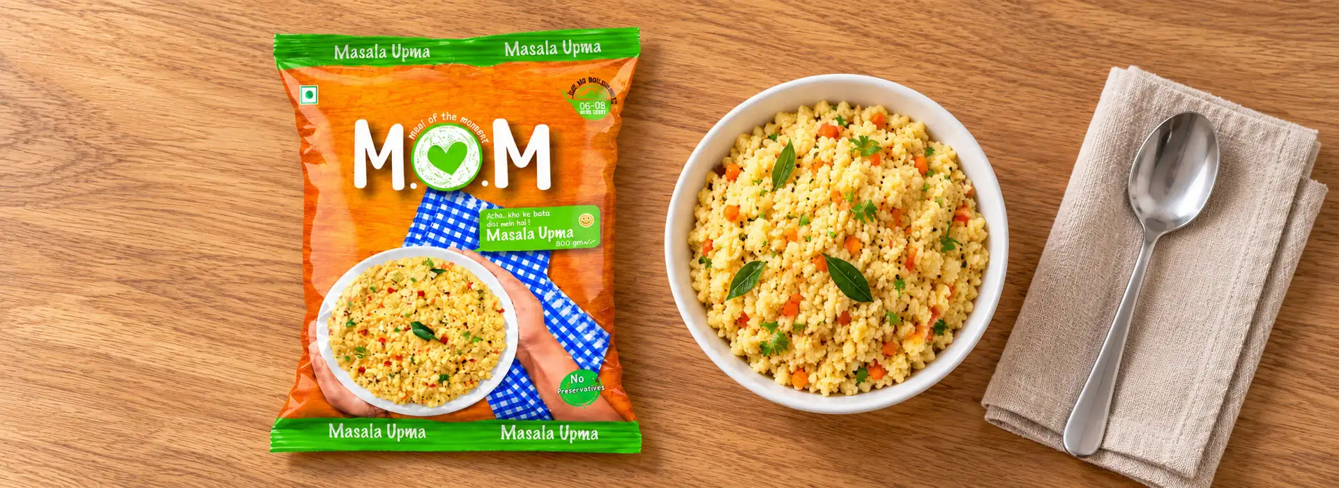
For MOM, Brij Design Studio developed a distinctive ready-to-eat food pouch packaging design built around the warmth of home-cooked food and the simplicity of quick preparation. The central visual featured a mother's hand holding a bowl, creating an emotional connection between the product and the familiar feeling of being served a meal at home.
Across the product variants, we maintained a consistent design approach while using playful emojis, English-Hindi communication and clear preparation instructions. Prominent "No Preservatives" messaging and easy-to-understand cooking cues helped make important product information visible on the front of the pack.
Project Overview
MOM Ready-to-Eat Food Packaging Design
Client

MOM
Category
Ready-to-Eat Food
Project Focus
The Brief
The Brief: Making Ready-to-Eat Food Feel Simple and Familiar
Ready-to-eat food packaging needs to communicate more than what is inside the pouch. It must help customers understand the product, recognise its convenience and feel confident about what they are choosing.
For MOM, our challenge was to make convenience feel familiar rather than impersonal. We wanted the packaging to communicate the warmth associated with home-style food while making the preparation process easy to understand.
Our creative direction combined a mother-inspired visual, friendly communication and practical on-pack instructions. Instead of relying only on conventional product imagery, we used the emotional familiarity of a mother serving food as the central idea.
The packaging was designed to make the product approachable, with a consistent visual system that could be carried across the different variants in the range.
02 · The Central Visual
Food Pouch Packaging Design Inspired by a Mother's Care
Food Pouch Packaging Design Inspired by a Mother's Care
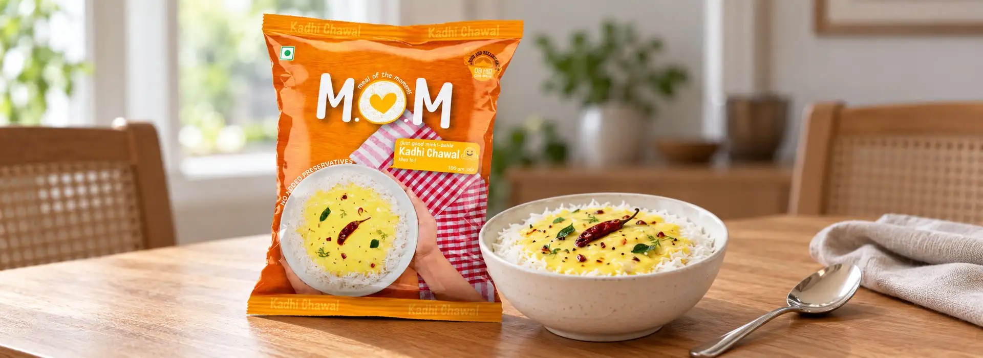
The strongest element of the MOM packaging was its central visual: a mother's hand holding a bowl of food. This simple, relatable image helped communicate the feeling of receiving a meal prepared with care.
The visual was not merely decorative. It gave the packaging a human connection, bringing the familiarity of home-style dining into a convenient ready-to-eat format.
For the food pouch packaging design, we balanced this emotional concept with clear product communication. The mother-and-bowl visual established the overall personality, while the supporting graphics and text helped communicate the product's convenience.
This concept gave the MOM range a distinctive creative direction, allowing the packaging to feel warm and approachable while remaining suited to a modern food product.
Every Variant
One Consistent Design Language Across Every Variant
When a brand offers multiple ready-to-eat products, each pack needs to be identifiable while still belonging to the same family. A fragmented design approach can make the range feel disconnected, whereas excessive repetition can make individual products difficult to distinguish.
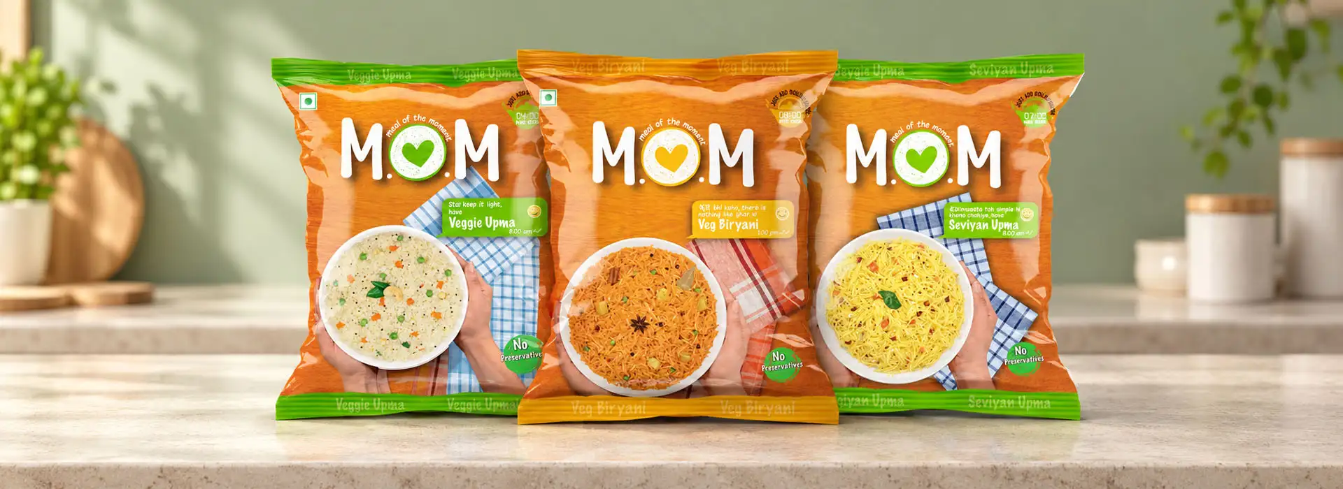
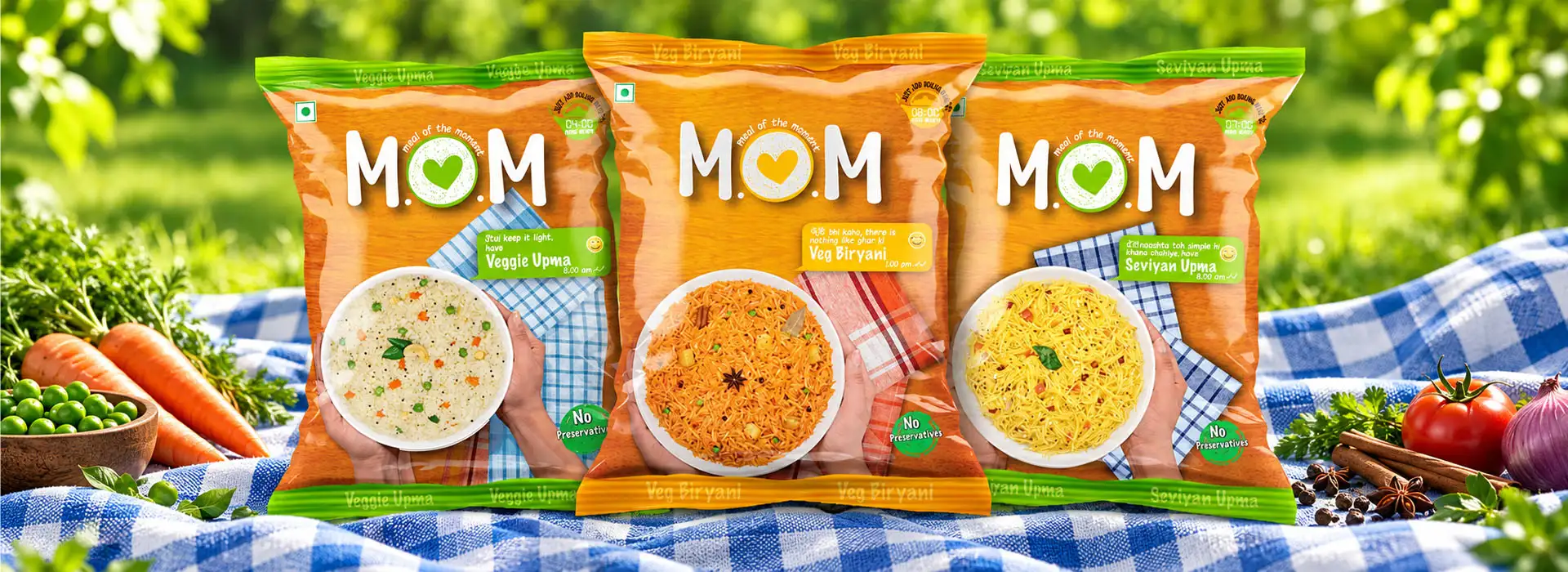
For MOM, we carried the same mother-inspired visual concept across the different variants. This created a recognisable design foundation for the range, helping connect the products through a shared visual story.
The packaging system allowed the brand to maintain consistency while accommodating product-specific details, including preparation instructions that could vary from one pack to another.
By treating the range as a connected packaging family, we created a cohesive visual approach rather than designing each pouch in isolation.




Hinglish
Hinglish Packaging Communication That Feels Relatable
Food is closely connected to everyday language, cultural familiarity and shared experiences. For a product aimed at a broad Indian audience, communication needs to feel accessible rather than overly formal or technical.
For MOM, we incorporated a playful combination of English and Hindi, supported by emojis to give the packaging a friendly, conversational tone. This Hinglish approach made the communication feel closer to the way people naturally express themselves in everyday life.
The emojis added personality and helped break up the information visually, while the bilingual wording made the tone more familiar to a wider audience.
Rather than treating copy as a secondary element, we used communication as an integral part of the packaging concept. The aim was to make the product feel approachable, easy to understand and relevant to everyday consumers.
 Friendly · Familiar
Just Add Boiling Water
Easy Preparation Instructions Right on the Pack
Convenience is meaningful only when customers can understand how to prepare the product. With ready-to-eat food, clear preparation instructions are an important part of the packaging experience.
Preparation
Easy Preparation Instructions Right on the Pack
01Just Add Boiling Water
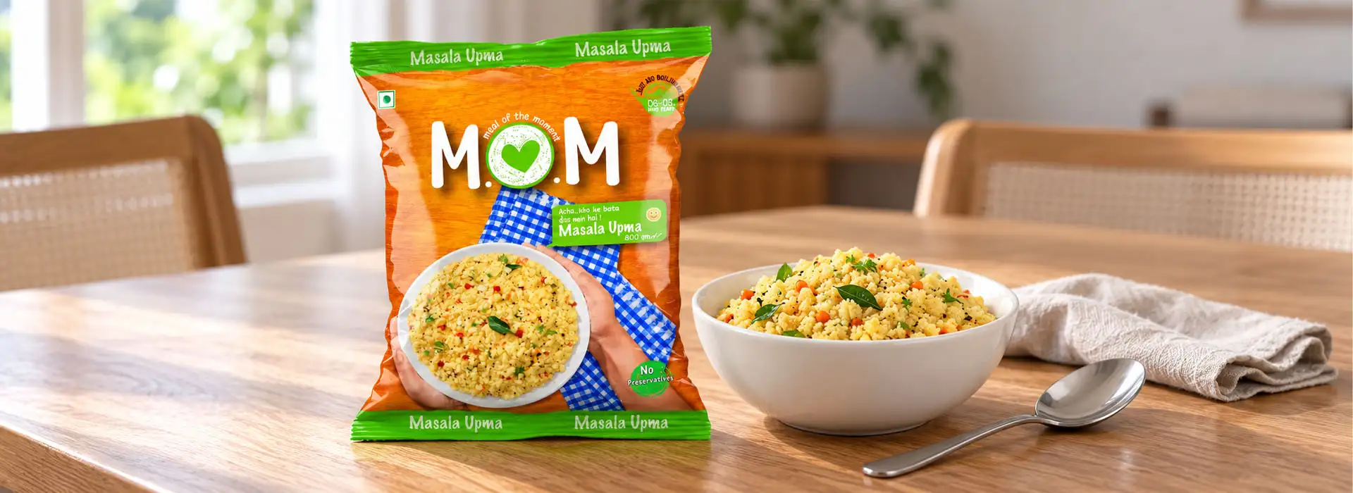
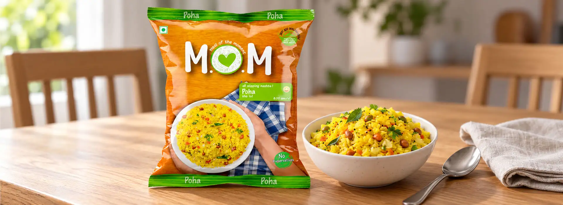
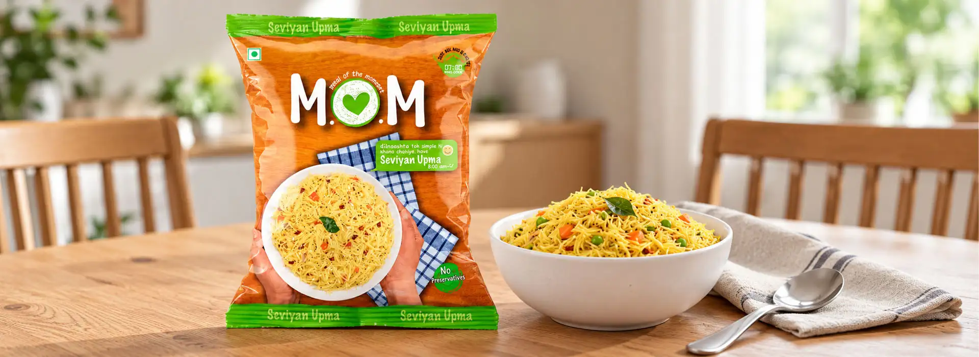
For MOM, we created a visual instruction cue at the top of the pouches to communicate the simple preparation process. The graphic highlighted the "Just Add Boiling Water" message alongside the preparation time, including four minutes where specified for the relevant variant.
02Easy to notice
This information was designed to be easy to notice without requiring customers to search through the entire pack for instructions. Because preparation details can differ by product, the communication was adapted to the requirements of the individual variants.
03Convenience
By making preparation guidance prominent, the design reinforced the central idea behind the range: a convenient food option with a straightforward preparation process.
Front of Pack
Prominent "No Preservatives" Communication
For food packaging, the hierarchy of information matters. Customers should be able to identify important product messages without having to examine every detail on the back of the pouch.
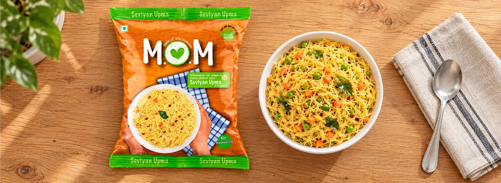
For MOM, the "No Preservatives" message was given prominent placement on the front of the packaging, as specified in the project brief. This made the intended product claim easy to notice during a quick product scan.
The design approach focused on visibility and clarity, ensuring that the message formed part of the main packaging communication rather than being lost among secondary details.
Clear front-of-pack communication can help customers understand a product's stated attributes more quickly. Any such claim should, of course, be supported by the product's formulation and applicable labelling requirements before the packaging is printed.
 Front-of-pack clarity
Emotion & Function
Ready-to-Eat Food Packaging That Balances Emotion and Function
Effective packaging needs to connect with people while helping them understand the product. For MOM, these two goals came together through the warmth of the mother-inspired visual and the practical clarity of the preparation instructions.
The creative concept gave the range its emotional character, while the Hinglish communication and emoji-led details added a conversational personality. The prominent preparation cue addressed usability, and the "No Preservatives" message gave visibility to an important stated product attribute.
Together, these elements helped establish a clear packaging hierarchy, balancing the brand story with the information customers need when choosing and preparing a product.
At Brij Design Studio, we approach ready-to-eat food packaging design as a combination of visual storytelling, brand communication and practical information design.
Our Creative Approach
Our Creative Approach to MOM Packaging
01
Understanding the Consumer
We focused on the familiarity of home-style meals and the need to communicate convenience in a warm, accessible manner.
02
Developing the Central Visual Concept
We used a mother's hand holding a bowl of food as the main visual, connecting the packaging with the familiar experience of being served a meal at home.
03
Creating a Consistent Variant System
We maintained the core visual approach across the different product variants while allowing product-specific information and preparation details to be incorporated.
04
Building a Relatable Communication Style
We introduced English-Hindi messaging and emojis to give the packaging a friendly tone that felt connected to everyday Indian communication.
05
Highlighting Preparation and Product Information
We made the boiling-water preparation cue prominent at the top of the pack and gave the "No Preservatives" message clear visibility on the front, in line with the project brief.
Food Packaging Design
Food Packaging Design by Brij Design Studio
The MOM project demonstrates how a simple, human-centred idea can shape an entire packaging range. By using the familiar image of a mother serving food, we created an emotional starting point for a ready-to-eat product category that often focuses primarily on speed and convenience.
We extended that idea through consistent variant design, Hinglish communication, playful emojis and clear preparation cues. The result was a packaging approach that balanced warmth with functionality and gave the product range a connected visual identity.
At Brij Design Studio, we create food pouch packaging design for brands looking to communicate their product's character clearly and creatively. From the central concept to the details on the pack, we bring together visual storytelling, communication and design consistency.
 Warmth · Functionality
Questions & Answers
Frequently Asked Questions
MOM ready-to-eat food packaging design is a pouch packaging project by Brij Design Studio. The design uses a mother-inspired visual, Hinglish communication, emojis, preparation instructions and prominent "No Preservatives" messaging to create a relatable and informative packaging experience.
Effective ready-to-eat food packaging combines clear product identification, readable instructions, relevant product information and a recognisable visual identity. The packaging should help customers understand what the product is and how to prepare it while communicating the brand's personality.
Depending on the project, food pouch packaging design can include creative concept development, visual identity application, product information hierarchy, variant differentiation, preparation instructions, front-of-pack messaging and print-ready artwork.
Brij Design Studio is a Mumbai-based branding and packaging design agency offering food pouch packaging, FMCG packaging, product label design and packaging systems. The studio develops creative concepts that connect brand storytelling with practical product communication.
Yes. A common design system can maintain consistent branding across multiple products while allowing each variant to display its own name, preparation instructions and other relevant information. The system should be planned around the requirements of the full product range.
Share your product range, pouch dimensions, ingredients and approved claims, preparation instructions, target audience, brand guidelines and printing requirements. These details help the design team develop a concept that balances visual appeal, information clarity and the practical requirements of packaging production.
More Work
Our Work That Will Interest You


Launching a ready-to-eat food brand?
Start Your Packaging Project
Let's create packaging that makes your product easy to recognise, understand and remember.
Book A Call →