

SukhamAroma Diffuser Packaging Design
A Nature-Inspired Luxury Box Designed to Turn an Aroma Diffuser Gift Set Into a Sensory Experience
Project Overview
Sukham Aroma Diffuser Packaging Design
A Nature-Inspired Luxury Box Designed to Turn an Aroma Diffuser Gift Set Into a Sensory Experience
Client
House Of Aroma
Category
Aroma & Home Fragrance
Project
Aroma Diffuser Gift Set Packaging
Scope
The Brief
Designing Packaging for a Complete Aroma Experience
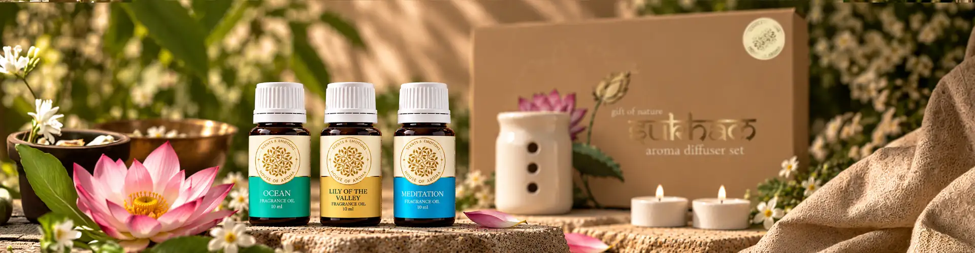
Sukham's diffuser gift set brought together a glass diffuser, aromatic oil, and candle in one premium box. The packaging therefore needed to do more than protect several delicate products; it needed to bring the complete set together visually and establish the mood of the experience before the box was opened.
The brief was to create packaging that felt natural, calming and premium, while giving the diffuser gift set an identity that would work for both personal use and gifting.
Rather than using a conventional fragrance or wellness aesthetic, we looked for a visual direction that could communicate the calm associated with aromatherapy through illustration, colour, structure and finishing.
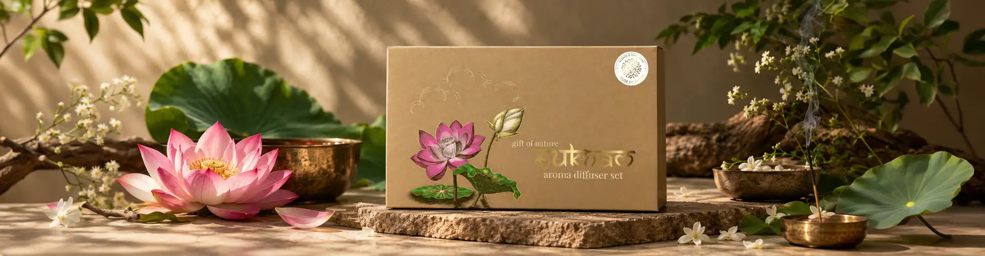
The Design Challenge
How Do You Make Calm Visible?
Aroma is experienced through scent, but the packaging has to communicate without the customer experiencing the fragrance first.
For Sukham, we needed to create a visual connection between the product and the feeling it was intended to evoke. The packaging had to suggest calm, nature, and purity while still looking sophisticated enough to be positioned as a luxury gift set.
The challenge was to create this balance without making the packaging feel overly decorative or disconnected from the natural character of the products.
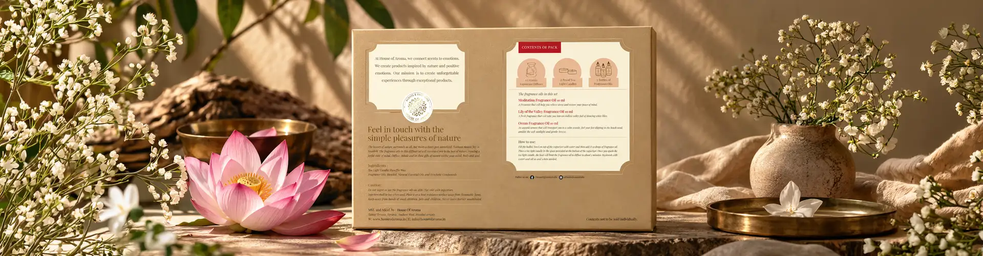
Nature as the Starting Point
The Lotus Became the Central Visual
The lotus was chosen as the key visual motif for the packaging. Its association with purity, calm, and renewal provided a natural starting point for the design.
Rather than using a generic floral graphic, we developed the lotus and surrounding foliage as hand-drawn artwork. The illustration became an important part of the identity of the box, allowing nature to flow across the packaging rather than appearing as a separate decorative element.
Hand-Drawn Illustration
Where Botanical Details Became Part of the Brand
We deliberately moved away from rigid, purely digital graphics and used hand-drawn illustration to create warmth and individuality.
The foliage and floral elements were developed to flow around the box, creating continuity across different panels and allowing the artwork to become part of the physical structure.
This approach was particularly suited to an aroma product because the illustration could visually communicate the natural and artisanal character associated with the oils and aromatherapy experience.

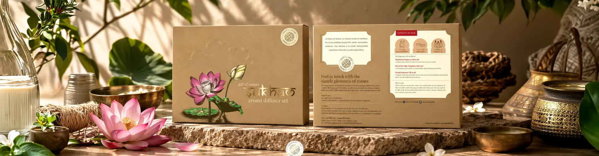

Box Packaging Design
A Box Designed to Bring the Complete Aroma Set Together
A Box Designed to Bring the Complete Aroma Set Together
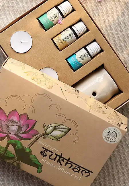
The box needed to accommodate a glass diffuser, aromatic oil, and candle while maintaining a premium presentation. The structural layout was therefore considered alongside the visual design.
The contents needed to remain secure, while the internal arrangement had to make the gift set feel organised and intentional when opened.
The artwork was designed to work with the structure rather than simply being placed onto a finished box. Floral elements were allowed to move across edges and panels, creating a more connected visual experience.
Luxury Box Packaging for Aroma Brand
Bringing Illustration and Luxury Finishing Into the Structure
For the luxury direction, we used a rigid box structure and gold stamping alongside the earthy, nature-inspired artwork. The contrast between the hand-drawn botanical illustration and the subtle metallic detailing gave the packaging a premium character without overpowering the natural visual language.
The physical weight and structure of the rigid box also contributed to the way the gift set was perceived when handled, making the packaging feel like part of the product rather than disposable outer protection.

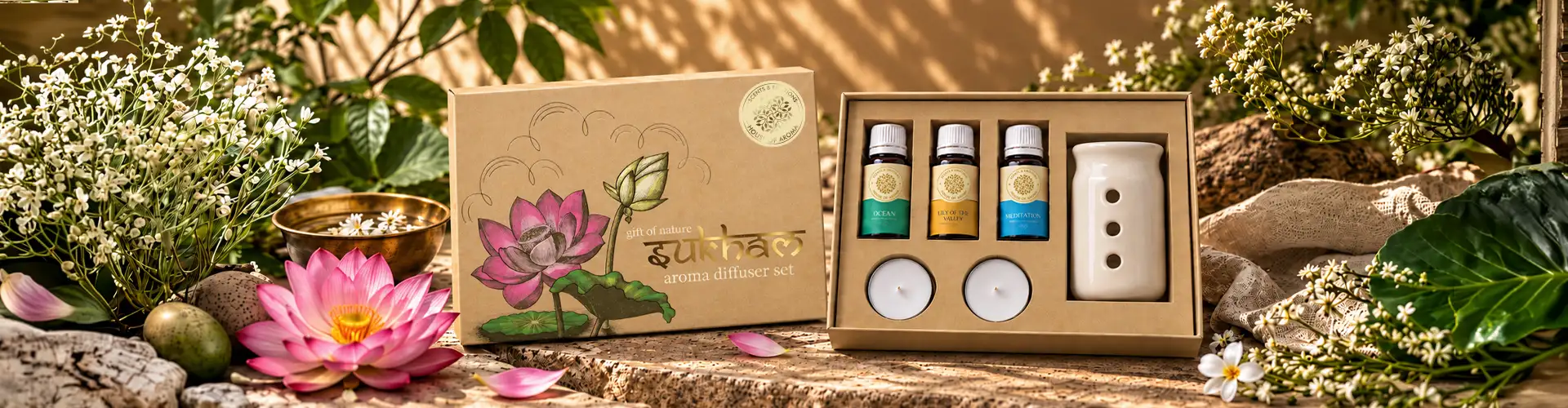
Creating the Aroma Product Story
Letting the Packaging Set the Mood Before Opening
The packaging was designed as a visual introduction to the aroma experience. The lotus, foliage, earthy tones, and carefully controlled composition establish a sense of calm before the customer encounters the diffuser itself.
The visual language was intentionally softer and more understated than a conventional retail pack. This allowed the packaging to communicate the character of aromatherapy without relying entirely on written product claims.
Designing for Aromatherapy
Translating an Invisible Experience Into Visual Design
One of the interesting challenges of aromatherapy packaging is that its primary product experience is invisible.
We therefore used visual cues associated with nature, botanical ingredients, and serenity to create a connection between what the customer sees and what they will experience through fragrance.
The hand-illustrated artwork and calming colour direction were developed to create this connection while keeping the overall packaging premium and sophisticated.

The Unboxing Experience
Making Opening the Box Part of the Product
01One curated set
The packaging was designed so that the experience continued beyond the exterior. The rigid box provides protection for the delicate glass diffuser, while the internal arrangement presents the diffuser, oil, and candle as one curated set.
02Considered, not functional
The visual flow of the illustration and the structure of the box work together to make the opening process feel considered rather than functional.
03A sense of occasion
For a gift set, this was particularly important. The packaging needed to create a sense of occasion before the individual products were even used.
Bringing Illustration Into Production
Maintaining the Character of the Artwork
Once the illustration and packaging direction were established, attention turned to how the artwork would translate into the final printed box.
Colour reproduction and finishing were considered carefully so that the earthy tones, fine illustrated details, and gold stamping worked together as intended.
The objective was to preserve the crafted quality of the original artwork through the final production rather than allowing printing and finishing to flatten the visual character.
Balancing Beauty and Protection
A Luxury Box That Still Performs Its Basic Job
While the visual direction was important, the packaging still had to protect fragile products.
The rigid structure was developed to provide a secure home for the glass diffuser and accompanying products. This meant the design had to work at two levels: visually create a premium experience while physically supporting and protecting the contents.
For us, the success of the box was in bringing these two requirements together rather than treating aesthetics and functionality as separate considerations.
The Final Packaging
A Nature-Inspired Expression of Luxury
The final Sukham diffuser packaging brings together nature, illustration, structure and luxury finishing in one cohesive gift set. The hand-drawn lotus and foliage establish the connection with nature. The rigid box provides structure and protection. Gold stamping adds refinement. And the internal presentation brings the diffuser, aromatic oil, and candle together as one experience.
Rather than simply packaging three aroma products, the box gives the complete set a visual identity and creates a more considered experience from the moment it is received to the moment it is opened.
Project Summary
Sukham's aroma diffuser gift set required packaging that could communicate the calm and natural character of aromatherapy while giving the product the presence expected from a luxury gift.
Brij Design Studio developed a nature-inspired packaging direction built around a hand-drawn lotus and botanical illustration. The artwork was integrated into a rigid box structure designed to accommodate the glass diffuser, aromatic oil, and candle.
Gold stamping and carefully considered printing details added a premium layer to the organic artwork, while the internal structure was designed to protect and present the products together.
The result is a luxury aroma diffuser packaging design that combines handcrafted illustration with practical box design, creating a complete visual and unboxing experience for Sukham.
What we designed
The Sukham Aroma Diffuser Packaging project included:
01
Aroma diffuser gift set packaging
02
Luxury box packaging design
03
Rigid box structure
04
Hand-drawn lotus illustration
05
Botanical and foliage artwork
06
Nature-inspired visual direction
07
Aromatherapy packaging design
08
Packaging layout
09
Product presentation
10
Gold stamping direction
11
Colour and typography direction
12
Packaging production artwork
13
Packaging visualization
More Work
Our work that will interest you


Questions & Answers
FAQs
The concept was inspired by nature and the calming qualities associated with aromatherapy. The lotus and hand-drawn foliage became the central visual elements, creating a connection between the natural world and the fragrance experience.
Because fragrance is experienced through scent rather than sight, packaging can use visual cues such as botanical illustrations, natural colours, ingredient-inspired imagery, and refined typography to suggest the mood and character of the aroma product.
Illustrations can give aroma packaging a distinctive visual identity while communicating the mood, ingredients, and natural character associated with a fragrance without relying entirely on text. For Sukham, hand-drawn botanical artwork helped visually express the calm and nature-inspired character of the aroma experience and helped the product stand apart from generic fragrance packaging.
A custom illustration can be developed specifically around the brand and product rather than relying on commonly used decorative graphics. When combined with considered typography, premium box structures, and finishes such as gold stamping, illustration can create a more distinctive luxury packaging experience.
Luxury packaging can make the product feel more considered from the moment it is received. A rigid structure, refined artwork, premium finishing, and thoughtful internal presentation can turn the packaging into an important part of the gifting and unboxing experience.
Aroma packaging needs to consider the product format, protection, product information, brand identity, and the overall customer experience. For products such as glass diffusers and essential oils, the packaging structure also needs to present and protect the products while maintaining a premium appearance.
Brij Design Studio develops aroma packaging by understanding the brand, product, and experience it wants to create. Depending on the project, this can include brand development, custom illustration, box packaging, label design, packaging structure, visual direction, and production detailing to create a consistent identity across the product range.