

Case Study · Packaging Design
Wax TabletPackaging
A Hand-Illustrated Sleeve Box Designed to Give Wax Tablets a Premium Aroma Experience
Project Overview
Wax Tablet Packaging
A Hand-Illustrated Sleeve Box Designed to Give Wax Tablets a Premium Aroma Experience
Category
Home Fragrance & Aroma
Project
Wax Tablet Packaging
Scope
The Brief
Wax tablets are experienced through fragrance, but the packaging has to communicate that experience visually, before anyone lights a thing. The brief was to elevate a simple home-fragrance product into something more refined and giftable, giving it enough visual distinction to stand out in a crowded fragrance category.
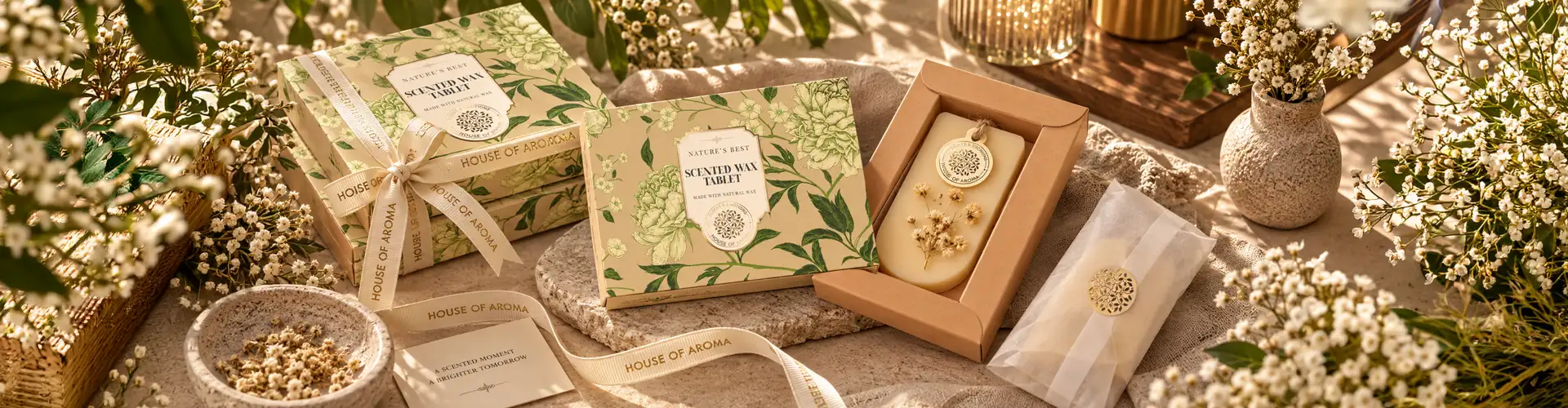
We built the concept around a sleeve box structure and hand-illustrated floral artwork, creating a direct link between the natural character of the wax and the sleeve packaging around it.
 The sleeve box
Design Inspiration
Nature as the Design Inspiration
Rather than reaching for stock imagery or generic fragrance motifs, we developed intricate hand-drawn floral illustrations specifically for this box.
The botanical detail was designed with a vintage-inspired quality, warm, crafted, and timeless rather than conventionally modern, so the artwork does more than decorate the pack. It signals the natural ingredients and aromatic experience inside before the box is even opened.
The illustration was designed to wrap continuously around the packaging rather than sit on a single front panel, so the floral pattern flows across every side and angle of the box.
The Concept
The Illustrated Sleeve Box Concept
The core idea behind the sleeve box was to make the product's fragrance experience visible before it's ever unboxed. Wax tablets communicate almost entirely through scent, so the packaging had to carry that sensory promise visually, through botanical illustration rather than literal fragrance imagery like steam lines or generic flower icons.
Hand-drawn floral artwork, wrapped continuously across the sleeve, was meant to suggest the natural, aromatic ingredients inside while giving the box a crafted, artisanal feel rather than a mass-produced one.
The sleeve structure itself reinforces this: the slow reveal as it slides open builds anticipation, mirroring the way a scent unfolds once released. Together, illustration and structure were designed to communicate one thing: that this isn't just a wax tablet; it's a considered, giftable object worth the reveal.
The Structure
Structure as Experience: The Sleeve Box
The sleeve box was chosen specifically because it creates a different kind of interaction than a standard box. The outer sleeve slides away to reveal an inner tray, building a small moment of anticipation as the package opens, while also giving the delicate wax tablets an extra layer of protection.
That structure also gave the illustration a continuous surface to move across, connecting the physical construction of the box directly to the visual concept rather than treating them as separate design decisions.
 Sleeve & inner tray
Gold Foiling
Gold Foiling as a Luxury Accent
Gold foiling was introduced to add a refined layer to the floral artwork, metallic detailing that catches the light against the matte surface as the box is handled. Used as an accent rather than a dominant finish, the foiling upgrades the illustration into a luxury presentation without overwhelming the natural, botanical character underneath.
Typography and product information were positioned carefully within the illustrated composition, keeping the pack legible and functional as a retail product without interrupting the artwork.
Handcrafted Positioning
Floral Illustration as Handcrafted Positioning
The floral illustration does more than decorate the box; it shapes how the buyer perceives the product before they've touched it. Hand-drawn botanical artwork reads immediately as considered and made, not manufactured, which shifts the wax tablets out of the mass-market fragrance aisle and into a more artisanal, gift-worthy category.
The visible imperfection and warmth of illustrated linework, as opposed to a clean vector graphic or photograph, signals craftsmanship in a way buyers register instinctively, even before reading any product copy. This perception matters most at the point of purchase or gifting, where a buyer is often choosing based on how premium and intentional a product feels on shelf.
By building the entire visual identity around illustration rather than photography or pattern, the packaging positions the wax tablets as a crafted object first, and a fragrance product second.
The Result
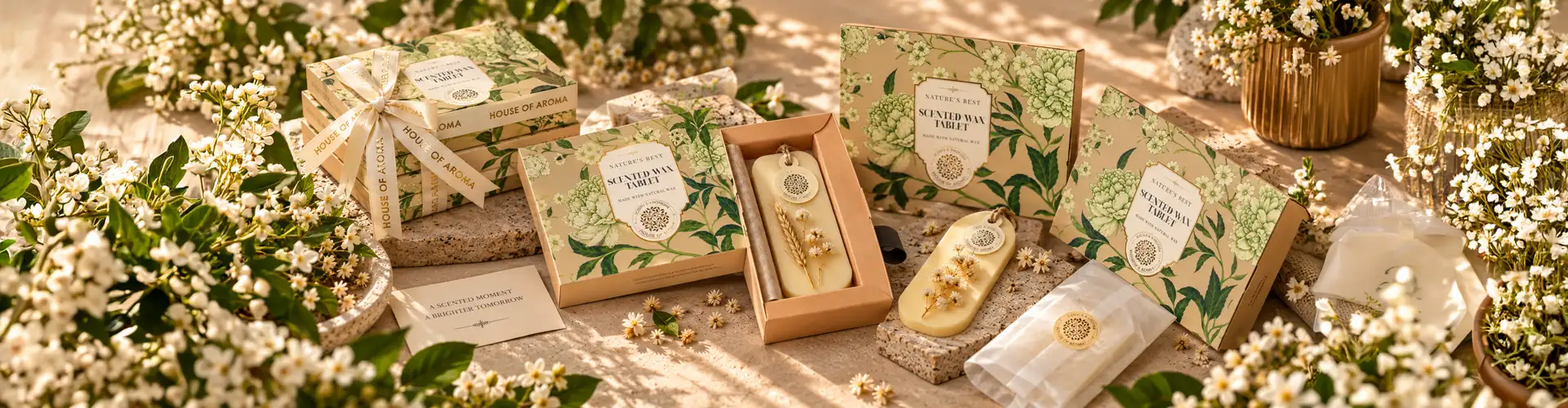
A sleeve box packaging system where illustration, structure, and finishing work as one experience: hand-drawn botanical artwork signals the product's natural character, the sleeve mechanism turns opening into a moment of anticipation, and gold foiling adds the refined layer expected of premium aroma packaging.
What we designed
The Wax Tablet Packaging project included:
Wax tablet packaging design01
Sleeve box packaging structure02
Hand-drawn floral illustration03
Vintage-inspired visual direction04
Gold foiling & finishing direction05
Typography & information hierarchy06
Packaging visualization07
Print & production artwork08
Print and finishing direction09
The Final Packaging
Where Nature, Illustration and Luxury Come Together
The final packaging brings together a sleeve box structure, hand-illustrated floral artwork, and premium gold foiling to create a distinctive presentation for wax tablets.
The botanical illustration communicates the natural and aromatic character of the product. The vintage-inspired visual language adds warmth and personality, while the sleeve structure creates a more engaging opening experience.
Gold foiling then adds a refined finishing layer, creating a balance between the organic character of the artwork and the luxury expected from premium aroma packaging.
Questions & Answers
FAQs
Wax tablet packaging design combines the box structure, artwork, typography, materials, and finishing used to present and protect scented wax tablets. For this project, BDS developed a sleeve box with hand-illustrated floral artwork and gold foiling to create a premium aroma product presentation.
The sleeve box provides a practical structure for protecting the delicate wax tablets while creating a more engaging opening experience. The sliding sleeve also provided a continuous surface for the floral illustration to flow across the packaging.
Hand-drawn illustrations can create a more distinctive and crafted visual identity than generic stock imagery. For the wax tablet packaging, botanical illustrations helped communicate the natural character of the fragrance while giving the box a unique visual signature.
Gold foiling adds a reflective, tactile detail that can highlight selected elements of the packaging. On the wax tablet box, gold details were combined with the floral artwork and matte surface to create contrast and a more refined, premium appearance.
Sleeve packaging can provide both protection and an engaging presentation. The sliding mechanism creates a reveal when the product is opened, while the outer sleeve provides a large continuous surface for branding, illustration, and other packaging graphics.
Brij Design Studio develops aroma packaging by considering the product, fragrance character, brand identity, structure, and customer experience together. Depending on the project, this can include custom illustration, sleeve or box packaging, luxury finishing, packaging graphics, and production-ready design.
More Projects
Our work that will interest you


From The Journal
Blogs you may like
Packaging Design
Luxury Packaging Design: How Premium Packaging Builds Brand Value, Desire & Customer Experience
November 14, 2024
Read More →

Packaging Design
Understanding Consumer Perception and Product Packaging
September 16, 2024
Read More →

Packaging Design
5 Major Packaging Design Mistakes to Avoid
September 16, 2024
Read More →
Work With Brij Design Studio
Let's Create a Box Design Your Customers Remember
Turn Your Packaging Into a Luxury Brand Experience.
Start Your Box Design Project →