Picture a physiotherapy clinic in Thane whose website homepage design was signed off on a 27-inch monitor in the owner’s cabin. On that screen it looks calm and expensive: a wide photo of the reception, a slow fade-in, the clinic’s name in thin grey letters.
Now picture the person who actually opens it. She’s in a crowded local train, back aching, phone in one hand, coming from a Google Maps link. She gets a blurry crop of a reception desk, a hamburger menu and no phone number on the first screen. She goes back to the map and taps the next clinic.
Nothing was broken. The homepage just answered the owner’s questions instead of hers.
This guide covers what a homepage must do in its first few seconds, each section from header to footer, layouts for five kinds of business, the Indian details that build trust, and how to test the page. Planning the full set of pages is a separate job, covered in the guide to the business website.
What Does Good Website Homepage Design Do in the First Five Seconds?
Good website homepage design answers three questions before the visitor scrolls: what is this, is it for me, and what do I do next? If a stranger can’t answer all three after five seconds, the page needs work, however good it looks.
Five seconds sounds harsh. But very few people type the web address. Most arrive from a search for the brand name, a Maps listing, an Instagram bio link, a WhatsApp forward or the QR code on a visiting card. They already half-know the business. They’re checking it’s real, it’s the right one and it can help them today.
So the top of the page has a narrow job. Say who it’s for. Show something real. Put one clear action where a thumb can reach it.
Homepage, Landing Page or About Page?
A homepage speaks to everyone, so it shows the whole business briefly and points each visitor to the right page. A landing page serves one campaign, often with a single button and no menu. An About page tells the story at length. A homepage that opens with the founding year and the founder’s vision is really an About page in the wrong place.
FAQs: What a Homepage Has to Do
What is the main purpose of a homepage?
To tell visitors quickly what the business offers and who it’s for, give them enough reason to trust it, and send them to the next step: a product, a service page, a booking or a chat.
What is the 5-second rule in web design?
It’s the idea that people decide very fast whether a page is worth their time. Show a stranger the homepage for five seconds, hide it, and ask what the business does. If they can’t say, the top of the page is unclear.
What does “above the fold” mean on a website?
Whatever shows on screen before anyone scrolls. On a phone that’s a small area, so the value line and the main button belong there.
How does Brij Design Studio decide what goes at the top of a homepage?
Its website design page says every page should guide visitors toward one clear next step, such as booking a call. So the top of a homepage is planned around that one step and the visitor’s first question.
Why Does the Homepage Matter More Than Other Pages?
The homepage matters most because it’s where brand searches and most first-time visitors land, and it sets the tone for every page after it. If it confuses people, they rarely give the inner pages a chance.
Inner pages mostly get people who already know what they want. The homepage gets everyone else: the person who heard the name at a wedding, the buyer checking a supplier before a meeting, the regular who just wants the phone number again.
It also carries the brand. Colour, type, photos and tone meet here first, so a mismatch with the shop board, the pack or the Instagram grid gets noticed. A homepage that feels like a different company makes people pause, and with a competitor one tap away, a pause is costly.
And search engines often lean on it to understand what the business is called, what it does and where. AI tools that sum up businesses do the same.
FAQs: Why the Homepage Matters
Is the homepage the most important page of a website?
For first impressions and brand searches, usually yes. For sales, a product or service page can matter just as much, because that’s where people make up their minds.
Does the homepage affect SEO?
Yes. It’s often the strongest page for the brand’s own name, and the links on it tell Google which inner pages matter most.
Can a weak homepage hurt a good business?
It can lose enquiries the business never hears about. Nobody calls to complain about a confusing homepage. They just leave.
How does Brij Design Studio keep a homepage in line with the rest of a brand?
The studio works on branding, packaging, website design and digital marketing, so the colours, type and tone on a homepage can come from the same brand system as the pack and the social posts.
What Sections Should a Website Homepage Design Include?
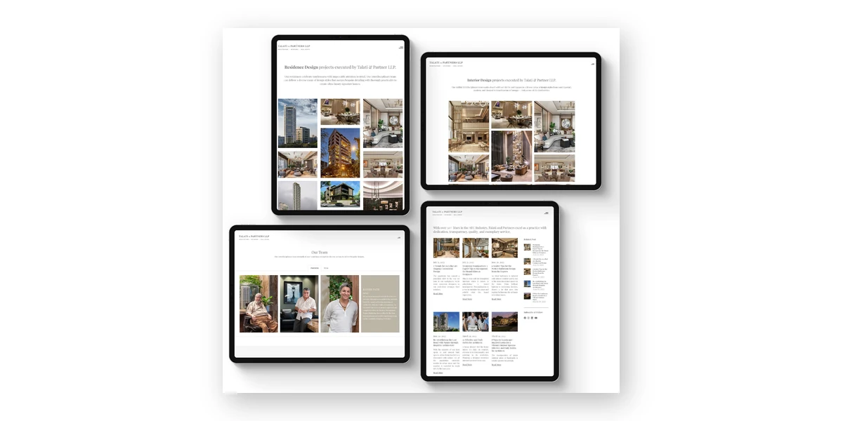
Most homepages that work follow one order: header, hero with a value line, proof, offers, how it works, stories, FAQ, a closing call to action and the footer. The order follows the visitor’s questions, from “what is this?” down to “how do I reach them?”.
Not every business needs every section, and the names change. A restaurant’s offers are its menu highlights; a factory’s are its product lines. Here’s what each one is for.
1Header
Logo, four to six menu items and one button that matches the main action: “Book a Visit”, “Shop Now”, “Get a Quote”. On phones, keep the call or chat button visible when the menu folds away.
2Hero and Value Line
One sentence on what the business does and for whom, a shorter line under it, one main button and a real photo. Everyone sees it, so it’s the part most worth rewriting.
3Proof Strip
A quick reason to believe: a review rating with the number of reviews, the year the business started, outlets, certifications or industries served. Small and factual.
4Offers
The main products, services or categories as cards with a picture, a short line and a link. Three to six is plenty. A homepage isn’t a catalogue.
5How It Works
Three or four steps from first contact to delivery: “Share your floor plan. See a 3D design. Approve and relax.” It calms the fear of the unknown, especially for services.
6Stories
Reviews with real names and photos, or one project and what changed. One specific story beats ten “Great service!” quotes.
7FAQ
Four to six questions people really ask on WhatsApp: delivery areas, timings, minimum order, parking.
8Closing Call to Action
A plain repeat of the main action for people who scrolled to the end. Nothing clever needed.
9Footer
Address, map link, phone, email, hours, social links, policies and legal details. People scroll here on purpose for contact details, so keep it complete.
To check the order, read only the section titles, top to bottom. They should sound like a short chat with a customer, not a list of the company’s departments.
FAQs: Homepage Sections
What is the ideal layout for a homepage?
Header, hero with the value line and main button, proof, the main offers, how it works, reviews or stories, a short FAQ, a closing call to action and the footer. Then trim it to what the visitor really needs.
How long should a homepage be?
Long enough to answer the visitor’s main questions and no longer. For most small businesses that’s six to nine sections. Length isn’t the problem. Sections that say nothing are.
How many menu items should a homepage header have?
Five or six is comfortable. Past that, people stop reading the menu and start guessing. The rest can live in the footer.
How does Brij Design Studio plan the order of homepage sections?
Its website design page says the studio plans the website sitemap carefully for easy navigation, and that every page should lead to one clear next step. On a homepage that means the main action is settled first and the sections are lined up to support it.
How Should the Hero Section Look and Read?
The hero should carry one value line, one supporting sentence, one main button and one real image, and it should fit on a phone screen without scrolling. Everything else can wait for the next section down.
- One main button, perhaps with a quieter text link. Three equal buttons ask the visitor to choose, and many choose to leave.
- Real photos over stock. The actual kitchen, the actual team. Visitors spot a stock handshake instantly.
- Room to breathe. A value line squeezed between a badge, a timer and a chat bubble doesn’t get read.
- Contrast that survives sunlight. Light grey text on a pale photo vanishes on a phone at a bus stop.
Photo, Video or Text-Only Hero?
A photo hero suits most businesses: fast, and it shows something real. Video can work for a resort, a restaurant or a fashion label where mood sells, but only if it’s short, silent, heavily compressed and backed by a still image. A text-only hero, big type on a plain colour, suits service and B2B firms whose work doesn’t photograph well. It’s the fastest of the three.
Long Homepage or Short Homepage?
Long pages suit big or unfamiliar decisions, like a full home interior or an industrial machine, where people want reassurance first. Short pages suit visitors who already know what they want, like someone checking a café’s timings. Most small businesses sit in between. Start at a medium length and let the scroll data decide.
How to Write the Homepage Value Line
A homepage value line says what the business does, for whom and why it’s a good pick, in roughly ten words a stranger understands. Write it before any design starts, because the layout should be built around the words, not the other way round.
A simple pattern gets most businesses close: what you do, plus who it’s for, plus the difference. Then cut every word a competitor could also say. Some made-up before-and-after pairs:
- “Leading solutions provider committed to excellence” says nothing. “Stainless steel kitchen equipment for hotels and hospitals, made in Coimbatore” tells a buyer what they need.
- “Your wellness partner” could be anything. “Physiotherapy for back and knee pain in Thane, with home visits” could only be one clinic.
- “Crafted with love” is on a thousand sites. “Small-batch Darjeeling teas, shipped across India” gives the shopper something to hold on to.
The line under it handles the next doubt: area served, speed, or who it’s best for. The button should say what happens when tapped. “Book a Free Assessment” beats “Submit”.
And write the way customers talk. If people on WhatsApp ask “Do you do home visits?”, the homepage says “home visits”, not “domiciliary care services”. Keeping that voice steady across site, pack and posts is covered in the guide to brand communication.
FAQs: The Hero Section and Homepage Copy
What is a hero section on a website?
The first big block at the top of the homepage, usually a headline, a short line, a button and an image. It’s the one part every visitor sees.
How many words should a homepage headline have?
Somewhere around six to twelve tends to work. Short enough to take in at a glance, long enough to say something specific.
Should a homepage have a video background?
Only if the video shows something a photo can’t, and it’s been compressed hard. Otherwise a strong photo loads faster and says just as much.
How does Brij Design Studio make a homepage hero feel premium without slowing it down?
Its website design page describes its UI work as clean layouts, sharp type and motion that make a brand feel premium, and says layouts, text sizes, buttons and images adapt to every screen while loading fast.
How Do You Design a Homepage Mobile First?
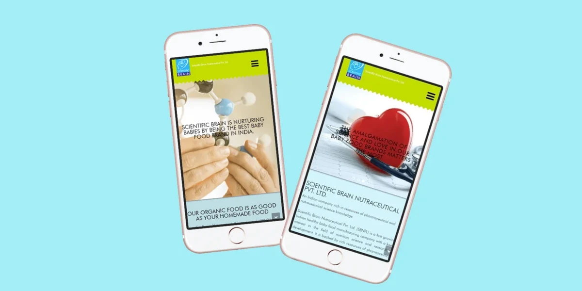
Design the phone version first: one column, the value line and main button on the first screen, big tap targets, and a call or WhatsApp button that stays within thumb reach. Then let the desktop version spread out.
Shrinking a desktop design is how homepages end up with tiny text and buried buttons. Starting on the phone forces the hard choices early.
What Changes on a Phone
- Order matters more in one column. Hero, proof and offers come before the story.
- Body text of around 16 pixels or more, and buttons big enough for a thumb.
- For local services, a sticky bottom bar with “Call” and “WhatsApp” sits right where the thumb rests.
- Cards stack, so their text must shrink. Three lines on desktop become six on a phone.
- No full-screen popups in the first second. Google has long advised against intrusive ones on mobile.
A Speed Budget for the Homepage
Google’s web.dev page speed guidance says the largest element on screen should load within 2.5 seconds for a good experience. On most homepages that’s the hero image, so the hero is where speed is won or lost.
- Export the hero as WebP or AVIF at the size it’s shown, not as a 6,000-pixel camera file.
- Use one or two font families and only the weights the design needs.
- Load chat widgets and social feeds after the main content, or drop them.
- Reserve space for images so the page doesn’t jump while loading. The same guidance scores that jumpiness and wants it at 0.1 or less.
Then test on a mid-range Android phone over mobile data, not the office Wi-Fi.
FAQs: Mobile-First Homepages
What does mobile-first homepage design mean?
Designing the phone layout first and then adapting it for bigger screens, instead of squeezing a desktop design down to fit.
Should the mobile homepage show less than the desktop one?
Usually the same content in a tighter order, with shorter text. Hiding whole sections on mobile annoys people who later open the site on a laptop and find things they never saw.
How fast should a homepage load on a phone?
Google’s web.dev guidance sets 2.5 seconds as the mark for the main content to appear. Faster is better, especially for visitors on patchy mobile data.
Does Brij Design Studio design homepages mobile-first?
Yes. Its website design page says most visitors browse on their phones, so a great website is designed mobile-first, with layouts, text sizes, buttons and images that adapt to every screen.
Which Homepage Layout Suits Your Type of Business?
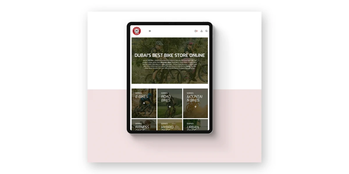
The sections stay much the same, but the order and main button change. A shop leads with products, a service firm with the problem it solves, a manufacturer with capability, a restaurant with food and timings, a clinic with trust and booking.
D2C Store
The visitor wants to see products and feel safe paying. Lead with bestsellers or one hero product, then categories, then reviews with customer photos. Delivery areas, returns and payment options should be easy to spot. A pin code checker near the top saves a lot of “do you deliver to…?” messages.
Service Firm
Architects, CA firms, interior designers. People are buying confidence in a team they haven’t met. Lead with what the firm solves and for whom, then three to five services, a few projects with one line on the result, then the people. A how-it-works strip earns its place here more than anywhere, because service buyers worry about a process they can’t see.
B2B Manufacturer
Often a purchase manager comparing three suppliers on a laptop, who may forward the link to the boss. Show the range, capacity, certifications and industries served, with real photos of the factory floor and testing lab. Make “Request a Quote” and a downloadable catalogue easy to find, and put the GSTIN and address where a careful buyer would look.
Restaurant or Café
Visitors want to know if it’s open, where it is, what’s on the menu and how to book or order. Put timings, location and a menu link at the top beside one big food photo. Make the menu a proper web page, with the PDF as an extra, so it opens fast and search engines can read it.
Clinic
A patient is often anxious and short of time. Lead with treatments in plain words, the doctor’s name and qualifications, timings and a “Book an Appointment” button. Keep reviews respectful and avoid before-and-after claims that promise too much. A short “What to expect on your first visit” section calms nerves better than any slogan.
FAQs: Homepages by Business Type
What should an ecommerce homepage include?
Bestsellers or a hero product, clear categories, reviews with photos, delivery and return details, payment options and a search bar that’s easy to find.
What should a B2B website homepage show?
The product range, capacity, certifications and industries served, real photos of the factory, and an easy way to request a quote or download a catalogue. Purchase teams want facts they can forward.
Should a restaurant homepage have its menu as a PDF?
A PDF is fine as an extra. The main menu works better as a web page, because it opens faster on phones and search engines can read it.
What kinds of websites has Brij Design Studio designed?
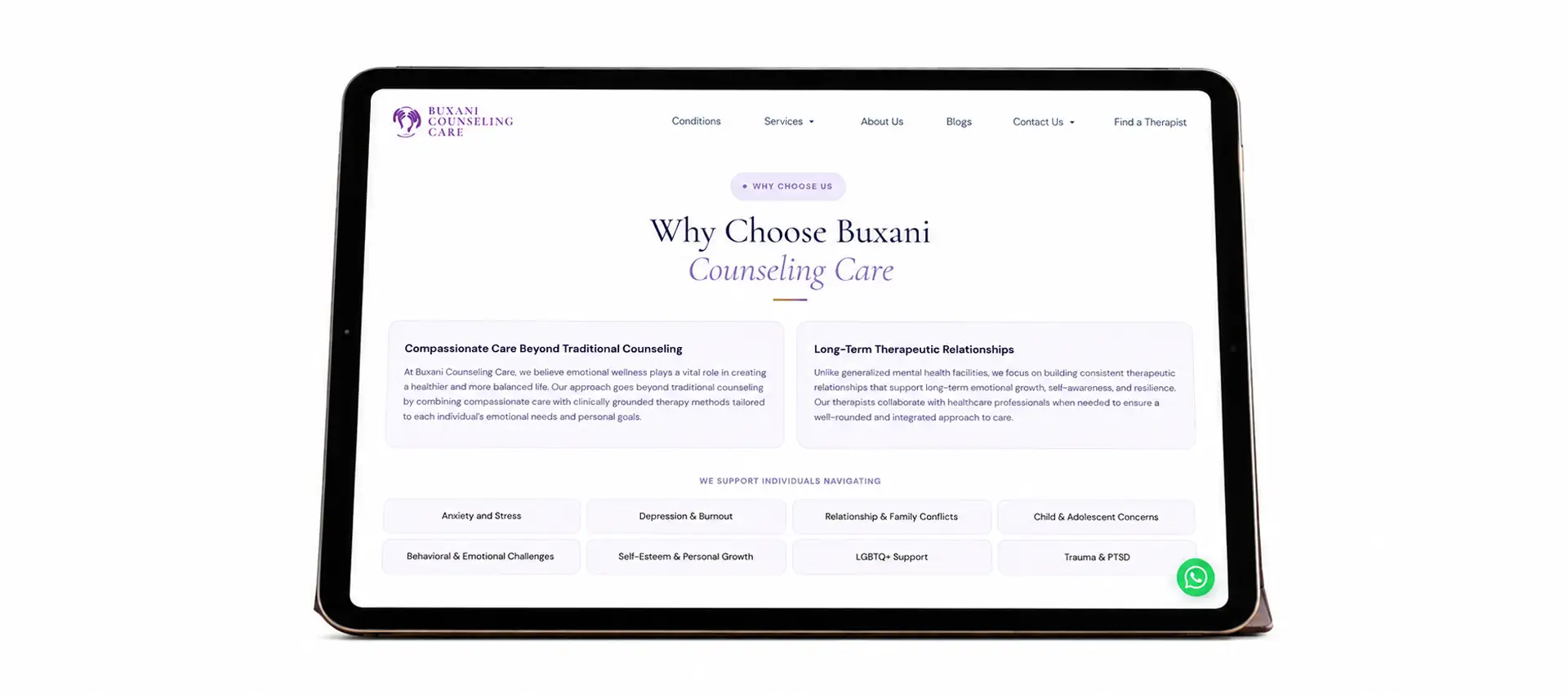
Its website design page shows online stores and product websites (fragrance, fashion, bicycles, Ayurveda, furniture and snacks), architecture and interior firms, a product catalogue for a planters brand, a counselling clinic and a facade construction company.
Indian Details That Make a Homepage Feel Trustworthy
Indian visitors look for a few local signals before they trust a homepage: a WhatsApp button, a phone number they can tap, familiar payment options, a real address and sometimes their own language. Leave these out and even a polished site feels foreign.
- WhatsApp links that carry context. The chat button on each product card can fill in that item’s name, so the team sees “Hi, I’d like to know about the two-seater teak sofa” instead of a bare “Hi”.
- Payment marks near the buy button and in the footer: UPI, cards, net banking, and cash on delivery if offered.
- A real address, a map link and the GSTIN in the footer. B2B buyers and older customers check for these.
- Phone numbers written with +91, set up so a tap starts the call.
- Language. A clinic in Nashik or a sweet shop in Madurai may do better with the headline, buttons and contact details in the local language too. A language switch belongs in the header.
- Festive banners that respect the layout. A Diwali offer can swap the hero photo, but it shouldn’t push the main button off the first screen.
None of this needs fancy design. It needs someone who remembers to do it.
FAQs: Indian Trust Details
Should an Indian website have a WhatsApp button on the homepage?
For most consumer and local businesses, yes, as long as someone actually replies. A chat left unanswered does more harm than having no button.
Where should payment logos go on a homepage?
Near the buy or checkout buttons, and again in the footer where shoppers often look for them.
Does a homepage need to be in Hindi or a regional language?
Not always. It depends on who the customers are. Translating the headline, buttons and contact details is often a sensible first step, and a full second version can follow if people use it.
How does Brij Design Studio make buttons like WhatsApp or “Book a Call” work harder?
Its website design page says well-placed, clearly worded buttons remove confusion and turn visitors into enquiries, so the position and wording of each button is planned along with the layout.
Steps to Plan and Design a Homepage
Plan a homepage in this order: settle the one main action, list the visitor’s questions, write the words, sketch the phone layout, then design, build and test with real people. Visual design comes surprisingly late.
1Pick the One Main Action
Book, buy, call, chat or request a quote. Pick one. Every section points to it somehow.
2Collect Real Questions
Read a month of WhatsApp chats, call notes and Google reviews. Note every question customers ask before buying.
3Line Up the Sections
Each section answers the next question in the queue. That list is the outline.
4Write the Words First
Value line, section titles, button text, a few lines per card. Designs built on dummy text rarely fit the real words.
5Sketch at Phone Width
About 360 pixels wide, on paper or as a wireframe. Widen it for desktop later.
6Design With Real Photos
Shoot the team, the space and the product in use. Honest phone photos still beat glossy stock.
7Build, Test and Watch
Compress images, connect analytics, run a five-second test, then watch the numbers for a month. The technical side is covered in the guide to website development.
At Brij Design Studio, the website design page describes the sitemap being planned carefully for easy navigation and every page guiding visitors toward one clear next step, such as booking a call. Step one above is that idea applied to a single page.
Questions to Ask Before Approving a Homepage Design
- Could a stranger say what the business does after five seconds?
- Is the main button visible on a phone without scrolling?
- Would the hero photo still make sense with the logo covered?
- Is any section there only because a competitor has one?
- Has anyone opened it on a cheap Android phone, outdoors?
- Who will update the offers and festive banners, and how often?
FAQs: Planning a Homepage
Should homepage content be written before or after the design?
Before, or at least a solid draft. A design built around real words fits better and gets approved faster.
What is a homepage wireframe?
A rough layout in grey boxes and placeholder lines that shows the order and size of the sections, without colours or photos. It’s much quicker to change than a finished design.
How long does it take to design a homepage?
It depends on how ready the words, photos and brand files are. Waiting for content is the most common reason homepages run late.
What does Brij Design Studio look at before it designs a homepage?
Its branding page says the studio starts by understanding the business: its objectives, market, audience, competition and long-term vision. A homepage has to speak to that same audience, so the same groundwork applies.
How to Test a Homepage: Five-Second Tests, Heatmaps and Analytics
Test a homepage three ways: a five-second test with strangers to check it’s clear, heatmaps to see where people tap and how far they scroll, and analytics to see whether visitors reach the main action. Each one catches things the others miss.
The Five-Second Test
Show the homepage on a phone to someone who doesn’t know the business. After five seconds, take the phone back and ask: what does this business do, who is it for, and what would you tap next? Try five people who could be customers, not colleagues. If two get it wrong, rewrite the hero. It costs a few cups of chai.
Heatmaps and Scroll Maps
Heatmap tools, several with free plans, show where visitors tap and how far they scroll. Look for taps on things that aren’t links, a main button nobody touches, and the point where most people stop. Anything important below that line needs to move up.
Numbers Worth Watching in Analytics
- Taps on the main action (call, WhatsApp, booking, add to cart), set up as events in Google Analytics.
- Where homepage visitors go next. If most head straight to Contact, the homepage isn’t answering enough.
- Engagement rate for new visitors on phones, apart from desktop.
- Brand-name searches in Search Console. The wider picture is in the guide to an SEO marketing strategy.
Change one thing at a time and give it a few weeks. Most small businesses don’t get enough traffic for a real A/B test, so comparing similar periods before and after is the honest option.
FAQs: Testing a Homepage
How do I know if my homepage is working?
Check whether visitors take the main action. If people land and leave without tapping call, chat, book or shop, the homepage isn’t doing its job, whatever the traffic looks like.
What is a good bounce rate for a homepage?
There’s no single right number, because it depends on the business and where visitors come from. In Google Analytics 4, engagement rate is the more useful figure to watch over time.
Can I A/B test a homepage with low traffic?
Not reliably. Make one change at a time and compare similar periods instead.
How does Brij Design Studio track how a homepage performs?
Its website design page says it integrates Google Analytics, which gives businesses insight into how visitors behave on their site.
Common Homepage Design Mistakes
Most homepage mistakes come from designing for the owner or the competitor instead of the visitor: vague headlines, too many buttons, hidden contact details, reviews that look fake and offers left up long after they’ve ended.
1Talking About the Company, Not the Customer
“Established in 1987, a trusted name in…” tells the visitor nothing they asked about. Start with what they get.
2Five Buttons Fighting in the Hero
Shop, Book, Download, Subscribe, Contact. When everything shouts, nothing gets heard.
3Approving It on a Big Monitor
Most visitors will never see that version. Review it on a phone at arm’s length, outdoors if possible.
4Reviews That Feel Made Up
“Excellent service! R.” with no photo and no detail reads as fake, even when it’s real. Fewer, fuller reviews win.
5A Popup Before the Page Has Loaded
A newsletter box in the first second, on a phone, sends people away before they’ve seen a single product.
6Festive Offers Left Up Too Long
A Diwali banner still running in March tells visitors nobody is looking after the site.
7Headlines Baked Into Images
Text inside a picture can’t be read by search engines or translated, and it gets cropped on some screens.
The fix for most of these is cheap: hand the phone to a stranger and watch.
FAQs: Homepage Mistakes
What is the biggest homepage design mistake?
A vague value line. If visitors can’t tell what the business does, nothing further down gets read.
Is it bad to have too many links on a homepage?
Too many choices slow people down. Keep the menu short and the hero focused on one action. Extra links can sit lower down or in the footer.
Should a homepage have a popup?
Not straight away, and never one that covers the whole phone screen. If an offer needs pushing, a slim bar or a popup after some scrolling is far less annoying.
How does Brij Design Studio keep homepages from getting cluttered?
Its website design page describes its UX-driven work as “every click planned, so visitors find what they need and act on it”, which leaves little room for sections or buttons that lead nowhere.
Where Is Homepage Design Heading?
Homepages are getting plainer in their words and richer in their proof. AI search tools now sum up businesses for people, so a homepage that says clearly what it offers, where and for whom is easier to describe correctly. Short video and small personal touches are growing too.
- Someone asks a chat assistant for “a physio in Thane who does home visits”. The answer comes from pages that say exactly that. A tagline about wellness doesn’t get picked up.
- Short vertical clips of a product in use or a kitchen at work, usually as a small section rather than the hero.
- Light personal touches, such as showing a returning shopper the category they browsed last time.
- Accessibility basics: readable contrast, alt text and menus that work with a keyboard. Older visitors notice most.
None of it replaces the basics. A clear value line and a WhatsApp button someone answers will beat a flashy homepage without them for a long while yet.
FAQs: The Future of Homepage Design
How often should a homepage be redesigned?
A full redesign every few years is normal. The content should change far more often: offers, reviews and photos every month or season.
Do AI search tools read a website’s homepage?
They draw on public web pages, and the homepage is usually the clearest place a business says what it does and where. Plain, factual lines give them less to get wrong.
Is dark mode worth adding to a homepage?
Nice to have, rarely urgent. If it’s added, check that the logo, photos and buttons still look right on a dark background.
How can Brij Design Studio help a homepage keep up after launch?
The studio also offers digital marketing, including SEO and content creation, so the homepage can stay in step with campaigns and search rather than being left alone after launch.
Why Choose Brij Design Studio for Website Design?
Brij Design Studio is a design studio in Mumbai that works across branding, packaging design, website design and digital marketing. Its websites are designed mobile-first, built on WordPress and connected to Google Analytics, with every page planned to lead visitors to one clear next step.
Because the same studio handles brand identity and packaging, a homepage can look and sound like the pack and the Instagram grid. Every project runs in-house at its studio in Vile Parle (East). The case studies show its wider work, and the contact page is the place to start.
Conclusion
A homepage has a small job and a hard one. In a few seconds it has to tell a stranger what the business does, prove it’s real and show where to tap. Every other section, from the proof strip to the footer, either helps with that or gets in the way.
Start with the words and the phone screen. Add the Indian details that build trust. Test it with people who’ve never heard of the business, then keep it fresh, because a homepage that was right last Diwali can be quietly wrong by spring.
If a stranger on a crowded train gets it in five seconds, it works.
Common FAQs About Website Homepage Design
What is website homepage design?
The planning and design of a website’s main page: its layout, sections, words, images and buttons, so visitors understand the business quickly and take the next step.
What is the difference between a homepage and a website?
The website is all the pages together. The homepage is the front door, usually the address with nothing after the domain name.
What makes a homepage design good?
Clarity first: a specific value line, one main action, real photos, some proof and quick loading on a phone. Looks matter, but they come second.
What colours work best on a homepage?
The brand’s own colours, with plenty of white or neutral space, and one strong colour kept for the main button so it’s easy to spot.
How many images should a homepage have?
Enough to show the real product, place or people: usually one strong hero image and one per offer card. Every extra image adds weight, so each one should earn its spot.
Does a homepage need a search bar?
An online store with lots of products, yes. A service firm with five pages can skip it.
Is a one-page website the same as a homepage?
Not quite. A one-page site puts everything on one long page, so the homepage is the whole site. It suits very small businesses, single products and events.
Can a homepage be designed from a template?
Yes, and as a start it can work well. The risk is looking like hundreds of other sites, so change the photos, the words and the section order to fit the business.
Can Brij Design Studio design a homepage along with the brand identity?
Yes. The studio works on branding, packaging, website design and digital marketing, so the identity and the homepage can be designed together and match from day one.
Is Brij Design Studio’s website work done in-house?
Yes. The studio says every project runs in-house at its studio in Vile Parle (East), Mumbai.
Last updated: October 2026