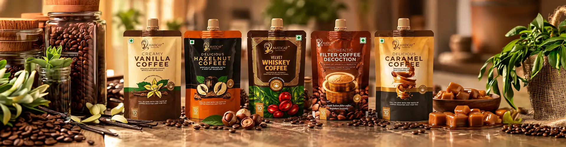
Madcaf CoffeePouch Packaging Design.
Coffee Packaging Design for Madcaf's Full Flavour Range
Vanilla · Hazelnut · Whiskey · Filter Coffee · CaramelScroll
Scope
Coffee packaging design across 5 SKUs · Individual illustration and photography routes per flavour · Colour-coded flavour system · Typography · Print-ready artwork · Shelf visualization
Project Overview
Madcaf Coffee Pouch Packaging Design
Client
Madcaf
Category
Food & Beverage | Coffee Decoction
Scope
The Design Challenge
The Design Challenge
Coffee Packaging Design for Madcaf's Full Flavour Range
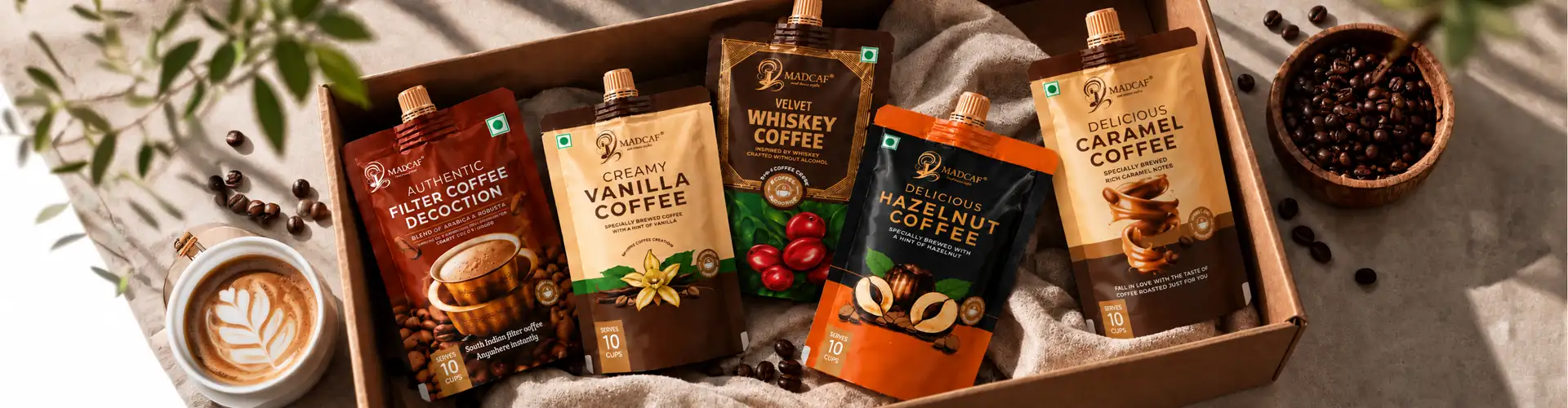
Coffee packaging design is the system of layout, illustration, typography, and colour built to help a customer recognise a coffee brand and pick the right flavour in seconds. This case study covers all five packs in Madcaf's coffee pouch range, Creamy Vanilla, Delicious Hazelnut, Velvet Whiskey, Authentic Filter Coffee Decoction, and Delicious Caramel, and breaks down the individual design route taken for each one, along with the shared system that ties the whole range together.

The System
One Coffee Packaging System, Five Individual Routes
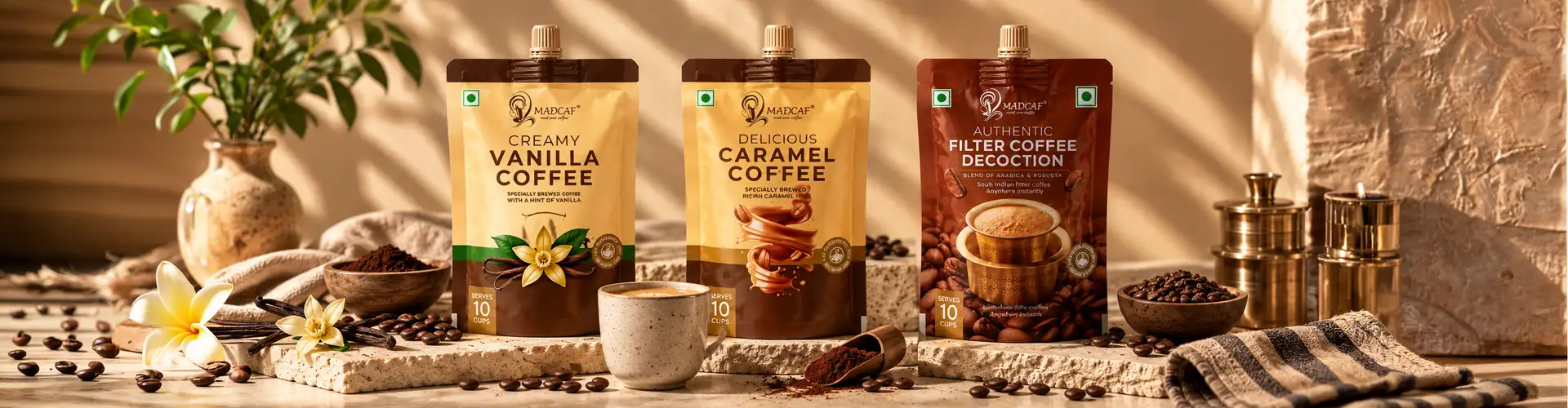
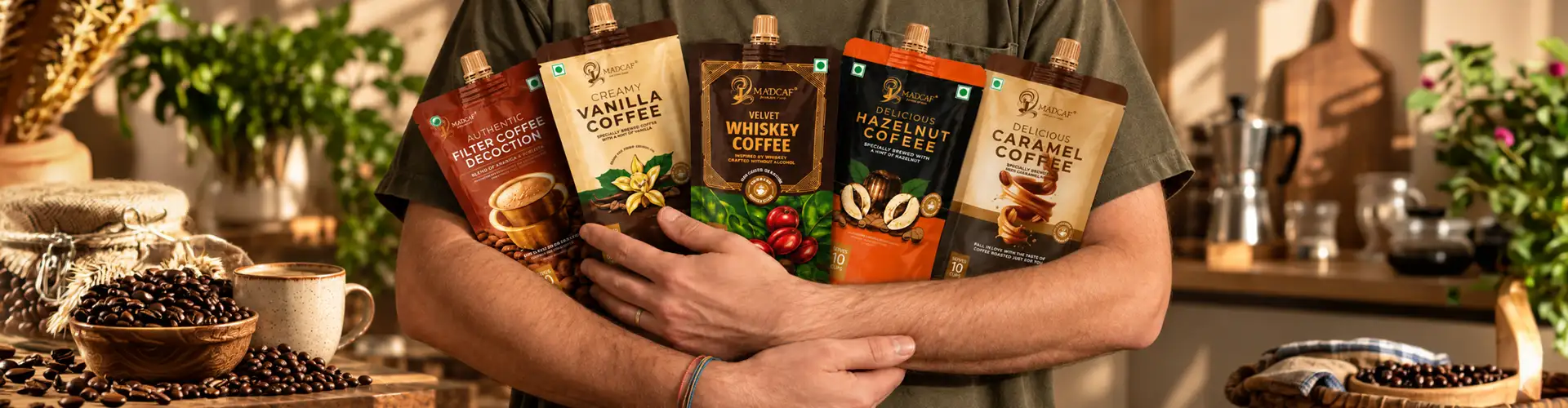
Most coffee packaging either forces every flavour into an identical template with just the colour swapped, or lets every pouch drift into its own unrelated look. Madcaf needed neither. Each pouch was designed as its own creative route, its own illustration style, its own colour mood, while a shared structure, logo placement, pouch shape, serving information, and layout grid, held the range together as one recognisable brand. The result is packaging design that feels custom per flavour but still reads instantly as Madcaf from across a shelf.

Our Approach
Our Approach to Coffee Packaging Design Concepts
Every flavour in a coffee range starts with the same question: what does this flavour feel like before anyone tastes it? We don't start with the logo or the layout grid; we start with the emotion the flavour is meant to trigger: comfort, indulgence, energy, ritual, craft, and let that emotion decide everything downstream: the colour palette, whether it's illustration or photography, the weight and style of the typography, even how much white space the pack gets. A comforting flavour gets softness. An energetic flavour gets contrast. An indulgent flavour gets richness. The flavour name doesn't decide the concept; it's decided by the feeling the flavour is supposed to sell.

Our Approach
We don't design what coffee looks like. We design what a flavour feels like, then let the pack prove it.
Two Tests
We don't design what coffee looks like. We design what a flavour feels like, then let the pack prove it.
Once that emotional direction is set, we test it against two things every pack has to survive: shelf speed (can it be recognised from three feet away in under two seconds) and range consistency (does it still feel like the same brand as everything next to it). A concept only earns its place on the pack if it can do both, look distinct enough to stand alone, and be disciplined enough to belong to the family.

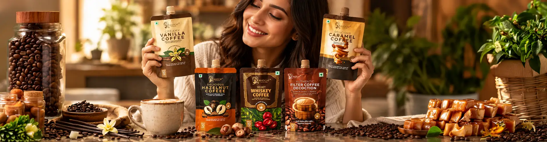
Individual packaging Design route for each variant
01
Creamy Vanilla
Packaging Design Route for Creamy Vanilla Coffee
Vanilla needed to feel warm and comforting rather than sharp or artificial, so the design route leaned into soft, creamy tones, a warm biscuit-cream background paired with a deep brown base panel. The centrepiece is a hand-illustrated vanilla pod and flower, rendered with visible detail rather than a flat icon, giving the pack a crafted, almost bakery-label warmth. Typography sits in a rounded, friendly serif to match the comfort-food feel of vanilla as a flavour, rather than the bolder, punchier type used elsewhere in the range. Every element here agrees with the others; the palette, the illustration, and the type all point toward the same feeling, making Vanilla the gentlest flavour on the shelf by design, not by accident.
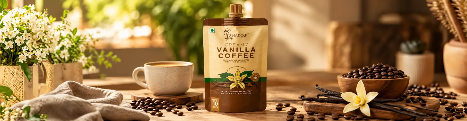 Comfort
02
Delicious Hazelnut
Packaging Design Route for Delicious Hazelnut Coffee
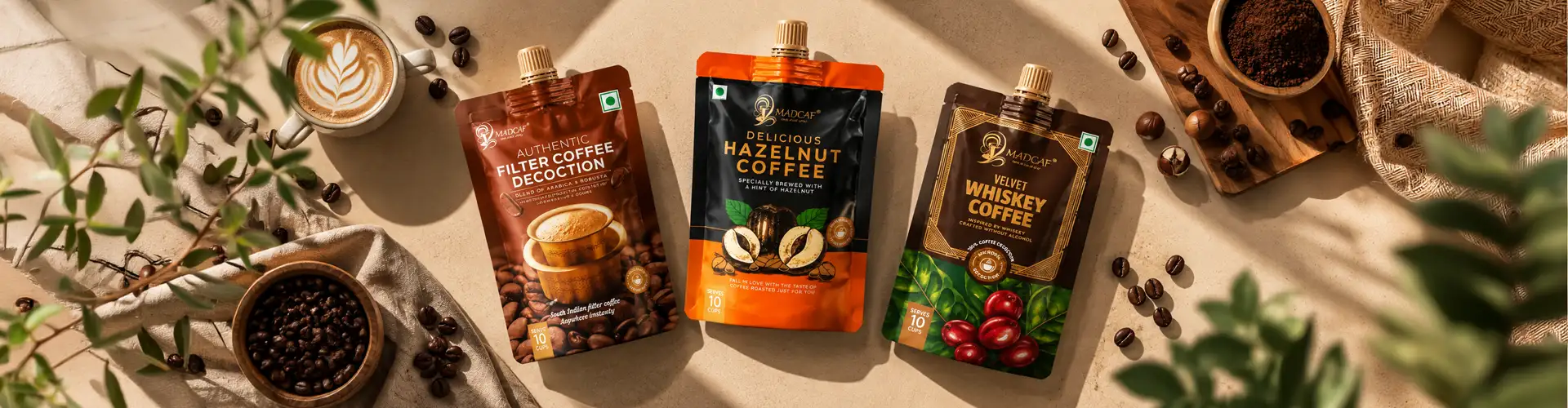
Hazelnut took the opposite route, energetic rather than gentle. The pack uses a burnt-orange and black colour block, one of the highest-contrast combinations in the range, specifically to make hazelnut the flavour that catches the eye first from a distance. The illustration shows cracked hazelnut shells with visible texture, communicating a roasted, nutty character immediately rather than relying on the word "hazelnut" alone to do the work. This design route treats colour as the primary differentiator and illustration as supporting proof, a common and effective pattern in flavoured coffee packaging where buyers scan fast and read second.
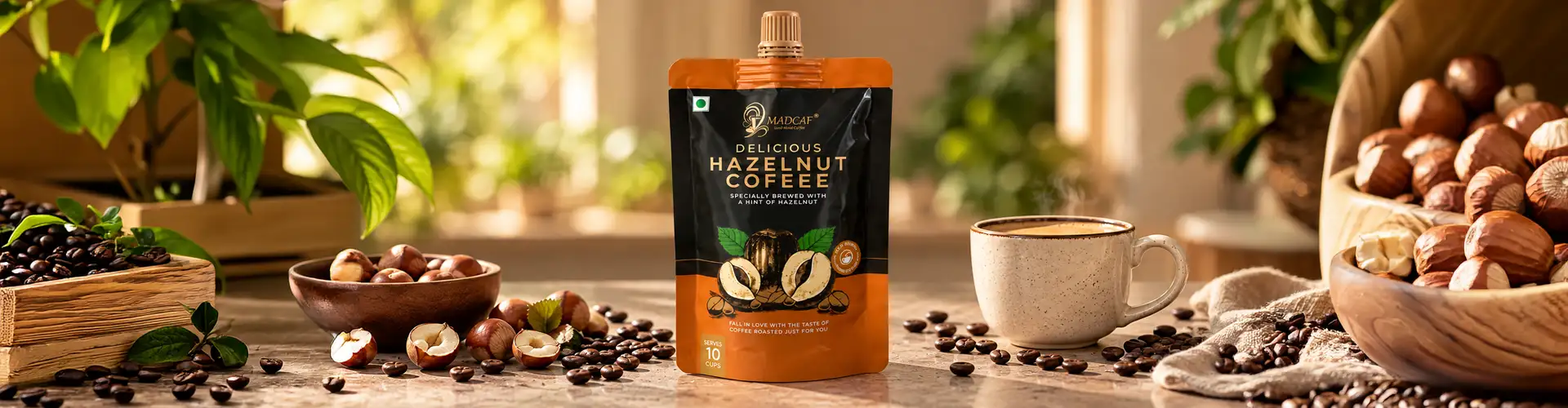 Energy

03
Velvet Whiskey
Packaging Design Route for Velvet Whiskey Coffee
Whiskey-inspired coffee needed to signal indulgence and sophistication without implying actual alcohol content, since the product is alcohol-free. The design route uses a deep forest-green and gold combination, colours borrowed from premium spirits packaging, paired with an ornate gold frame around the product name to suggest craft and depth. Whole coffee cherries appear at the base of the pack, grounding the "whiskey" concept back in real coffee origin rather than letting the metaphor float free of the product. Typography is set in a refined serif with generous spacing, the most formal lettering treatment in the range, reinforcing the premium positioning. The pack borrows visual cues from an adjacent category to build a flavour story, while the coffee cherries keep the base product credibly coffee-first, narrative and honesty working side by side.
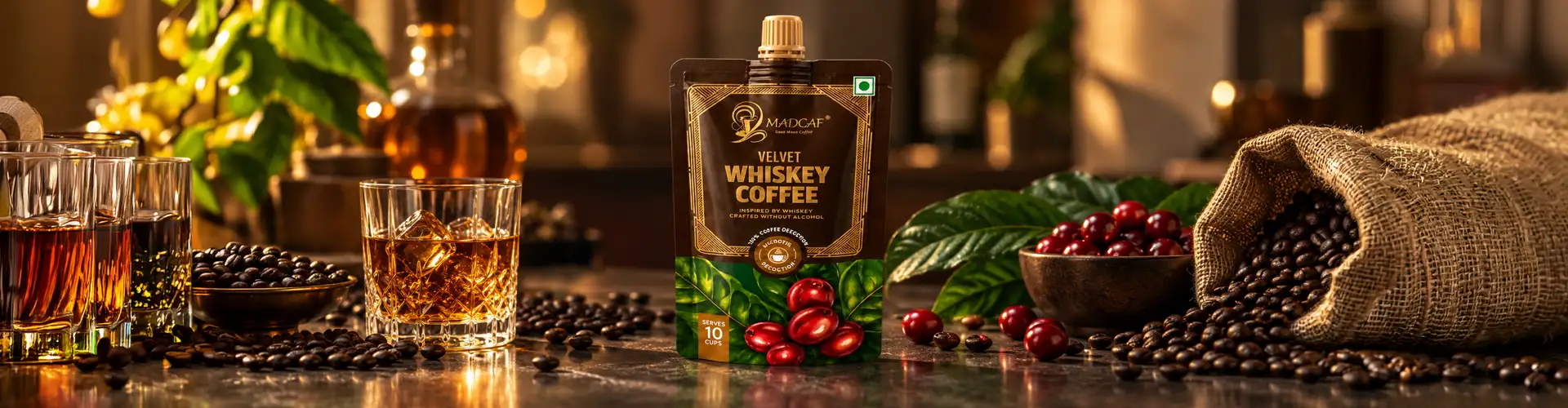 Indulgence
04
Authentic Filter Coffee Decoction
Packaging Design Route for Authentic Filter Coffee Decoction
This pack carries the heaviest job in the range: introducing an unfamiliar format, ready-to-mix South Indian filter coffee decoction, to buyers who may have never bought coffee in this form before. The design route uses real photography instead of illustration, a filter coffee tumbler and davara shot mid-pour, specifically to show the product in use rather than describe it. Deep brown tones and a straightforward "Authentic Filter Coffee Decoction" name, set larger than the flavour names elsewhere in the range, prioritise clarity and format-education over flavour-forward branding. This is packaging design solving a trust problem first and a shelf-appeal problem second, since a buyer needs to understand what the product is before flavour messaging even matters.
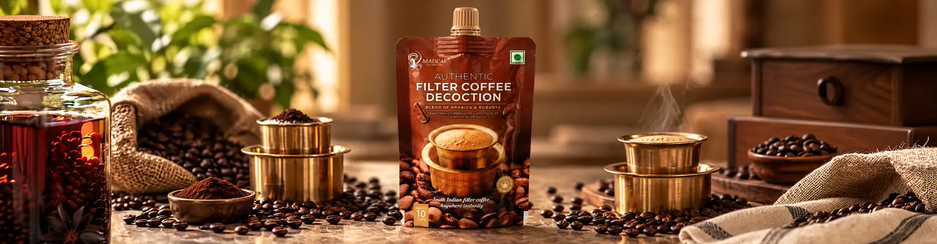 Ritual
05
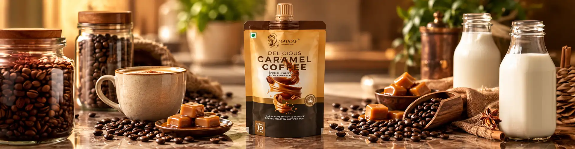
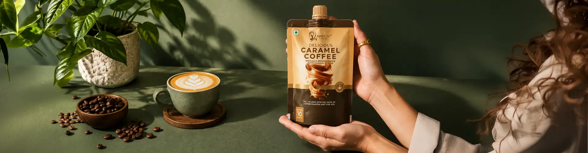
Delicious Caramel
Packaging Design Route for Delicious Caramel Coffee
Caramel needed to feel indulgent and immediate, so the design route uses a rich caramel-swirl photograph, the only pack in the range where the "topping" itself is the hero image rather than a raw ingredient like a bean or a pod. Black and warm tan panels frame the photography, letting the glossy caramel swirl read as an almost dessert-like visual against a coffee product. This route leans on food photography realism rather than illustration, betting that a close-up of caramel itself sells the flavour faster than any illustrated symbol could.
 Richness
The Shared System
What Ties the Coffee Pouch Packaging Design Range Together
01Fixed structure
Across all five packs, three structural decisions stayed fixed regardless of individual design route: logo placement and lockup, the pouch's serve size and format callouts ("Serves 10 Cups"), and the overall pouch silhouette and spout position.
02Instant recognition
This consistency means a customer who knows Madcaf from one flavour can instantly recognise the brand on any other pack in the range, even when the colour, illustration style, and typography shift completely from pouch to pouch.
03The principle
This balance- individual creative freedom per flavour, fixed brand architecture across the range- is the core principle behind coffee product packaging design for any multi-SKU beverage brand.

The Result
A coffee pouch packaging design range where every flavour earns its own identity, illustration, colour, and mood built specifically around what that flavour feels like, while still standing together as one unmistakably Madcaf range on shelf. From the comfort of Vanilla to the indulgence of Whiskey to the trust-building clarity of the Filter Coffee Decoction, each pack solves its own problem without breaking the system holding the range together.

What we designed
01
Coffee Pouch packaging design (5-flavour range)
02
Flavour-specific concept development
03
Illustration and photography direction per SKU
04
Typography & layout system
05
Colour-coded flavour identity
06
Print-ready artwork
07
Shelf visualization


Questions & Answers
FAQs
Coffee packaging design is the visual and structural system, layout, typography, illustration or photography, and colour, built for coffee packs so a customer can identify the brand and flavour instantly on shelf.
Neither extreme works well. Strong coffee pouch packaging design usually gives each flavour its own colour and visual treatment for fast differentiation, while keeping brand elements like logo placement and pouch structure fixed across the range for recognition.
Illustration works well for ingredient-led flavours like vanilla or hazelnut, where a hand-drawn ingredient builds warmth and craft. Photography works better when the product itself needs to be shown in use, like a filter coffee decoction, or when a topping like caramel is the flavour's main visual appeal.
For new formats like ready-to-mix decoctions, packaging design leans on real photography of the product in use and clearer, larger naming, prioritising customer understanding over flavour-forward branding until the format itself is familiar.
Consistency comes from fixed structural elements, logo placement, pouch shape, serving information, and layout grid, staying the same across every SKU, even while colour and illustration style change from flavour to flavour.
Stand-up spouted pouches are common for liquid coffee concentrates and decoctions, since they allow controlled pouring, resealing, and enough print surface to carry both flavour branding and usage instructions.
More Work
Our work that will interest you


Journal
Blogs you may like