

VakoozHealthy Snacking Brand Packaging Design
Building a Vibrant Brand Identity for a New Generation of Healthy Snacks
Healthy Snacking Brand
VAKOOZ
Building a Vibrant Brand Identity for a New Generation of Healthy Snacks
Project Overview
Vakooz Healthy Snacking Brand Packaging Design
Building a Vibrant Brand Identity for a New Generation of Healthy Snacks
Client
Vakooz
Category
FMCG | Healthy Snacking
Project
Brand Development & Packaging Design for Snack Brand
Scope
The Brief
Creating a Brand for the Healthy Snacking Category
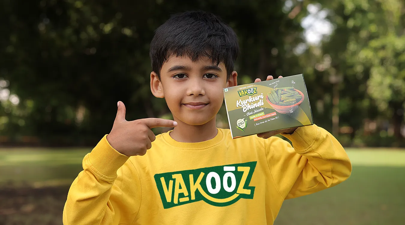
Vakooz wanted to build a distinctive identity for its range of healthy snacks and establish a stronger visual presence in the competitive snack category.
The challenge was to communicate the healthier side of the product without making the brand feel clinical, restrictive or overly serious. Healthy snacking is often communicated through predictable visual cues, greens, minimal layouts and ingredient-focused imagery.
For Vakooz, we wanted to take a different route.
The brief was to create a brand and packaging system that could communicate health, taste, energy and a sense of enjoyment at the same time.
The Design Challenge
How Do You Make Healthy Snacking Look Exciting?
A healthy snack still has to look like something people want to eat.
For Vakooz, the packaging needed to communicate its healthier positioning while retaining the appetite appeal expected from a snack brand. It also had to create enough visual impact to compete with other products on a busy shelf.
We therefore looked beyond conventional wellness packaging and explored a more expressive visual language one that could combine natural cues with colour, illustration and typography to make the brand feel energetic and contemporary.
From Healthy to Appealing
Making Wellness Feel More Enjoyable
The visual direction for Vakooz was built around the idea that healthier choices do not have to feel boring.
Instead of relying only on conventional health cues, we introduced vibrant colours, organic patterns, expressive typography and illustrated elements to give the brand a more energetic personality.
This helped shift the communication from simply saying "this is a healthy snack" to creating a brand that looked enjoyable, approachable and relevant to modern snacking habits.
01
Vibrant colours
02
Organic patterns
03
Expressive typography
04
Illustrated elements
Developing the Vakooz Visual Language
Colour Became a Key Part of the Brand
Colour played an important role in creating the personality of Vakooz.
We developed a vibrant colour direction that could make the packaging immediately recognisable while giving the different products enough flexibility to establish their own visual identities.
The colours were not treated simply as decoration. They helped create hierarchy, differentiation and shelf presence while contributing to the energetic character of the overall brand.
04 · One Brand, Many Colours
Hierarchy, differentiation and shelf presence.
 Flavour 01
 Flavour 02
 Flavour 03
 Flavour 0401020304
 05
Illustration & Organic Patterns
Bringing a Handcrafted Feel Into a Modern Snack Brand
Illustration became another important part of the Vakooz identity.
We explored organic patterns and illustrated elements that could communicate the natural and handcrafted character associated with the products. This gave the packaging more personality than a purely photographic or text-led approach.
The illustrations also helped create a visual connection between the different products, allowing the range to feel like one brand while retaining its own individual character.
 Organic patternsTypography
Typography
Giving the Brand Its Own Voice
Typography was developed as an important part of the brand personality.
Rather than using a purely functional type treatment, we explored handcrafted and expressive font styles that could make Vakooz feel more distinctive and approachable.
The typography needed to remain clear on pack while contributing to the energetic, contemporary character of the brand.
Together with the colours and illustrations, it created a visual language that could be carried consistently across the packaging range.
Healthy Snack Packaging Design
Designing Packaging That Works on the Shelf
The packaging needed to communicate quickly.
A shopper should be able to recognise the Vakooz brand, understand the product and get a sense of its positioning within a few seconds.
We therefore created a clear visual hierarchy between the brand, product information and supporting visual elements. Colour, typography and illustration were balanced so that the packaging could feel expressive without becoming difficult to navigate.
The result was a healthy snack packaging design that aimed to combine shelf visibility with the approachable personality of the Vakooz brand.
Packaging of Snack Foods
Creating a System Across the Range
Snack brands often need to work across multiple products, formats and flavours.
For Vakooz, we developed the visual language with this scalability in mind. The core brand elements remained consistent while colour, product information and supporting graphics could adapt across different products.
This created a packaging system rather than a collection of unrelated individual packs.
The objective was to make every product recognisable as Vakooz while allowing the complete range to create a stronger presence when displayed together.
Product Story
Communicating the Idea Behind Vakooz
The packaging was developed around a simple product story making healthier snacking feel enjoyable and accessible.
Instead of making the communication overly technical, we wanted the brand to feel positive and inviting. The visual language therefore combined natural references with bright colours and expressive graphics.
This helped create a balance between the product's wellness positioning and the pleasure associated with eating snacks.
Brand & Packaging Working Together
Building More Than a Food Packet
For Vakooz, packaging was not developed as an isolated deliverable.
The brand colours, typography, illustrations and overall visual direction were considered together so that the identity could extend beyond the individual pack.
This approach helped establish a consistent foundation for future brand communication, allowing the same visual language to be used across packaging, marketing material and other brand touchpoints.
10 · Packaging Visualization
Seeing the Brand Before It Reached the Shelf
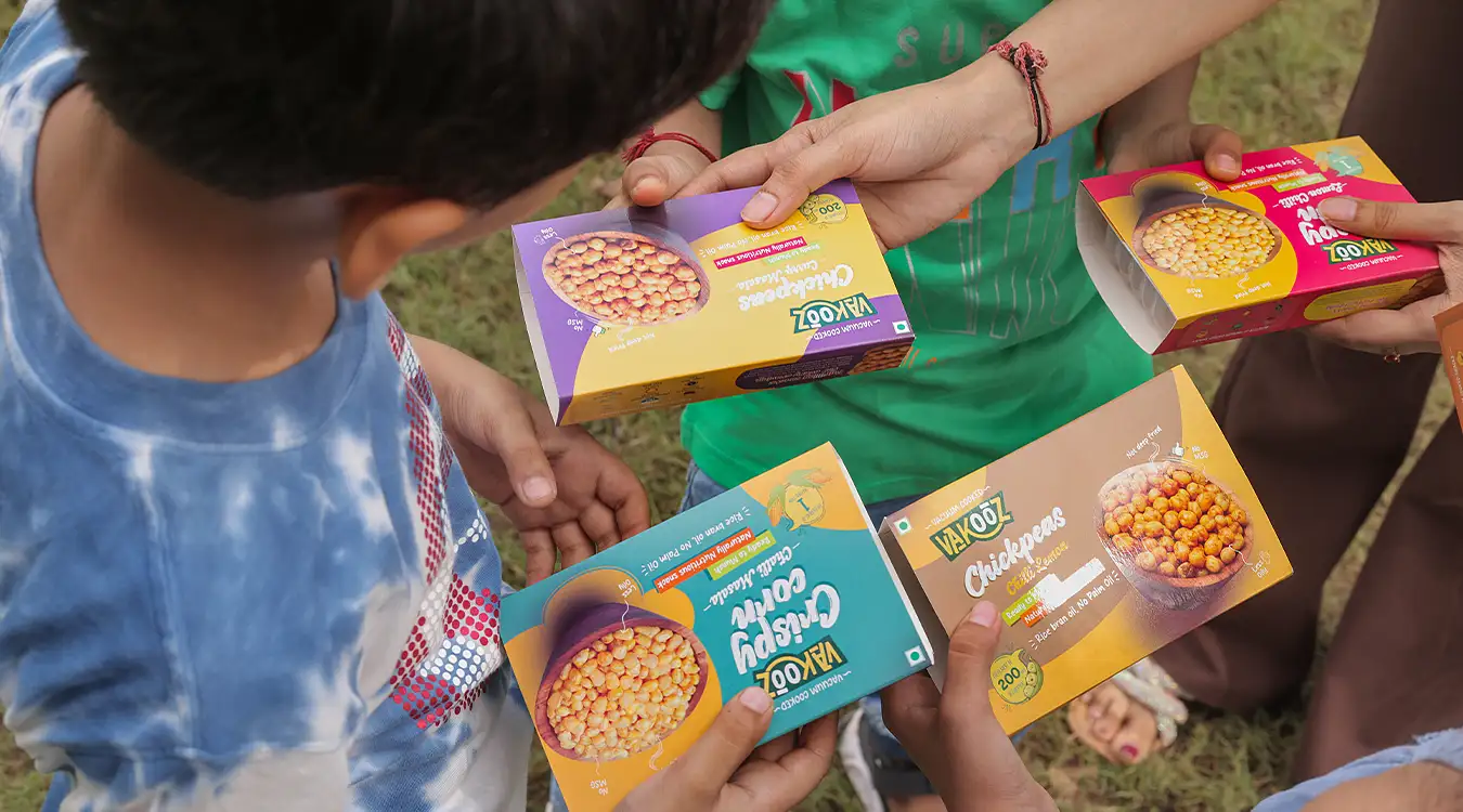
Packaging visualization allowed us to evaluate how the identity translated from design artwork into a physical product.
We explored the packs as they would appear in a real retail environment, looking at colour relationships, hierarchy, proportions and overall shelf impact.
This helped us refine the design before final production and ensure that the visual system worked as a complete range rather than only as individual artwork.
Creating Shelf Presence
Making Vakooz Recognisable at a Glance
In a crowded snack category, packaging has very little time to attract attention.
Our design approach therefore focused on creating a strong visual signature through the combination of colour, typography, illustration and layout.
The aim was not simply to make the packaging colourful. Every element needed to contribute to recognition and communicate the personality of the brand quickly.
This gave Vakooz a distinctive visual presence within the healthy snacking category.
What We Designed
The Vakooz Healthy Snacking Brand & Packaging project included:
01Brand visual direction
02Brand colour system
03Packaging design
04Healthy snack packaging design
05Snack food packaging
06Illustration
07Organic pattern development
08Typography direction
09Product story
10Packaging layout
11Product communication
12Packaging visualization
13Range consistency
The Final Packaging
A More Vibrant Take on Healthy Snacking
The final Vakooz packaging combines vibrant colour, expressive typography, organic patterns and illustration to create a distinctive identity for the healthy snacking brand.
The design moves away from predictable wellness packaging and gives healthy snacks a more energetic and enjoyable personality.
By bringing the brand identity and packaging system together, we created a visual foundation that could work across the Vakooz range while giving the brand the recognition and shelf presence needed in a competitive snack category.
Project Summary
Vakooz approached Brij Design Studio to develop a stronger visual identity for its healthy snacking range.
The challenge was to communicate wellness without sacrificing appetite appeal or making the brand feel overly clinical. We therefore developed a vibrant visual language using colour, illustration, organic patterns and expressive typography.
The resulting Vakooz healthy snacking brand packaging design gives the range a distinctive identity while creating a flexible system that can work across multiple snack products.
The project demonstrates how branding and packaging can work together to make a product's positioning clear while giving it a stronger and more recognisable presence in the market.
More Work
Our work that will interest you


Questions & Answers
FAQs
The key challenge was to communicate the healthy positioning of Vakooz while keeping the brand visually appealing and exciting as a snack product. We wanted the packaging to communicate wellness without relying on a conventional or overly clinical health-food aesthetic.
We developed a visual system combining vibrant colours, expressive typography, illustration and organic patterns. These elements were designed to work together across the range and create a recognisable identity for Vakooz.
Packaging can quickly communicate what a product stands for while influencing how it is perceived on shelf. For a healthy snack, the challenge is often to communicate the healthier positioning while still creating appetite appeal and a sense of enjoyment.
Snack pouch packaging needs to balance shelf visibility, product communication, brand recognition and practical layout. For Vakooz, we considered colour, typography, illustration and product information together to create packaging that could communicate the brand quickly while maintaining a consistent visual identity across the healthy snack range.
A healthy snack pouch can stand out through a distinctive combination of colour, typography, illustration and clear visual hierarchy. For Vakooz, BDS moved away from a conventional clinical health-food appearance and developed a more vibrant and approachable direction, helping the packaging communicate healthier snacking while retaining the visual appeal expected from a modern snack brand.
Attractive healthy snack packaging usually combines clear communication with a distinctive visual identity. Colour, typography, food imagery, illustrations and packaging structure can all influence how a product is perceived. The design should make the product look appealing while communicating its healthier positioning without making the packaging feel overly clinical or restrictive.
Common snack food packaging formats include pouches, stand-up pouches, sachets, boxes, jars, tubs and flexible packaging. The right format depends on the product, quantity, shelf life, distribution requirements and intended customer experience. For many snacks, flexible pouch packaging is popular because it offers practical product protection while providing a large surface area for branding and product communication.
Snack food packaging generally needs to communicate important product information such as the product name, ingredients, nutritional information, net quantity, manufacturing details, storage instructions and other applicable declarations. The exact requirements depend on the product and the regulations applicable to its market.
Packaging consistency helps customers recognise a brand across different products and flavours. Using common elements such as logo placement, typography, colour systems and layout creates a visual connection across the range while allowing individual products to have their own distinguishing characteristics.
Work With Brij Design Studio
Healthy can look exciting. Let's prove it on your shelf.
Brij Design Studio brings branding and packaging together to make a product's positioning clear and give it a stronger, more recognisable presence in the market.
Start Your Packaging Design Project →