
Case Study · Packaging Design
PlanetCar Air Freshener Perfume Box Packaging Design
A Cosmic Packaging Concept That Turns Car Fragrance Into a Premium Experience
Project Overview
Planet Car Air Freshener Perfume Box Packaging Design
A Cosmic Packaging Concept That Turns Car Fragrance Into a Premium Experience
Client
Bergammon
Category
Car Air Freshener & Fragrance
Project
Car Air Freshener Perfume Packaging
Scope
The Brief
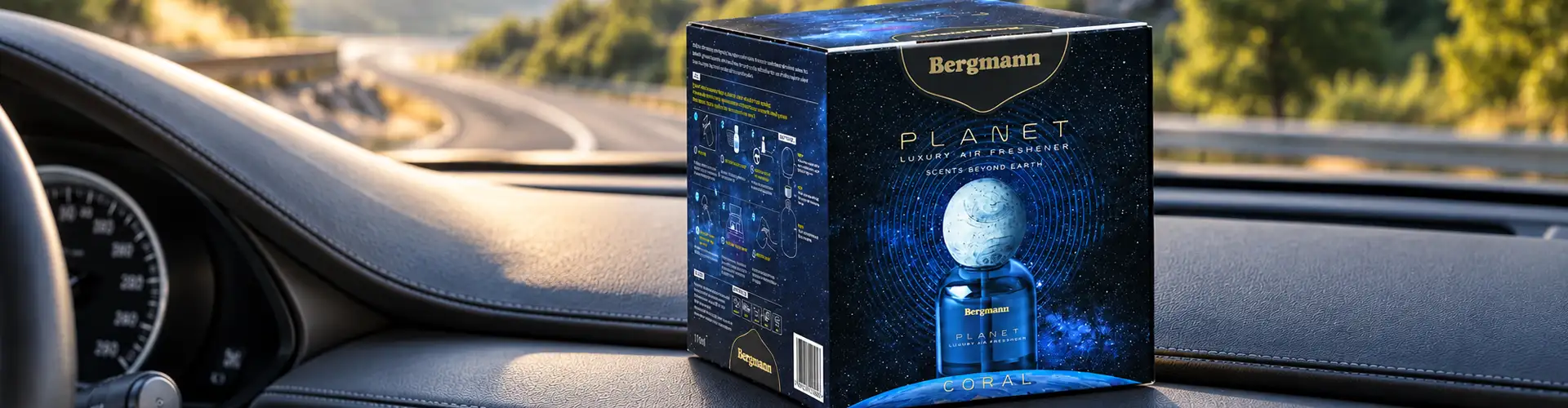
Bergammon came to us with a car air freshener range that needed a distinctive identity — one that could compete as a premium fragrance product rather than a conventional car accessory. The name itself, Planet, suggested the direction: we built the concept around orbits, cosmic movement, and exploration, landing on the positioning line "Scents Beyond Earth" as the creative foundation for the whole range.
 Scents Beyond Earth
The Concept
From Name to Universe: The Concept
Instead of simply placing "Planet" on a box, we asked what the fragrance experience would look like if it were imagined as something beyond the ordinary. "Scents Beyond Earth" gave us the creative territory to explore fragrance through the language of space, movement, orbit, and discovery, letting the packaging tell a story before the customer ever experiences the scent.
That concept had to work within a genuinely compact format. Car air freshener boxes leave little surface area to establish a brand, a fragrance, and a visual universe all at once, so hierarchy mattered as much as the concept itself. The front panel leads with brand and fragrance identity; the remaining panels carry supporting product information in the same clean, structured system.
The Aspiration Route
Car Air Freshener Packaging Design: The Aspiration Route
Car air freshener perfume box packaging design should feel like a lifestyle object, not a utility item- something a buyer displays with intent, not tucks away. Aspiration should come through premium cues that outsize the category: metallic finish, considered typography, and a concept borrowed from something bigger than the car itself, like space, travel, or luxury fragrance codes. The goal is to make the buyer feel they're choosing a personal indulgence, not restocking a consumable, elevating a small, routine purchase into a considered one
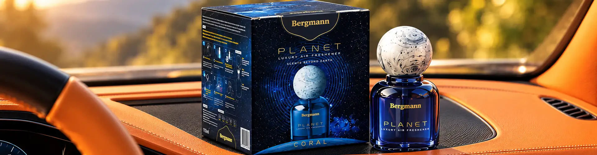 A lifestyle object
4 Fragrances, One Planet
Creating Variation Within a Unified Perfume Box Design
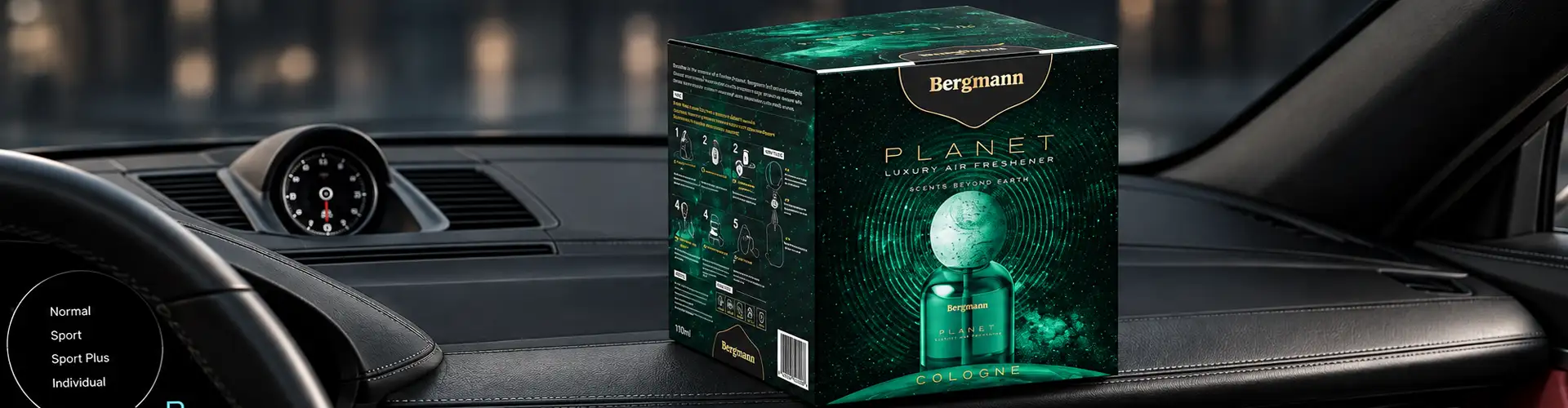
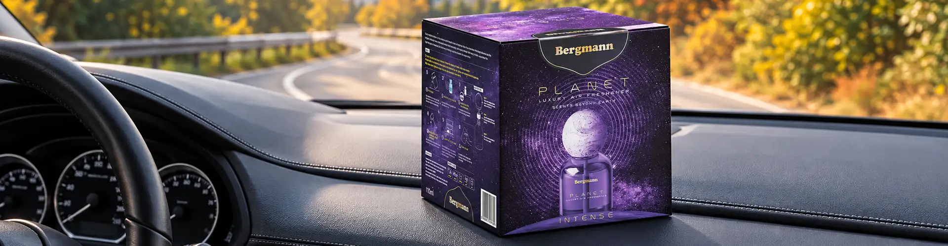
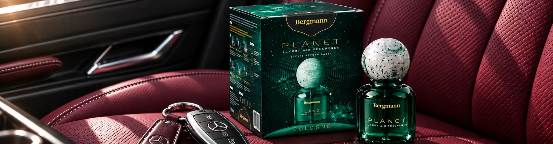
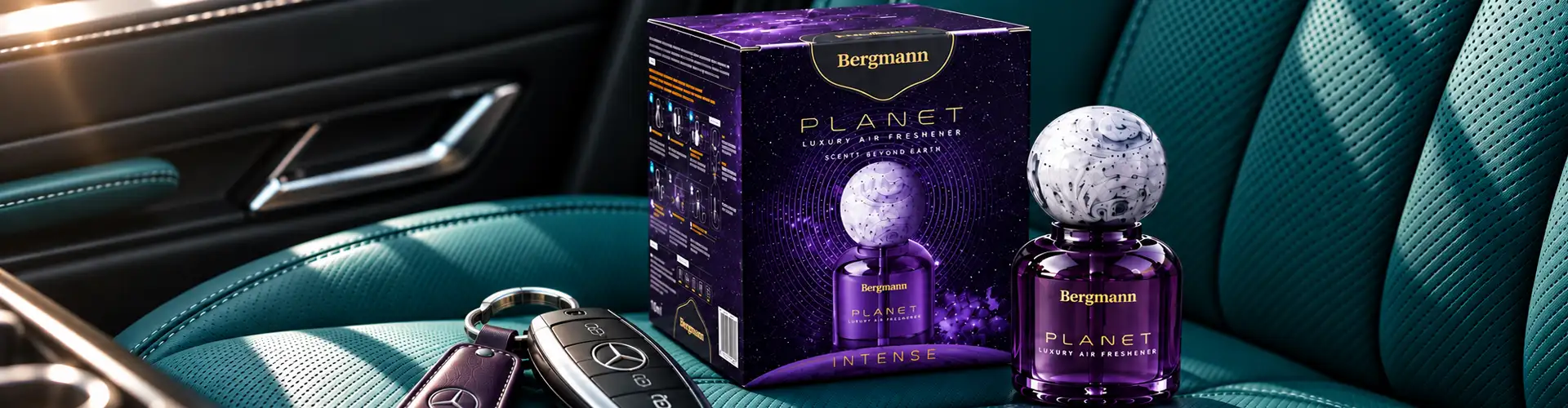
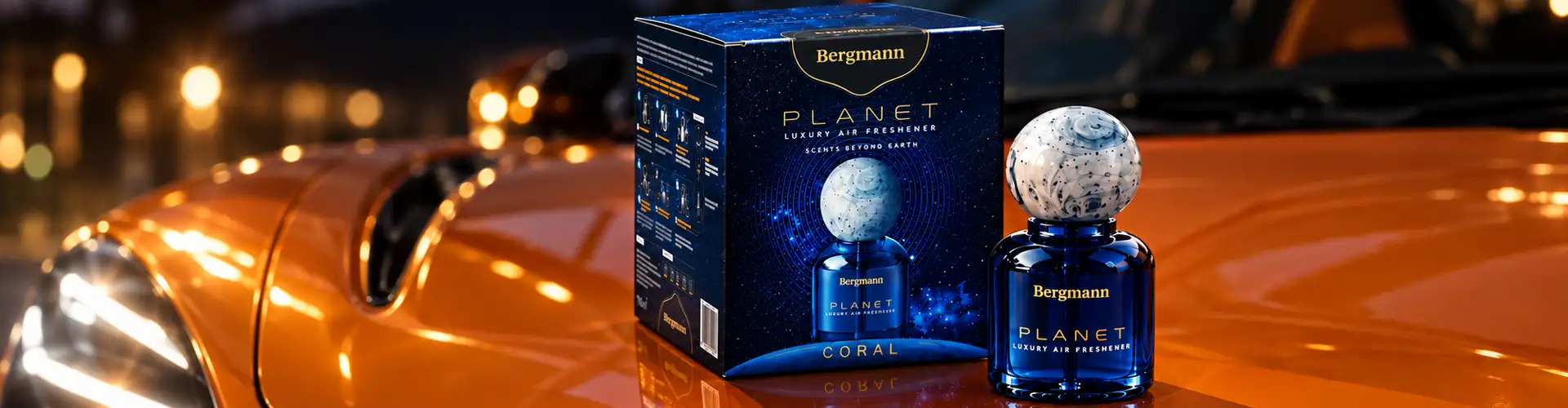
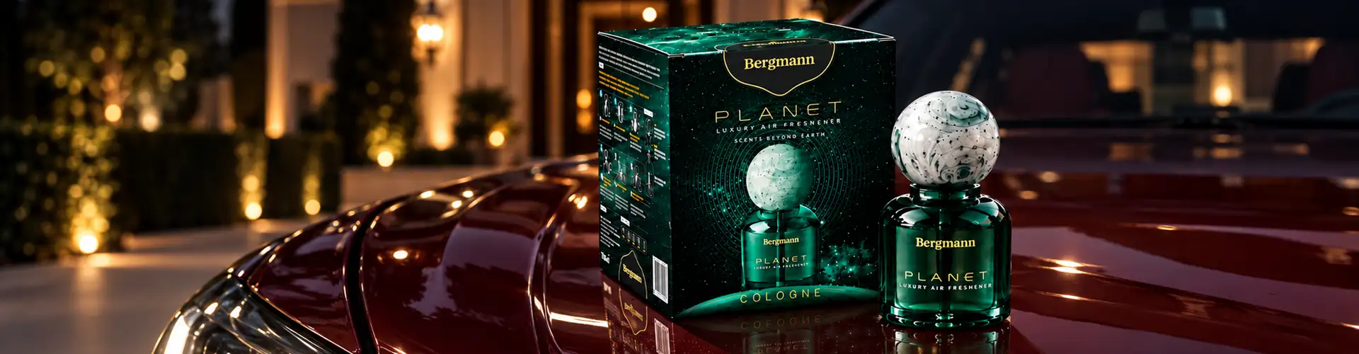
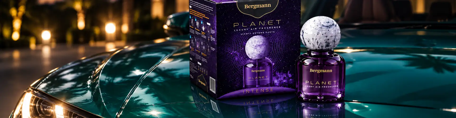
Planet was developed across 4 distinct perfume fragrances. Rather than creating 4 unrelated designs, we established a common cosmic visual language and then adapted it for each fragrance. The variants could therefore have their own colour and visual character while remaining immediately recognisable as part of the Planet range. This created consistency across the collection of car perfume boxes without making every fragrance look identical.
 4 Fragrances, One Planet
Bespoke Typography
Bespoke Typography, Built to Move Like an Orbit
The Planet wordmark was designed specifically for this project, with fluid, orbit-like curves and subtle gradients that echo the movement of celestial bodies. Rather than functioning as a standard logo, the typography became a visual expression of the brand concept itself, distinctive enough to lead the front of the packaging on its own, while tying directly into the cosmic system built around it.
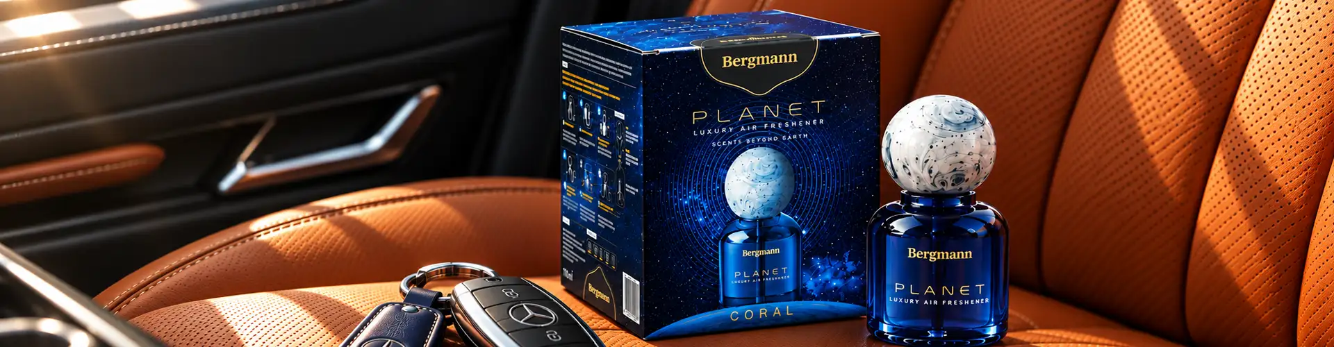
Cosmic Visual System
A Cosmic Visual System, Built for Variation
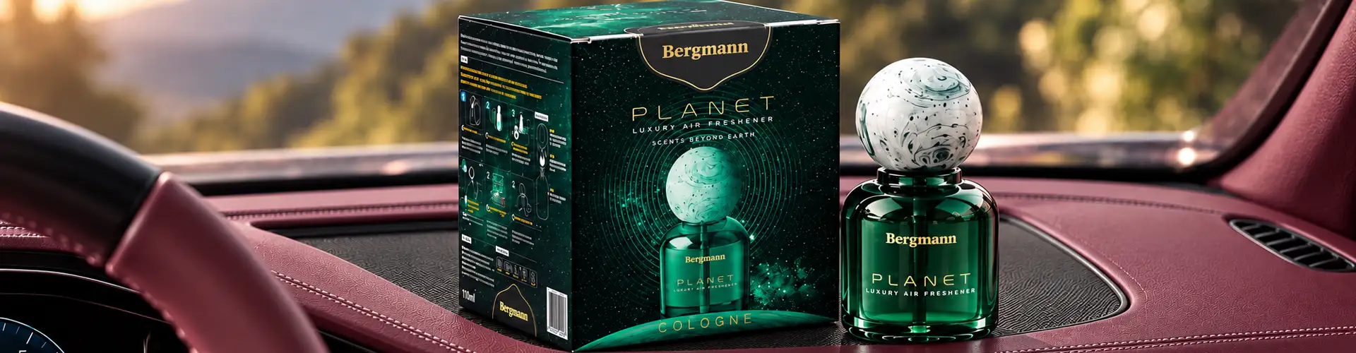
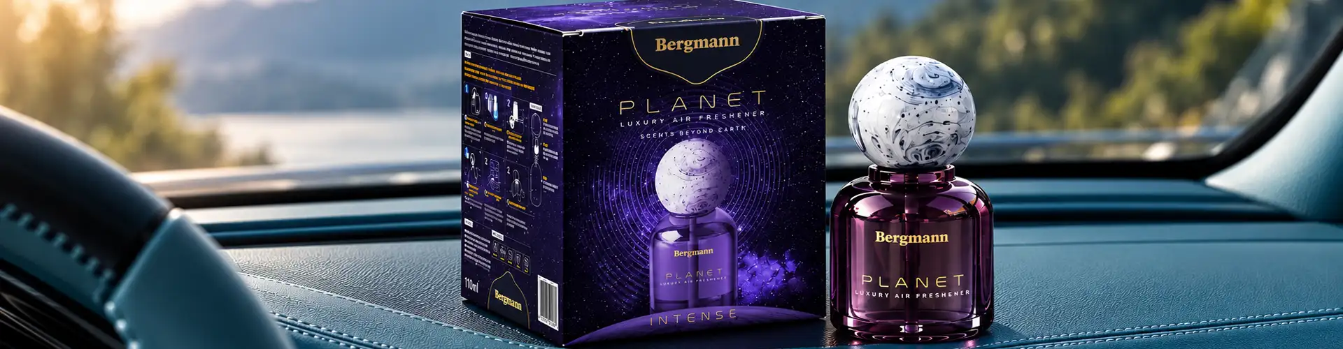
The visual language rests on three elements working together: metallic golds and silvers for premium refinement, deep cosmic blues and purples for celestial depth, and luminous gradients suggesting planetary light and atmosphere.
Every Side of the Box
Rather than treating the box as a single front panel, the design extends planetary rings and star-trail graphics across every side, so the concept continues as the box is turned and handled, not just when it's facing forward.
Four Fragrances
That same system was built to flex across four distinct fragrances. Each variant carries its own colour and character within the shared cosmic language, so the range reads as a unified collection without any two fragrances looking identical.
The Result
A perfume box that turns a familiar car-accessory format into a premium fragrance experience with its own visual universe. Bespoke typography anchors the Planet identity; planetary rings, star trails, metallic accents, and cosmic colour build the world around it, consistent across four fragrances, distinctive in a category that rarely asks for either.
07 · The Result
01
Packaging 3d render
02
Visual posters for Packaging
03
Packaging mockup
07 · The Result
Packaging 3d renderVisual postersPackaging mockupWhat We Designed
The Planet car air freshener packaging project included:
Car air freshener perfume packaging01
Brand & packaging concept02
Creative direction03
Bespoke Planet typography04
Cosmic visual language & graphics05
Colour direction06
4 fragrance variant designs07
Packaging hierarchy08
Packaging visualization09
Packaging 3d render10
Visual posters for Packaging11
Packaging mockup12
Questions & Answers
FAQs
Car air freshener perfume packaging design combines the brand identity, fragrance positioning, box structure, typography, graphics, and product information needed to present a car fragrance as a distinctive consumer product. The design needs to work within a compact format while creating strong visual recognition.
Premium car air freshener packaging can use a distinctive concept, refined typography, strong colour direction, quality finishes, and carefully structured box graphics. For Planet, metallic accents, cosmic colours, gradients and bespoke typography were used to create a more sophisticated fragrance presentation.
BDS used the Planet name as the starting point and developed the "Scents Beyond Earth" concept around it. Planetary rings, star trails, cosmic colours and bespoke typography were then brought together to create the box packaging design.
A strong packaging system establishes common brand elements first and then creates controlled differences between variants. For Planet, four fragrances shared the same cosmic visual language while using different visual and colour treatments to distinguish each scent.
Bespoke typography can give a fragrance brand a distinctive visual signature that generic fonts cannot provide. For Planet, the custom letterforms used fluid, orbit-like curves to reinforce the relationship between the brand name and the cosmic packaging concept.
Brij Design Studio works on packaging concepts, box packaging design, visual identity, typography, packaging graphics, colour direction, and packaging visualization for fragrance and aroma products. The approach starts with the product concept and develops the packaging around a clear visual story.
More Projects
Our work that will interest you


From The Journal
Blogs you may like
Packaging Design
Luxury Packaging Design: How Premium Packaging Builds Brand Value, Desire & Customer Experience
November 14, 2024
Read More →

Photography
7 Secrets to Captivating Jewellery Photos Like a Pro
September 16, 2024
Read More →

Packaging Design
Unleash Your Creativity: 8 Box Design Ideas to Try Today
September 16, 2024
Read More →
Work With Brij Design Studio
Let's Create Packaging Your Customers Remember
Turn Your Packaging Into a Premium Brand Experience.
Explore our Branding and Packaging Services →