Brij Design Studio

Start a project

Have a brand, product, or website that needs work?

Let's chat →

D03, Parle Colony, Sahkar Road,
Vile Parle (East), Mumbai 400057

+91 98335 89989
birju@brijdesignstudio.com

Govindaya Dairy Branding Packaging Design

Govindaya approached Brij Design Studio to build a distinctive identity for its premium cow ghee brand, with ambitions to reach consumers across India. Our Govindaya dairy branding and packaging design project focused on creating a memorable logo and coordinated ghee tin packaging inspired by Indian dairy traditions. The golden cow symbol communicates optimism, prosperity, and a premium brand personality, while the packaging brings the identity to life across 500 g and 1 litre tins. Together, these elements establish a cohesive visual direction for the Ahmedabad-based startup’s product presentation and brand positioning.

Premium Cow Ghee Brand Development

Developing a premium cow ghee brand requires a visual identity that balances traditional associations with contemporary presentation. For Govindaya, Brij Design Studio created a branding concept inspired by Indian farming heritage and the familiarity of dairy products. The golden cow logo became the central brand symbol, expressing the intended ideas of optimism, prosperity, and quality. We extended this creative direction into the ghee tin packaging to maintain consistency across the product range. This premium cow ghee brand development project gave the startup a distinctive visual foundation for presenting its products to a wider Indian market.

Ghee Tin Packaging Design

Our ghee tin packaging design for Govindaya focused on creating a premium, recognisable presentation rooted in Indian dairy traditions. The packaging was developed in two formats, 500 g and 1 litre, with a consistent visual identity connecting both sizes. The golden cow logo provided a distinctive focal point, while the overall design direction supported the brand’s intended positioning. Careful adaptation across the two formats helped maintain visual consistency while accommodating the requirements of each tin. The project demonstrates how thoughtful packaging design can connect brand identity, product presentation, and a clear visual story.

Dairy Logo Design

The Govindaya dairy logo design centres on a distinctive golden cow with its legs positioned upwards. The cow creates an immediate connection with the dairy category, while its unusual pose gives the identity a memorable visual character. Gold was selected to introduce a premium feel and communicate the intended themes of optimism, prosperity, and success. Our objective was to develop more than a simple dairy symbol; we wanted a logo with a story that could support the brand’s identity across packaging and communication. The resulting concept became the foundation for Govindaya’s visual presentation and ghee tin packaging.

Dairy Branding and Packaging Design

Effective dairy branding and packaging design brings the brand’s identity and product presentation together through a consistent visual language. For Govindaya, Brij Design Studio developed a golden cow logo and extended its creative direction across 500 g and 1 litre ghee tins. The concept drew inspiration from Indian farming traditions while giving the startup a premium and contemporary appearance. Our approach focused on visual recognition, brand consistency, and a clear connection between the logo and packaging. By developing these elements together, we created a cohesive branding concept to support Govindaya’s ambition to introduce its dairy products to consumers across India.
Govindaya golden cow logo with the Govindaya wordmark, Heavenly Milk Products

GovindayaDairy Branding &Packaging Design

Rooted in Indian Tradition. Designed for a Premium Dairy Brand.

Client

Govindaya

Based in

Ahmedabad, India

Project

Dairy Logo & Ghee Tin Packaging

Project Overview

Govindaya Dairy Branding and Packaging Design

Building a dairy brand requires more than an attractive package. It requires a visual identity that communicates trust, familiarity, and a clear sense of origin. Govindaya, a dairy startup from Ahmedabad, approached Brij Design Studio to develop its brand logo and ghee tin packaging, with the ambition of reaching consumers across India.

Our creative direction combined a distinctive golden cow logo with packaging inspired by Indian farming traditions. Designed for 500 g and 1 litre ghee tins, the visual identity was developed to give Govindaya a recognisable presence and a premium brand personality.

Client

Govindaya

Based in

Ahmedabad, India

Formats

500 g and 1 litre ghee tins

Scope

Dairy Logo DesignGolden Cow SymbolGhee Tin Packaging500 g Tin1 Litre TinBrand DevelopmentPremium Positioning

The Brand Concept

A Golden Cow with a Positive Story

OptimismProsperityPositivity

At the heart of Govindaya's identity is a distinctive golden cow logo, designed to express optimism, prosperity, and a positive outlook for the business.

The cow serves as a visual connection to dairy and India's agricultural heritage, while the unusual upturned-leg pose adds a memorable and distinctive element to the identity.

The golden treatment brings a premium quality to the logo, helping it stand apart from more conventional dairy branding. Together, the symbolism and visual execution create a brand mark that communicates the intended ideas of wholesomeness, authenticity, and quality.

Our objective was to create an identity that could become the foundation for Govindaya's packaging and wider brand communication.

A designer sketching the Govindaya cow by hand
The Govindaya golden cow with its legs upturned, foil-printed on white paper

Dairy Logo Design

Inspired by Tradition and Prosperity

01 · The Pose

A logo often becomes the most recognisable element of a new brand. For Govindaya, we developed a dairy logo design featuring a golden cow with its legs positioned upwards. The concept was intended to symbolise optimism, hope, and success, giving the brand an identity with a story behind it.

02 · The Gold

The cow connects directly with the dairy category, while the gold finish introduces a premium visual quality. The distinctive pose gives the symbol an element of individuality, helping the identity feel memorable rather than generic. This combination of category relevance and symbolic meaning formed the foundation of the Govindaya brand identity.

Premium Cow Ghee Brand Development

The creative direction drew on the familiarity of Indian dairy and farming traditions while giving the brand a refined, contemporary presentation.

For Govindaya, our premium cow ghee brand development approach focused on building a cohesive identity from the logo through to the finished packaging concept. As a startup looking to establish itself beyond its home market, the brand needed a consistent visual language that could communicate its positioning to a broad audience.

We developed the golden cow logo and translated its visual character into the ghee tin packaging. By connecting the logo, packaging format, and overall visual style, we created a foundation for Govindaya to present itself as a distinctive dairy brand.

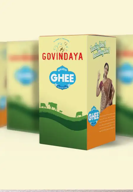
Govindaya ghee tins with a green farm landscape and cow illustration

Ghee Tin Packaging Design

Connecting with Indian Farms

The packaging design for Govindaya was developed around the idea of connecting the brand with India's agricultural roots. Ghee is closely associated with Indian food traditions, making the visual relationship between dairy, farming, and the product an important part of the creative direction.

We designed tin packaging that reflected this connection while supporting the brand's premium positioning. The goal was to create a presentation that felt familiar to Indian consumers yet distinctive enough to establish a recognisable brand identity.

This approach demonstrates how ghee packaging design can communicate more than product information. Through a considered combination of branding, visual symbolism, and packaging format, it can help tell the story of the brand behind the product.

500 g and 1 Litre Ghee Tin Packaging

One Identity, Two Formats

Govindaya's packaging was designed in two formats: 500 g and 1 litre tins. Developing a consistent identity across both sizes was important to maintaining recognition throughout the product range.

The packaging concept was designed to carry the same core brand elements across the two formats, ensuring that the logo and visual direction remained connected. At the same time, each size needed to accommodate its own layout and product information clearly.

A consistent packaging system gives a brand a more unified presence and makes it easier to extend the same visual identity across additional formats in the future.

Govindaya ghee tins and 1 litre boxes, the complete packaging range

The Range

From Ahmedabad to India

A brand built to travel, without losing its roots.

Startup Brand

Building a Dairy Startup Brand

For the Indian Market

Govindaya was an Ahmedabad-based startup with ambitions to reach consumers across India. For a brand entering a wider market, establishing a recognisable identity is an important step in creating consistent product presentation.

Our work focused on developing a visual foundation that could travel across markets without losing its connection to Indian dairy traditions. The golden cow logo provided a distinctive brand symbol, while the ghee tin packaging extended that identity into the product experience.

The project reflects our approach to brand development for startups: understand the intended positioning, create a meaningful identity, and translate it into packaging that communicates the same story consistently.

Our Approach

Brij Design Studio's Approach to Dairy Branding

Branding and Packaging, One Story

At Brij Design Studio, we approach branding and packaging as connected parts of a brand's story. For Govindaya, the logo and packaging were developed around one central idea: combining the familiarity of Indian dairy traditions with a premium visual identity.

From the golden cow symbol to the 500 g and 1 litre tin formats, the design direction focused on consistency, recognisability, and a clear brand personality.

The project demonstrates how thoughtful dairy branding and packaging design can give a startup a distinctive foundation for presenting its products and communicating its intended market positioning.

Outcome

Project Outcome

A Cohesive Branding and Packaging Concept

The Govindaya project brought together a distinctive dairy logo and ghee tin packaging concept for a startup with national market ambitions. The golden cow symbol created a memorable visual identity, while the packaging connected the brand with Indian farming traditions and a premium presentation.

With designs developed for 500 g and 1 litre tins, the project established a consistent visual direction across both product sizes. The result was a cohesive branding and packaging concept designed to help Govindaya introduce its identity to a broader Indian audience.

What We Designed

The Govindaya project included:

01

Golden cow logo

02

Dairy logo design

03

Brand identity

04

Premium cow ghee brand development

05

Ghee tin packaging design

06

500 g tin packaging

07

1 litre tin packaging

08

Consistent packaging system

Questions & Answers

Frequently Asked Questions

The Govindaya project is a branding and packaging assignment by Brij Design Studio for an Ahmedabad-based dairy startup. The work included designing a golden cow logo and ghee tin packaging in 500 g and 1 litre formats, with a visual direction inspired by Indian farming traditions.

The logo features a golden cow with its legs positioned upwards. The cow connects the identity to the dairy category, while the golden treatment and distinctive pose were intended to communicate optimism, prosperity, and a premium brand personality.

Premium cow ghee packaging design should balance brand recognition, clear product information, packaging functionality, and a distinctive visual identity. Colour, typography, imagery, and the packaging format should work together to communicate the intended brand positioning.

Ghee packaging can draw on visual references associated with Indian food culture, dairy, and farming. These references should be used thoughtfully to create a relevant brand story while keeping product information clear and accurate.

Packaging helps a dairy startup establish a recognisable identity and present its products consistently. A considered design can communicate the brand's intended positioning, distinguish the product visually, and create a foundation for future product extensions.

Dairy branding and packaging design can include logo development, colour selection, typography, brand positioning, packaging layouts, product information hierarchy, and adaptations for different pack sizes. The exact scope depends on the brand's requirements.

An effective dairy logo should be relevant to the product category, easy to recognise, and suitable for use across packaging and marketing materials. A distinctive symbol or meaningful concept can help communicate the brand's intended personality.

A startup can begin by defining its target audience, brand positioning, and intended market perception. Logo design, visual identity, and packaging should then be developed together so the brand communicates a consistent story across product and marketing touchpoints.

Brij Design Studio develops branding and packaging concepts for businesses looking to establish or strengthen their product identities. The Govindaya project demonstrates our approach to logo development, dairy brand identity, and packaging design across multiple ghee tin sizes.

Brand identity gives a new dairy product a consistent visual presentation through its logo, colours, typography, and packaging. These elements help establish recognition and communicate the brand's intended positioning as it enters the market.

Brand development for startups involves creating the foundation of a business's identity and market positioning. It can include logo design, visual identity, messaging, packaging, and brand communication, helping the business present itself consistently as it grows.

A dairy brand can establish a distinctive presence through a relevant brand story, a recognisable identity, consistent packaging, and clear product communication. Understanding the intended audience and the competitive environment is essential when developing the visual direction.

Dairy Branding & Packaging Agency

Building a dairy brand with a story? Let's give it a symbol.

Let's Talk →