Brij Design Studio

Start a project

Have a brand, product, or website that needs work?

Let's chat →

D03, Parle Colony, Sahkar Road,
Vile Parle (East), Mumbai 400057

+91 98335 89989
birju@brijdesignstudio.com

Harrit Herbal Medicine Packaging Design For Ayurvedic Brand

Harrit’s herbal product range called for packaging that brings together traditional Ayurvedic inspiration and contemporary visual appeal. At Brij Design Studio, we developed a design direction using earthy, brown paper-inspired textures, natural graphic elements, and elegant gold accents. The concept creates a balance between organic character and premium presentation, helping establish a cohesive identity across different product categories. From herbal hair care to wheatgrass powder and dhoop sticks, the packaging follows a consistent visual language while accommodating individual product requirements. The result is a distinctive approach to Harrit herbal medicine packaging design.

Ayurvedic Medicine Packaging Design

Effective Ayurvedic medicine packaging design communicates a product’s identity through thoughtful colours, textures, typography, and visual elements. For Harrit, we explored an earthy design direction inspired by nature and traditional herbal products. A brown, paper-inspired background established the foundation, while gold detailing introduced a refined, premium character. Botanical-inspired graphics complemented the overall concept, creating continuity across the product range. Our approach focused on developing packaging that feels connected to Ayurvedic traditions while presenting the brand through a contemporary design perspective. This balance helped establish a cohesive visual identity across Harrit’s diverse product categories.

Ayurvedic Hair Care and Herbal Product Packaging

The Harrit Herbal Medicine Packaging Design range includes Ayurvedic hair oil packs and herbal hair care products designed around natural ingredients. Our packaging approach used earthy textures, botanical-inspired visuals, and premium gold accents to connect these products with the wider brand identity. Each design was developed to maintain consistency while allowing the individual product to remain identifiable. The combination of natural-looking elements and refined detailing creates a visual balance between traditional inspiration and modern presentation. Through considered Ayurvedic hair care and herbal product packaging, Brij Design Studio helped bring a unified creative direction to Harrit’s product range.

Box Packaging Design for Wheatgrass Powder and Face Packs

For Harrit’s wheatgrass powder and Ayurvedic face pack products, the box packaging design followed the brand’s earthy and premium visual direction. Brown, paper-inspired textures provided a natural-looking foundation, while gold accents added contrast and refinement. Botanical-inspired design elements helped maintain consistency with the wider herbal product range. The packaging concept was developed to give both categories a cohesive appearance while allowing their individual product identities to remain clear. By extending the same design language across different box formats, Brij Design Studio created a connected packaging system that supports Harrit’s overall brand presentation.

Ayurvedic Packaging Design Agency in Mumbai

As an Ayurvedic packaging design agency in Mumbai, Brij Design Studio creates packaging concepts that combine traditional inspiration with contemporary brand presentation. For Harrit, we developed an earthy visual direction using brown paper-inspired textures, botanical elements, and premium gold accents. The design system extended across Ayurvedic hair oil, herbal hair care, wheatgrass powder, aloe vera gel, face packs, and dhoop sticks. Our focus was to maintain consistency across the product range while allowing each category to retain its identity. This approach brings together thoughtful packaging design, visual storytelling, and cohesive brand communication for herbal and Ayurvedic products.

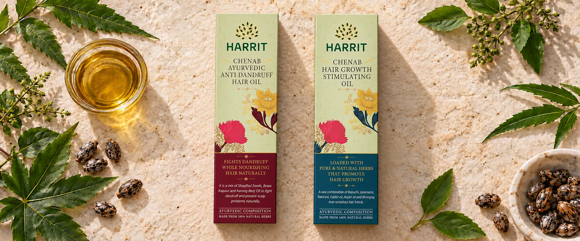
Harrit Ayurvedic hair care boxes among fresh herbs, oil and seeds

HarritHerbal MedicinePackaging Design

Rooted in Nature. Designed for a Modern World.

Client

Harrit

Category

Ayurvedic & Herbal Products

Project

Packaging Design

Project Overview

Harrit Herbal Medicine Packaging Design

Traditional herbal products carry a story of nature, ingredients, and time-honoured practices. The challenge is to translate that story into packaging that feels authentic while appealing to today's consumers.

For Harrit, Brij Design Studio developed a packaging design direction that combines earthy textures, botanical-inspired visuals, and premium gold detailing. By creating a consistent visual language across diverse products, we brought together the natural character of the brand and a refined, contemporary packaging aesthetic.

Client

Harrit

Category

Ayurvedic & herbal products

Direction

Earthy textures, botanical visuals, gold detailing

The Range

Ayurvedic Hair OilHerbal Hair CareWheatgrass PowderAloe Vera Skin Care GelFace PacksDhoop Sticks

The Creative Concept

Nature Meets Premium Design

The creative direction for Harrit was built around a simple idea: let the packaging reflect the natural inspiration behind the products.

Instead of relying on overly decorative graphics, we explored earthy visual elements that evoke botanical ingredients and traditional herbal preparations.

A brown, paper-inspired texture formed the foundation of the packaging, creating a grounded and organic visual character. Gold accents introduced contrast and a sense of refinement, giving the designs a premium finish without losing their connection to nature. The combination of these elements helped create a distinctive balance between traditional Ayurvedic associations and contemporary product presentation.

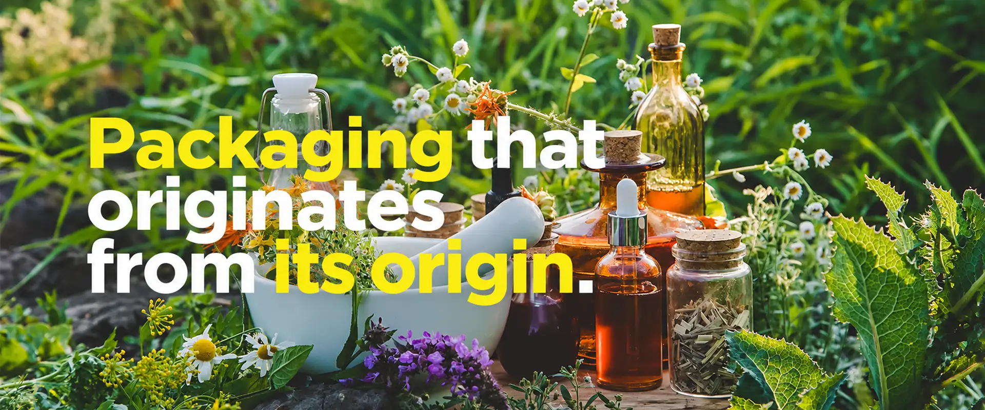
Herbs, flowers and oil bottles in a garden with the line: Packaging that originates from its origin

Ayurvedic Medicine Packaging Design with an Earthy Identity

The earthy base created a connection with nature, while the gold detailing added visual richness.

Effective Ayurvedic medicine packaging design needs to communicate the product category while giving the brand a recognisable identity. For Harrit, our approach focused on natural-looking textures, botanical design elements, and carefully balanced visual hierarchy.

Product names and visual elements were organised to maintain clarity across the range. This design direction allowed the packaging to feel connected to Ayurvedic traditions while presenting the products in a polished, modern way. The result is a visual approach that demonstrates how packaging can communicate a brand's intended character through colour, texture, and composition.

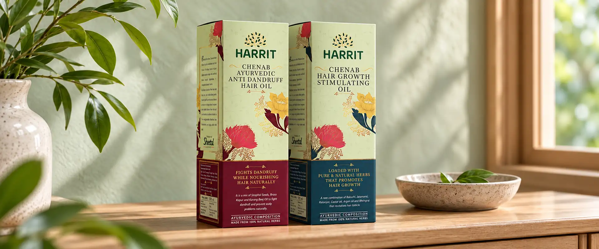
Harrit hair care boxes on a wooden shelf by a sunlit window
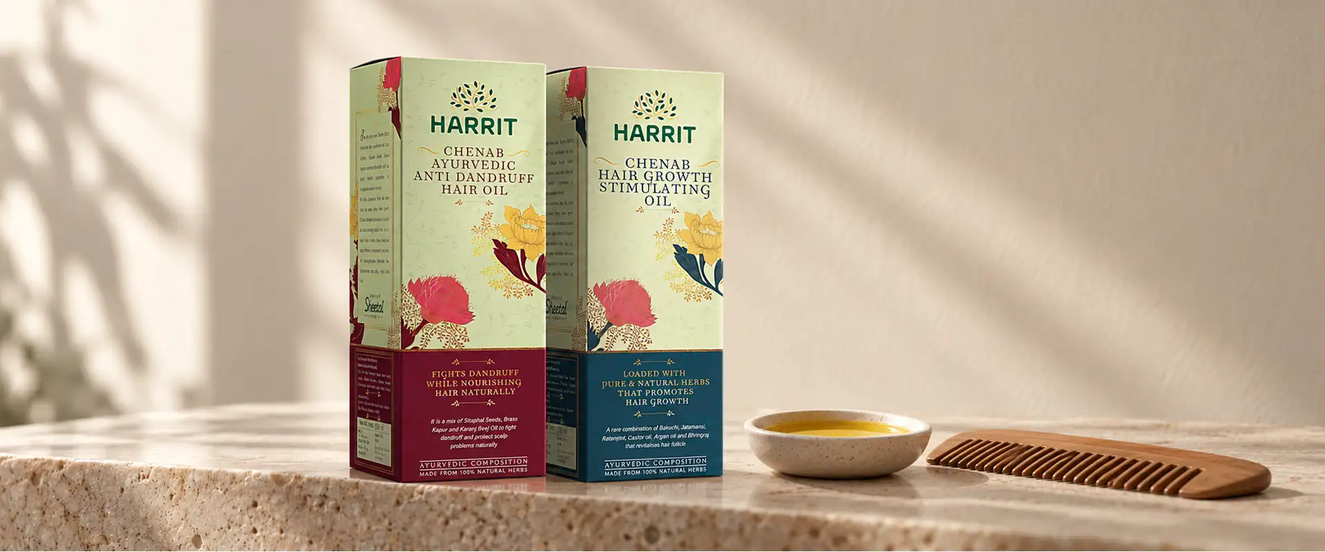
Harrit hair care boxes with gold detailing beside a wooden comb and oil

Brown Paper-Inspired Textures

Natural Design Elements

Texture played an important role in establishing the visual personality of the Harrit packaging. We used a brown, paper-inspired base to create an earthy appearance that complements the herbal and Ayurvedic product category.

Natural design elements supported the concept, helping the packaging feel connected to the ingredients and traditions associated with the range. Rather than using visual elements simply as decoration, we considered how they could contribute to a consistent product story.

This combination of texture and botanical inspiration gave the designs a distinctive look while creating continuity across different formats, including boxes for hair care, skin care, powders, and dhoop sticks.

Gold Detailing

A Premium Packaging Experience

To balance the organic visual direction, we introduced gold as an accent colour. Gold brings contrast and refinement to the earthy base, helping the packaging communicate a more premium brand personality.

The intention was to create a visual relationship between nature-inspired design and elevated presentation. The gold detailing complements the brown texture instead of overpowering it, allowing both elements to contribute to the overall identity.

This approach shows how thoughtful colour and finish selection can change the perception of a package. When used with restraint, premium accents can add sophistication while preserving the natural character of an Ayurvedic product range.

Packaging Design Across a Diverse Ayurvedic Product Range

Six Categories, One Language

Harrit's product portfolio spans several categories, each with its own packaging requirements and visual considerations. The range includes Ayurvedic hair oil packs, herbal hair care products, organic wheatgrass powder boxes, aloe vera skin care gel, Ayurvedic face pack boxes, and Ayurvedic dhoop sticks.

Our approach was to establish a shared visual language that could work across these different products and position Harrit as a premium Ayurvedic brand. The earthy base, natural design elements, and gold accents helped connect the range, while individual product presentation supported differentiation.

This is an important part of product packaging design: creating a family of products that feels consistent without making every package look identical. A cohesive system helps the brand maintain recognition as consumers encounter different products within the same range.

  1. Ayurvedic Hair OilHair Care
  2. Herbal Hair CareHair Care
  3. Wheatgrass PowderPowders
  4. Aloe Vera Skin Care GelSkin Care
  5. Ayurvedic Face PacksSkin Care
  6. Ayurvedic Dhoop SticksAromatics
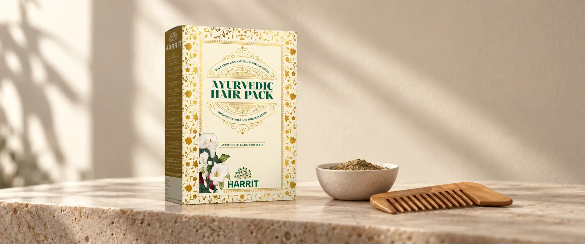
Harrit Ayurvedic hair pack box with a wooden comb and a bowl of herbal powder

Ayurvedic Hair Care and Herbal Product Packaging

One Visual Language Across the Hair Care Range

Hair oil and herbal hair care products were an important part of the Harrit packaging range. For these products, the design direction drew on natural textures and botanical-inspired visuals to reinforce the overall identity.

The packaging needed to connect with the broader Ayurvedic product family while remaining suitable for the specific product format. By applying a consistent visual language across the hair care range, we helped maintain brand continuity while allowing each product to retain its own identity.

The same creative principles extended to the wider portfolio, giving Harrit a packaging system built around natural inspiration and premium presentation.

Box Packaging Design

For Wheatgrass Powder and Face Packs

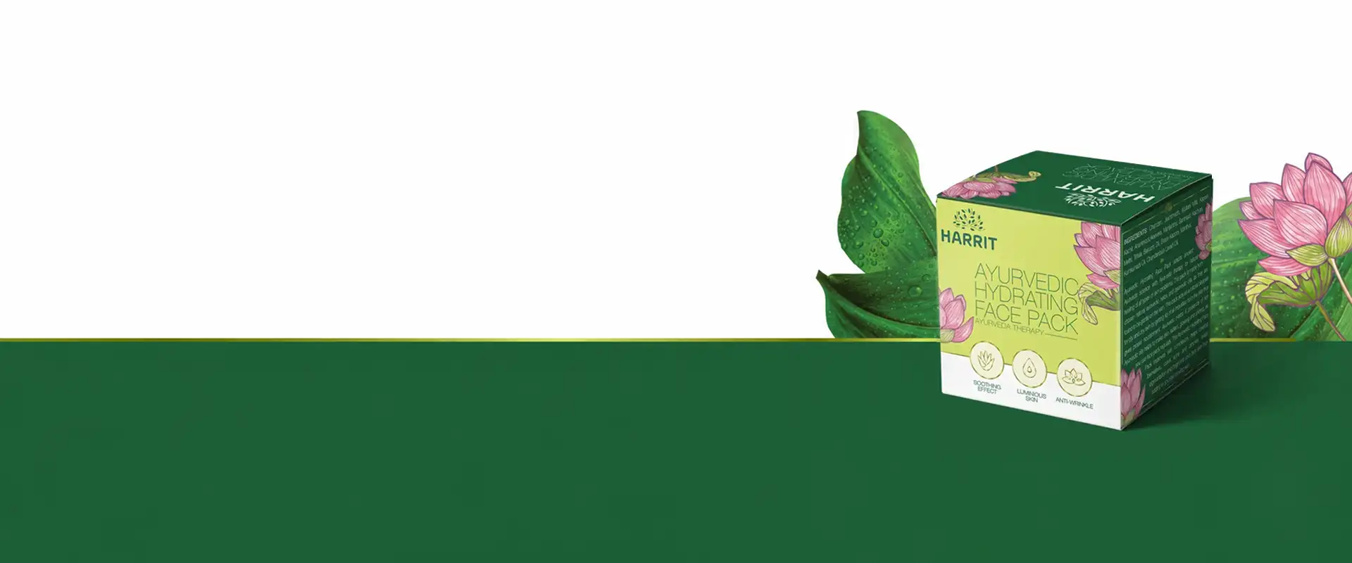
Powder-based products such as wheatgrass powder and Ayurvedic face packs require packaging that balances visual appeal with clear product identification.

For Harrit, the box designs followed the same earthy and premium creative direction used across the range. The brown, paper-inspired background established visual continuity, while gold detailing introduced contrast. Natural design elements supported the brand's overall character, allowing the boxes to feel like part of one product family.

This approach demonstrates how box packaging design can be adapted across different product categories while preserving a recognisable brand identity. The packaging concept remains consistent, while the presentation responds to each product's individual requirements.

Harrit Ayurvedic Hydrating Face Pack box with lotus flowers and leaves Ayurvedic Face Pack

Aloe Vera Skin Care Gel and Ayurvedic Dhoop Stick Packaging

Different Purposes, One Brand Identity

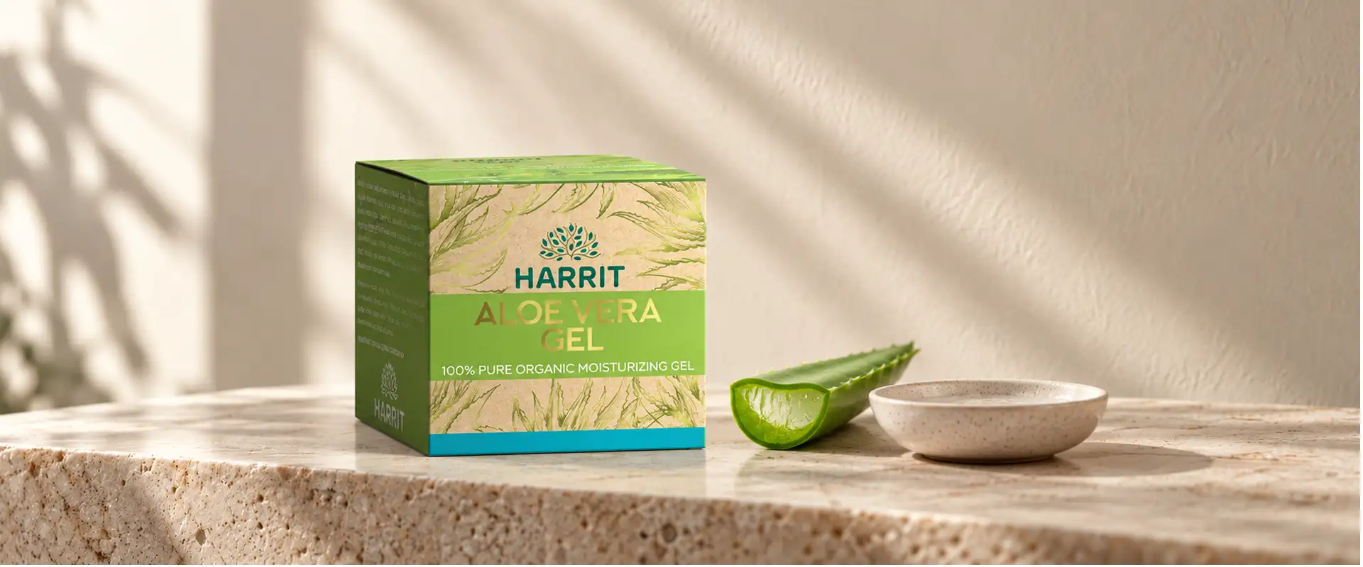
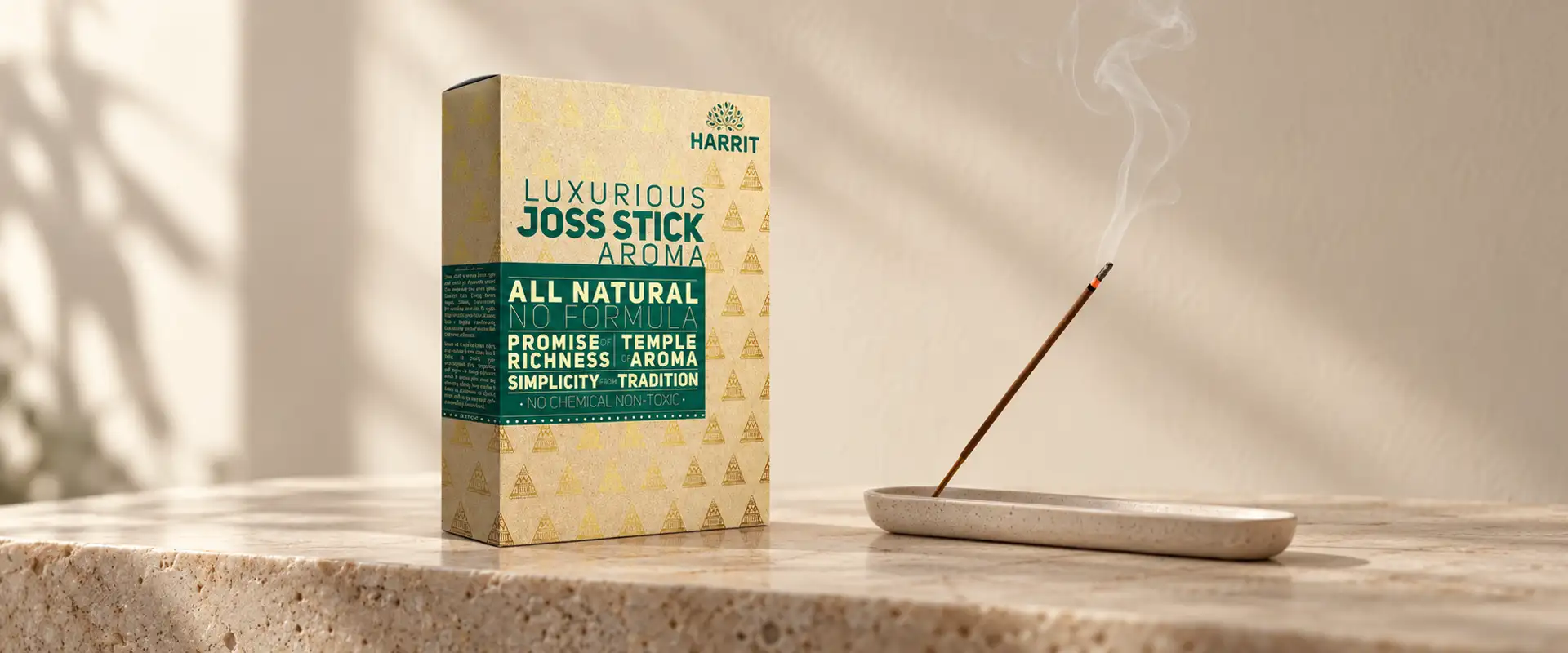
The Harrit range also includes aloe vera skin care gel and Ayurvedic dhoop sticks, extending the packaging system into skin care and traditional aromatic products.

Although these categories serve different purposes, a shared visual language helps connect them under one brand identity. Earthy textures and natural design elements provide continuity, while the premium detailing adds a consistent finishing touch.

Designing across multiple categories requires more than repeating the same artwork. Each format must be considered individually, with the overall identity adapted to its shape, information requirements, and intended presentation. The Harrit project reflects this balance between a unified brand story and product-specific packaging.

Harrit aloe vera gel box beside a fresh aloe leaf and a bowl
Harrit Ayurvedic joss stick box beside a burning incense stick

Tradition, Presented Today

Traditional herbal inspiration, with contemporary sophistication.

Our Approach

Brij Design Studio's Approach to Ayurvedic Packaging Design

Packaging as a Visual Expression of Identity

At Brij Design Studio, we see packaging as a visual expression of a brand's identity and positioning. For Harrit, we brought together natural inspiration, premium detailing, and a consistent design language to create packaging across a diverse Ayurvedic product portfolio.

From the brown paper-inspired texture to the gold accents and botanical visual direction, every design decision supported the same creative idea: traditional herbal inspiration can be presented with contemporary sophistication.

The project demonstrates our approach to Ayurvedic medicine packaging design, where colour, texture, product clarity, and brand consistency work together to create a cohesive packaging experience.

Outcome

Project Outcome

A Unified Direction for a Diverse Range

The Harrit project brought a unified creative direction to a diverse range of Ayurvedic and herbal products. Earthy textures established a connection with nature, botanical-inspired elements supported the product category, and gold detailing added a premium visual dimension.

By extending these elements across hair care, wheatgrass powder, skin care, face packs, and dhoop sticks, we developed a consistent packaging approach that connects the products while allowing their individual identities to remain clear.

The result is a packaging design concept that brings together natural inspiration, traditional associations, and modern visual appeal.

What We Designed

The Harrit packaging project included:

01

Ayurvedic hair oil packs

02

Herbal hair care products

03

Wheatgrass powder boxes

04

Aloe vera skin care gel

05

Ayurvedic face pack boxes

06

Ayurvedic dhoop sticks

07

Brown paper-inspired texture

08

Gold detailing

09

Botanical design elements

10

Consistent packaging system

Questions & Answers

Frequently Asked Questions

The Harrit project is an Ayurvedic and herbal product packaging design project by Brij Design Studio. The creative direction combines brown paper-inspired textures, natural design elements, and gold accents across a range that includes hair oil, herbal hair care, wheatgrass powder, aloe vera gel, face packs, and dhoop sticks.

The range includes Ayurvedic hair oil packs, herbal hair care products, wheatgrass powder boxes, aloe vera skin care gel, Ayurvedic face pack boxes, and Ayurvedic dhoop sticks.

Ayurvedic medicine packaging design should balance brand identity, clear product identification, relevant information, and an appropriate visual language. Natural textures, botanical imagery, and considered colour choices can support the intended positioning, while product claims and ingredient information must remain accurate.

Designers can use earthy colours, botanical illustrations, organic textures, and restrained layouts to create a visual connection with nature. These elements should complement the product's identity rather than substitute for accurate ingredient information.

Box packaging design provides a structured surface for brand identity, product naming, and required product information. It can also create a consistent visual presentation across different products and sizes within a range.

Premium herbal packaging can be developed through a considered combination of materials, textures, typography, colour, and finishing details. For Harrit, the creative direction paired earthy, paper-inspired visuals with gold accents to create a refined appearance.

Ayurvedic packaging design often draws on visual associations with herbs, nature, and traditional practices, depending on the brand's positioning. General medicine packaging may prioritise a different visual language. Both must communicate product information clearly and comply with applicable labelling requirements.

A packaging design agency can help develop the visual concept, colour palette, typography, product layouts, and packaging system. It can also help maintain consistency across product variants and formats while aligning the designs with the brand's intended positioning.

Brij Design Studio develops packaging concepts for brands across product categories, including wellness and herbal products. Our approach combines creative direction, visual storytelling, product identification, and brand consistency to create packaging tailored to each project's requirements.

Businesses should review their target audience, brand positioning, product range, packaging format, mandatory labelling, and production requirements. The redesign should strengthen brand recognition while ensuring product names, ingredients, directions, and claims are accurate and legible.

Our approach begins with understanding the product category and the brand's desired positioning. We then develop a visual direction using suitable colours, textures, typography, and design elements. For Harrit, the direction combined earthy textures, botanical inspiration, and gold detailing to create a cohesive packaging identity.

Ayurvedic Packaging Design Agency

Rooted in nature? Let's design the packaging to match.

Let's Talk →