

Ambrosia OrganicFood Label Design
From the Hands of the Farmer to the Heart of the Home
Project Overview
Ambrosia Organic Food Label Design
From the Hands of the Farmer to the Heart of the Home
Client
Ambrosia
Category
Organic Food | Health-conscious Brand
Format
Labels for PET Jars
Scope
More than what's inside the jar
Organic food packaging should communicate more than what is inside the jar.
It should tell a story of nature, nourishment, and the people behind the food. For Ambrosia, Brij Design Studio created organic food label designs that translate the brand's health-conscious positioning into a distinctive visual language.
Inspired by the textures of brown paper, the simplicity of handcrafted illustrations, and the details of grain sketches, the packaging was designed to create a natural, authentic impression. Farmer illustrations became a central part of the concept, connecting the products with the agricultural roots of food and helping communicate a more conscious approach to everyday eating.
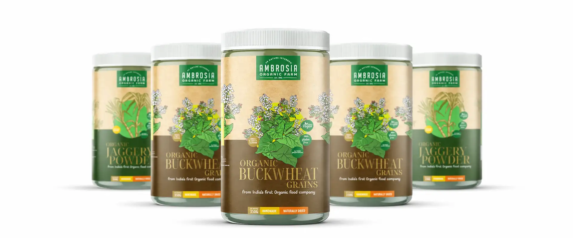
Organic Food Packaging Design Rooted in Nature
The idea was to create an immediate visual connection with nature.
Instead of relying on glossy, overly decorative graphics, we explored a brown-paper-inspired appearance that feels earthy, warm and approachable.
The labels were designed for products packed in PET jars, giving us a compact surface to communicate the brand's story through illustration, colour and typography. Every design decision was guided by the perception we wanted the packaging to create: a brand that feels connected to natural ingredients, thoughtful food choices and traditional agricultural roots.
The result is a packaging concept that uses visual storytelling to give Ambrosia a distinctive presence on the shelf.
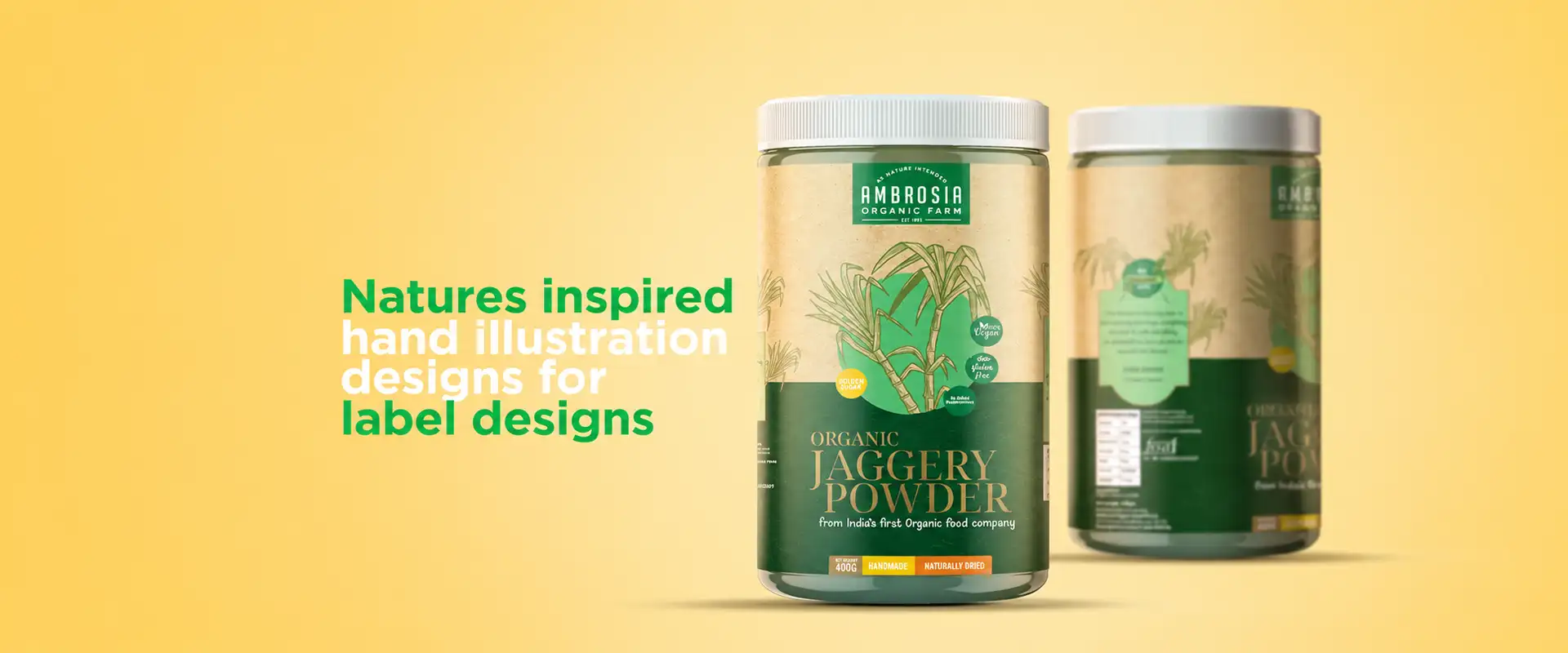
Organic Food Label Design with a Handcrafted Look
A product label is often the first interaction a customer has with a food brand.
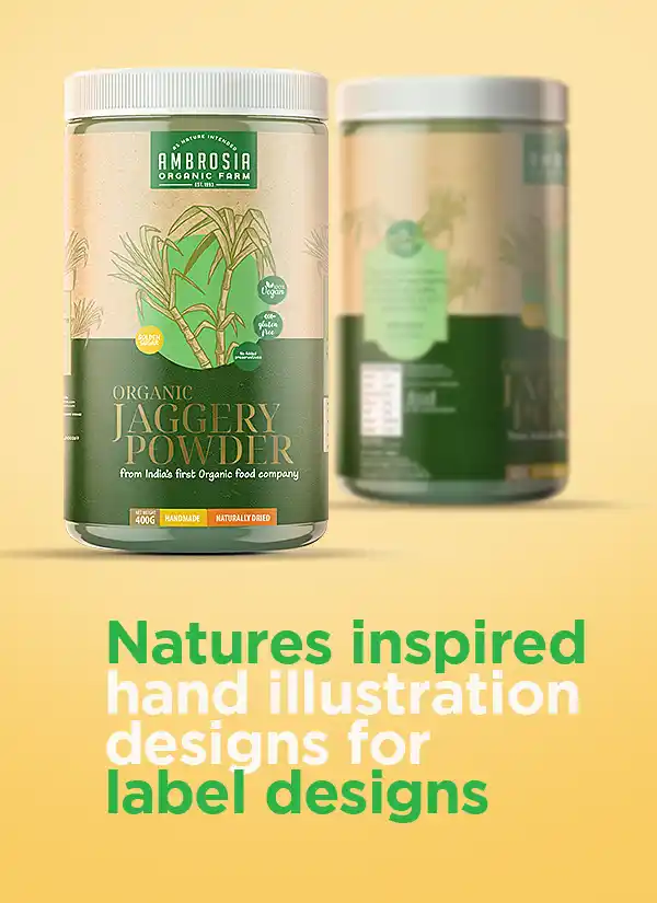
For Ambrosia, we wanted that first impression to feel natural, honest, and connected to the source of food. Our organic food label design approach centred on a brown-paper-inspired background and handcrafted-style illustrations. These elements introduce a tactile, artisanal character to the packaging, while the overall layout keeps the visual identity cohesive.
Rather than treating the label as a space for product information alone, we used it as an opportunity to tell a story.
The design brings together visual cues associated with farming, grains, and nature to support the brand's intended health-conscious positioning.
03 · A Handcrafted Look
03 · A label that tells a story
 01
 02
04 · Farmer Illustrations That Tell a Story
What if the packaging could remind customers where their food begins?
This question shaped one of the central elements of the Ambrosia project: the farmer illustration.
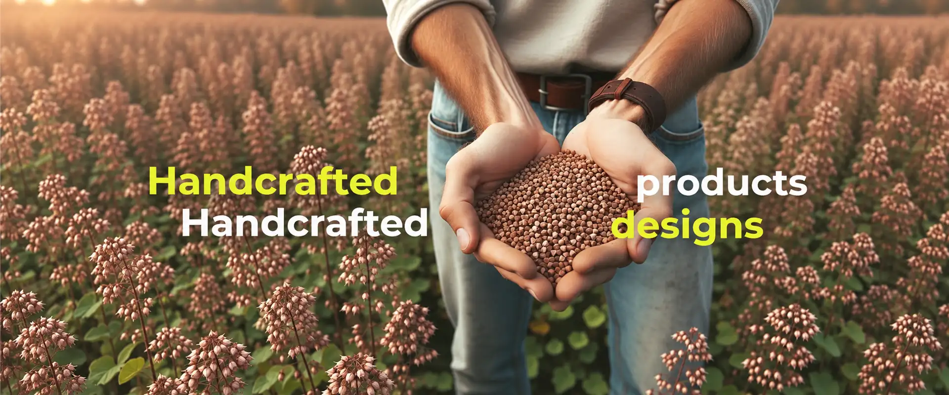
We developed a handcrafted-style farmer sketch to create a visual connection between the product and the people involved in growing food. The illustration adds a human dimension to the packaging, moving beyond conventional product graphics to communicate a story rooted in agriculture.
The intention was to create a sense of familiarity and authenticity at first glance. By placing the farmer at the heart of the visual concept, we gave Ambrosia a distinctive design element that helps express its connection with natural food and conscious consumption.
Grain Pen Sketches and Natural Design Elements
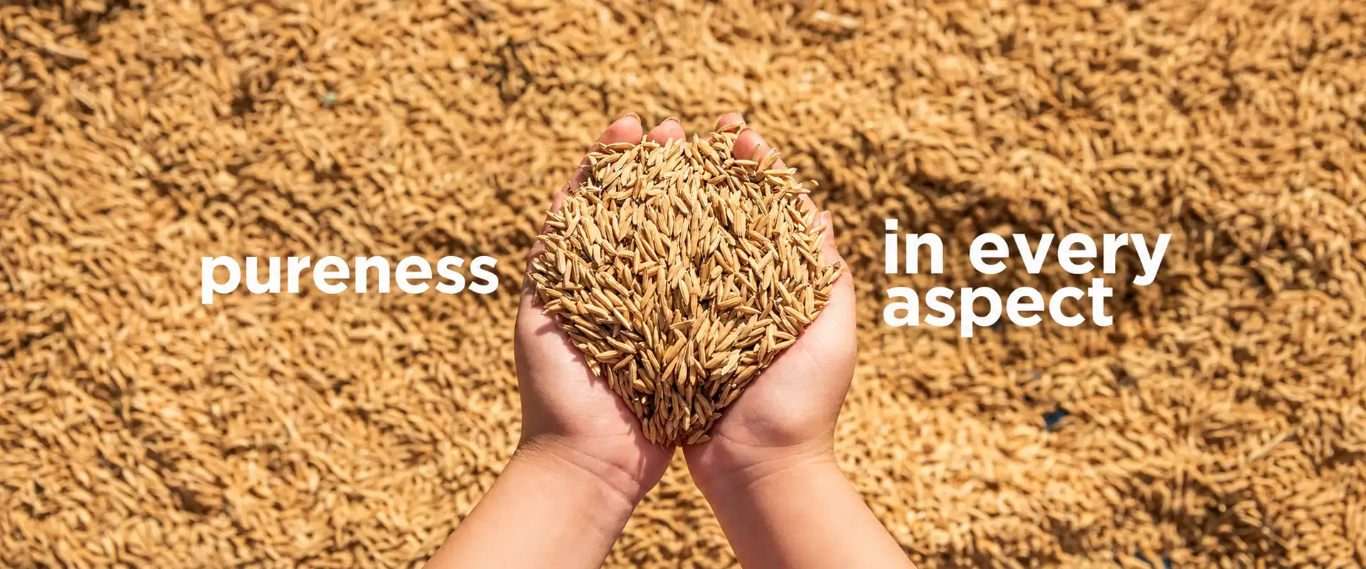
Alongside the farmer illustration, grain pen sketches played an important role in building Ambrosia's packaging identity.
The delicate, hand-drawn treatment brings visual detail to the labels while reinforcing the concept's connection with agricultural produce. The grain illustrations were selected to complement the brown-paper-inspired background and handcrafted visual style. Together, these elements create a cohesive composition that feels organic in its design language without relying on unnecessary decoration.
At Brij Design Studio, we approached these details as more than decorative additions. The illustrations were part of a broader visual strategy to help customers associate the packaging with nature, food origins, and a thoughtful brand personality.

PET Jar Label Design for Organic Food Products
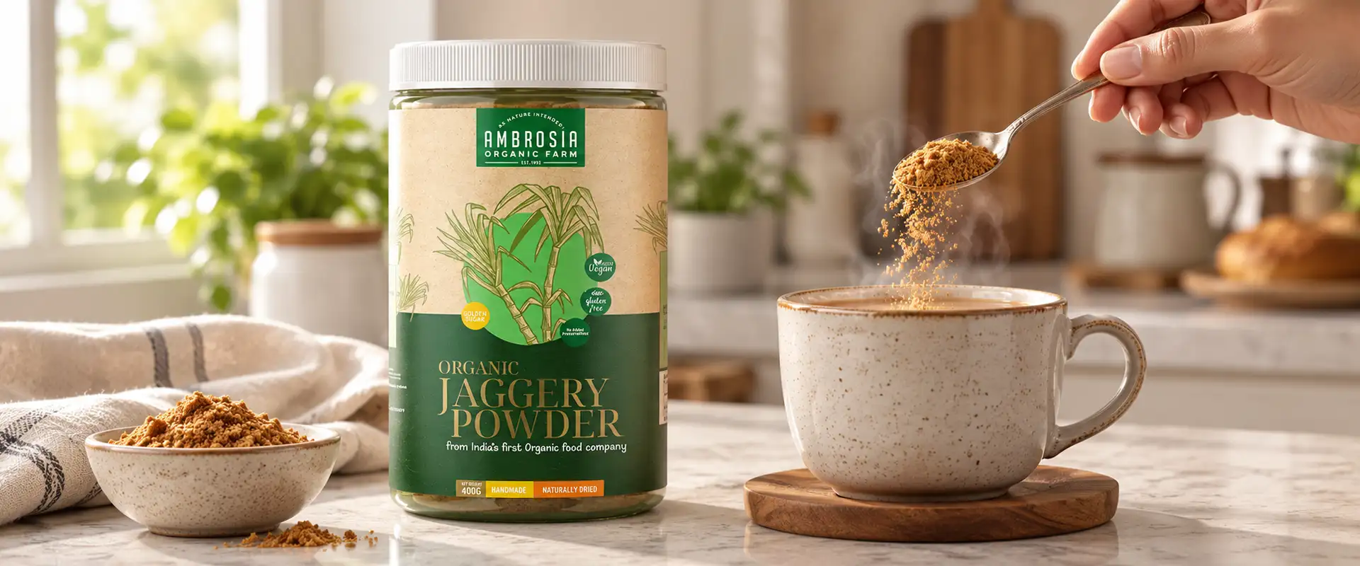
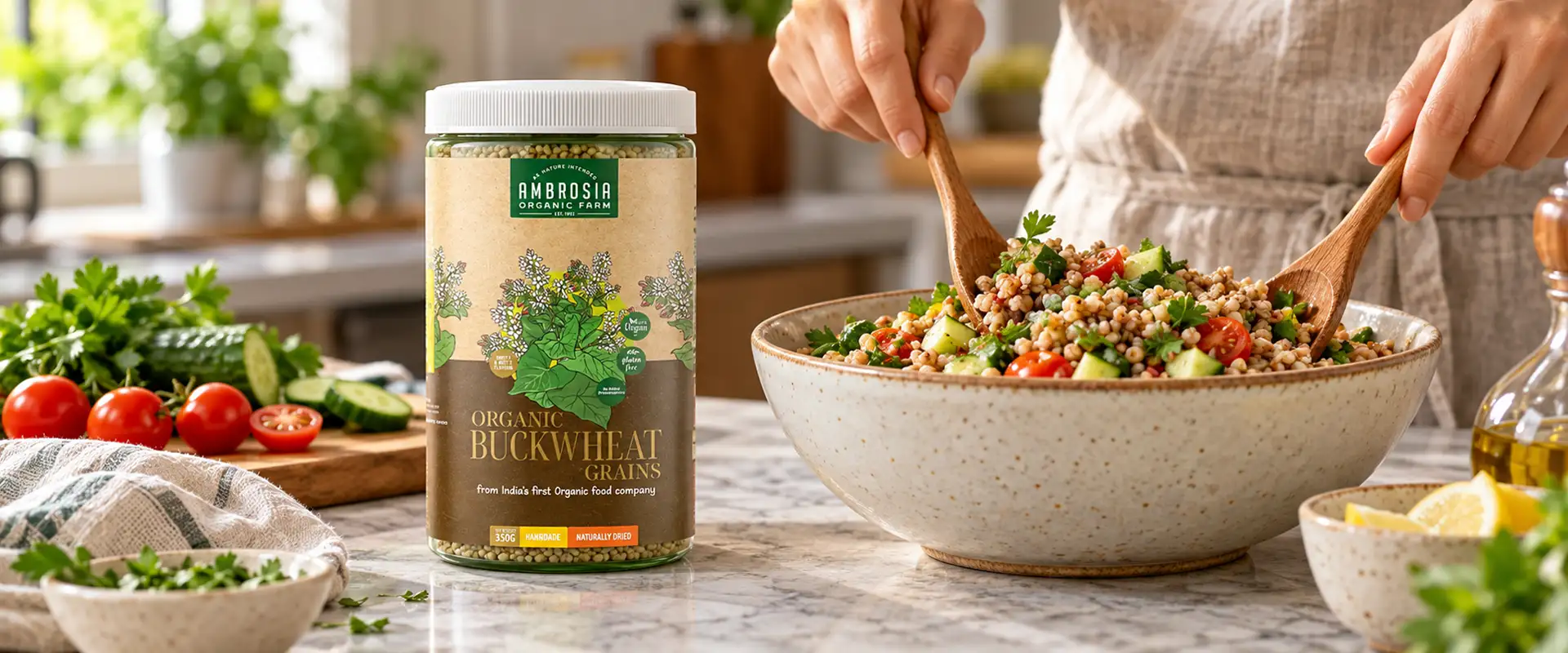
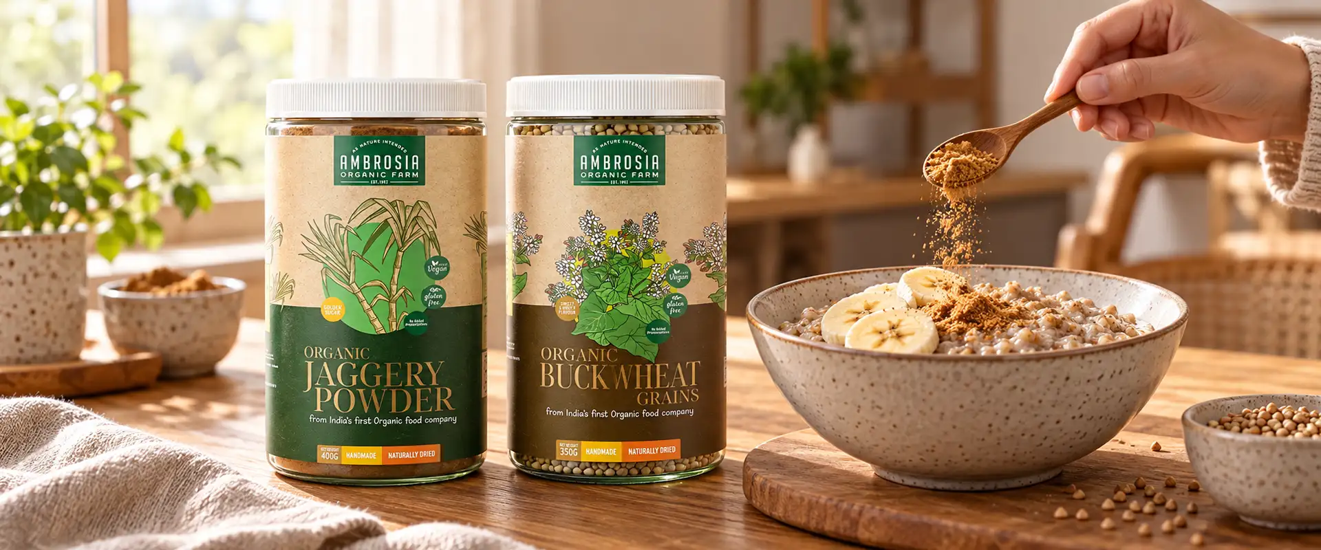
Packaging design must work with the container as well as the brand concept. For Ambrosia, the labels were created for products packed in PET jars, making the label an important part of the overall product presentation. The design approach focused on adapting the natural visual language to the jar format. The brown-paper-inspired look, farmer sketch, and grain illustrations were brought together to create a recognisable appearance across the label design.
The objective was to make the packaging feel considered and distinctive while allowing essential product information to remain part of the composition. By treating the label and container as one visual experience, we developed a packaging direction suited to Ambrosia's organic food positioning.
Label and jar, one visual experience.
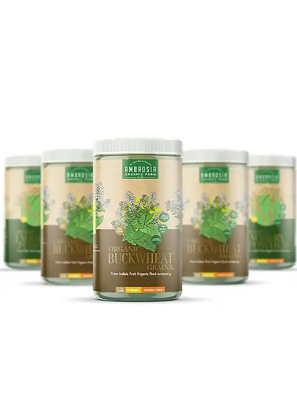
Label Design for Food Products That Shapes Perception
Good label design for food products does more than identify what is being sold.

It influences how customers interpret a product before they have tried it.
For Ambrosia, we considered the visual associations customers might make when they see a package: natural ingredients, farming, grains, and mindful food choices. The brown-paper-inspired background and handcrafted sketches were selected to build these associations through design.
The farmer illustration adds a human story, while the grain sketches connect the visual identity to agricultural produce. Together, these elements help create a coherent impression of a health-conscious food brand. The concept demonstrates how thoughtful packaging can communicate a brand's intended personality before a customer reads the label in detail.
Design Elements
Design Elements Behind the Ambrosia Packaging
Every element in the Ambrosia label design contributed to the overall concept.
01
Brown-paper-inspired background
Creates an earthy, understated visual foundation.
02
Handcrafted farmer illustration
Connects the brand story with agriculture and the people behind food production.
03
Grain pen sketches
Add fine illustrative detail and reinforce the agricultural theme.
04
Natural visual language
Brings the different design elements together into a cohesive packaging identity.
05
Label layout and typography
Help organise the information and balance storytelling with product communication.
06
PET jar format
Provides the packaging surface on which the visual concept comes to life.
The strength of the design lies in how these elements work together. Rather than relying on one graphic or colour, the concept builds a complete visual story around the product.
Our Creative Approach to Ambrosia
Our approach began with a simple question: what should customers feel when they first see Ambrosia on a shelf?
We wanted the packaging to communicate a connection with nature and food origins.
From this insight, we explored an earthy visual direction, using a brown-paper-inspired background and handcrafted illustrations to give the labels a distinctive character.
The farmer sketch became the central storytelling element, supported by detailed grain pen illustrations. We then brought these components together within the PET jar label format, balancing the artwork with the need for clear product communication.
The focus throughout was on building a meaningful visual concept, where every detail had a purpose, and the packaging reflected the brand's intended identity.
Scope of Work
Brij Design Studio's creative scope for the Ambrosia project included:
01Organic food packaging design
02Organic food label design
03PET jar label design
04Brown-paper-inspired label concept
05Handcrafted farmer illustration
06Grain pen sketch illustrations
07Packaging visual direction
08Label layout and typography
09Visual storytelling and concept development
10Food product label artwork
The Story of Food
Packaging That Brings the Story of Food to Life
The Ambrosia project demonstrates how illustration and thoughtful visual choices can give food packaging a distinct personality.
By combining an earthy, brown-paper-inspired look with farmer sketches and grain illustrations, Brij Design Studio created a label concept rooted in the story of food and agriculture. Designed for products packed in PET jars, the packaging brings together visual character and product communication in one cohesive design direction.
For us, effective packaging design is about understanding the impression a brand wants to create and translating that intention into a visual experience. With Ambrosia, that experience begins with a simple idea: reconnecting the product with the story behind the food.
More Work
Our work that will interest you


Journal
Blogs you may like
Questions & Answers
Frequently Asked Questions
Organic food label design is the process of creating product labels that communicate a food brand's identity, product information, and intended positioning. It involves colour selection, typography, illustrations, and layout. For Ambrosia, the concept used a brown-paper-inspired appearance, farmer sketches and grain illustrations to create a natural, handcrafted visual identity.
Packaging can communicate an organic food concept through carefully chosen visual elements, such as earthy colours, botanical or agricultural illustrations and understated layouts. These design cues can help create a nature-inspired impression. Any specific organic certification or product claim must still be supported by the appropriate documentation.
Farmer illustrations can help connect a food brand's story with agriculture and the people involved in growing food. In the Ambrosia project, the handcrafted-style farmer sketch was used as a central visual element to communicate the brand's intended connection with food origins and conscious consumption.
Grain illustrations add a visual connection to agricultural produce and can complement a handcrafted packaging style. For Ambrosia, pen-sketch grain details supported the brown-paper-inspired background and farmer illustration, helping create a consistent visual story across the labels.
PET jar label design involves considering the available label area, container shape, product information, typography, and overall brand identity. The artwork must be adapted to the jar format so that the design remains legible and visually balanced. Final artwork should also account for the printer's specifications and applicable food-labelling requirements.
Handcrafted-style food packaging uses visual details such as hand-drawn illustrations, sketch-like artwork, and natural-looking backgrounds to create an artisanal character. These elements can help a brand establish a recognisable visual identity when they are used consistently and suit the product and audience.
Food packaging influences customer perception through its colours, illustrations, typography, information hierarchy, and overall presentation. These elements can shape the first impression of a product and suggest qualities such as simplicity, tradition, or premium positioning. Packaging should communicate the brand's intended identity clearly without making unsupported product claims.
Brij Design Studio is a Mumbai-based creative agency offering branding and packaging design services. Its work can include food product labels, packaging concepts, illustration, typography, and visual identity development, tailored to the brand's positioning and packaging format.
A food label design project may include concept development, visual direction, illustration, typography, layout, product information hierarchy, and print-ready artwork. Depending on the project, it may also involve adapting the design to different packaging formats and preparing artwork according to printer specifications.
A brand can create consistency by using a recognisable combination of colours, typography, illustration styles and layout principles across its labels. These elements should work together while leaving enough flexibility for individual products to communicate their own names and information.
Let's Create Packaging with a Story
Every product has a story. The right packaging helps people see it.
At Brij Design Studio, we develop brand-led packaging concepts that combine creative direction, illustration, and visual communication to give products a distinctive identity.
Let's Design Your Product Packaging →