

AyurvedamProduct Packaging Design
A Nature-Led Packaging System Bringing Ayurvedic Heritage Into a Contemporary Visual Language
Project Overview
Ayurvedam Product Packaging Design
A Nature-Led Packaging System Bringing Ayurvedic Heritage Into a Contemporary Visual Language
Client
Ayurvedam
Category
Ayurveda & Wellness
Line
6 SKUs
Scope
The Brief
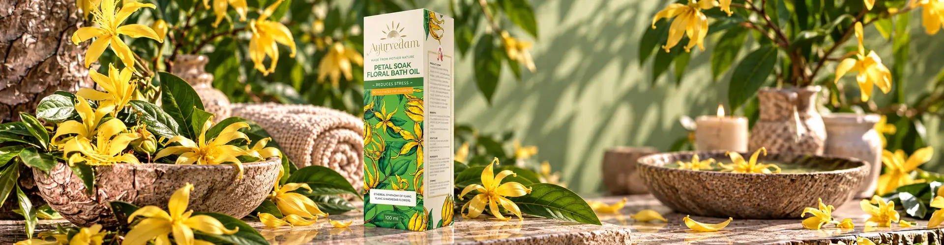
Ayurvedam needed packaging that could communicate the natural character of its products through a clear, distinctive visual identity, one that drew on Ayurvedic heritage without feeling dated or overly traditional.
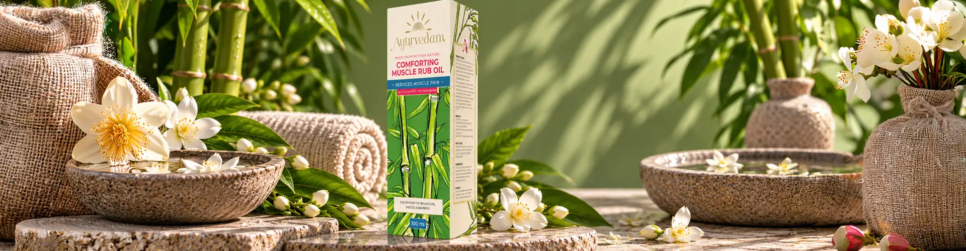
We looked closely at the relationship between Ayurveda and nature. Leaves, flowers, herbs, and organic forms became our core visual references, letting the packaging speak to the purity and natural origins behind the products.

The Concept
The Concept: Nature as the Visual Foundation
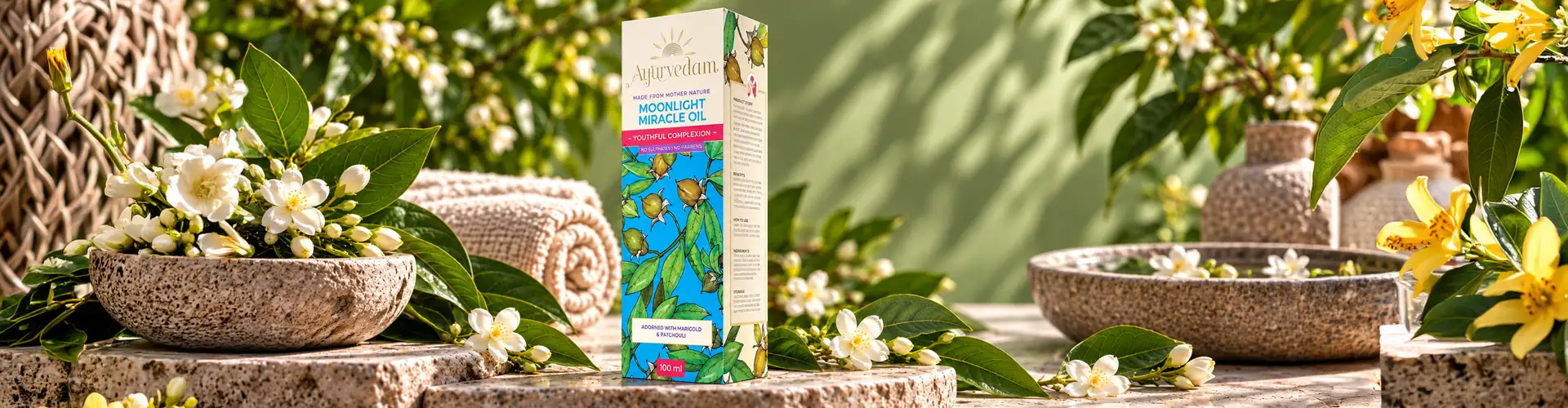
Rather than leaning on traditional Ayurvedic symbols, we built the identity around illustration, colour, typography, and composition, a more contemporary read on a heritage category.
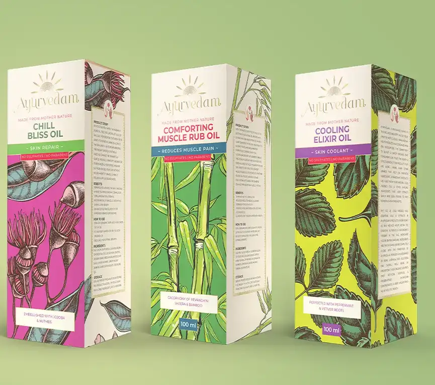
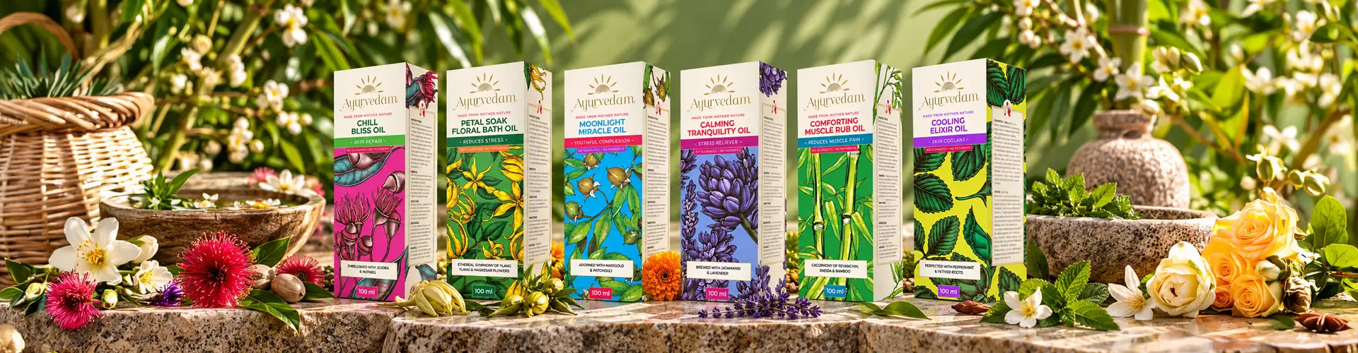
Custom floral illustrations were developed specifically for this line rather than sourced generically, giving each of the 6 SKUs its own identifiable botanical character while staying part of one cohesive family. These illustrations do double duty: they signal the product's natural ingredients and give the shelf presence its own distinct visual signature.
The Challenge
The Challenge With Ayurvedic Brand Packaging
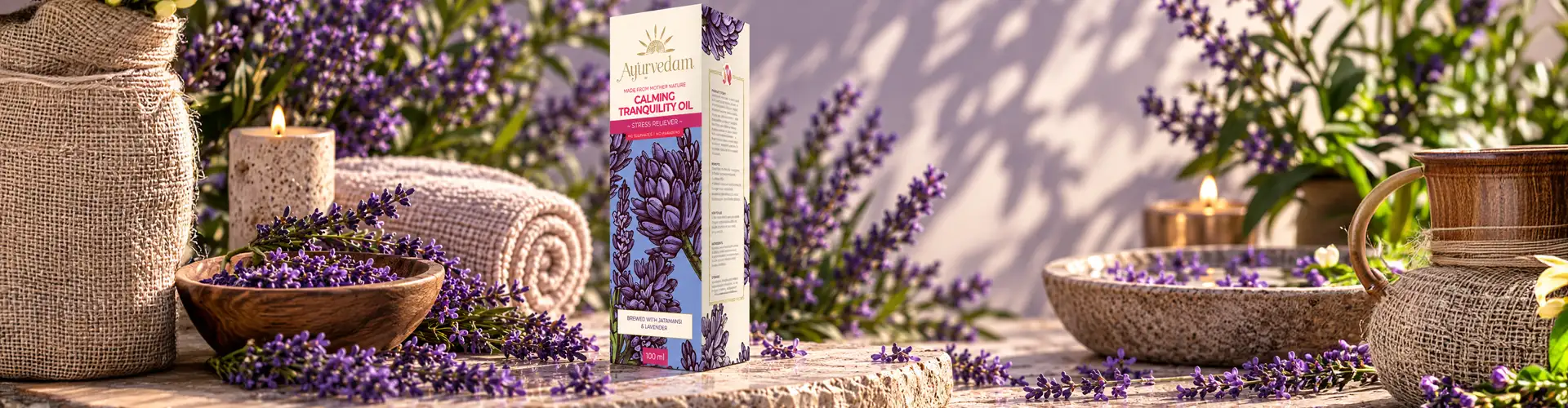
Most Ayurvedic brands face the same tension on shelf. Lean too hard into traditional cues, temple motifs, ornate typography, heavy golds and maroons, and the packaging starts to feel more like a pharmacy remedy than a product someone reaches for as part of a modern wellness routine. Lean too far the other way, stripping everything down to a clean, minimal, "beauty aisle" look, and the packaging loses what actually makes Ayurveda credible in the first place: its connection to nature, tradition, and holistic origin.
Ayurvedam sat squarely in this gap. The brand needed packaging that a contemporary consumer would trust and want to pick up, without giving up the sense that the product came from something older and more considered than a typical wellness SKU. That meant every design decision- illustration, colour, layout, typography- had to earn its place on both sides of that line at once, rather than picking a side and committing to it.

Design Inspiration
Nature as the Design Inspiration for Ayurvedic Medicine Packaging
Nature as the Design Inspiration for Ayurvedic Medicine Packaging
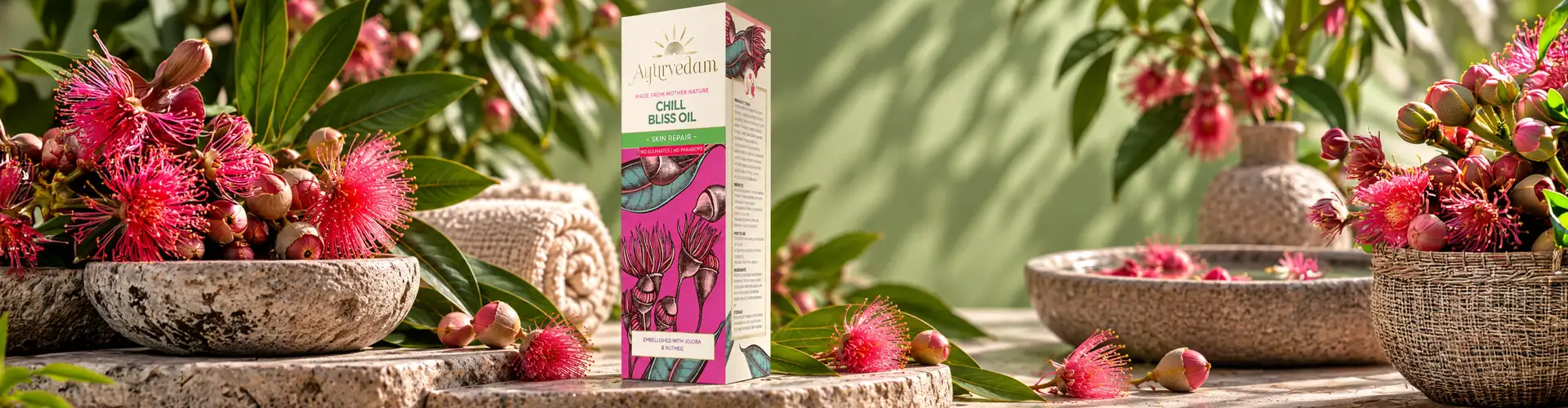
Our starting point was to ask what actually connects Ayurveda to a modern audience without translation, and the answer was nature itself. Leaves, flowers, herbs, and organic form aren't just traditional Ayurvedic symbols; they're also exactly the visual language today's wellness consumer already associates with "natural," "clean," and "trustworthy." That overlap became the foundation of the whole packaging system.
Rather than illustrating nature as background decoration, we treated botanical form as the main visual story across all 6 SKUs. Each illustration was custom-developed to reflect the character of the product it sits on, so the artwork does more than decorate the pack, it signals ingredient and origin at a glance, the same way a customer might read a label on a farmers'-market product.
This also shaped colour and composition. Instead of borrowing the deep, ornate palettes typical of traditional Ayurvedic branding, we let the botanical illustration carry the "natural heritage" signal, and used colour to keep the packaging feeling calm, considered, and current. The result is a line where nature isn't a decorative theme layered on top of the design it's the reason the design looks the way it does.

Design System
Ayurvedic Medicine Packaging Design System
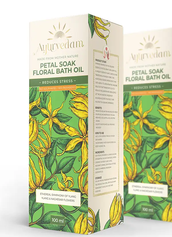
Colour, typography, illustration, and product information were treated as one system rather than separate decisions layered on top of each other. Botanical artwork provides the visual foundation; layout and typographic hierarchy keep each pack legible and easy to shop, even with six variants sitting side by side on shelf.




From Concept to Shelf
From Concept to Shelf
013D packaging visualization
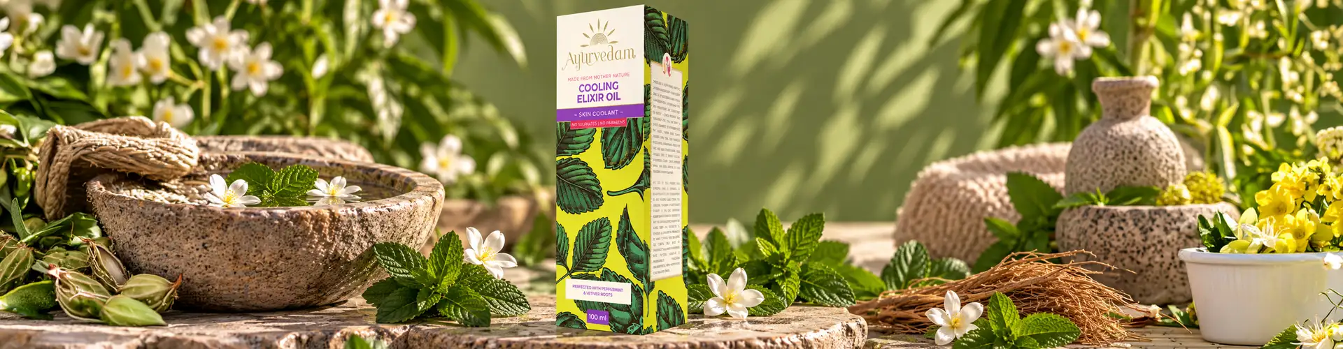
3D packaging visualization let us test how illustration, colour, and typography would actually read on the finished product, not just as flat artwork, but as something a customer picks up and turns over. This step also flagged where illustration needed to flex across the different SKU sizes and formats in the line.
02Print separations
Once the design was locked, we prepared detailed print separations to carry the illustrated artwork accurately into production, keeping the final packaging faithful to the original concept.


The Result
A 6-SKU packaging system that translates Ayurvedic heritage into a contemporary shelf presence, rooted in botanical illustration, unified by one design system, and distinctive enough to stand apart in a crowded wellness category.

What we designed
01
Packaging concept
02
Product story development
03
Custom floral illustration
04
Packaging layout & typography
05
3D packaging visualization
06
Print separations
07
Final production artwork
More Work
Our work that will interest you


Questions & Answers
FAQs
Ayurvedic product packaging design combines branding, visual communication, illustration, typography, colour, and packaging structure to present Ayurvedic products. The design can draw from natural ingredients, botanical elements, and Ayurvedic heritage while using contemporary visual principles to create relevant and distinctive packaging.
Floral illustration can visually communicate the natural and botanical character associated with Ayurveda. For Ayurvedam, floral and nature-inspired elements were used as an important part of the packaging language, helping connect the visual identity with the natural origins of Ayurvedic products.
The balance comes from combining traditional references with contemporary composition, typography, colour, and illustration. Instead of reproducing traditional motifs literally, Ayurvedic packaging can interpret the connection with nature and heritage through a more modern visual system.
Nature is closely associated with the ingredients and visual language of Ayurvedic products. Using botanical elements, organic forms, and natural visual references can help packaging communicate the product's connection with nature while creating a recognisable identity within the wellness category.
Brij Design Studio worked on the Ayurvedam project across packaging design, product story, floral illustration, packaging visualization, and print separations. These elements were developed together to create a cohesive visual direction for the product packaging.
BDS begins by understanding the product and the qualities the packaging needs to communicate. For Ayurvedic and wellness products, this can involve exploring natural visual references, illustration, colour, typography, and product storytelling before translating the direction into practical packaging artwork and production-ready designs.