

AyurvedamGhee Bottle Label Design
Project Overview
Ayurvedam Ghee Bottle Label Design
Client
Ayurvedam
Category
Ayurveda & Wellness
Scope

The Brief
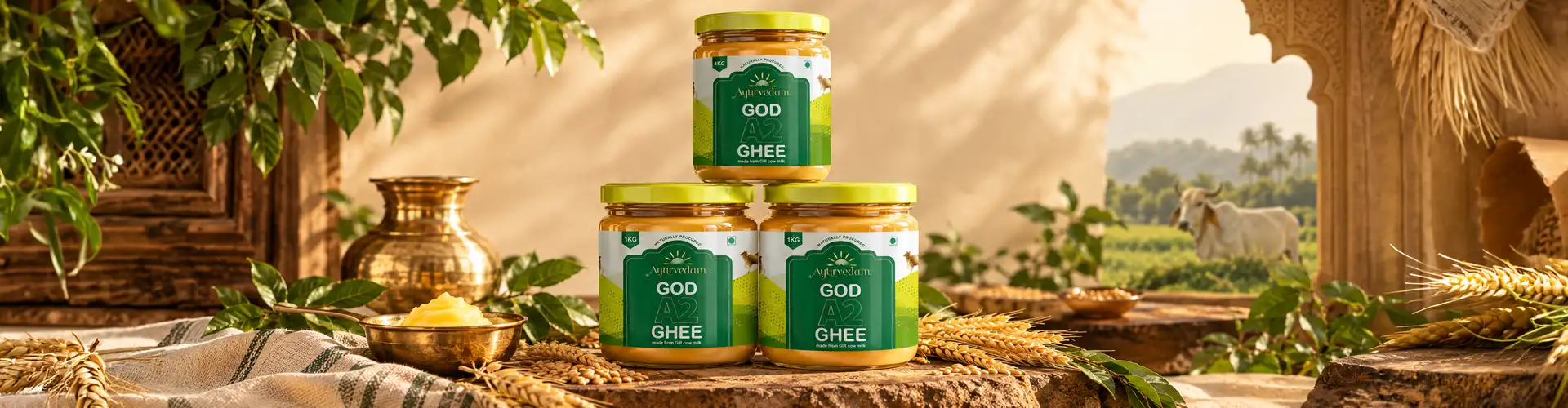
Ayurvedam needed a ghee bottle label that could communicate purity, tradition, and authenticity at a glance, without relying on the generic, overly ornate visual cues common across the desi ghee category. The brief was to design a label rooted in Indian heritage while still feeling considered and premium enough to stand apart on shelf.
The starting point was the product's origin story: A2 Gir cow milk, sourced from farms committed to indigenous cow breeds and traditional methods. That story became the foundation for the entire visual direction.

The Challenge
The Design Challenge
The real challenge was standing apart in a category where most ghee labels look nearly identical: similar cow imagery, similar gold-and-green palettes, similar layouts borrowed from one another. Rather than refining that same formula, we treated the Gir cow illustration as an opportunity to be specific rather than familiar, giving Ayurvedam a label that couldn't be mistaken for a competitor's. The goal wasn't just a good-looking Label design for bottles; it was one a customer could recognize instantly, even from a distance on a crowded shelf.


Visual Anchor
The Gir Cow as the Visual Anchor
The Gir Cow as the Visual Anchor
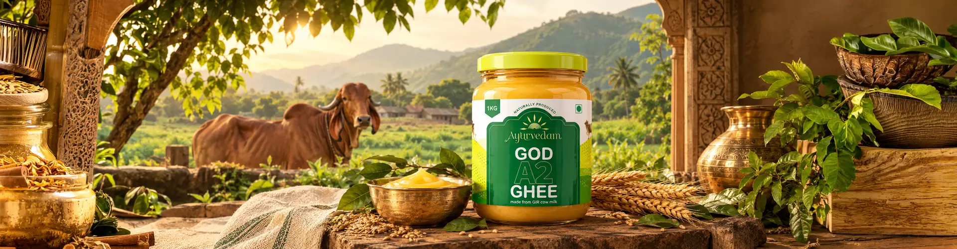
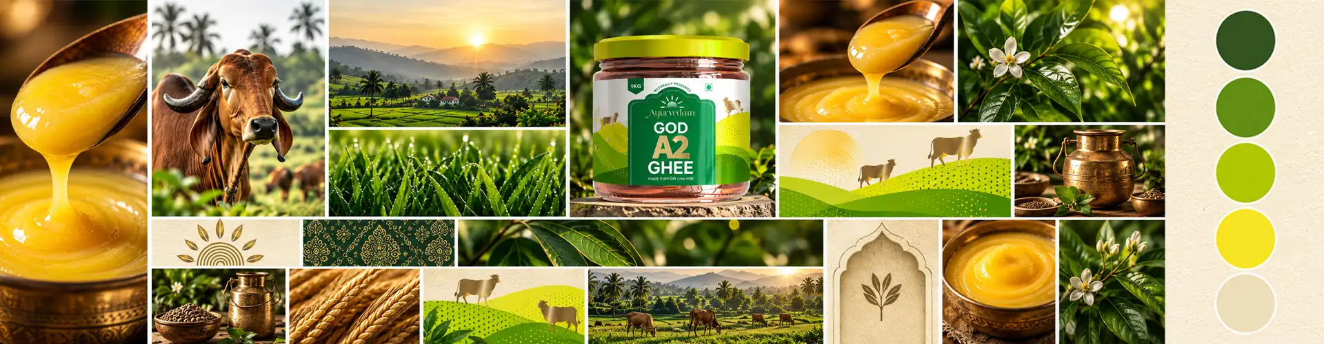
Rather than using stock imagery or generic pastoral graphics, we developed a hand-drawn illustration of the Gir cow specifically for this Ghee label design, a breed central to the ghee's quality and to the story Ayurvedam wanted to tell. The illustration does more than decorate the bottle; it signals origin and authenticity immediately, communicating the product's connection to traditional Indian cow farming before a customer reads a single word of copy.
Surrounding artwork, green farmland, traditional motifs, warm colour tones — was built around this central illustration, reinforcing the same sense of heritage without overcrowding the label.
Shelf Clarity
Balancing Heritage With Shelf Clarity
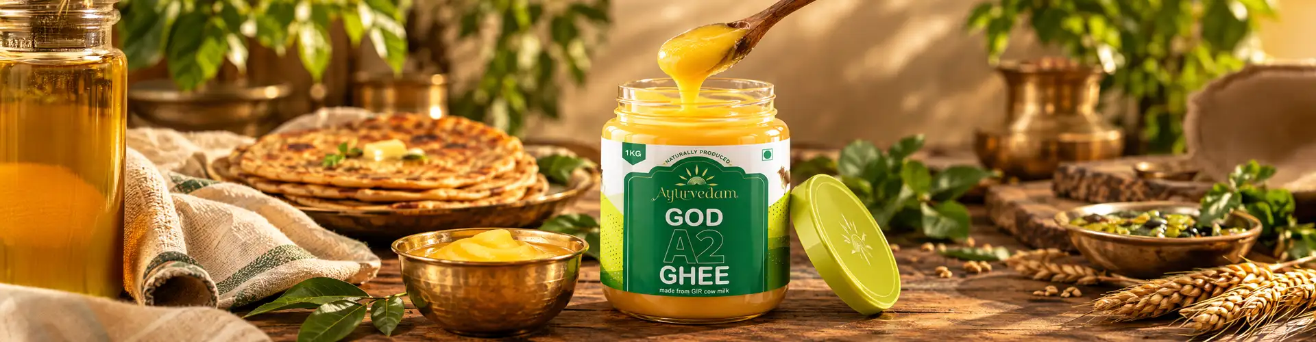
Traditional Indian design elements carry real risk on a label: lean too far into ornamentation and the design starts to look cluttered or dated rather than authentic. We worked to keep the label legible and structured, balance, symmetry, and a controlled colour palette were used to let the illustration and product story come through clearly, without competing with the information a customer needs to make a purchase decision.
This balance let the label read as both premium and traditional at once, rather than forcing a choice between the two.

Authenticity
Designing for Authenticity
Authenticity was the lens behind every decision on this Ghee label design, not just a word to reference in copy. We treated the Gir cow illustration as proof, not decoration, a specific, hand-drawn reference to the actual breed behind the ghee, rather than a generic cow silhouette that could belong to any dairy brand. Colour, typography, and layout were kept restrained so the illustration could carry that credibility without competition. The goal was a Ghee label that earns trust the way a trusted local producer would, through specificity and craft, rather than through claims of purity printed in bold type.


From Artwork to Bottle
From Artwork to Bottle
01Print separations
The detail in the hand-drawn illustration required careful print preparation to translate accurately onto the bottle format. Print separations were developed to preserve the linework and colour fidelity of the original artwork through production, ensuring the finished label matched the intended design rather than losing detail in the print process.
02Packaging visualization
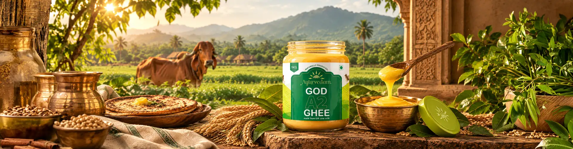
Packaging visualization helped confirm how the ghee label would actually sit and read on the bottle, checking legibility, proportion, and overall shelf presence before moving to final production.
The Result
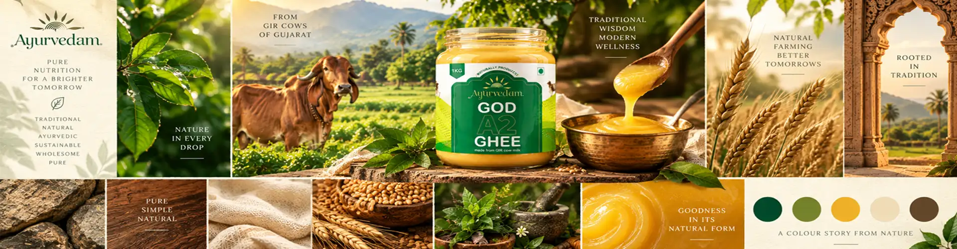
A ghee bottle label design that tells Ayurvedam's origin story through illustration rather than text alone, anchored by a hand-drawn Gir cow, supported by traditional Indian design elements, and structured for shelf clarity. The result is a label that feels rooted in heritage while holding its own as a considered, premium product.
What we designed
01
Ghee bottle label design
02
Gir cow hand-drawn illustration
03
Product story development
04
Label layout & typography
05
Print separations
06
Packaging visualization
07
Packaging Mock ups
More Work
Our work that will interest you


Questions & Answers
FAQs
Ayurvedam's ghee bottle label design uses a hand-drawn illustration of the Gir cow to communicate the product's authenticity and traditional origins. The design combines Indian heritage cues with a clean, modern layout to stand out on shelf while reflecting the brand's Ayurvedic values.
The label combines a hand-drawn Gir cow illustration, traditional Indian motifs, a controlled colour palette, and structured typography. These elements work together to communicate purity, quality, and origin without overcrowding the bottle's surface.
Ghee label design needs to balance tradition with modern shelf appeal, since the category is closely tied to heritage, purity, and trust. Unlike more generic product labels, ghee labels often rely on visual cues — like cow imagery, farmland, or traditional motifs — to signal authenticity and origin at a glance.
Illustrative label design lets a traditional product like ghee feel both authentic and premium. Custom illustration avoids the generic look of stock imagery, gives the brand a distinctive identity, and communicates origin and craftsmanship visually — reducing the need for heavy text-based claims to earn consumer trust.
A strong ghee label design should communicate purity, origin, and quality within seconds of a shelf glance. This typically means showing the source (like the cow breed or farm), using a restrained but premium colour palette, and keeping typography clear enough that the product's authenticity isn't lost behind decoration.
Professional label designing typically starts with the product's story and origin, moves through concept and illustration development, then layout and typography, and finishes with print preparation to ensure the artwork translates accurately onto the final packaging or bottle.
Label designing shapes a buyer's first impression before they read any product claims. A well-designed label signals quality, authenticity, and care through visual choices alone — illustration style, colour restraint, and layout — which builds trust faster than text-based messaging on its own.