

FruitlyCandy Wrapper Packaging
A Little Fruit. A Lot of Chushka.
Project Overview
Fruitly Candy Wrapper Packaging
A Little Fruit. A Lot of Chushka.
Client
Fruitly
Category
Fruit Jelly Candy
Project
Candy Wrapper & Pouch Packaging
Scope of Work
Fruitly
A Little Fruit. A Lot of Chushka.
Some flavours need no introduction. They need a splash of colour, a playful expression and a little attitude. That was the inspiration behind Fruitly Candy Wrapper Packaging, a creative packaging design project by Brij Design Studio for a fruit jelly candy brand.
The challenge was to move beyond ordinary candy wrappers and create a visual experience that felt as juicy, playful, and exciting as the candy itself. Our approach combined vibrant strawberry-inspired visuals, expressive typography, glossy finishes, and a distinctly Indian voice to bring the product to life.
From individual plastic candy wrapper packaging to larger jelly candy pouch packaging, we created a connected visual direction built around one memorable idea: "Strawberry ka Real Chushka." The result is packaging that brings together flavour, fun and local cultural expression in a colourful brand experience.
The Brief
The Brief: Making Every Candy Feel Like a Burst of Fruit
From an Everyday Sweet to a Playful Brand Experience
Candy packaging has a small space to make a big impression. In a category filled with colourful products, simply displaying a flavour or a product name is not always enough to establish a distinctive personality.
For Fruitly, we wanted the packaging to communicate the excitement of fruit jelly candy at first glance. The design needed to feel energetic, youthful, and instantly connected to the product's fruity appeal.
We explored how colour, typography, fruit imagery and a playful local-language expression could work together to create this experience. The visual direction was developed for two formats individual candy wrappers and larger pouches while maintaining a consistent identity.
The goal was simple: make Fruitly feel less like an ordinary candy packet and more like a little burst of fruity fun.
The Creative Concept
Strawberry Ka Real Chushka
The Creative Concept: Strawberry Ka Real Chushka
Giving Fruitly a Voice of Its Own
What does a juicy strawberry splash look like when translated into packaging? For Fruitly, it became the starting point for a bold and expressive visual story.
We developed the concept around the sensation of enjoying fruit jelly candy, using vibrant strawberry tones, dynamic splash graphics, and playful typography to create a lively impression. The visual language was designed to suggest movement, sweetness, and a burst of flavour without making the layout feel complicated.
The defining element was the tagline "Strawberry ka Real Chushka." With its familiar Indian conversational tone, the line gave the packaging a quirky personality and made the brand communication feel closer to everyday language.
Rather than relying on a generic confectionery message, the concept gave Fruitly a distinctive expression one that connects fruity visuals with a local sense of fun.
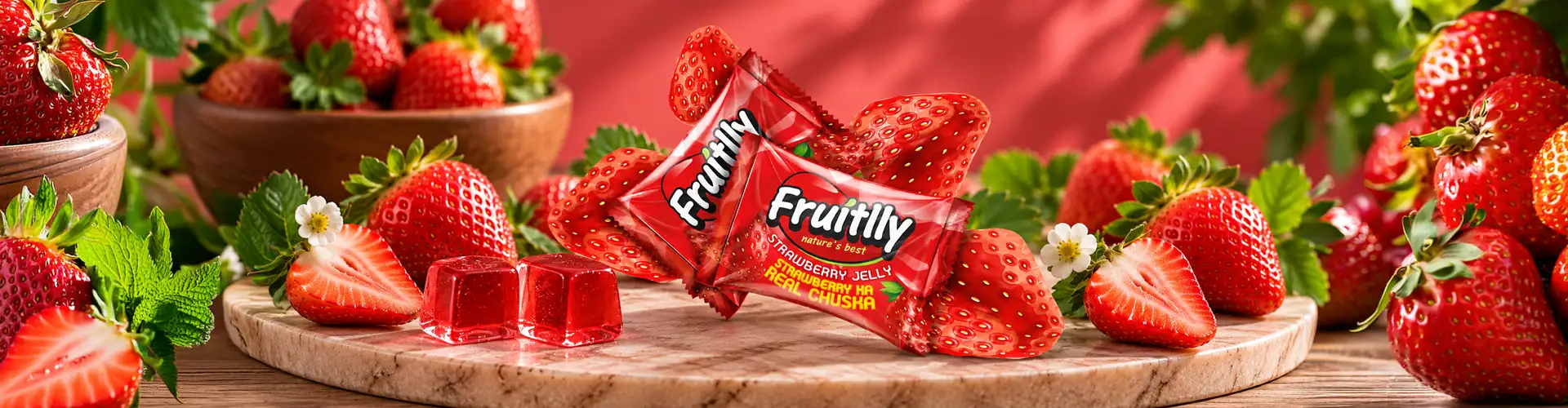
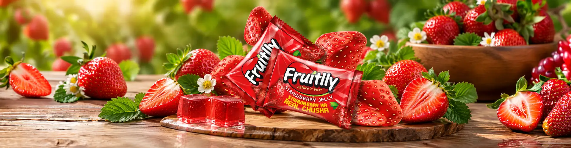
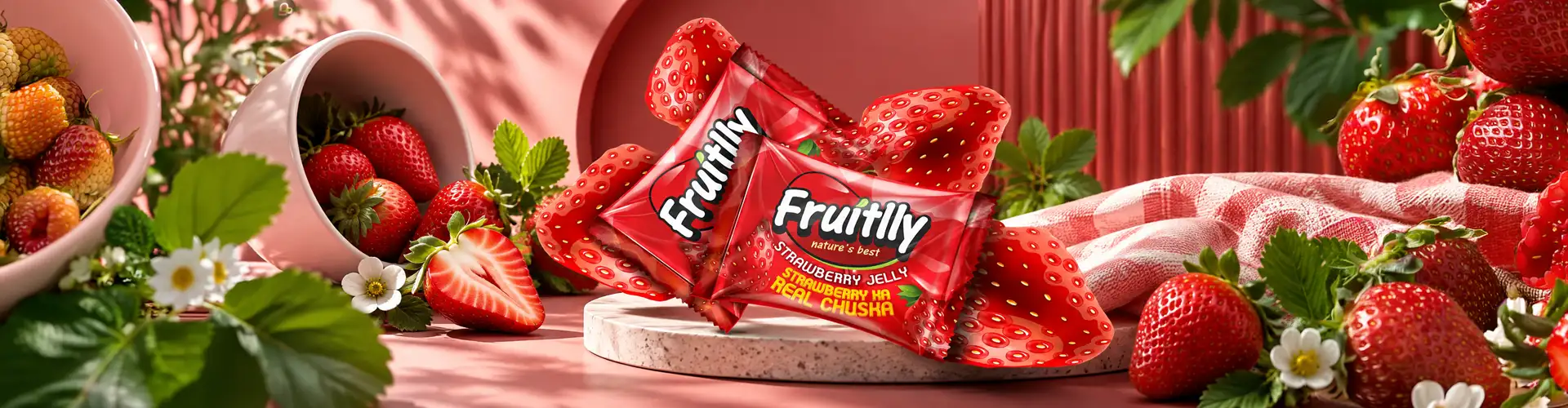
Individual Candy Wrapper
Small Wrapper. Big Personality.
Individual candy wrappers offer limited space, so every design element must earn its place. The Fruitly wrapper was developed to make the brand and its strawberry-inspired visual story easy to recognise within a compact format.
Bold red tones establish the flavour direction, while juicy fruit graphics create a sense of movement and excitement. The typography adds a playful character, helping the wrapper feel expressive rather than purely functional.
We also considered how the artwork would appear on a glossy plastic wrapper. The design direction focused on retaining visual clarity while allowing the colour and splash imagery to remain prominent.
The result is a candy plastic wrapper packaging design that carries the Fruitly personality into an individual, single-candy format. Even at a small scale, the wrapper contributes to the larger brand experience through its colour, visual energy, and memorable local-language tagline.
Jelly Candy Pouch
One Big Pouch. A Whole Lot of Fruity Fun.
The larger Fruitly pouch gave us more room to bring the creative concept to life. While the individual wrapper needed to communicate quickly within a compact space, the pouch could carry a more expansive version of the brand's visual story.
We developed the jelly candy pouch packaging around the same strawberry-inspired imagery, vibrant colours and playful personality. The larger format allowed the brand name, flavour cues and tagline to work together as a more prominent composition.
A consistent visual direction across both formats was important. The pouch needed to feel unmistakably like Fruitly while creating its own presence as a larger retail pack.
By adapting the same creative idea to a different packaging format, we aimed to create a cohesive product family from the individual candy in your hand to the pouch containing multiple treats.
Local Language, Lasting Personality
Why "Strawberry Ka Real Chushka" Works
Packaging does not communicate through visuals alone. The words on a pack can give a product its personality, establish a tone, and make the brand feel familiar to its audience.
For Fruitly, "Strawberry ka Real Chushka" brought a local, conversational expression into the world of candy packaging. The Hinglish tagline feels playful and approachable, creating a connection with the way people speak in everyday life.
This cultural familiarity became an important part of the design concept. Instead of treating the tagline as an additional line of copy, we made it part of the packaging story, working alongside the strawberry graphics, bold colours and expressive typography.
The result is a visual and verbal identity that feels rooted in the Indian market while retaining the energetic appeal expected from a fruit jelly candy brand.
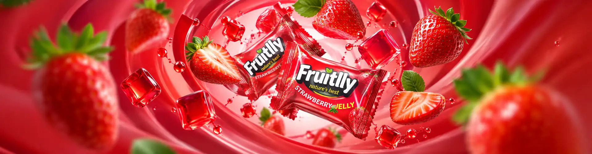
The Visual Language: Colour, Splash and Gloss
Making the Flavour Visible
01Strawberry reds
Fruitly's packaging direction was built around visual cues that communicate the product's fruity character. Strawberry-inspired reds provide a strong colour foundation, while splash graphics introduce movement and energy.
02Gloss & motion
The glossy visual treatment complements the jelly candy's soft, playful personality. Dynamic typography adds another layer of expression, giving the design a sense of motion rather than a static, conventional appearance.
03Product, image, message
We focused on creating a clear relationship between the product, the imagery, and the brand message. The fruit visuals establish the flavour story, the typography communicates the brand's attitude, and the tagline gives the design a recognisable local voice.
04Part of the experience
Together, these elements form a creative candy packaging design that makes the packaging itself part of the product experience.
One Creative Direction, Two Packaging Formats
Building Consistency Across Wrappers and Pouches
A product range feels more connected when its packaging shares a recognisable visual language. For Fruitly, the individual plastic wrappers and larger candy pouches needed to express the same brand personality despite their different sizes and layouts.
We carried the central creative elements across both formats:
01
Strawberry-inspired graphics to establish the fruity visual direction.
02
Vibrant colours to create an energetic and playful impression.
03
Expressive typography to complement the brand's youthful character.
04
Local-language communication to make the tagline feel familiar and memorable.
05
Format-specific layouts to accommodate the requirements of individual wrappers and larger pouches.
This approach helped establish a cohesive packaging direction without requiring both formats to look identical. Each design could work within its own dimensions while remaining part of the same Fruitly brand story.
Our Packaging Design Approach
Turning a Flavour Idea into a Visual Experience
At Brij Design Studio, the Fruitly project brought together concept development, visual storytelling and packaging artwork. We began with the product's fruity character and explored how it could be translated into a visual identity that felt lively, distinctive and locally relevant.
The creative process focused on developing the strawberry-splash concept, establishing the colour direction, refining the typography and integrating the tagline into the packaging composition. We then adapted the visual language for individual plastic wrappers and larger candy pouches.
Each format was considered as part of the same brand experience, with attention to the visibility of the brand name, the prominence of the fruit visuals and the overall balance of the artwork.
The objective was to create packaging that communicates the spirit of Fruitly through a combination of visual impact, playful language and a consistent design direction.
The Final Experience
The Final Experience: A Little Chushka in Every Pack
Fruitly's candy packaging project demonstrates how a simple flavour idea can become a distinctive visual story. Through strawberry-inspired graphics, bold colours, glossy styling, and the memorable line "Strawberry ka Real Chushka," we developed a playful identity for both individual candy wrappers and larger jelly candy pouches.
The project brought together two essential aspects of confectionery packaging: making the product visually recognisable and giving the brand a personality people can connect with.
At Brij Design Studio, we believe effective packaging design begins with understanding what makes a product different. For Fruitly, that difference became a colourful, locally expressive and fruit-inspired packaging experience designed to make the brand's character visible before the candy is even unwrapped.
More Work
Our work that will interest you


Questions & Answers
Frequently Asked Questions
Fruitly Candy Wrapper Packaging is a candy packaging design project by Brij Design Studio. The project focused on creating a playful, strawberry-inspired visual identity for fruit jelly candy, including individual plastic wrappers and larger candy pouches. The creative direction uses vibrant colours, fruit-splash graphics, expressive typography, and the tagline "Strawberry ka Real Chushka."
The concept was inspired by the lively, fruity appeal of strawberry jelly candy. We translated this idea into vibrant strawberry tones, dynamic splash graphics, glossy styling, and playful typography. The tagline "Strawberry ka Real Chushka" added a familiar Indian expression, helping the packaging communicate the product's fun and flavour-led personality.
Candy plastic wrapper packaging design involves creating the graphic artwork for individual candy wrappers. It considers the available print area, brand visibility, colour, typography, product identification, and the placement of essential information. For Fruitly, the wrapper design used strawberry-inspired visuals and bold branding to create a recognisable look within a compact format.
Jelly candy pouch packaging design focuses on creating the visual layout for a larger pouch containing jelly candies. It brings together the brand name, product visuals, flavour cues, and supporting information within the available space. For Fruitly, the pouch adapted the same strawberry-splash concept and local-language tagline used in the individual wrappers to maintain brand consistency.
Local-language expressions can make packaging feel familiar, conversational, and culturally relevant. In the Fruitly project, "Strawberry ka Real Chushka" gave the brand a playful Hinglish voice that complemented the colourful visuals. A memorable tagline can help communicate brand personality without relying only on graphics or product descriptions.
The design direction combined strawberry-inspired graphics, vibrant red tones, glossy visual styling, dynamic typography, and a locally expressive tagline. Rather than treating each element separately, we brought them together into one creative concept. This helped establish a consistent visual language across individual plastic candy wrappers and larger jelly candy pouches.
Creative candy packaging design combines product communication with a distinctive visual concept. Colour, illustrations, typography, imagery, and messaging work together to express the product's character and attract attention. For Fruitly, the creative direction used a strawberry-splash concept and playful local-language communication to give the jelly candy packaging a lively personality.
Consistent branding helps consumers recognise that different packaging formats belong to the same product range. Shared colours, typography, imagery and messaging create a connection between individual wrappers and larger pouches. In the Fruitly project, we adapted the central creative concept to both formats while allowing each layout to suit its available space.
A designer should consider the product format, available artwork area, brand visibility, flavour identification, typography, colour palette, and required product information. The artwork must also be adapted to the chosen packaging material and production specifications. For Fruitly, the focus was on balancing strawberry-inspired visuals and playful messaging across small wrappers and larger pouches.
Packaging is often one of the first visual interactions a customer has with a product. Its colours, imagery, typography, and language can communicate whether a brand feels playful, premium, traditional, or contemporary. Fruitly's packaging used vibrant strawberry visuals and the tagline "Strawberry ka Real Chushka" to establish a fun, locally expressive identity.
A candy packaging design agency develops packaging concepts and artwork suited to a confectionery brand's products and audience. Its work may include creative direction, visual identity, typography, colour selection, wrapper design, pouch design, and artwork adaptation across formats. Brij Design Studio approaches packaging as a combination of product communication, visual storytelling and brand consistency.
Brij Design Studio combines creative concept development with practical packaging design to help brands express their product identity. For Fruitly, our approach brought together strawberry-inspired graphics, a playful Hinglish tagline, and coordinated artwork for individual candy wrappers and larger pouches. We develop packaging concepts tailored to each brand's product, positioning, and visual personality.