
QuicFoodInstant Mix Packaging Box Design
India on the Box. A Feast in Every Pack.
Project Overview
QuicFood Instant Mix Packaging Box Design
India on the Box. A Feast in Every Pack.
Client
QuicFood
Category
Instant Food Mixes · FMCG
Range
10+ instant mix variants & 3-in-1 tiffin packs
Scope
QuicFood
India on the Box. A Feast in Every Pack.
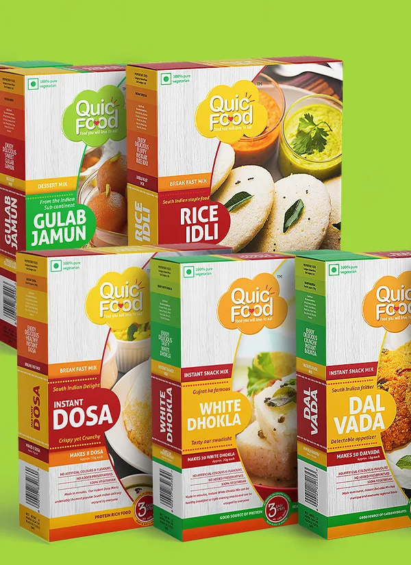
India's food culture is colourful, diverse and full of flavour. For QuicFood, the challenge was to translate this familiarity into packaging that could stand out in a competitive FMCG market dominated by established food brands. Brij Design Studio developed a distinctive product packaging design direction that brought together Indian-inspired colours, handcrafted illustrations, handwritten typography and playful doodles.
The project covered more than 10 instant food mix variants, including Idli, Dosa, Gulab Jamun, Dal Vada and Sheera. Beyond individual products, we also conceptualised unique 3-in-1 tiffin packs that brought complementary food categories together, inspired by the idea of a wholesome Indian meal.
Ready to Eat Food Brand
Packaging Design for a Ready to Eat Food Brand
In a competitive Indian food market, packaging needs to do more than display a product name. It must create familiarity, communicate the product clearly and give consumers a reason to notice the brand.
For QuicFood, our packaging design for a ready to eat food brand focused on creating an Indian visual identity with a contemporary, retail-friendly presentation. We explored colours associated with Indian food culture, supported by handcrafted illustrations and expressive typography.
The objective was to create packaging that felt relatable to Indian consumers while maintaining a distinctive appearance across the product range. Every design element contributed to a visual language that was vibrant, approachable and rooted in the everyday food experiences familiar to Indian households.


FMCG Packaging Design
FMCG Packaging Design with an Indian Touch
FMCG Packaging Design with an Indian Touch
How do you create packaging that feels familiar to Indian consumers while competing for attention on a crowded retail shelf? For QuicFood, the answer lay in building a strong visual connection with the food itself.
Our FMCG packaging design approach combined Indian-inspired colours with playful illustrations and handwritten-style typography. Instead of relying on a conventional corporate look, we explored a more expressive direction that reflected the diversity and personality of Indian cuisine.
The design system was developed to work across multiple product variants, helping the range maintain visual consistency while allowing individual products to be identified. This balance between a shared brand identity and product-level distinction was central to the overall packaging concept.
10+ Variants
Instant Mix Product Packaging Design Across 10+ Variants
From breakfast favourites to traditional sweets and savoury snacks, Indian food offers a wide range of familiar flavours and occasions. QuicFood's product range required a packaging system flexible enough to accommodate more than 10 instant mix variants.
Our instant mix product packaging design covered products such as Idli, Dosa, Gulab Jamun, Dal Vada, Sheera and more. Each package was developed within the larger QuicFood visual language, using expressive typography, handcrafted-style illustrations and Indian-inspired colours.
The challenge was to create a connected product family without making every pack look identical. By working with a consistent design direction across the range, we aimed to make the packaging feel cohesive while preserving the identity of each food variant.
Food Packaging Boxes
Food Packaging Boxes That Bring Indian Flavours to Life
A box is more than a container; it is an opportunity to introduce the product and its personality before the pack is opened. For QuicFood, the food packaging boxes were designed around the familiarity and warmth of Indian food culture.
The creative direction brought together bold colour combinations, hand-drawn visual elements and handwritten-style lettering. Doodles and illustrations added a playful character, making the packaging feel approachable rather than overly formal.
The box design was also developed with the wider product range in mind, ensuring that individual variants could sit within a recognisable brand family. The result was a packaging concept that celebrated Indian food through visual storytelling while maintaining a clear product presentation.

The 3-in-1 Tiffin Pack
Three Favourites, One Wholesome Idea
01One pack, one meal
What if one pack could bring together the different parts of a familiar Indian meal?
02Complementary combinations
This idea inspired QuicFood's distinctive 3-in-1 tiffin pack concept. Instead of treating every instant mix as a separate purchase idea, we explored combinations that brought complementary food categories together in one pack.
03Rice, dal and a sweet
Inspired by Indian thalis, dhaba-style meals and breakfast combinations, the concept included combinations such as rice, dal and a sweet. The aim was to present a more complete meal idea through one thoughtfully assembled packaging concept.
04A single food experience
The tiffin-inspired approach gave the project a product concept beyond individual box design. It connected the packaging with familiar Indian eating habits and offered a way to present multiple variants as part of a single food experience.
Thalis & Dhaba-Style Food
Packaging Concepts Inspired by Indian Thalis and Dhaba-Style Food
Indian meals are often about combinations rather than individual dishes. A thali brings different tastes together, while a dhaba-style meal evokes the familiarity of hearty, traditional food.
These familiar experiences informed our packaging concepts for QuicFood. We explored how instant mixes could be presented not only as individual products but also as components of a larger meal. The 3-in-1 tiffin idea translated this thinking into a distinctive product presentation, bringing complementary variants together.
The concept was designed to make the range feel relevant to everyday Indian food preferences, including breakfast and wholesome meal occasions. It also gave the brand an opportunity to communicate variety through packaging, rather than relying solely on individual product boxes.
Illustration & Type
Handcrafted Illustrations, Handwritten Typography and Playful Doodles
The personality of QuicFood's packaging came from the details. Handcrafted-style illustrations, handwritten typography and playful doodles helped create a visual language that felt expressive and connected to Indian food culture.
The illustrations added character, while the typography gave the packaging a more informal, approachable tone. Indian-inspired colours brought energy to the overall design, creating a balance between product communication and visual storytelling.
These elements were developed to work across the different product variants and the 3-in-1 tiffin concept. Rather than treating artwork as decoration, we used it to reinforce the brand's personality and make the packaging feel like part of the food experience.
Our Creative Approach
Our Creative Approach to QuicFood Packaging
Our approach began with understanding the competitive environment of the Indian food industry and the need for a recognisable visual identity. We wanted QuicFood to feel familiar to consumers without simply repeating the conventional look of established FMCG brands.
We developed an Indian-inspired colour direction, then brought it to life through handcrafted illustrations, handwritten-style typography and doodles. The visual system was adapted across more than 10 instant mix variants, including traditional breakfast, savoury and sweet products.
We also explored a larger product idea through the 3-in-1 tiffin packs, connecting the range with familiar Indian meal combinations. Together, these decisions created a packaging concept built around food culture, product variety and visual character.
Scope of Work
Brij Design Studio's creative scope for the QuicFood project included:
01
Product packaging design
02
Instant mix packaging box design
03
Packaging design for a ready to eat food brand
04
FMCG packaging design
05
Packaging concepts for multiple food variants
06
Packaging design for more than 10 instant mix products
07
3-in-1 tiffin pack concept development
08
Indian-inspired colour palette development
09
Handcrafted-style illustrations and doodles
10
Handwritten-style typography
11
Product-specific packaging layouts
12
Visual consistency across the product range
13
Food packaging box design
The Result
Building a Distinctive Identity for QuicFood
The QuicFood project demonstrates how packaging can draw from familiar food culture to develop a distinctive brand identity. Through Indian-inspired colours, handcrafted illustrations, handwritten typography and playful doodles, Brij Design Studio created a visual direction designed to stand apart in a competitive FMCG category.
The project extended beyond individual instant mix boxes to explore a 3-in-1 tiffin concept inspired by Indian thalis, dhaba-style meals and breakfast combinations. This added another dimension to the packaging, connecting individual products with the idea of a more complete meal.
For us, effective food packaging design combines consumer understanding, clear communication and a creative concept that gives the brand its own character.
More Work
Our work that will interest you


Journal
Blogs you may like


Questions & Answers
Frequently Asked Questions
Instant mix product packaging design involves creating the visual presentation and packaging layout for products that help consumers prepare food. It includes colour selection, typography, illustrations, product information and packaging structure. For QuicFood, the design approach used Indian-inspired colours and handcrafted-style graphics across more than 10 food variants.
Effective packaging design for a ready to eat food brand combines clear product identification, an appealing visual identity and practical packaging requirements. Colours, illustrations and typography can help communicate the brand's personality. For QuicFood, the creative direction drew inspiration from Indian food culture to create a familiar yet distinctive presentation.
FMCG packaging design can help a food brand stand out through a recognisable colour palette, distinctive typography, relevant illustrations and a consistent visual system. Packaging should also make product names and important information easy to identify. QuicFood used Indian-inspired colours and playful, handcrafted-style graphics to establish its visual character.
The QuicFood project covered more than 10 instant mix variants, including Idli, Dosa, Gulab Jamun, Dal Vada and Sheera, along with other products. The project also included a 3-in-1 tiffin pack concept inspired by combinations of complementary foods.
The 3-in-1 tiffin pack was conceived around the idea of bringing complementary food categories together in one pack. Inspired by Indian thalis, dhaba-style meals and breakfast combinations, the concept explored combinations such as rice, dal and a sweet to represent a more complete meal experience.
Indian-inspired colours can help food packaging feel familiar and connected to local food culture. When combined with appropriate illustrations and typography, they can give a brand a distinctive visual identity. For QuicFood, the colour direction supported the goal of creating packaging with an Indian touch for a competitive FMCG market.
Handcrafted illustrations can give food packaging a more expressive and approachable appearance. They can also help communicate a brand's personality and create a consistent visual theme across multiple products. For QuicFood, illustrations and doodles worked alongside handwritten-style typography to bring character to the packaging.
Food packaging box design should consider product dimensions, packaging structure, required product information, readability, brand identity and print specifications. The visual concept should also adapt to different product variants without losing consistency. For QuicFood, the box designs were developed as part of a wider packaging system covering multiple instant mixes.
Brij Design Studio is a Mumbai-based creative agency offering branding and packaging design services. Its work includes food packaging concepts, FMCG packaging, product labels, box design, illustrations and packaging systems tailored to a brand's identity and product range.
Consistency can be created by establishing shared design elements such as colours, typography, illustration style and layout principles. These elements can then be adapted to individual products while keeping product names and information clear. QuicFood's packaging used a common Indian-inspired visual direction across more than 10 instant mix variants.
Let's Create Packaging That Stands Out
Start Your Food Packaging Design Project
Every food brand has a story, and packaging is where that story meets the customer.
At Brij Design Studio, we create packaging concepts that bring together consumer understanding, visual storytelling and brand identity to help food products find their own voice.
Start Your Food Packaging Design Project →