Brij Design Studio

Start a project

Have a brand, product, or website that needs work?

Let's chat →

D03, Parle Colony, Sahkar Road,
Vile Parle (East), Mumbai 400057

+91 98335 89989
birju@brijdesignstudio.com

Derby Toffee Pouch Packaging Design

Derby partnered with Brij Design Studio to develop packaging for its exciting range of toffees, candies, and lollipops. The creative direction focused on vibrant colours, expressive typography, and playful Hinglish communication to appeal to a younger audience. Our work covered individual inner sleeves, outer stand-up pouches, and jar labels, creating a cohesive visual identity across multiple product variants. Each design was developed to express its own personality while retaining a connection to the Derby brand. This Derby toffee pouch packaging design project demonstrates how creative packaging can bring energy and character to a confectionery range.

Lollipop Packaging Design

Effective lollipop packaging design combines visual excitement with a memorable product identity. For Derby, our creative approach centred on vibrant colour palettes, playful typography, and a lively design language suited to the confectionery category. The objective was to give each product variant a distinctive appearance while maintaining consistency across the wider range. We considered how the packaging could communicate the brand’s fun personality through colours and lettering that catch attention. By extending the same creative direction across different formats, Brij Design Studio helped establish a connected packaging system for Derby’s toffees, candies, and lollipops.

Toffee Wrapper Design

For Derby, toffee wrapper design was an important part of creating a recognisable identity for individual products. We developed distinctive typographic treatments and vibrant colour combinations to give each variant its own character. The inner sleeves were designed to work alongside the outer stand-up pouches, ensuring that the visual identity remained connected from individual pieces to the larger pack. Playful Hinglish communication added another layer of personality to the overall concept. This approach brought together product differentiation and brand consistency, demonstrating how carefully considered wrapper design can contribute to a cohesive and engaging confectionery packaging experience.

Candy Packaging Design

The Derby candy packaging design concept was created to make the product range feel colourful, energetic, and engaging for a younger audience. We used vibrant palettes and expressive typography to establish a playful visual personality across individual variants. Each design was given its own typographic treatment, helping distinguish the products while maintaining a recognisable connection to the Derby brand. Hinglish communication supported the informal, lively tone of the packaging. From individual inner sleeves to outer pouches, the design system carried a consistent creative direction across formats, giving the confectionery range a unified identity with room for individual product expression.

Confectionery Packaging Design for Toffees, Candies and Lollipops

The confectionery packaging design project for Derby involved creating a cohesive visual system for a range of toffees, candies, and lollipops. Our approach combined bright colours, distinctive typography, and playful Hinglish communication to reflect the personality of the category and its intended audience. The design work extended across inner sleeves, stand-up pouches, and jar labels, requiring the visual identity to adapt to different formats while remaining consistent. By balancing individual variant character with shared brand elements, Brij Design Studio developed a connected packaging direction that brings visual energy and recognisability to Derby’s diverse confectionery portfolio.

Stand-Up Pouch Packaging Design

The stand-up pouch packaging design for Derby extended the brand’s playful visual identity to the outer packaging of its confectionery range. We used vibrant colours and distinctive typography to create an engaging presentation while maintaining consistency with the individual inner sleeves and other packaging elements. Each variant needed to feel unique without losing its connection to the wider product family. Our design approach considered the pouch as both a product presentation surface and an important brand touchpoint. Combined with jar labels and wrapper designs, the stand-up pouches helped establish a cohesive packaging system for Derby’s growing confectionery range.
Derby toffee campaign visual, Taste Fun, by Brij Design Studio

DerbyToffee Pouch Packaging Design

Big Colours. Playful Typography. A World of Sweet Surprises.

Client

Derby

Category

Confectionery | Toffees, Candies & Lollipops

Project

Packaging Design & Brand Communication

Project Overview

Derby Toffee Pouch Packaging Design

Big Colours. Playful Typography. A World of Sweet Surprises.

Client

Derby

Category

Confectionery | Toffees, Candies & Lollipops

Project

Packaging Design & Brand Communication

Scope

Toffee Packaging DesignCandy Packaging DesignVariant-wise TypographyColour PalettesInner SleevesStand-Up PouchesJar LabelsHinglish CommunicationBrand Communication

The Brief

Packaging as Exciting as the Treats Inside

When it comes to confectionery, packaging should be as exciting as the treats inside. Derby, a premium confectionery brand with a diverse portfolio of toffees, candies, and lollipops, approached Brij Design Studio to develop packaging for its new product range.

Our creative direction focused on vibrant colours, distinctive typography, and playful Hinglish communication designed to appeal to young consumers.

From individual inner sleeves and outer stand-up pouches to jar labels, we created a connected packaging system that brought personality to every variant while maintaining a recognisable Derby brand identity.

Derby Funjeera candy pouch packaging design with sunburst graphics Derby · Funjeera

The Creative Challenge

How Do You Make Every Sweet Stand Out?

With multiple toffee, candy, and lollipop variants to introduce, Derby needed packaging that could capture attention and give each product its own character.

The challenge was to create a visual language that felt energetic, colourful, and engaging for children while remaining consistent across different packaging formats.

Our approach focused on making typography a key part of the creative concept. Each variant received its own typographic treatment and vibrant colour combination, helping the products express their individual personalities. The result was a playful packaging direction designed to make the Derby range visually distinctive and easy to navigate.

Derby toffee brand communication, Unwrap Joy
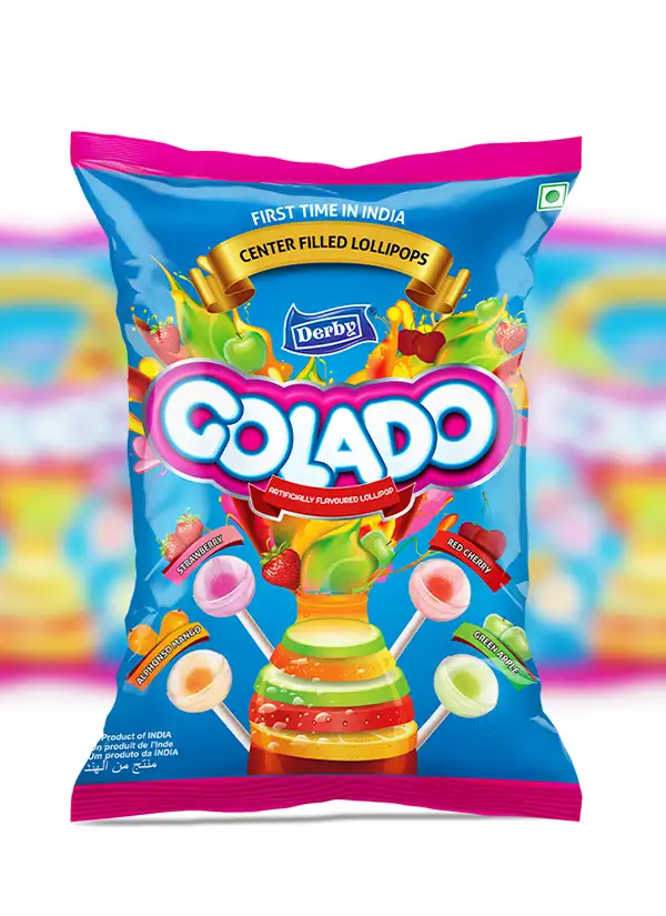
Derby Colado lollipop pouch packaging with playful typography

Toffee Packaging Design

Vibrant Colours for Every Toffee

Our toffee packaging design approach centred on bright colours, expressive typography, and a lively visual identity.

The packaging was designed to reflect the fun and excitement associated with confectionery, appealing to children through an energetic presentation.

Candy Packaging Design

Typography with Personality

Typography played a central role in the Derby project. We developed distinctive typographic treatments for individual variants, using lettering as a visual tool to communicate their playful personalities.

The aim was to move beyond simply displaying product names and make the typography an integral part of the packaging experience. Combined with vibrant colours, the lettering helped each variant feel different while remaining part of the Derby family.

This approach to candy packaging design shows how thoughtful typography can contribute to product recognition, visual energy, and brand personality, particularly in a category where packaging needs to appeal quickly to its intended audience.

Formats & Touchpoints

One playful identity, from sleeve to shelf.

Sleeves + Pouches

Pouch Designing

From Inner Sleeves to Stand-Up Pouches

The Derby project involved multiple packaging formats, requiring the creative direction to work across different sizes and applications. We designed individual inner sleeves as well as outer stand-up pouches, ensuring that the visual identity remained connected throughout the packaging system.

The inner sleeves carried the product-level design, while the outer pouches provided a larger canvas for the overall range presentation. Both formats followed the same vibrant, typography-led creative approach.

Our pouch designing process considered how the brand identity could be adapted across packaging sizes without losing its character. The goal was a consistent and recognisable experience, from individual confectionery pieces to the outer pack.

The Range

Confectionery Packaging Design

One Brand for Toffees, Candies and Lollipops

Derby's portfolio spans different confectionery products, each offering an opportunity for a distinctive visual expression. Our packaging concept used colour and typography to create differentiation across the range while keeping the overall brand identity cohesive.

The creative direction was developed for a young audience, using energetic colours and playful visual communication to reflect the enjoyment associated with sweets. The same principles were applied across toffee packaging, candy pouches, lollipop-related packaging, and jar labels.

Marketing

Brand Communication

Supporting the Packaging Range

Beyond the packaging artwork, the project included brand communication to help market the new pouch range. The communication approach followed the same playful direction established in the packaging, using vibrant visuals and engaging language to maintain consistency.

Aligning packaging with marketing communication is important because consumers may encounter a product through different touchpoints. A consistent visual style and tone can help reinforce recognition and make the brand presentation feel connected.

For Derby, the aim was to carry the energy of the packaging into the wider communication surrounding the product range.

The Family

One Packaging Family

Balancing Variety and Consistency

Rather than treating every variant identically, we explored individual typographic styles and colour palettes to give each product a distinctive look. At the same time, shared design elements maintained a connection across the range.

This balance between variety and consistency helped establish a unified packaging family that could work across individual toffees, multipacks, and larger product formats.

Derby lollipop packaging design in the same vibrant Derby identity

Jar Label Design

Extending the Derby Identity to Every Jar Label

Alongside the inner sleeves and stand-up pouches, the project included jar labels. This extended the Derby packaging identity to another product presentation format.

The design direction retained the project's vibrant colour palette and expressive typography, helping the labels remain visually connected to the wider range. Adapting a packaging concept across pouches, sleeves, and jars requires attention to layout, scale, and information hierarchy so that the identity remains recognisable in each format.

By applying consistent visual principles across these touchpoints, we created a packaging system that supported the broader presentation of the Derby confectionery range.

Derby Ghotala candy pouch with the line Taste the Twist

Hinglish Brand Communication

Speaking the Language of Fun

01Hindi meets English

For Derby, packaging was also an opportunity to communicate with its audience in a more playful and relatable voice. We incorporated Hinglish brand communication into the creative direction, combining Hindi and English to give the packaging a familiar, lively tone.

02A voice for young fans

This approach helped the communication feel suited to the intended young audience and the informal excitement associated with confectionery. Rather than relying only on visual appeal, the packaging used language as another way to express the brand's personality.

03Visual + verbal, together

The combination of playful typography, vibrant colours, and Hinglish communication brought visual and verbal elements together in one cohesive creative concept.

Brij Design Studio's Approach to Confectionery Packaging

Identity, Differentiation and Communication

At Brij Design Studio, we approach packaging as a combination of visual identity, product differentiation, and audience-focused communication.

For Derby, we developed a vibrant, typography-led direction that could work across multiple variants and packaging formats.

From inner sleeves and stand-up pouches to jar labels and marketing communication, the project brought together colour, typography, and Hinglish messaging under one creative vision.

What We Designed

The Derby packaging project included:

01

Toffee packaging design

02

Candy packaging design

03

Lollipop-related packaging

04

Variant-wise typography

05

Vibrant colour palettes

06

Individual inner sleeves

07

Outer stand-up pouches

08

Jar label design

09

Hinglish brand communication

10

Brand communication for the pouch range

11

Connected packaging system

The Final Packaging System

A Lively, Cohesive Identity for the Derby Range

The result is a packaging concept designed to give Derby's confectionery range a lively and cohesive identity while allowing each variant to express its own personality.

This unified approach to confectionery packaging design helps a broad product portfolio feel like one connected brand rather than a collection of unrelated products.

Derby Ghotala candy stand-up pouch range, final packaging system by Brij Design Studio

Final Packaging

Project Summary

Colour, type and Hinglish, working together.

Derby partnered with Brij Design Studio to develop packaging for its new range of toffees, candies and lollipops, built around vibrant colours, distinctive typography and playful Hinglish communication.

Our work included variant-wise typography, individual inner sleeves, outer stand-up pouches, jar labels and brand communication for the new pouch range.

By treating every format as part of one packaging system, we gave each variant its own personality while keeping Derby recognisable across the range.

Questions & Answers

Frequently Asked Questions

The Derby project is a confectionery packaging design assignment by Brij Design Studio for a new range of toffees, candies, and lollipops. The work included variant-wise typography, inner sleeves, outer stand-up pouches, jar labels, and brand communication.

The creative direction combines vibrant colour palettes, expressive typography, and playful Hinglish communication. Each variant has its own typographic treatment while retaining a connection to the overall Derby brand identity.

Typography helps communicate product names and contributes to a product's visual personality. For Derby, individual typographic treatments helped distinguish variants and create an energetic packaging style suited to the confectionery category.

Stand-up pouch packaging design involves creating the visual layout for flexible pouches designed to stand upright. The design needs to account for the packaging shape, product information, branding, and how key visuals appear on the front-facing panel.

Packaging designed for a young audience may use vibrant colours, playful typography, memorable visual elements, and accessible language. The design should remain appropriate to the product and ensure that essential information is clear.

A consistent packaging system uses shared brand elements while allowing individual products to vary through colour, typography, and other design details. This helps consumers recognise the product family while distinguishing different variants.

Confectionery packaging design can include product naming, typography, colour selection, illustrations or imagery, packaging layouts, and variant differentiation. Depending on the project, it may cover individual wrappers, pouches, boxes, jars, and multipacks.

Outer pouch design presents the product range as a whole and provides space for branding, product identification, and required information. It also needs to work visually alongside any individual wrappers or inner sleeves contained within the pack.

Jar label design adapts the brand's visual identity to a curved or defined label area. Consistent typography, colours, and branding elements help the jar remain recognisable as part of the wider product range.

Brand communication extends the product's visual identity and tone into marketing materials and other customer touchpoints. Consistent communication can help reinforce brand recognition and connect packaging with promotional activity.

A packaging design agency can develop a visual direction, design individual variants, adapt artwork to different packaging formats, and align the packaging with the brand's intended audience. It can also support communication concepts that extend the packaging identity into marketing.

Brij Design Studio develops packaging concepts for different product categories and formats. The Derby project demonstrates our approach to pouch design, variant-wise typography, colour differentiation, and cohesive packaging across inner sleeves, outer pouches, and jar labels.

Brands should consider the target audience, product variations, packaging format, visual differentiation, brand recognition, and mandatory product information. A connected packaging system can help new products establish a consistent identity across the range.

The right design depends on the product, audience, format, brand positioning, and retail context. Colour, typography, and visual hierarchy should work together to communicate the product clearly and establish a recognisable identity.

Packaging Design Agency in Mumbai

Launching a sweet new range? Let's make it pop.

Let's Talk →